
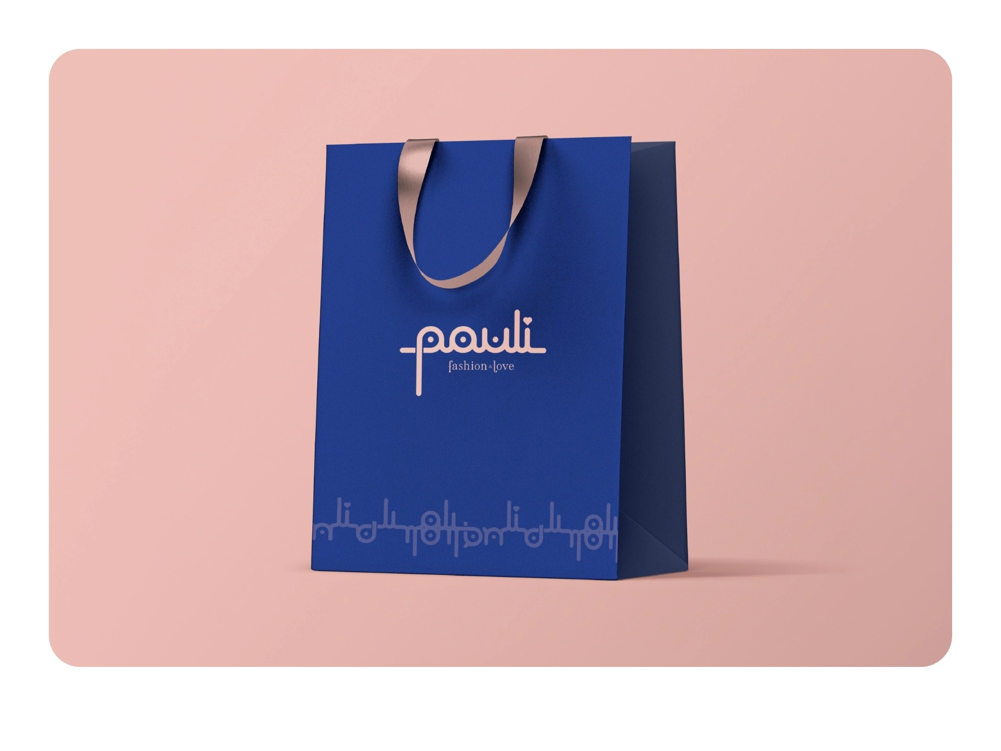
Pauli is the fashion brand of a close friend of mine, someone with a deeply artistic and loving personality. Its philosophy is “fashion & love”, and the identity had to feel as personal as she is. The question I set myself: could a single wordmark carry that warmth and also become the entire visual system?
Overview
Small boutiques live on personal connection, yet many of their identities are a tasteful font and little else. Pauli needed to feel as if someone had drawn it by hand, for you.
Approach
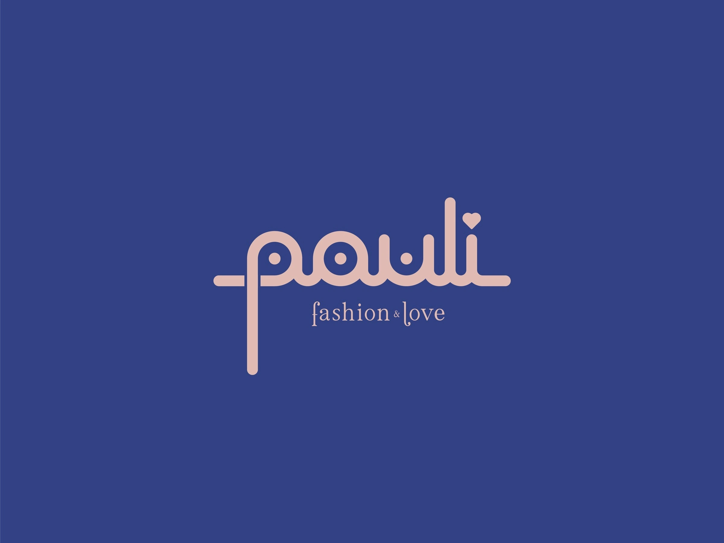
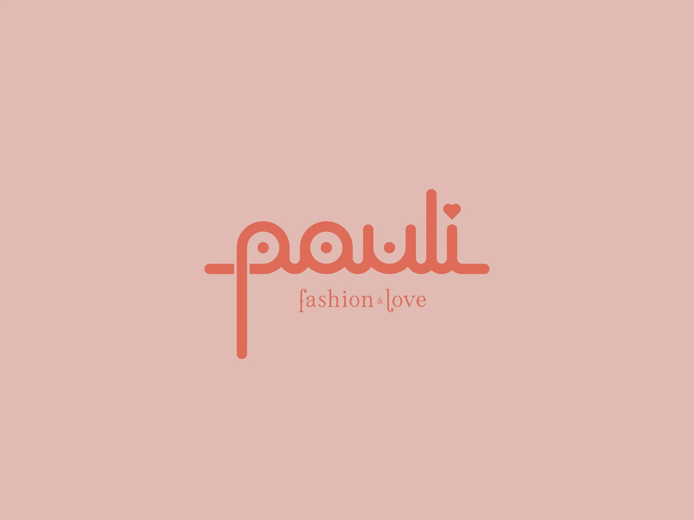
A connected lowercase wordmark, drawn with rounded strokes, circular details and flowing curves. A consistent line weight keeps it calm, while the elongated “p” and the tall “l” give the silhouette its rhythm. A small heart replaces the dot on the “i”, so the affection sits inside the name rather than beside it.
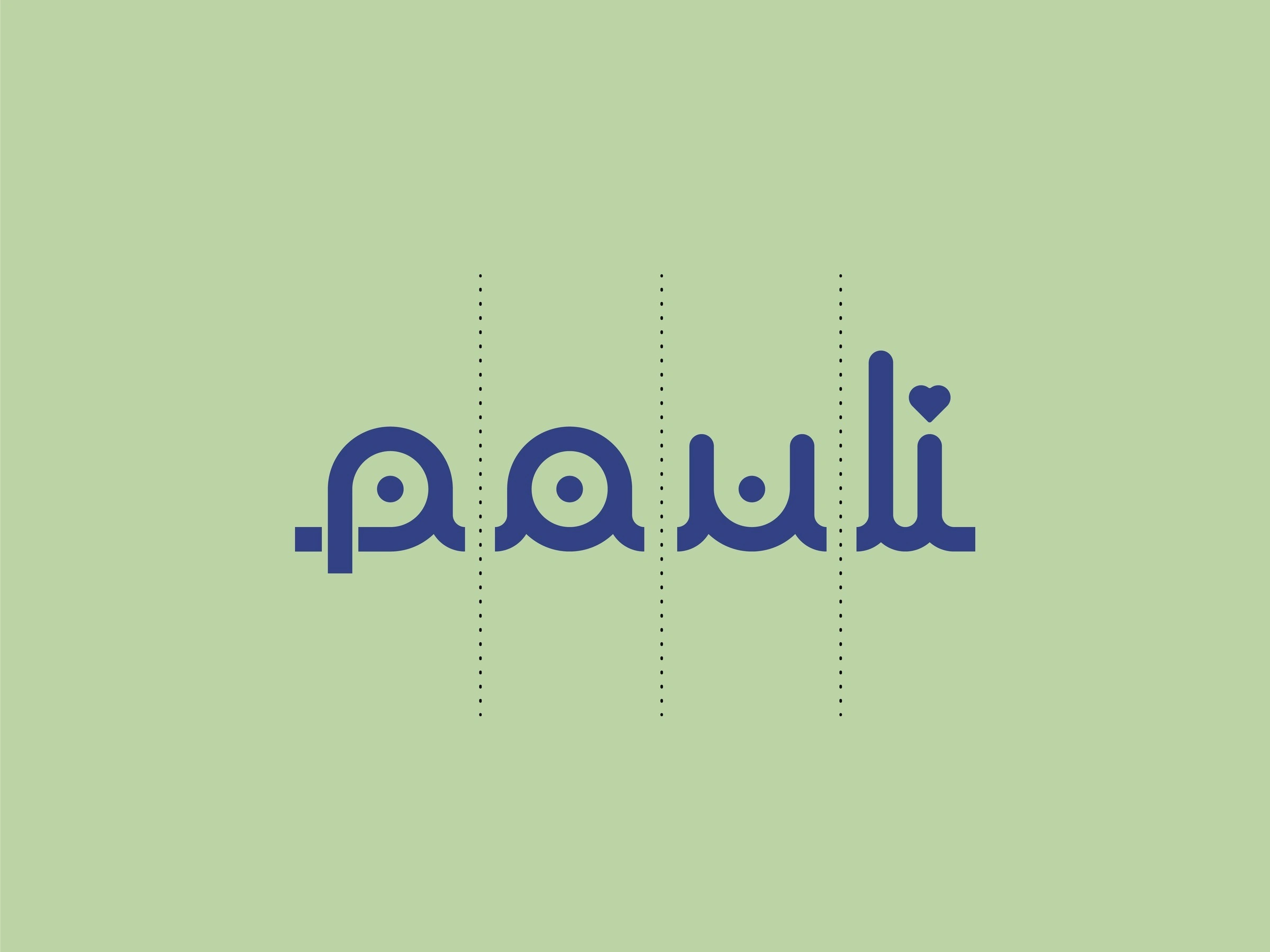
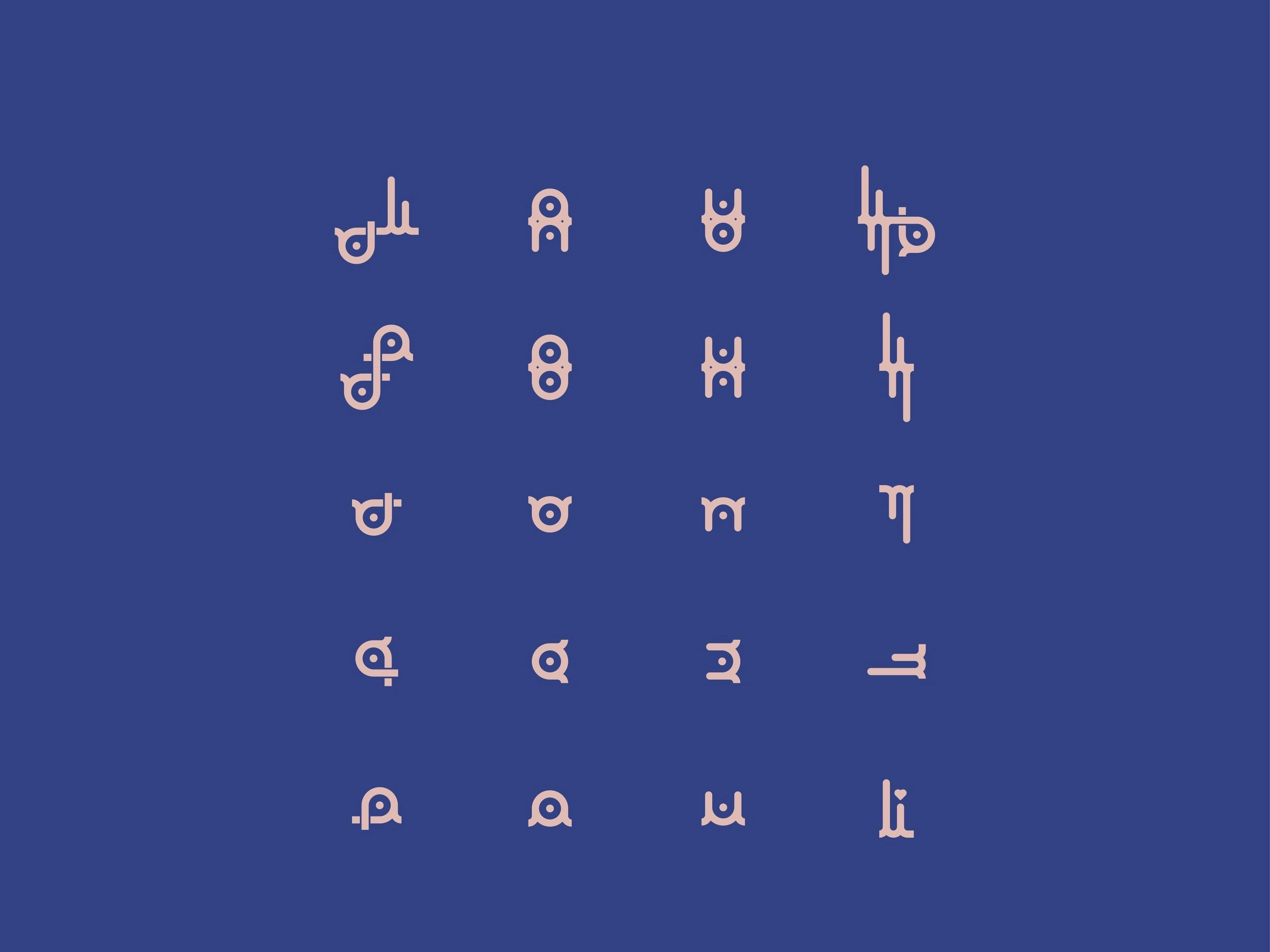
The letters were built to come apart. Each one is a self-contained module with its own rhythm, which is what made everything that followed possible.
Selected Work
Separated, mirrored and turned, the letterforms become a graphic toolkit. Nothing in the system had to be invented from outside the name.
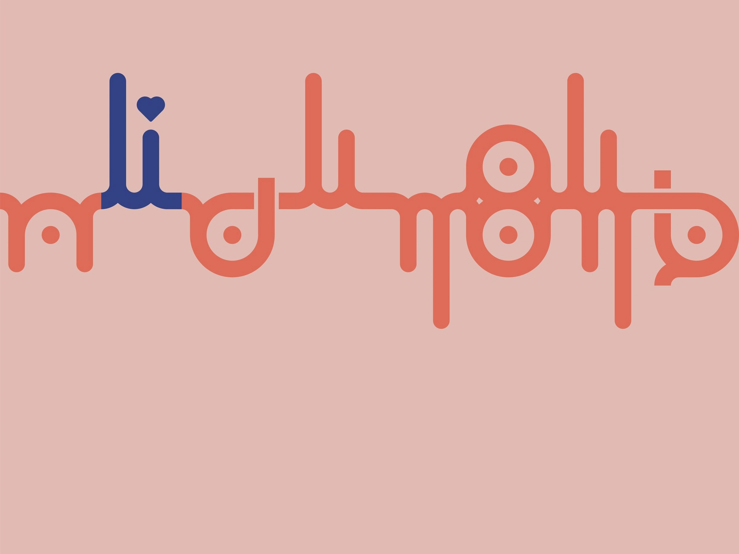
Linked together, the modules form a continuous pattern that reads like handwriting at a distance and like the logo up close. It can run endlessly across any edge.
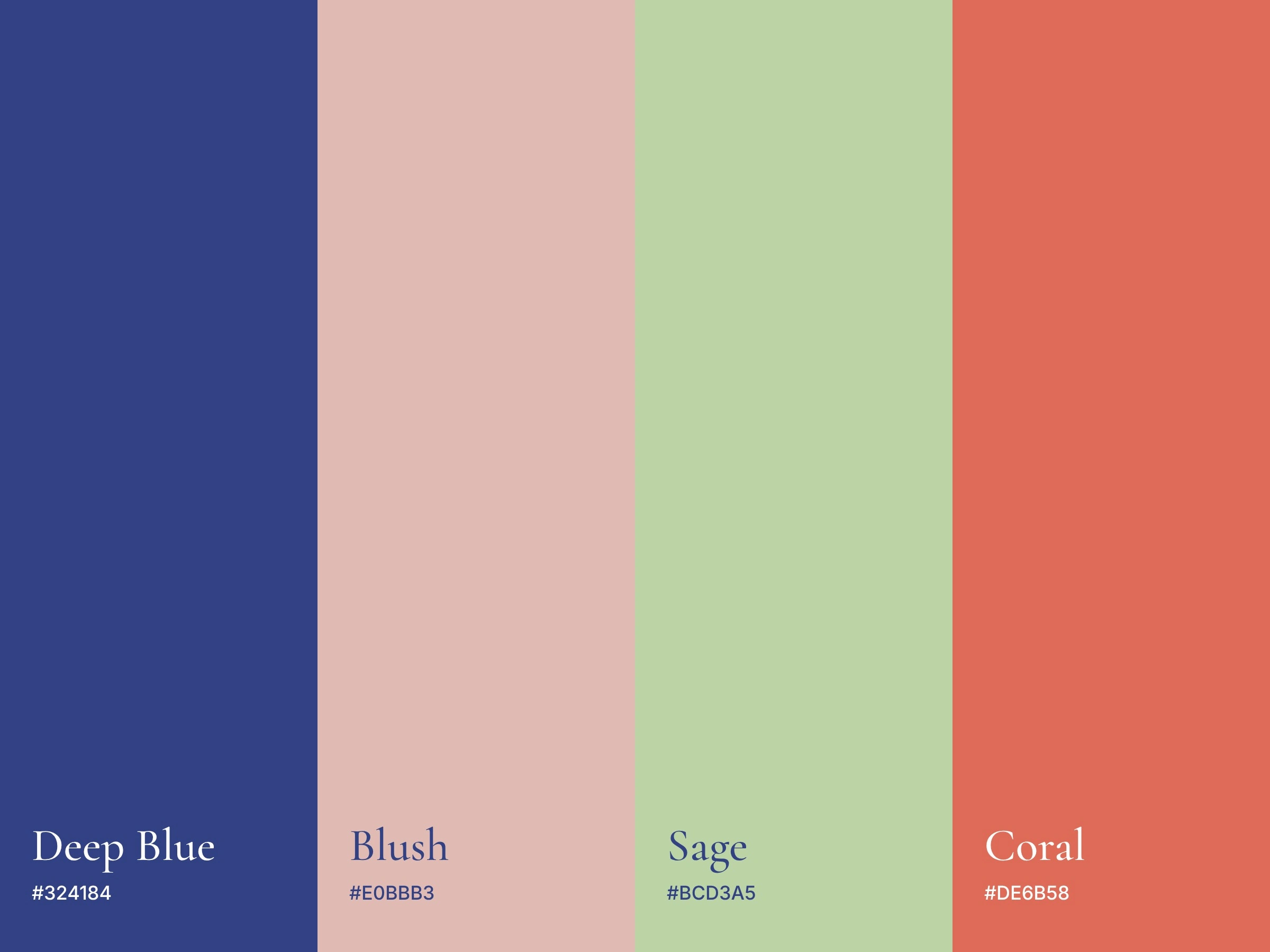
Deep blue anchors the identity. Blush, sage and coral keep it welcoming, and the delicate serif tagline adds elegance beneath the expressive lettering.
Outcome
The finished system includes:
Primary wordmark with “fashion & love” tagline
Four-colour palette and colourways
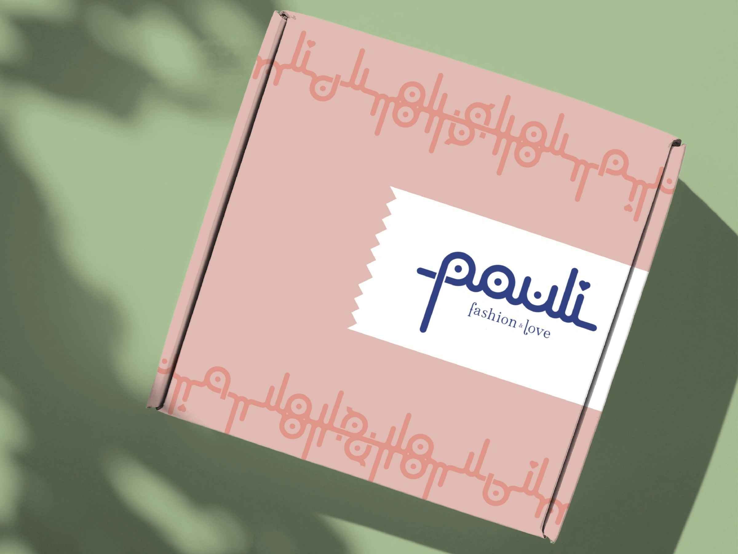
Modular letter toolkit and repeat pattern
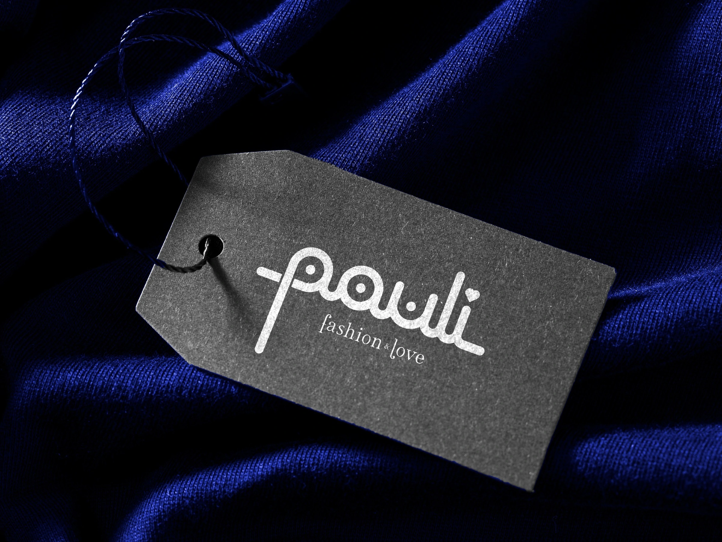
Mockups for shopping bag, shipping box and hang tag
The project is also documented on my Malt profile.
My Role
Logo Designer and Brand Designer. I created the concept, the lettering, the toolkit and the applications.
0 likes · 7 views · Nov 5, 2026
A hand-drawn wordmark for a fashion boutique that grows into a whole system of letter modules, patterns and packaging.
Timeline
Jan 1, 2022 - Dec 31, 2022
