
Nouca, formerly Nutrilotse, supports cancer patients over 65 through chemotherapy with nutrition, movement and psychological care. The company needed a mark that could stay warm in the hardest phase of someone’s life, and promise nothing no one can keep. So I started with the people, not with shapes.
Overview
Many patients lose muscle strength, often before they are even diagnosed, and only about three in ten receive any supportive care at all. Nouca was built for that gap, with Denmark, Norway, Spain and Romania as target markets.
Approach
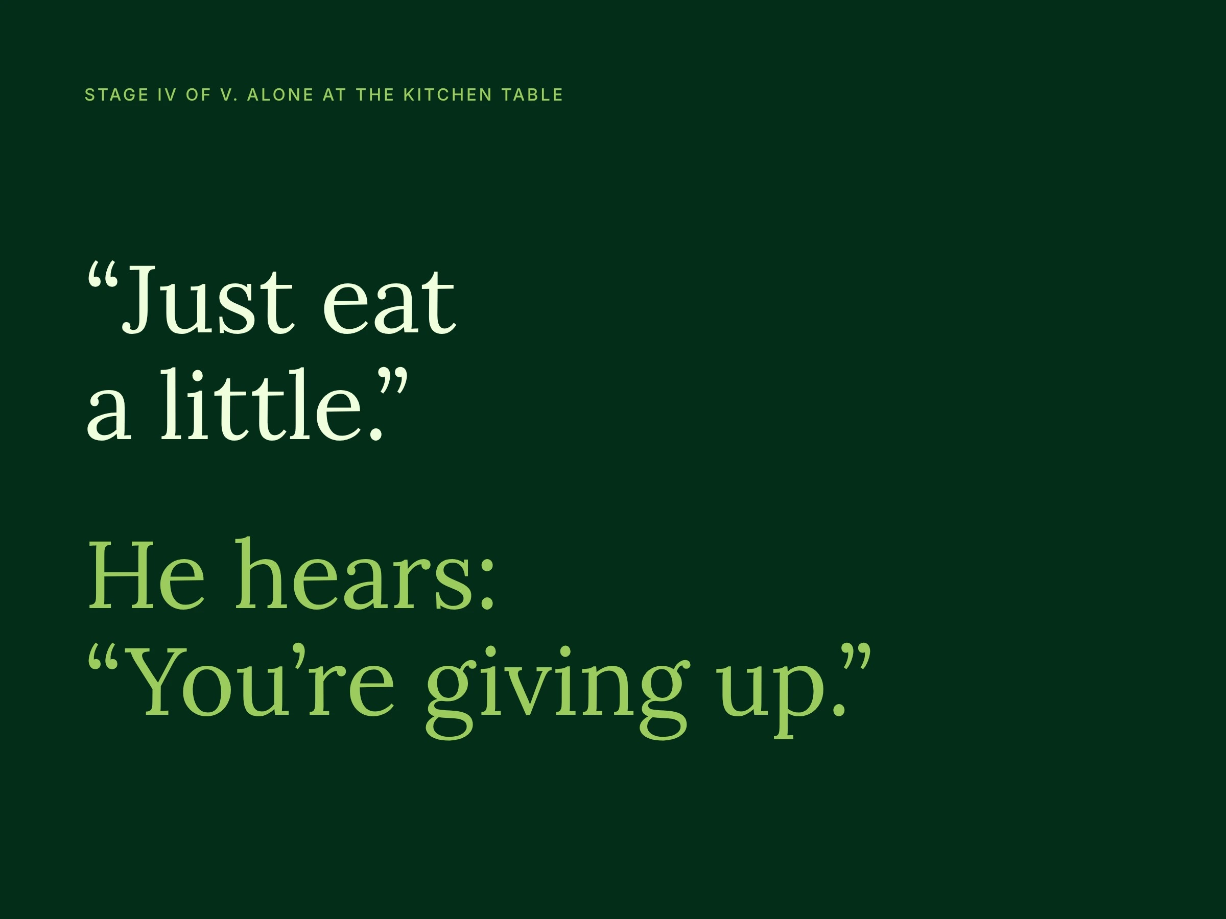
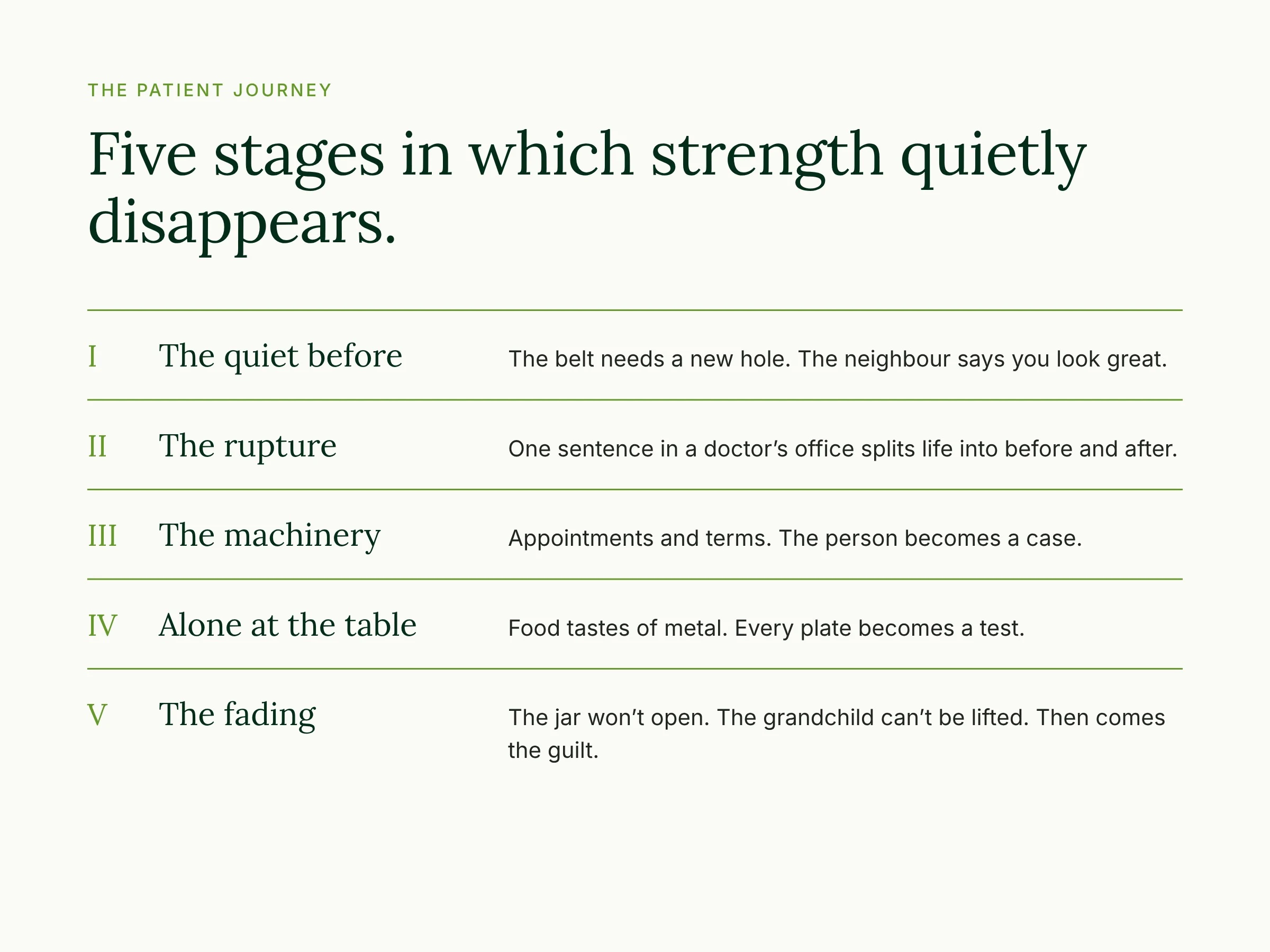
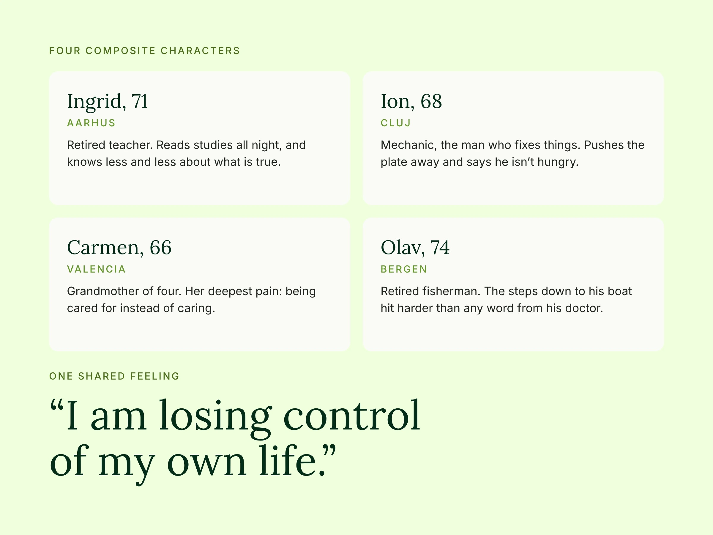
Before I touched a single form, I wrote a 15-page brand foundation about the people behind the brief: the five stages they go through before they find Nouca, and four composite characters who make those stages feel real. It gave the client and me one shared picture of who this mark is for.
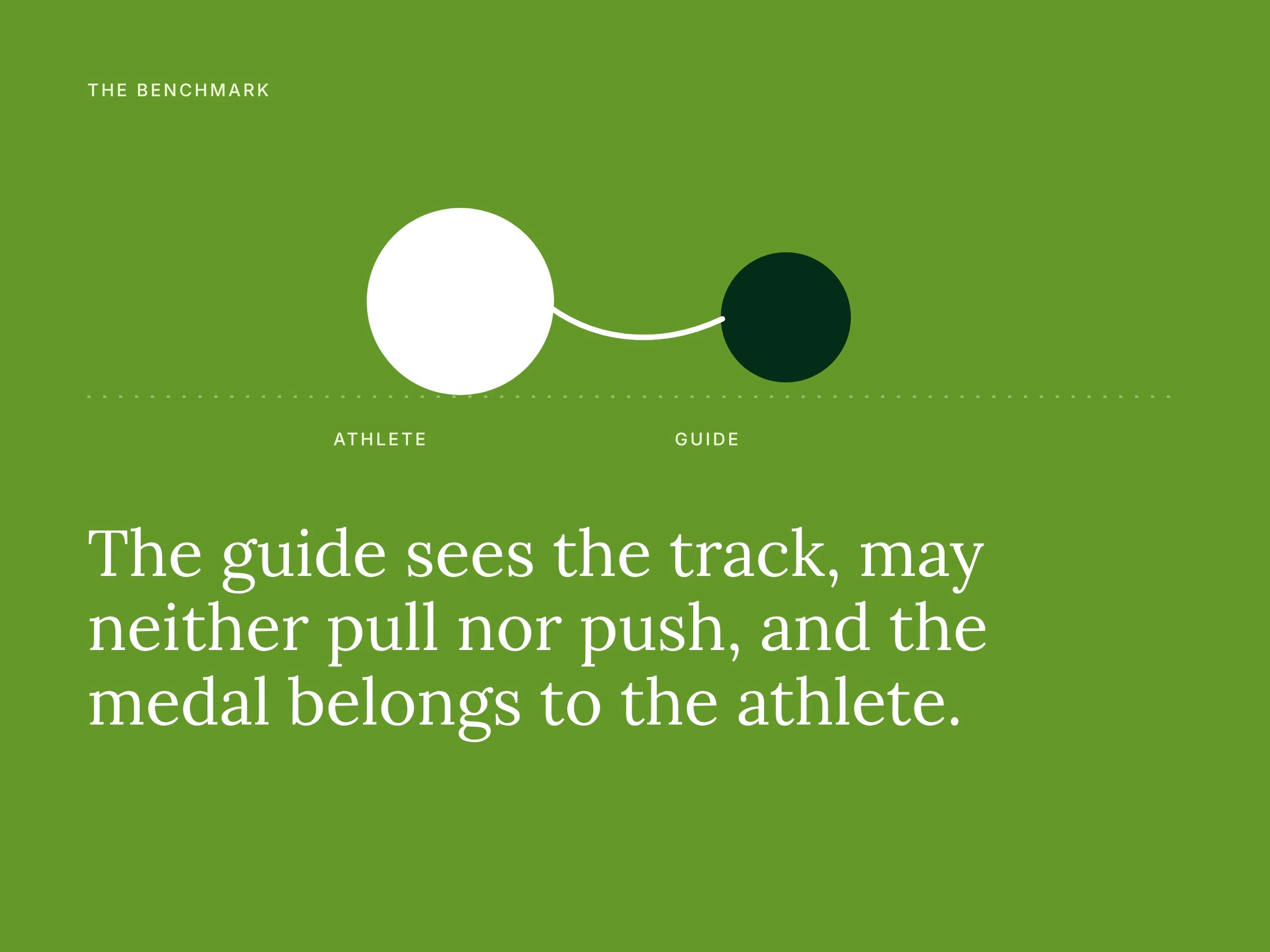
That defined the brand’s role: the patient is the hero and walks with their own strength, while Nouca knows the way and keeps the connection. My benchmark came from blind running. Athlete and guide are joined only by a short tether.
The challenge followed directly from that. The mark could not suggest healing, feel cold, look spiritual or read as a nutrition brand, and it speaks to a generation for whom showing weakness feels like failure. I also wasn’t starting from zero: the managing director brought her own drafts, and her navigation arrow captured the idea but looked like a GPS app. So I kept the idea and changed what it says.
Selected Work
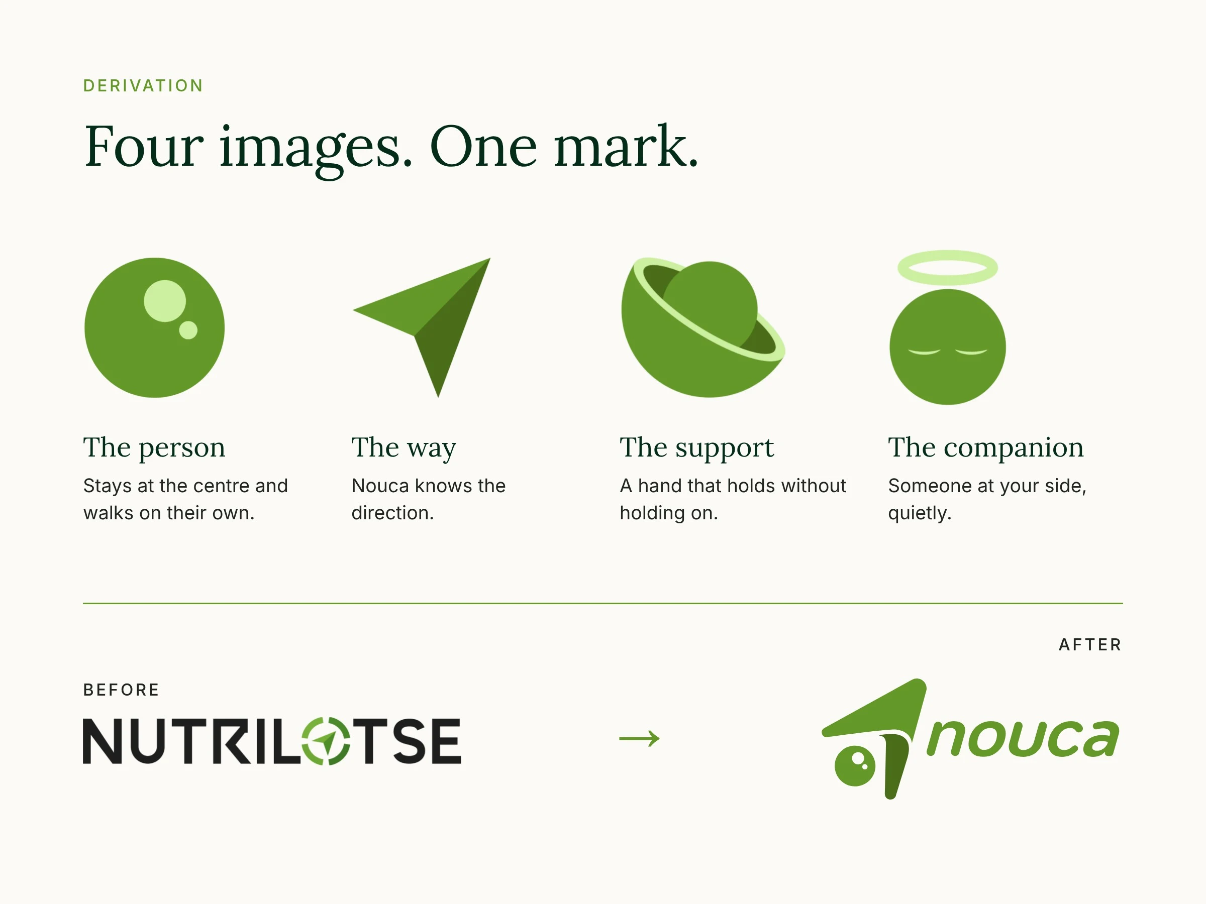
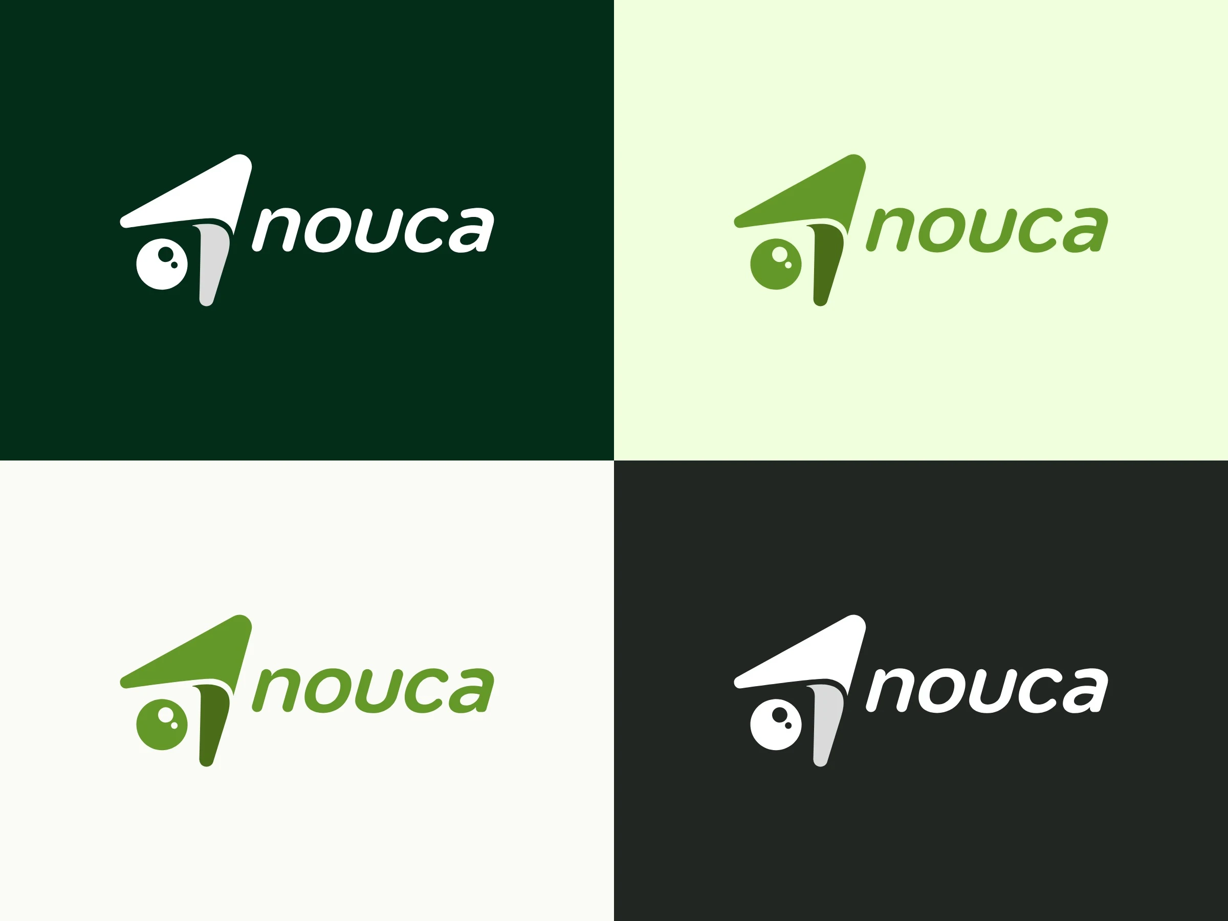
Four pictograms became one form. Every part of the final mark has a job, and the most important one is the space between the parts.
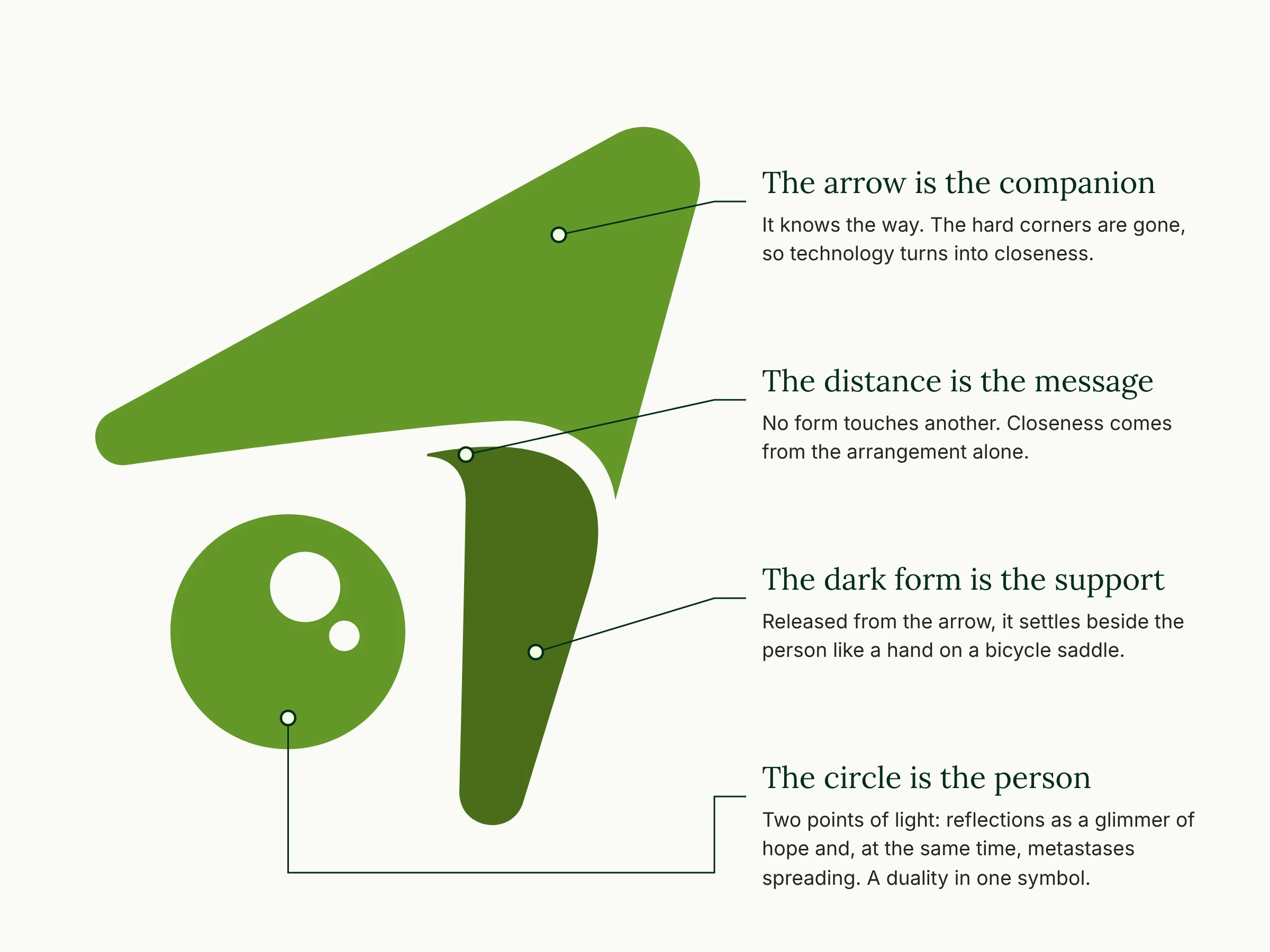
The two points of light in the circle carry the hardest part of the story. They read as reflections, a glimmer of hope, and at the same time as metastases that spread. One symbol holds both, because this journey does too.
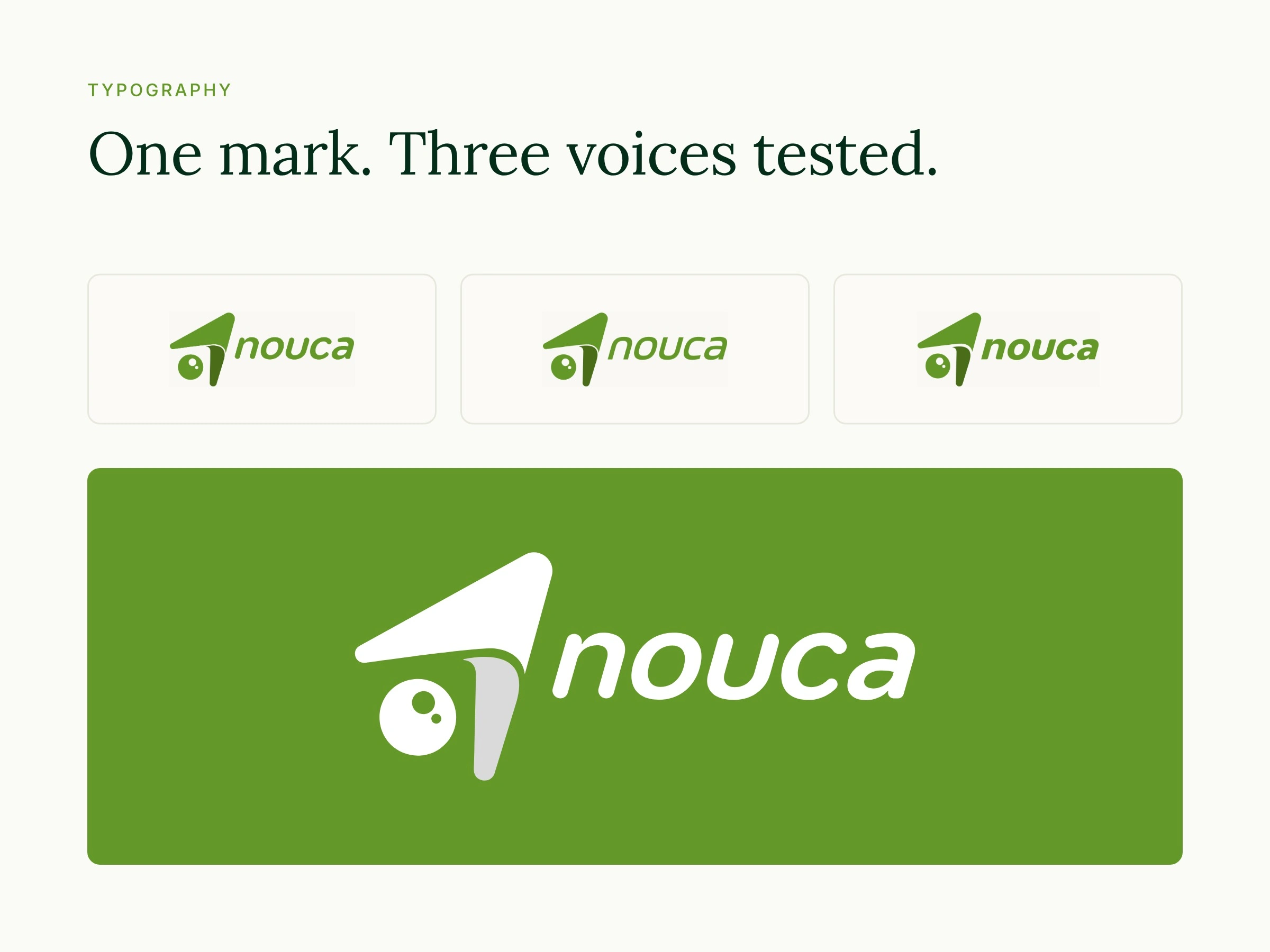
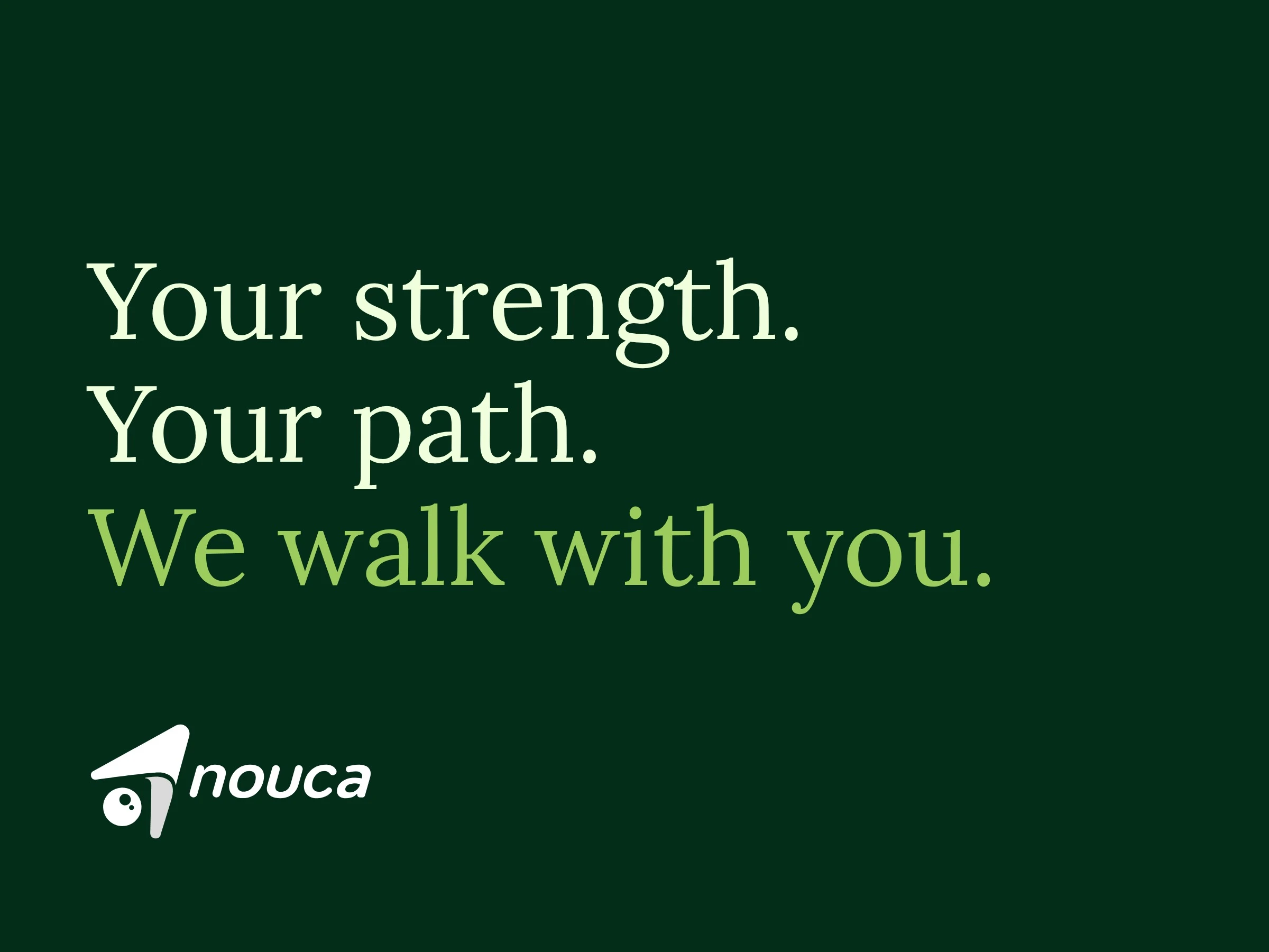
The wordmark is lowercase, softly rounded and leans forward. It moves along without raising its voice. We compared three typefaces with the symbol unchanged, so the decision was only about tone.
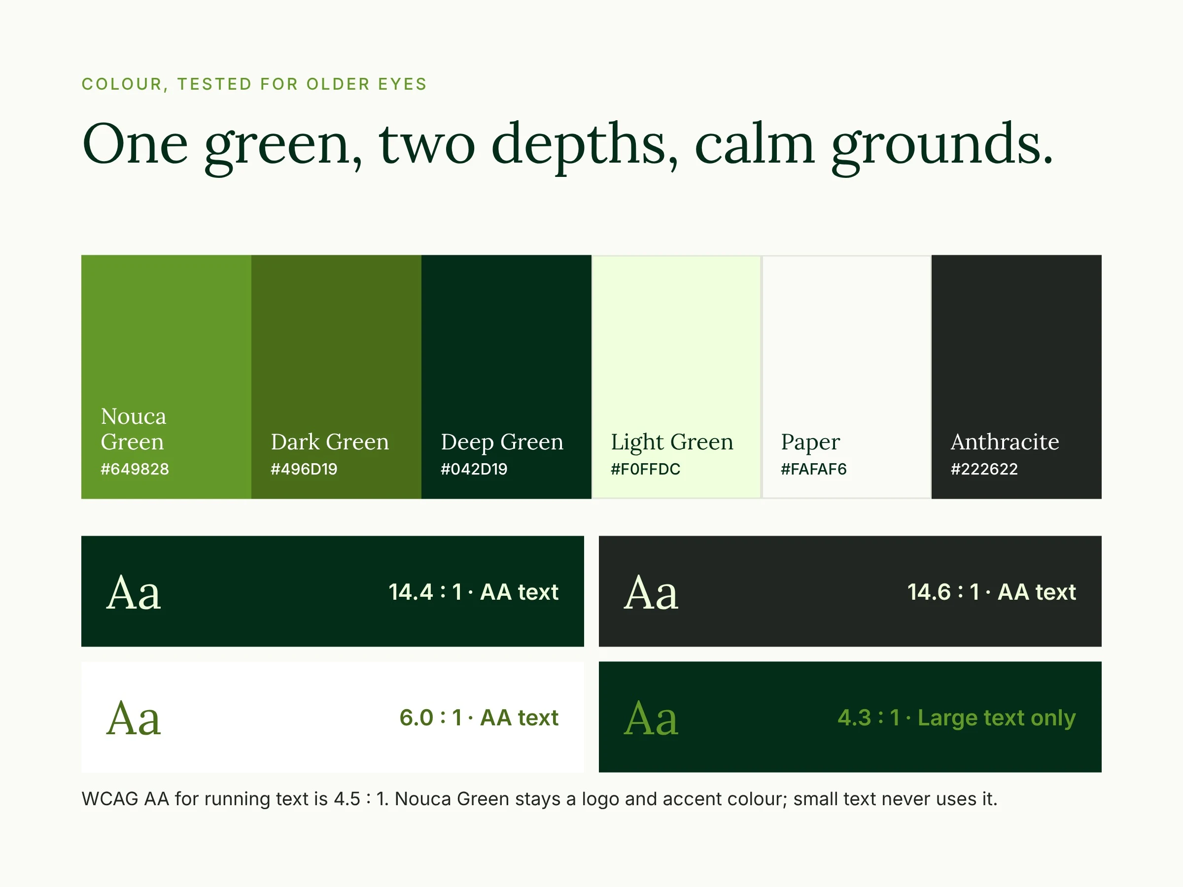
The audience is over 65, so legibility was part of the design, not a check at the end. Every text colour pair was tested against WCAG, and Nouca Green stays reserved for the logo and accents.
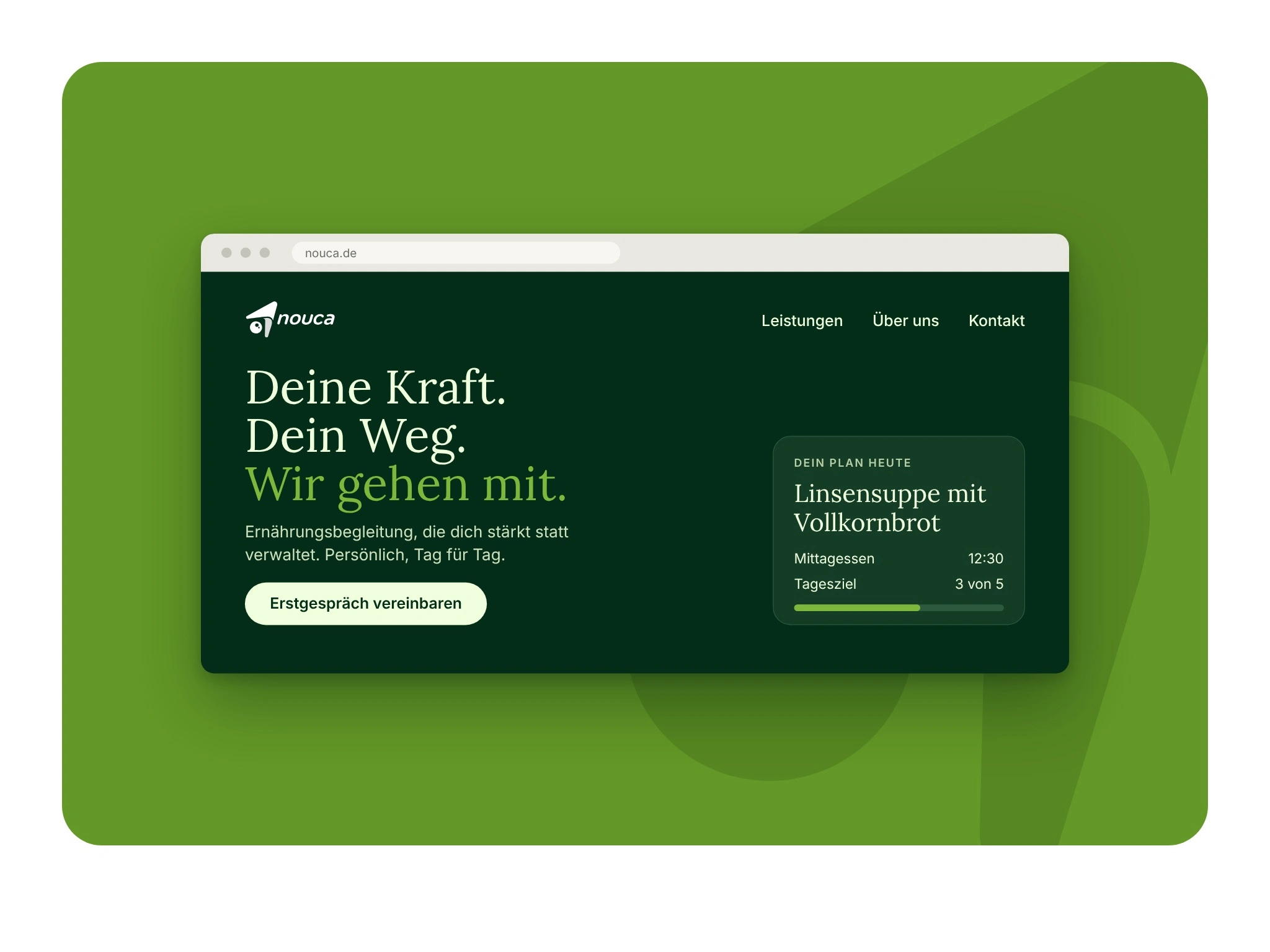
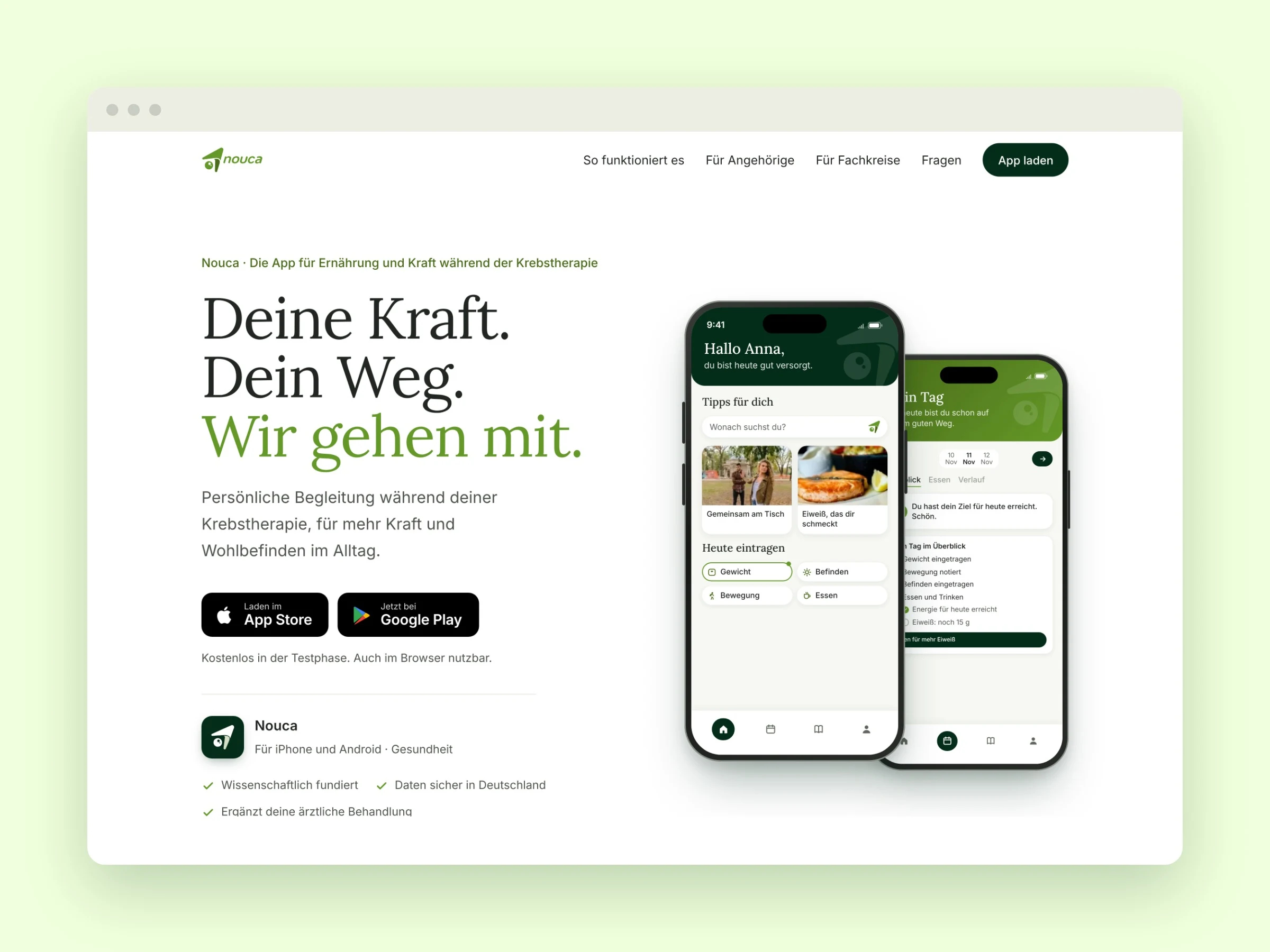
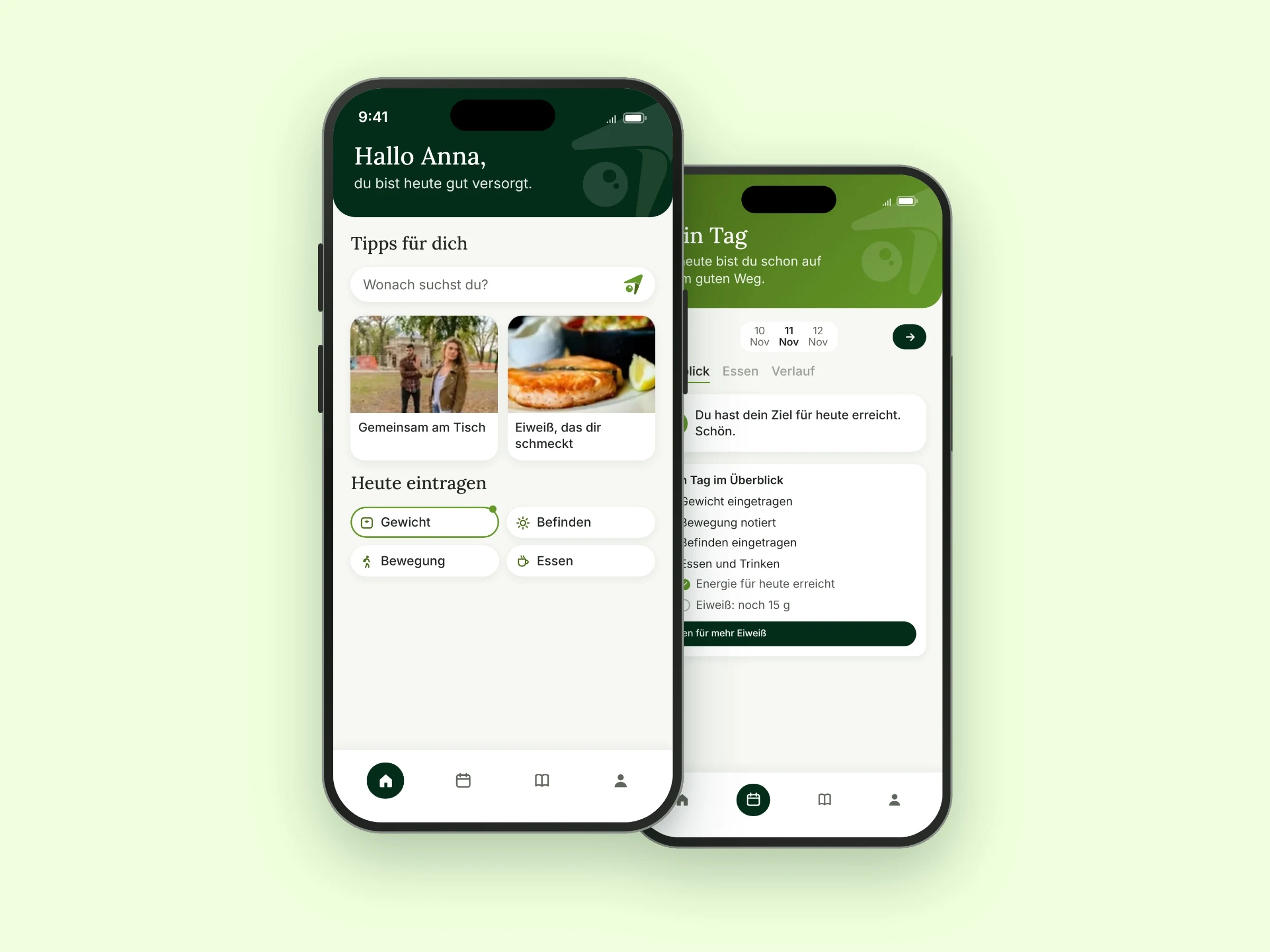
The identity then carried into the landing page I designed for the app: calm layouts, large type and a font size control for older readers.
Outcome
The app is currently in its test phase, so there are no market results to report yet. What I can show is the finished system:
Logo system: wordmark and icon in Nouca Green, Anthracite and White, in AI, SVG, PNG, WEBP and JPEG
Colour system with HEX, RGB and CMYK values, plus a WCAG contrast check
Type guidance with minimum sizes for app and print
Logo usage guide and a 15-page brand foundation
Landing page design
The product is live at nutrilotse.de, still under its previous name.
My Role
Brand Strategist, Logo Designer and Brand Designer. I led the strategy, the symbol, the wordmark, the colour and type system, and the guidelines, working directly with the managing director.
0 likes · 6 views · Nov 5, 2026
A brand identity for a cancer care app for patients over 65: strategy, symbol, wordmark and a colour system tested for older eyes.
