Lansing Promise
Gerald Westlund
The Lansing Promise brand in a snapshot
PROJECT DETAILS
CLIENT
Lansing Promise is a non-profit organization that is dedicated to helping students write and realize their own success stories.
SERVICES
Brand Strategy
Brand Identity Design
Brand Identity System
Voice & Messaging

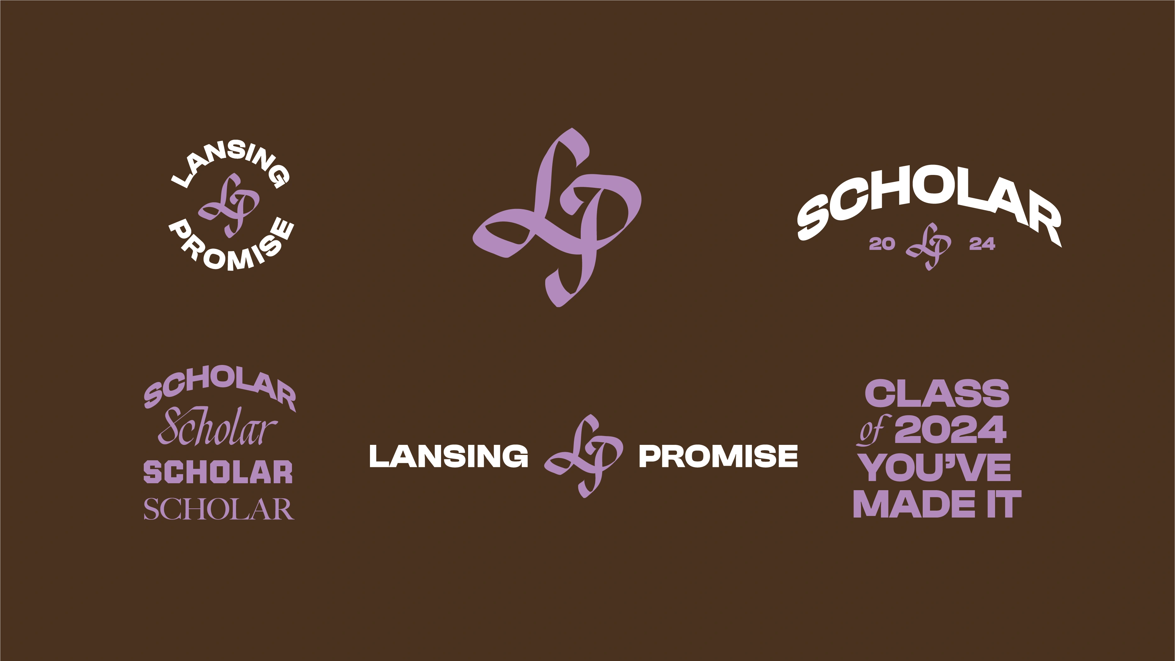
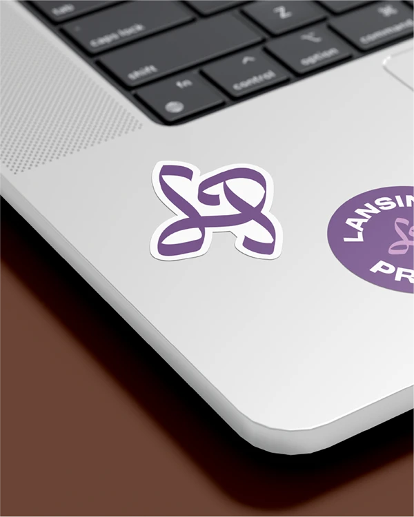
The LP icon was created as an homage to chancery hand calligraphy you might see on a certificate of achievement.
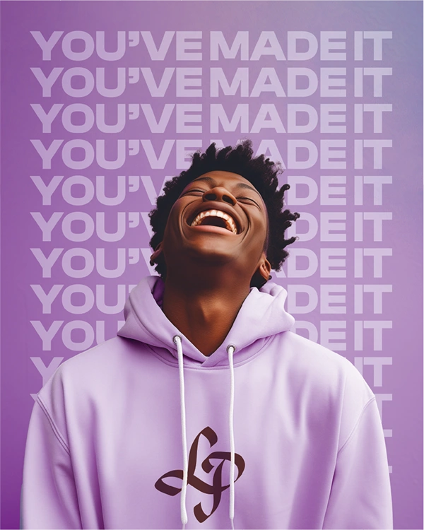
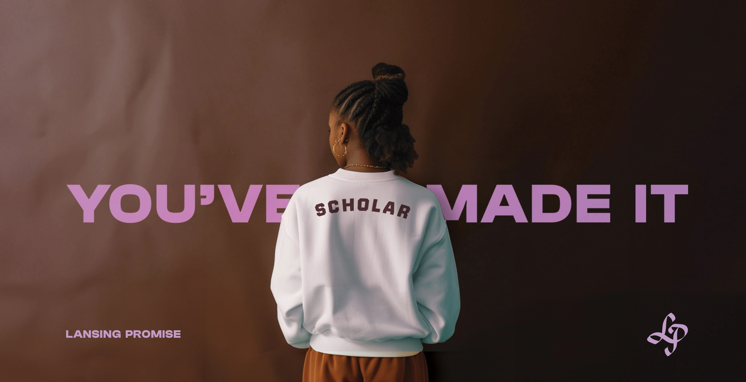
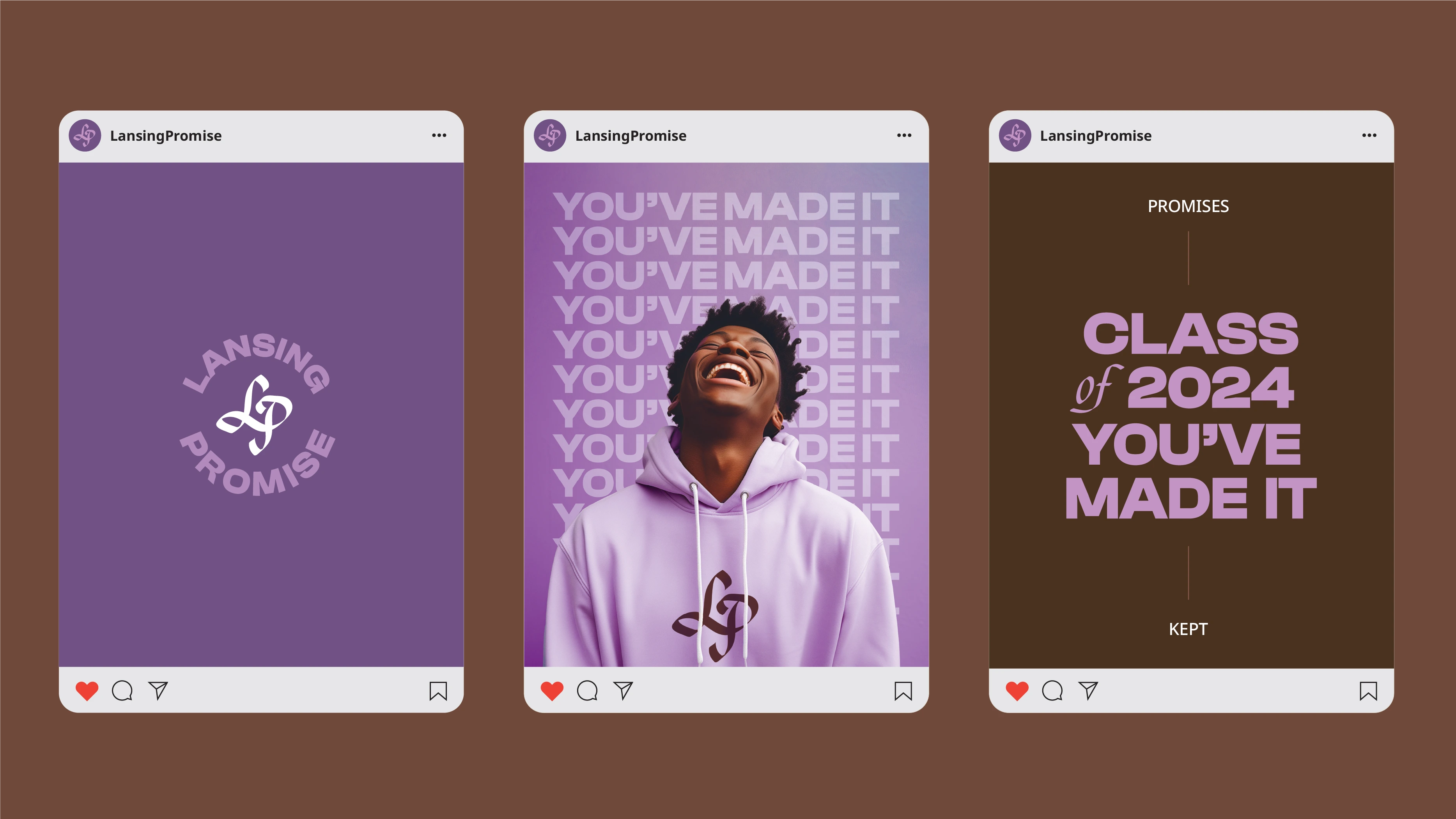
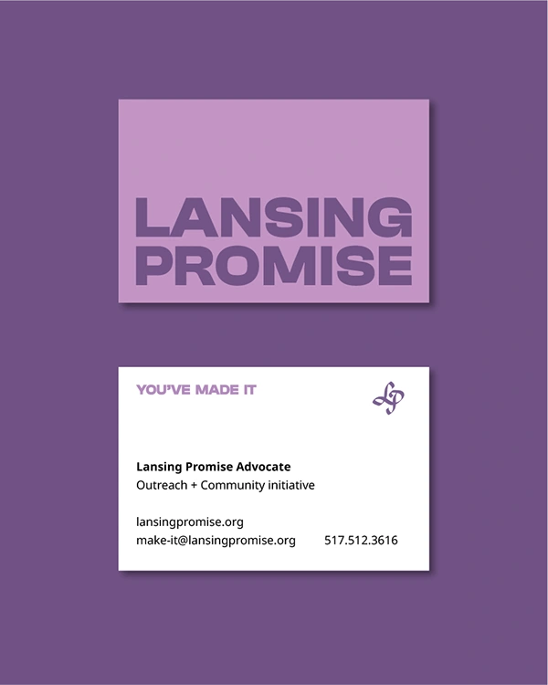
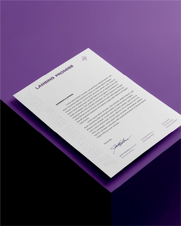
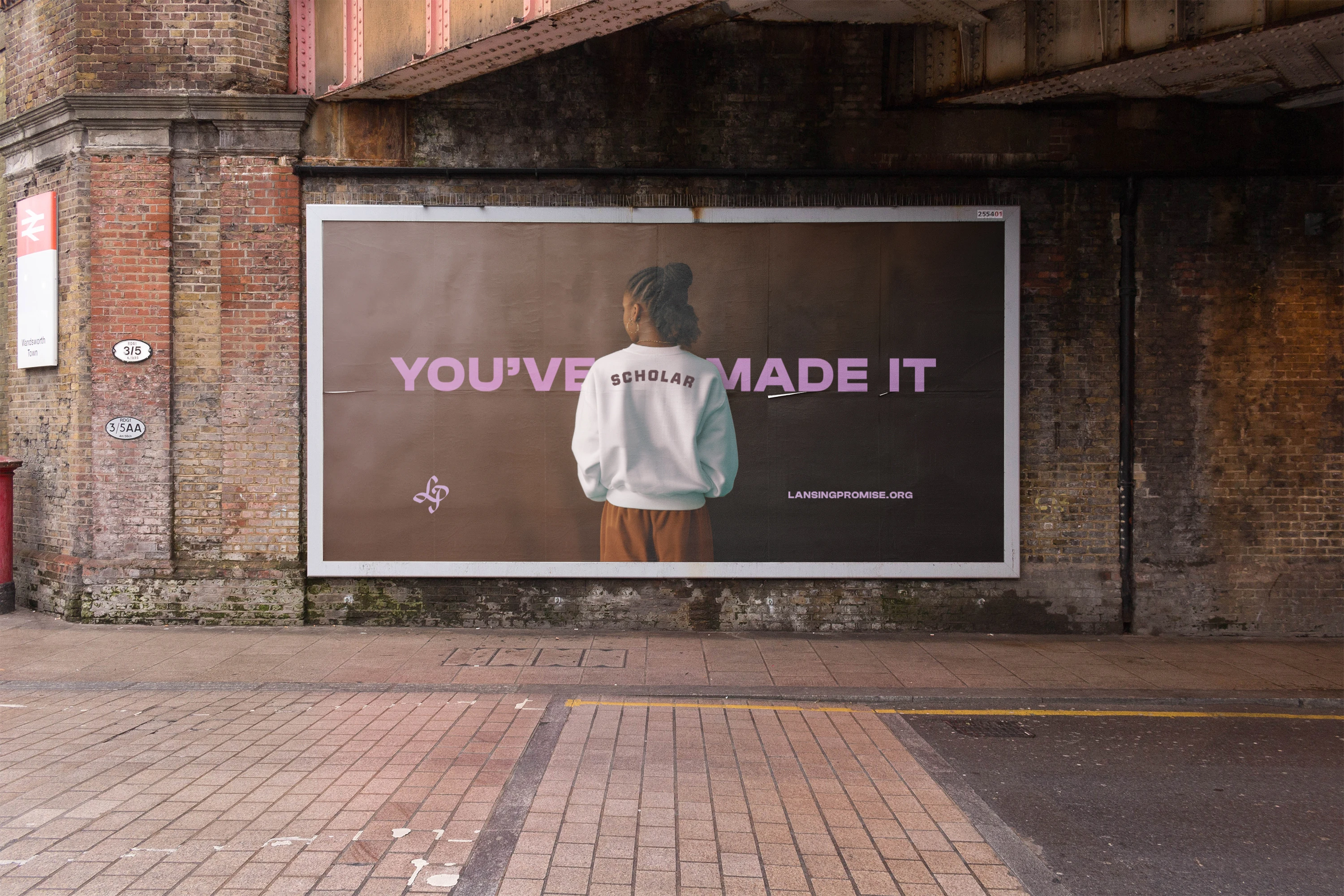
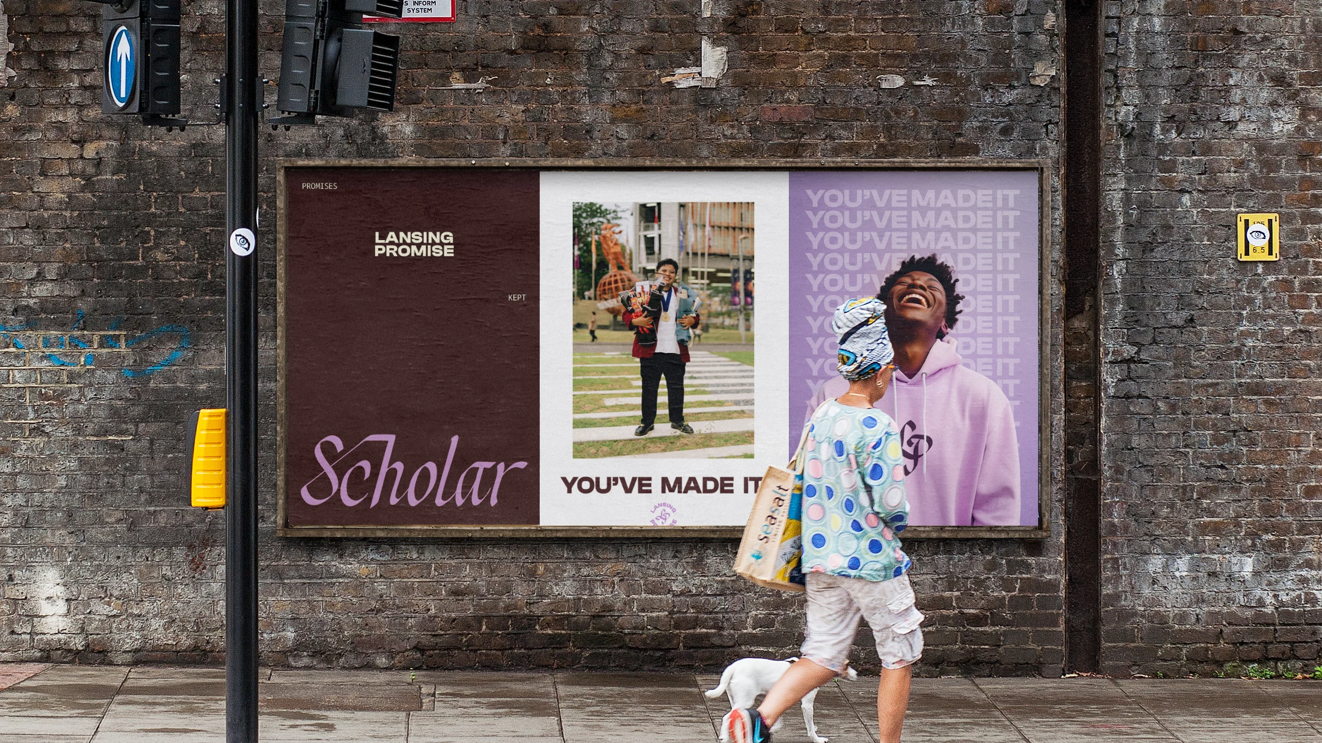
"You've Made It" Became their rallying cry, a celebration of student's commitments and achievements.
Project Overview
We were brought on board to help develop a brand ID that students would want to identify with.
The Problem
Their old logo was visually dense and did not scale well.
In its attempt to feel trustworthy and professional, it had co-opted as many symbols associated with academia as it could - caps, gowns, banners, an administrative color palette etc — which left it feeling bogged down and uninspired.
It also severely impacted their brand from conveying the kind of hope or potential that the Promise team knew their brand should communicate to current/future scholars.
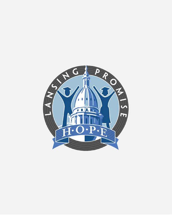
The original Lansing Promise badge felt like an administrative seal
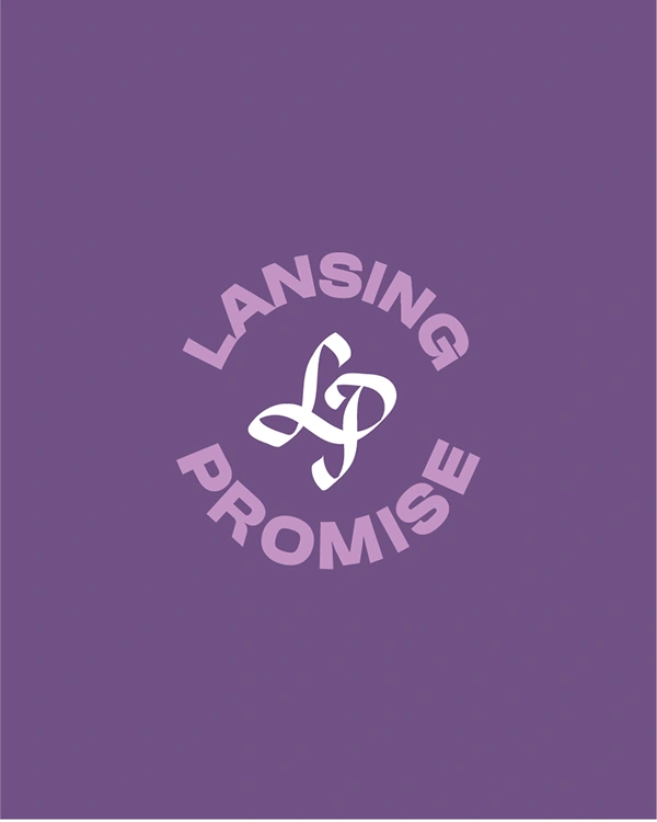
The revised seal is simplified and easily identifiable.
The Solution
How could we imply academia/academic success, without retreading old territory? The answer was surprisingly simple - black letter calligraphy.
Reflective of the sort of typography often emblazoned at the top of a diploma or certificate - but rather than the cold and very formal approach, we looked to other parallel-pen calligraphy, specifically Chancery Script, to create something fluid, and human, that felt considered, professional and trustworthy.
This approach allowed us to retain the human element that is so essential to their work, while also connecting to a broader visual language often associated with academic achievement.
Typography
Given the nature of their work, our typographic choices were limited to that which was freely licensable for use on both desktop and the web. Cue Google Fonts.
We landed on Clash Display because of its bold, unapologetic nature — Like it could just as easily have been plugged into a Nike advertising campaign. That energy allowed us to create an strong visual statement that broke free of the traditional academic visual norms, without challenging their trustworthiness.
We then paired it with the multi-lingual workhorse Noto Sans, as well as a secondary messaging typeface Libre Caslon, for more formal treatments such as a message tailored toward a legislator rather than a student.
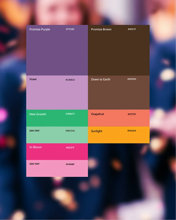
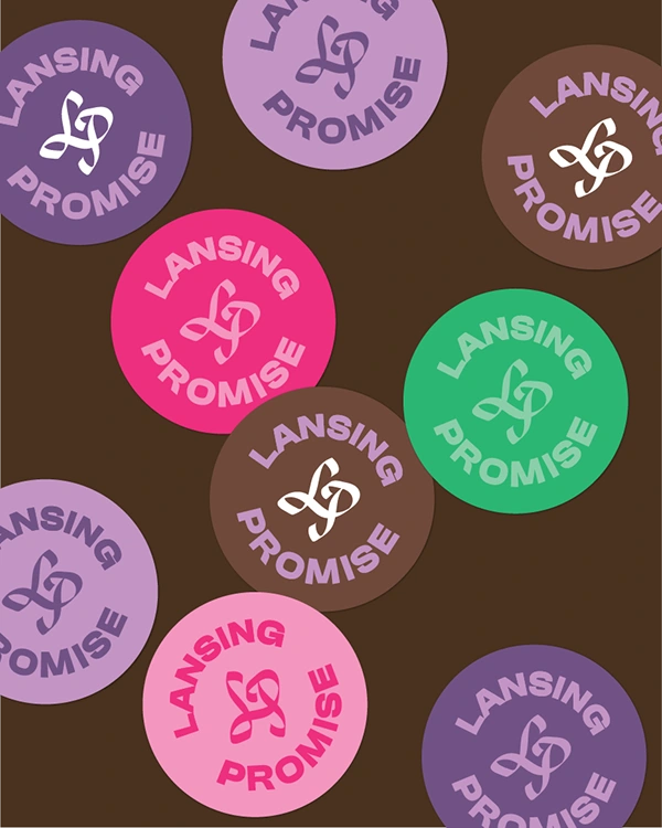
The revised Lansing Promise color palette is warm, distinct and not administrative.
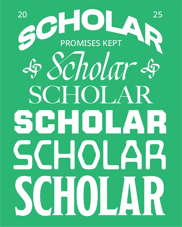
Each scholar is unique, typography presented an interesting means to expressing that.
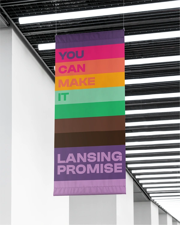
Color & Expressiveness
Color was a challenge - as it was essential that they not look like any of the schools in the district or any of their peer organizations.
Using brown was another moment of clarity gained from our discussions with their team. Why was brown so often avoided in branding. It not only represented growth - deep rich soil, but also a sense of being down to earth, grounded, stable and earnest.
And ultimately became a foundation upon which to build a vibrant and energetic color palette that exuded hope, growth and excitement.
____
One last thing that really resonated with us from our discussions with the Promise team, was the fact that no two scholars are the same. Their paths, challenges and their stories are wholly unique unto them.
This revelation enabled the brand to break free of the barriers and guardrails that traditional branding would have us cling to, and create the potential for genuine connection and self-expression for each individual scholar.
While also become a joyful nod to a sentiment expressed by Paula Scher
'Words have meaning, type has spirit'.
Brand Personality
The biggest revelation for their brand expression arrived as a result of this question:
What is your logo to someone who can't see?
How should it make your audience feel?
The sentiment that rose the top was "I've got this' something students would often proclaim as a statement of pride upon attaining the scholarship, or making the promise.
In order to leverage its empowering nature, we flipped it into a 'you' statement, which also allowed us to tap into the language most often associated with a promise — to make one.
'You've Made It' became the anthem for their brand expression.
It showed us a path forward that would allow us to present academic achievement in the same light that elite athleticism is most often depicted. This juxtaposition became a means to contextualizes these very parallel pursuits and elevate academic success to its rightful place alongside other areas of excellence.
Thank you for viewing our project!
Like this project
Posted May 6, 2025
Helping a local organization create a real connection with students.
Likes
2
Views
11
Timeline
Nov 15, 2023 - Mar 30, 2024
Clients
Lansing Promise