West Michigan Piano
Gerald Westlund
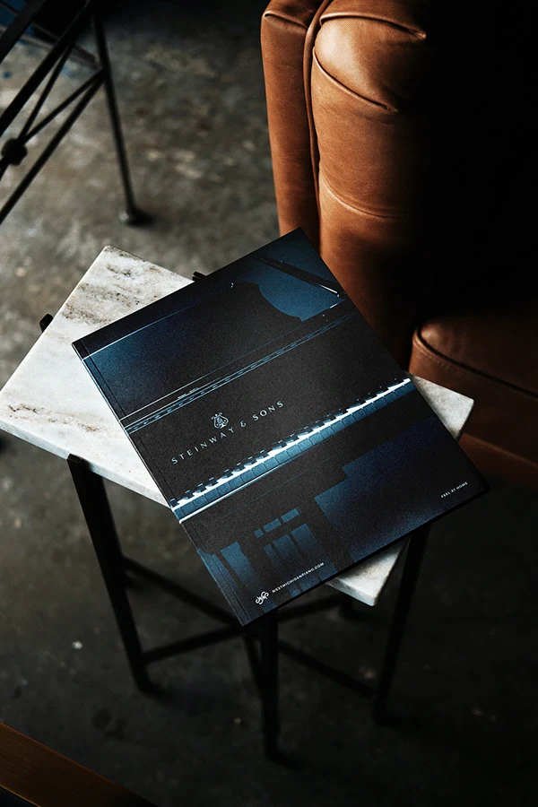
West Michigan Piano is the only certified Steinway & Sons piano retailer in west Michigan. Their commitment to helping music flourish in their community extends from their open-door community performance space to their work engaging with local schools and universities.
Project Overview
A blend of traditional and approachable, West Michigan Piano needed an identity that could express their unique position as the areas only Steinway & Son retailer (a coveted certification) with a deep personal commitment to their local piano community.
The Problem
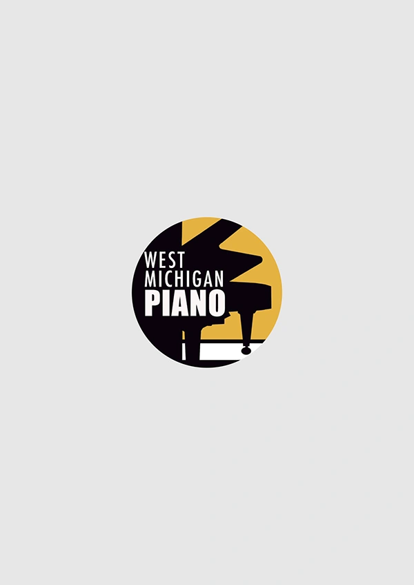
Their previous logo was never really a logo at all, but rather an idea loosely reinterpreted over time - white, black, yellow and some sort of piano element. But it never quite conveyed the care they brought to their work, nor the trust that was essential for them to remain a partner of the world renowned Steinway & Sons brand.
The Solution
Between their deep connection to the local community, and their mission to create the potential for more music in the world, finding inspiration wasn't hard.
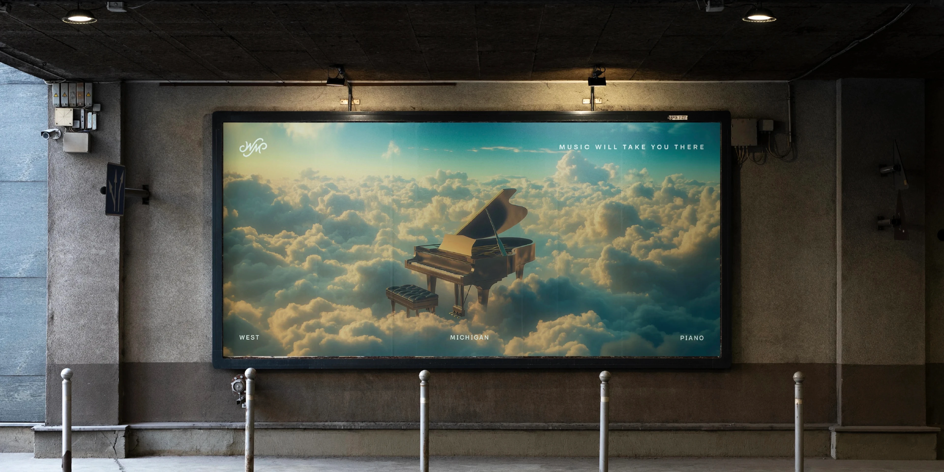
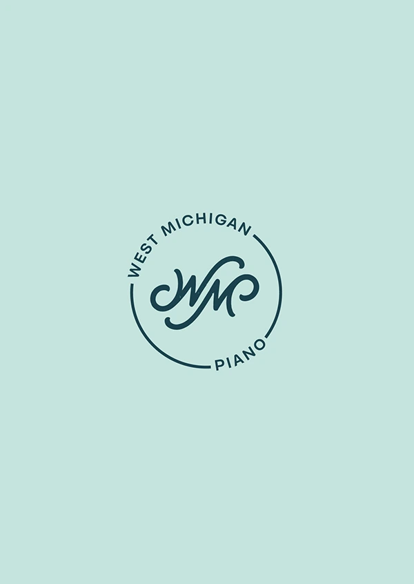
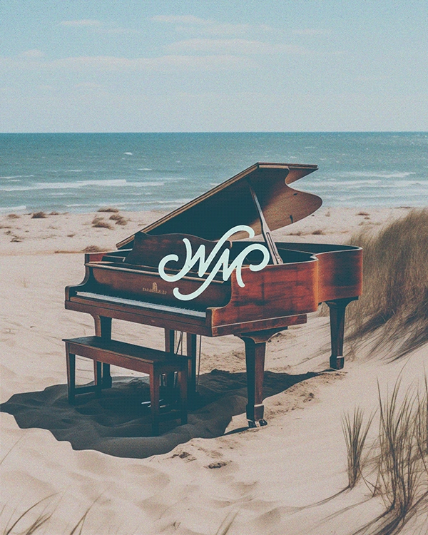
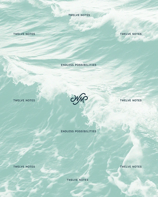
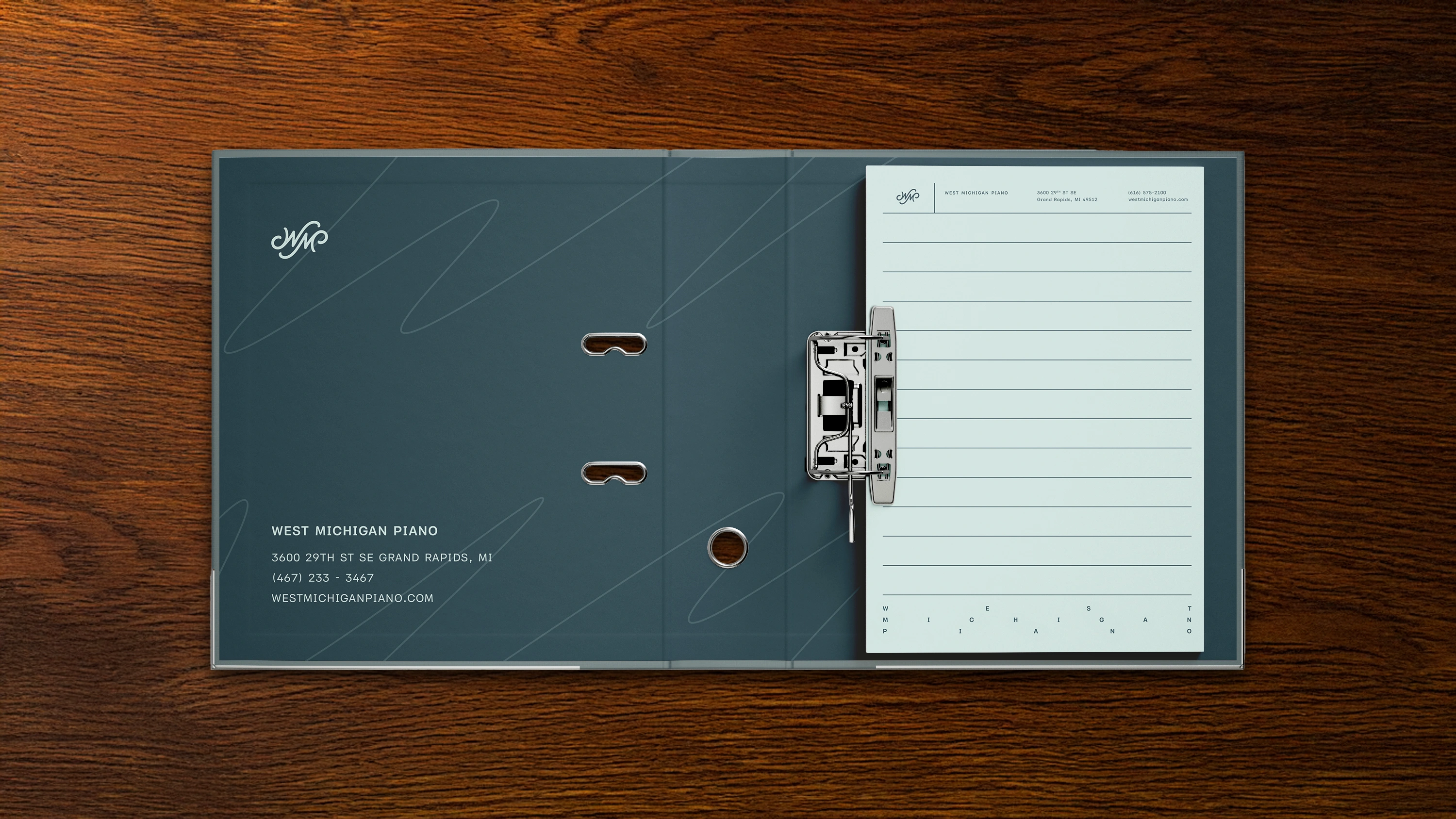
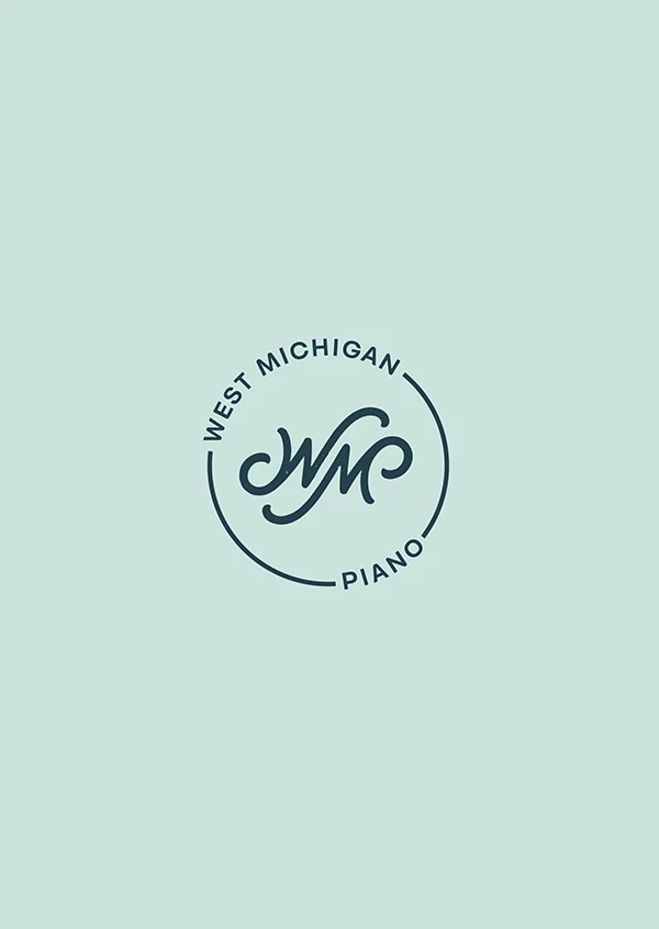
Their monogram is meant to evoke the fluidity of the waves of Lake Michigan (a large piece of their collective communal identity) while also implying/referencing the forms often found in musical notation. Additionally, the wave like swashes created an interesting opportunity to hide the P from their initials within the mark while not disrupting its balance.
Typography & Expression
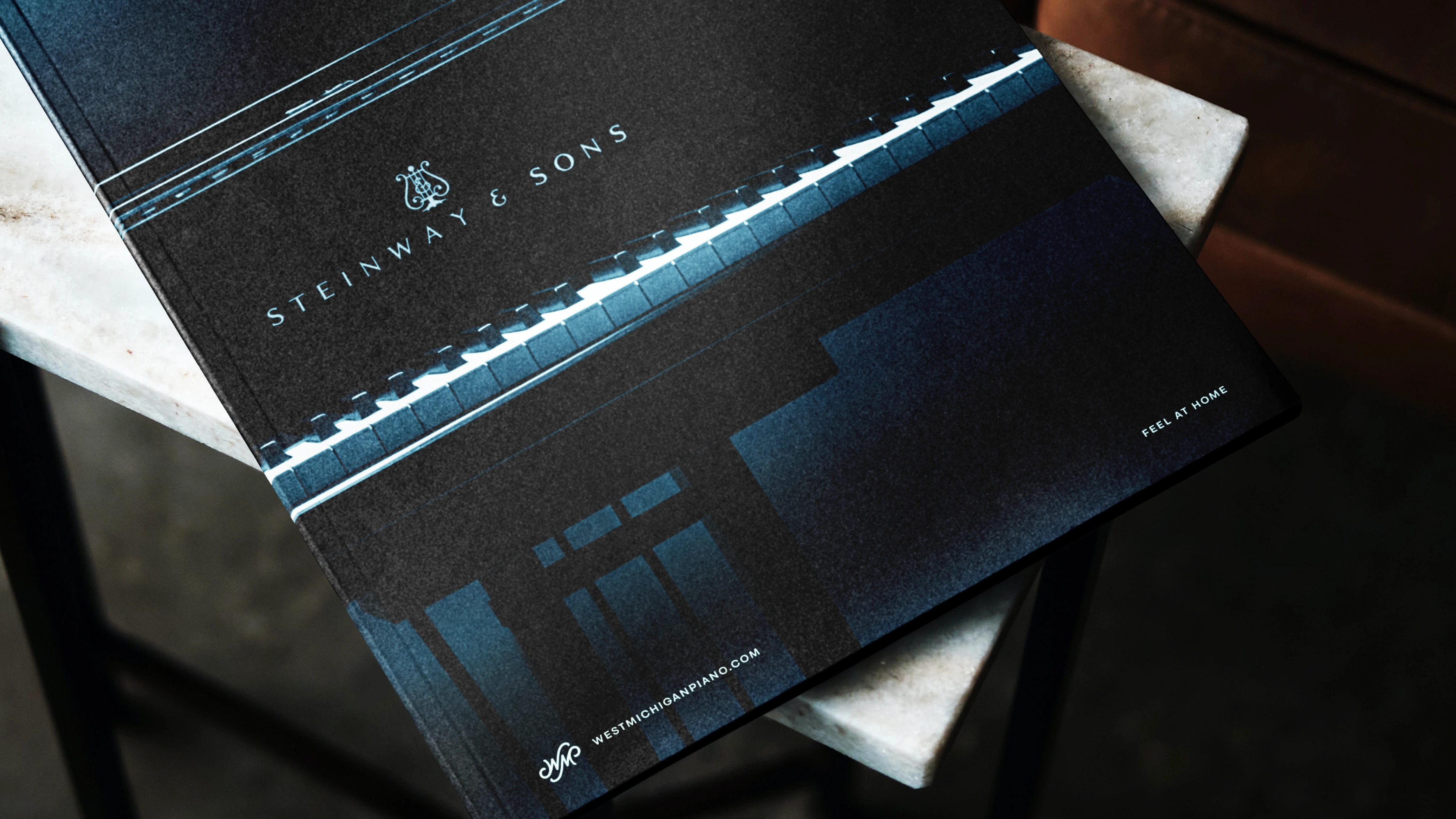
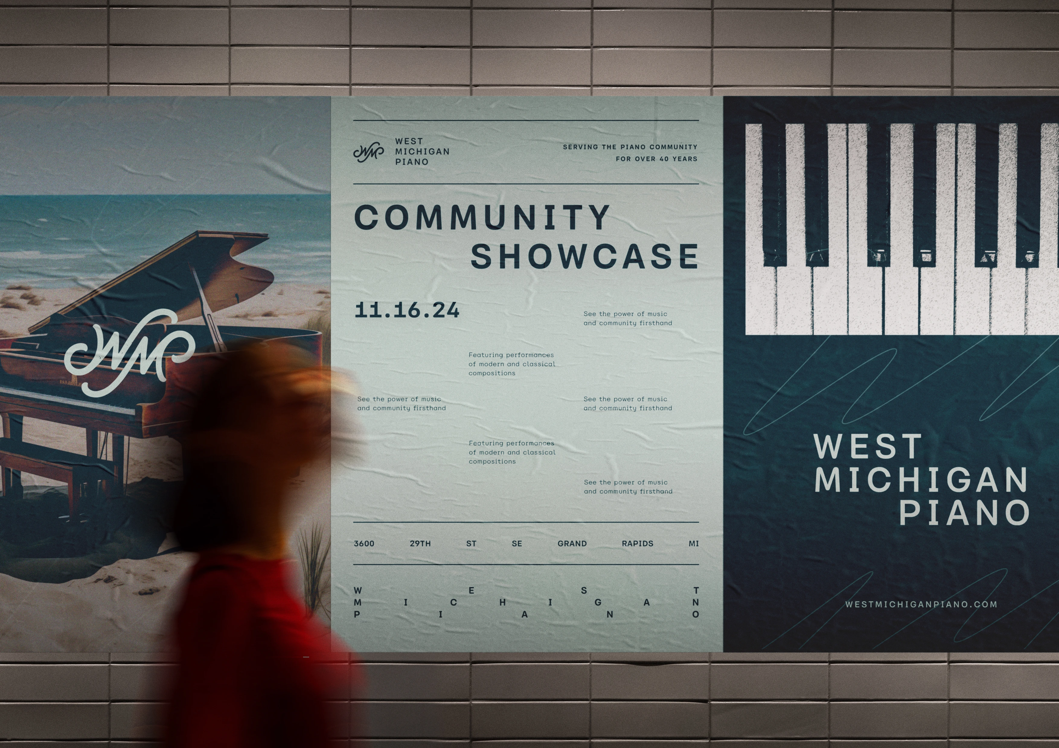
When legibility became secondary to expression and distinction, we leveraged the concept of fluxus, and pushed the type to its limits. This exploration allowed us convey musicality and rhythm in an interesting way that could further their image as not just a retailer, but also an integral member/extension of the local piano community.
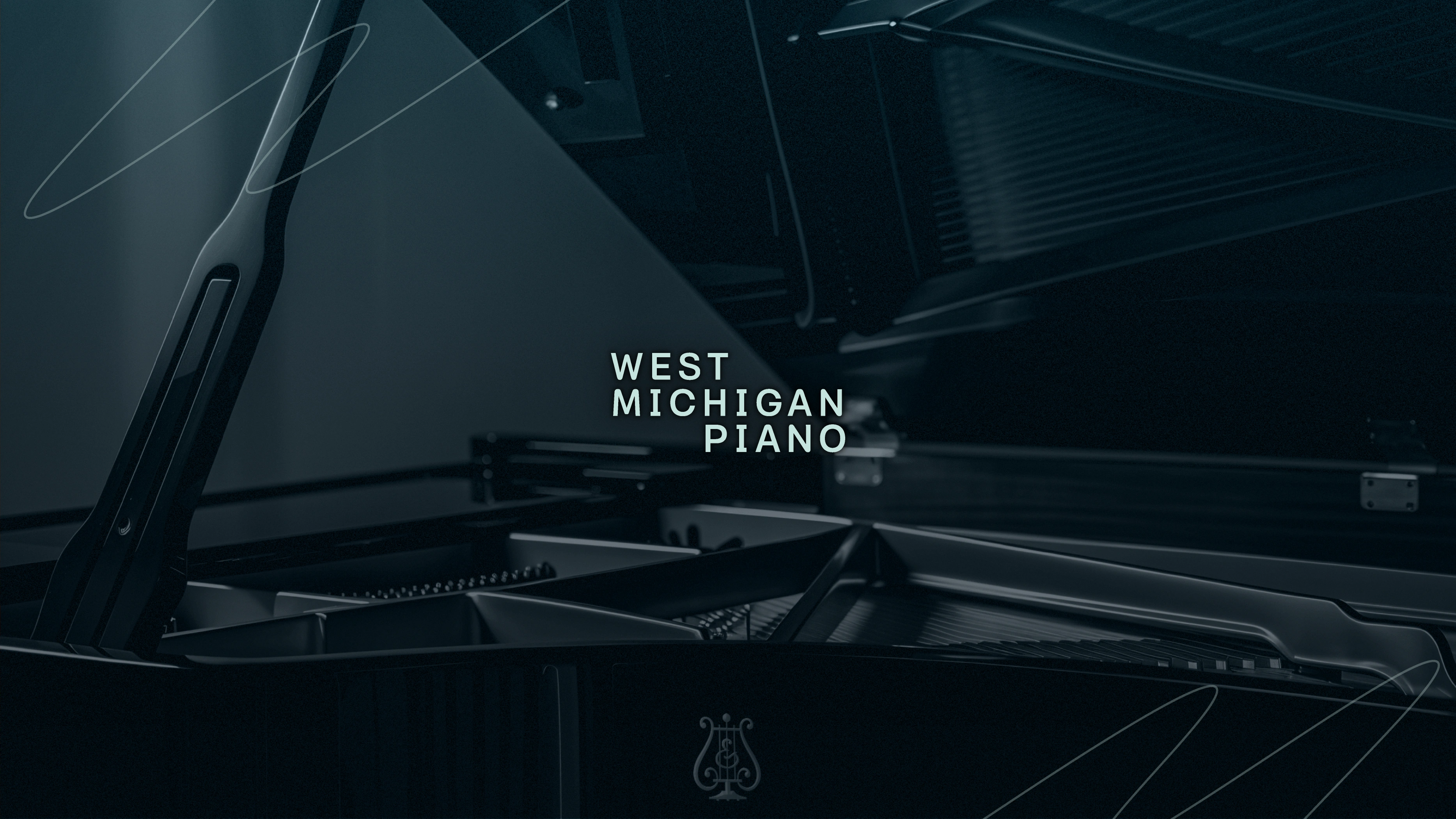
Color
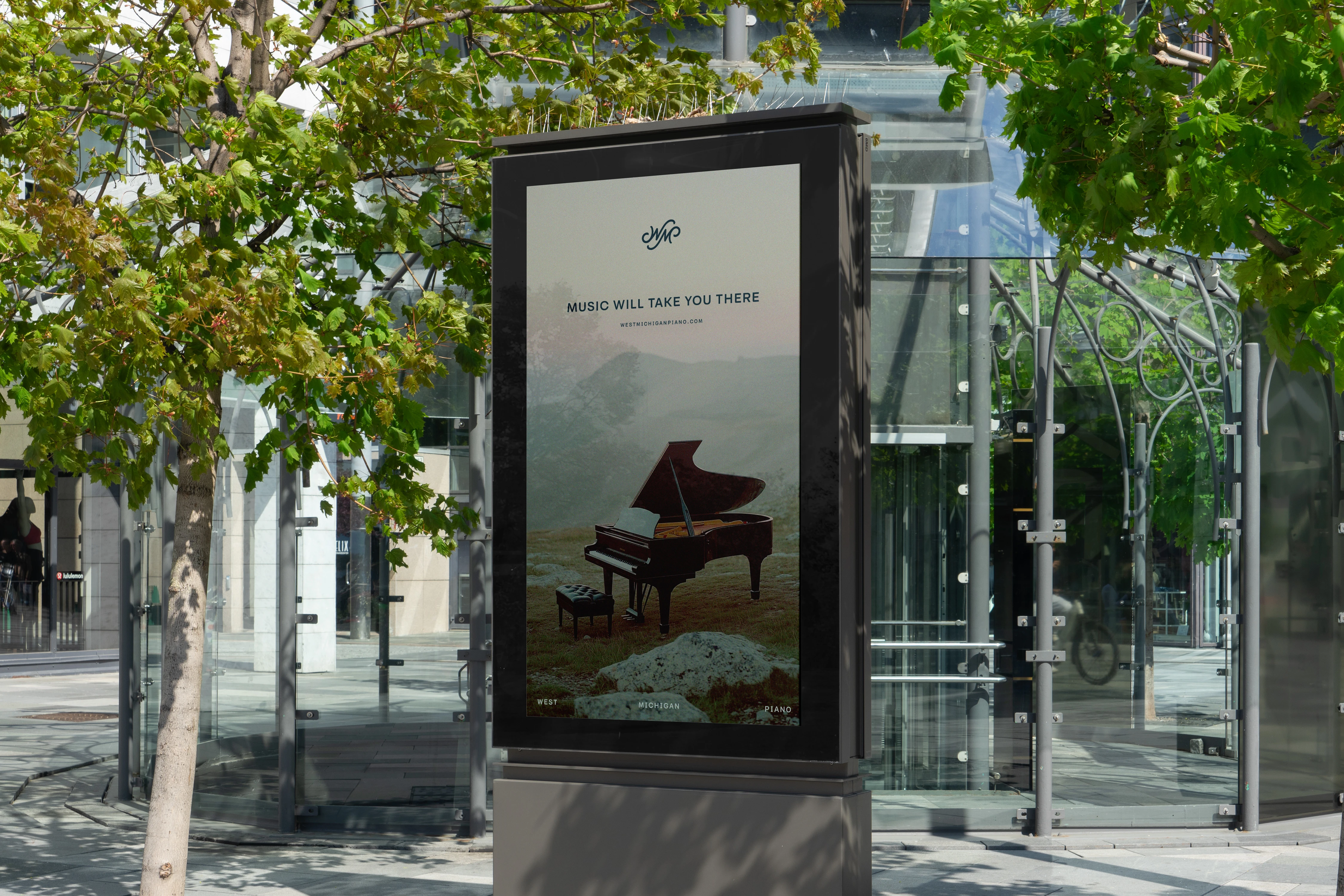
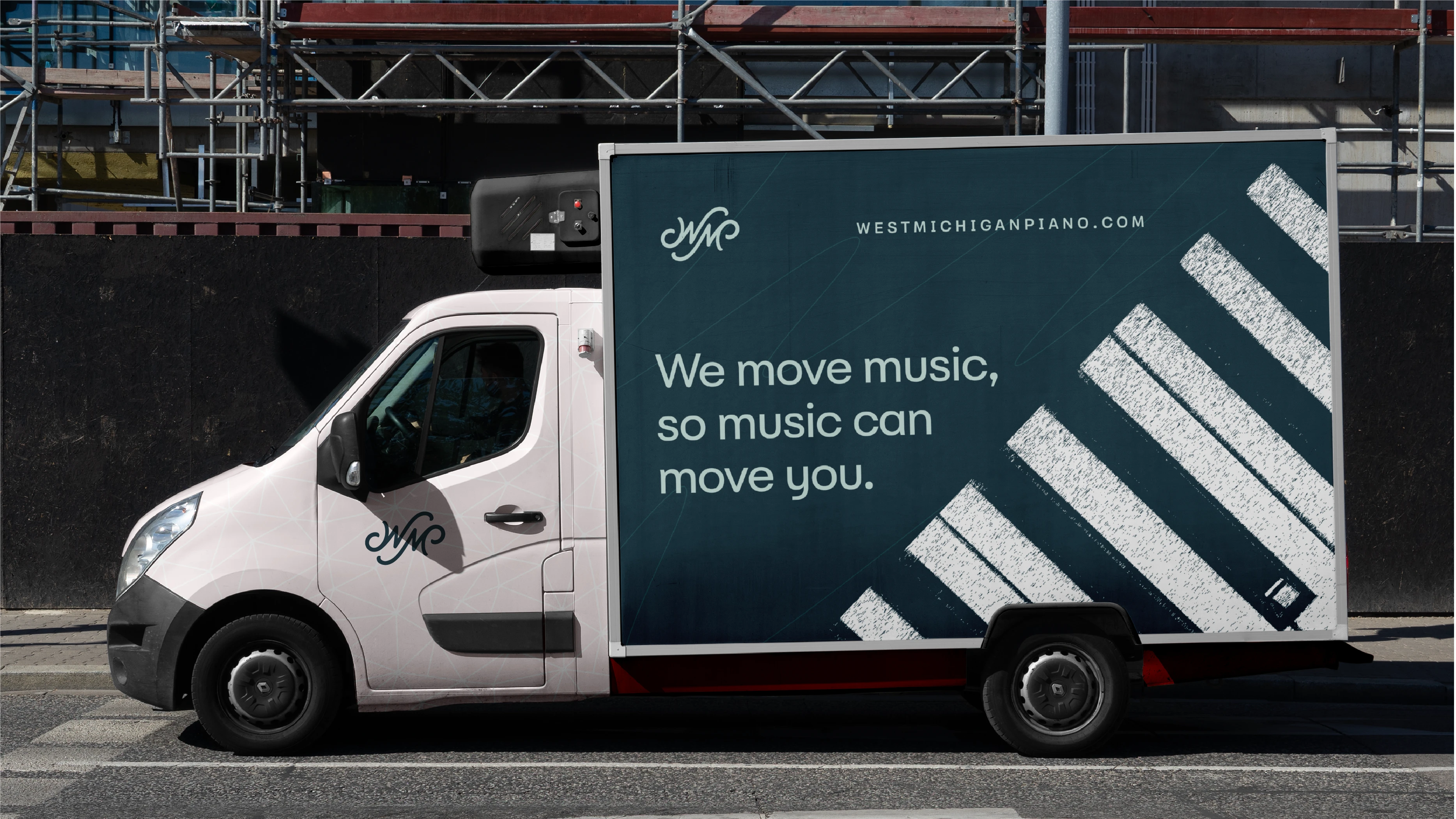
In order to tap into a level of sophistication that the former identity never quite captured. We leveraged a monochromatic color palette reminiscent of the deep waters of Lake Michign as well as the calm soft-box of the sometimes overcast skies created by the lake effect weather patterns.
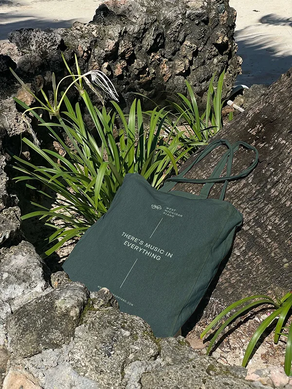
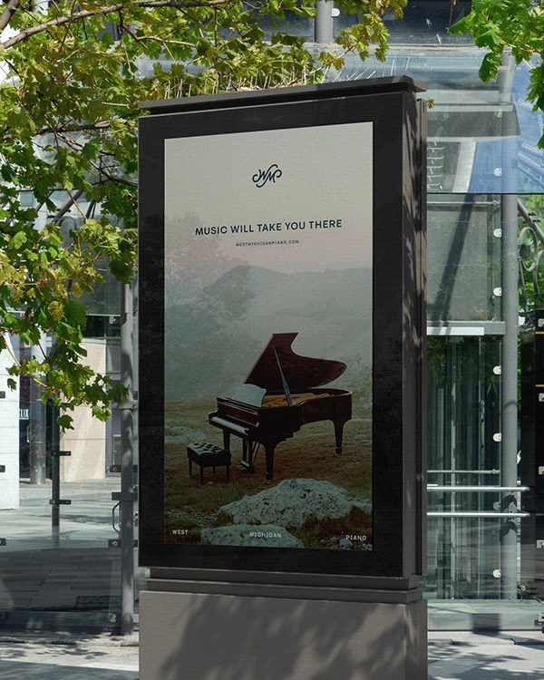
This calming, yet professional approach, when paired with the appropriate imagery, messaging and typographic expression, became the perfect platform to convey their unique approach to their work. That of a compassionate, low-pressure guide rather than a high-pressure, transactional salesperson for which their competition had become synonymous.

Thank you for viewing our project!
Like this project
Posted May 7, 2025
A sophisticated rebrand that reflects years of service to West Michigan's piano community