User Centric approach to Redesign Pune Metro's App.

Paras Kamble


Introduction
The Pune Metro is a pivotal transportation system in the city, aimed at providing an efficient and sustainable means of commuting. However, the existing Pune Metro app has been receiving criticism from users due to its poor user interface (UI), lack of consistency, and the absence of essential features. As a UX designer, my goal was to transform the app into a user-centric and visually appealing platform while addressing these concerns.
❌Problem Analysis
Poor UI and Consistency: The existing app lacked a modern and consistent UI. It had an outdated appearance, making it difficult for users to navigate and causing frustration.
Inadequate Color Theme: The app lacked a proper color theme that represented the identity and originality of Pune Metro. The absence of a consistent color palette led to a lack of visual appeal and brand identity.
No Option to Edit Personal Information: Users were unable to edit their personal information, leading to dissatisfaction and inconvenience.
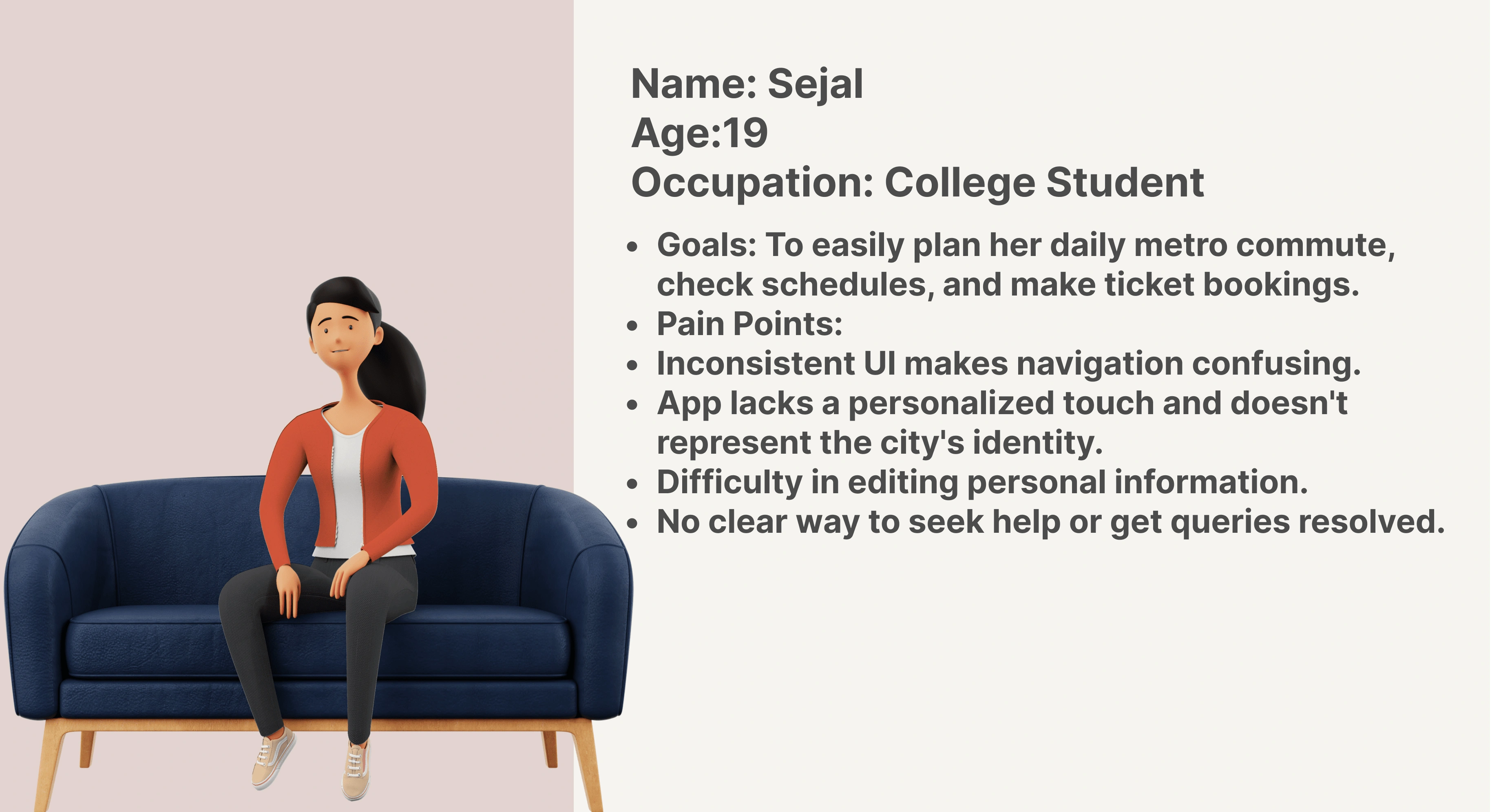
👧User Persona
To understand the issues the users are facing, I asked one of my friend who uses Pune Metro’s App daily.
✅Design Solutions
Consistency in UI: Created a modern and cohesive design with standardized layout, navigation, icons, buttons, and typography for a user-friendly experience.
60–30–10 Color Theme: Adopted a consistent color scheme — 60% primary brand color, 30% secondary accents, and 10% neutral backgrounds for a visually appealing and brand-aligned look.
User-Centric Approach: Simplified the user journey, reduced complexity, and made important features easily accessible from the home screen to cater to user preferences. Added an “Edit Profile” section for users to update personal information, enhancing user control.
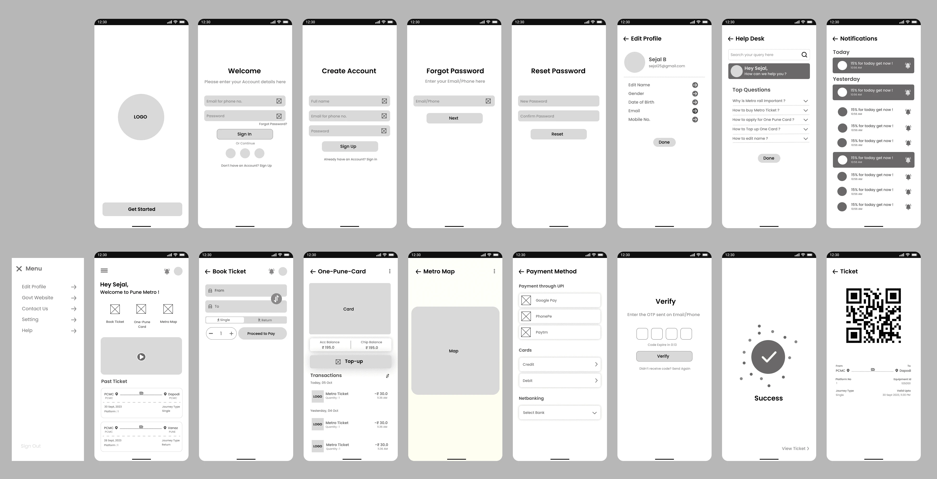
Wireframing
Is the process of creating a basic structure of the app in low,mid & high fidelity format.
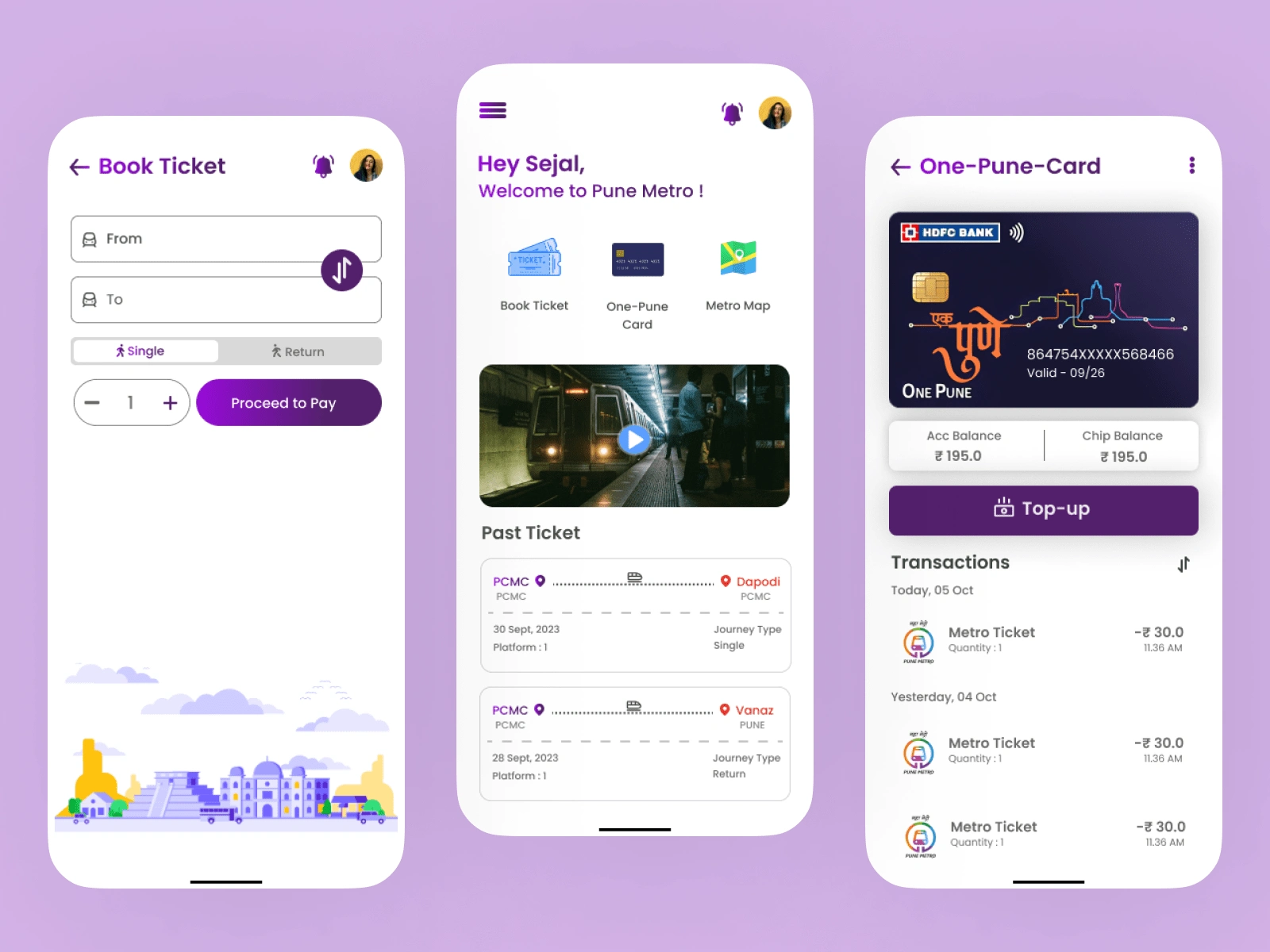
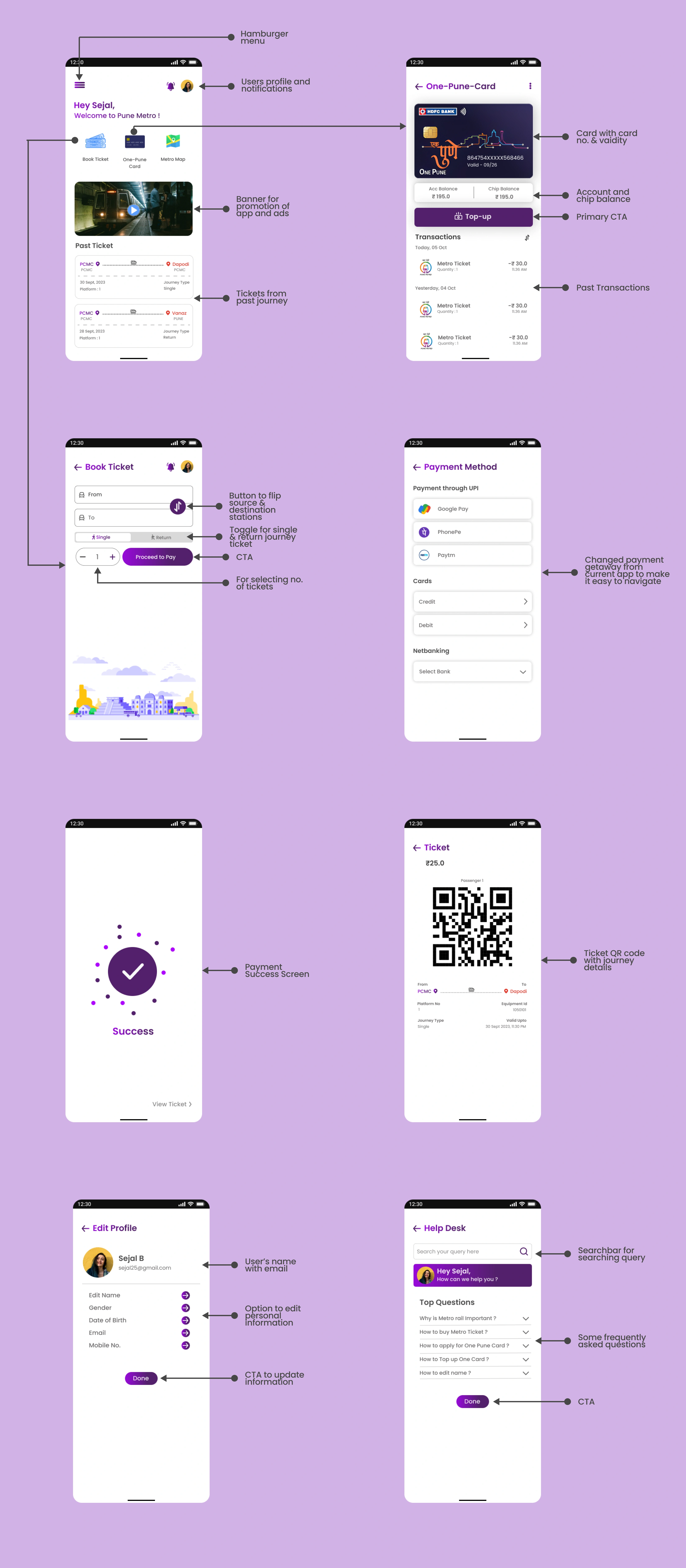
💥Introducing new redesigned Pune Metro App
📈Product Success
The redesigned Pune Metro app, informed by wireframes, has shown significant improvements in terms of user experience, identity representation, personalization, and query resolution. It offers a seamless and visually appealing experience, aligning with the needs and expectations of users like Sejal.
Client Satisfaction
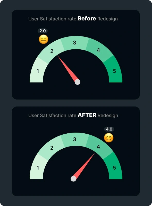
Conclusion
The inclusion of wireframing in the design process played a crucial role in ensuring that the information architecture, layout, and interactions of the Pune Metro app were well-planned and user-centric. This approach, combined with user research and usability testing, resulted in an app that is both visually appealing and highly functional, addressing the identified issues effectively.
And that’s a Wrap!
Thank you so much for Reading!✨As this was just a personal project i would love to work on the real app in future and make the app more efficient in real world. Actively looking for opportunities ✌️
Like this project
Posted Jun 7, 2024
Completely Revamped the UI of Pune Metro App and made it more user friendly by solving issues reported by the users. Redesign the UI to make it more compelling.
Likes
0
Views
6


Improved UX and Drove Sales through Client Conversion by 20%
Made Subscription easy management across platform.