Improved UX and Drove Sales through Client Conversion by 20%

Paras Kamble


💭Storytime
On a random tuesday night of march while scrolling instagram reels and reading some news on google, I stumbled upon a article about the launch of Pune first ONDC Transport app the “O Rickshaw” aimed to revolutionize the autorickshaw industry by offering a platform with no commission charges for drivers and minimal inconvenience for users.
As a curios person i decided to try “O Rickshaw” but, my first impression about the app was not good, However, the app faced several critical issues in its user interface (UI) and user experience (UX), hindering its competitiveness against established rivals like Ola and Uber. The App has a big potential to capture a big market of daily commuters if they improve their users experience. As a UI/UX Designer😎 myself i got a new personal project to work on with the goal of making the user satified with the app.
🤨Problems Analysis
Poor User Interface (UI): The UI lacked professionalism and ease of navigation, making it inferior to competitors.
Color Theme: The color theme needed improvement for better visual appeal and user engagement.
Inconsistent Icons: The app suffered from inconsistency in icon styles, which contributed to user confusion and disorientation.
Lack of Map Feature: Absence of a map feature made it challenging for users to select pickup and drop locations conveniently.
Missing Live Tracking: The absence of live tracking further diminished the user experience, as it’s a standard feature in competitor apps.
Overbearing Personal Information Requests: The app demanded excessive personal details during signup, leading to trust issues among users.
No Display of Live Rickshaw Availability: Users couldn’t see the live availability of rickshaws in their area, impacting their decision-making process.
🧐Research
Competitor Analysis: Conducted an in-depth analysis of competitor apps such as Ola and Uber to understand industry benchmarks and user expectations regarding UI/UX features, color schemes, map integration, live tracking, and signup processes.
User Feedback: Utilized feedbacks from reviews on Google play store to gather insights from current O Rickshaw app users regarding their pain points, preferences, and suggestions for improvement. This qualitative data helped prioritize UI/UX enhancements.
👦Approach
I used Jakob’s Law in this project. What is Jakobs’ Law?
Its simple, Jakob’s Law recommends the use of familiar patterns in design in order to facilitate user experience, because users prefer it when a site works in the same way as all the other sites they already know.(Ola,Uber)
💥Introducing the redesigned O Rickshaw
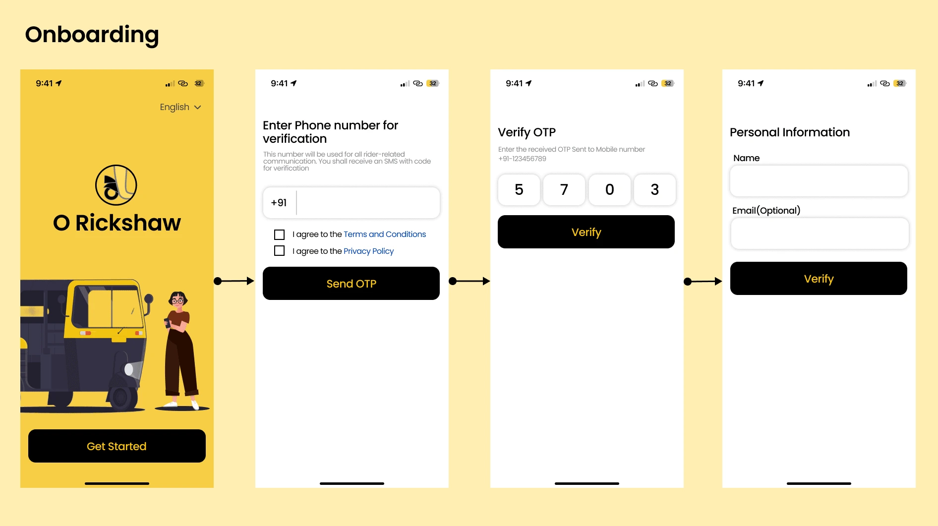
Started with the Onbaording pages by making them asthetically better and uproachable to the users.
Used Illustrations like auto rickshaw and a woman on her phone booking a ride to increase the engagement as Illustrations look attractive
Homepage
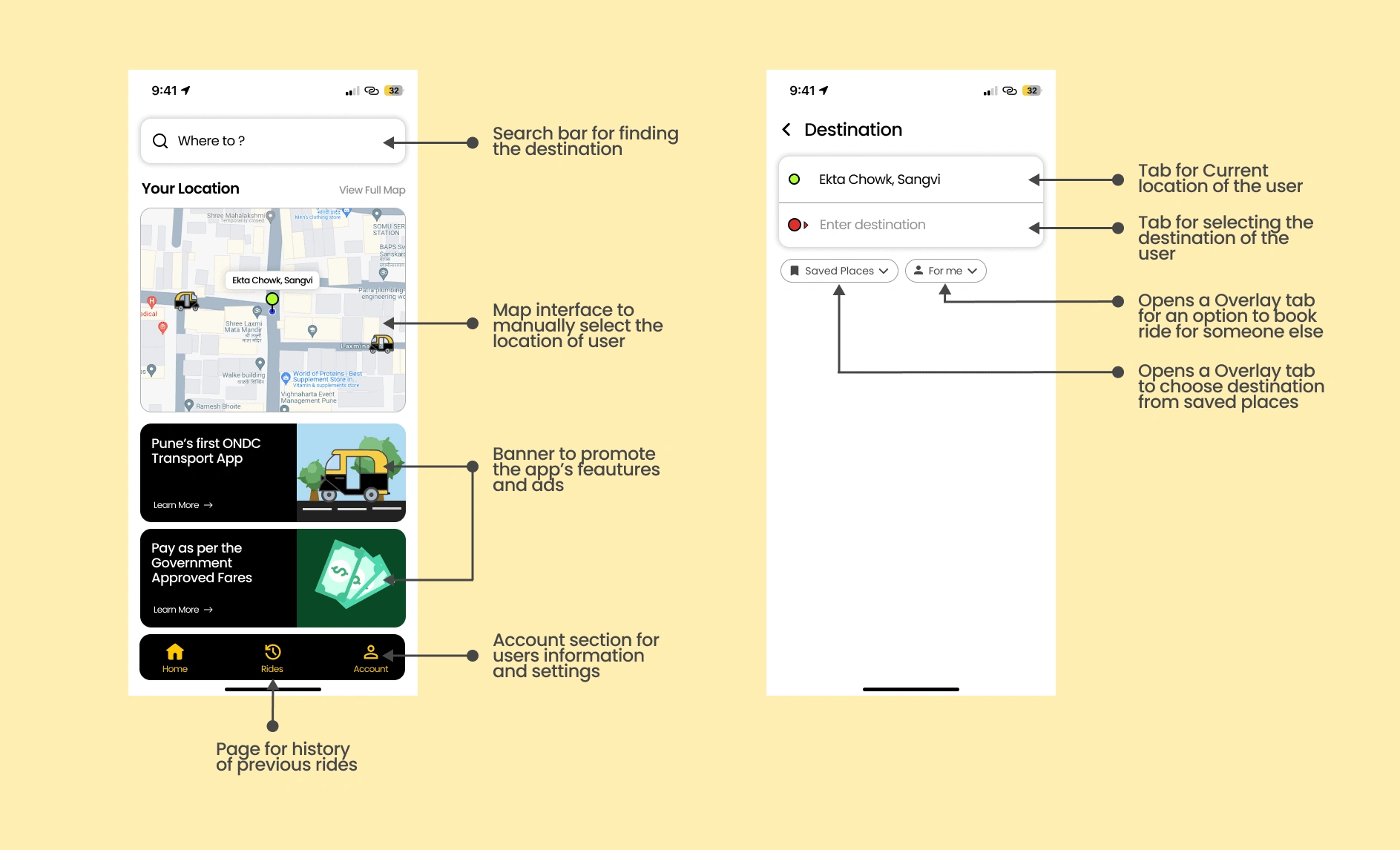
Completely Revamped the homepage UI as compared to current UI. Added a Live map to select the users current location, Added banners to promote app’s feature and ads, current UI has lots of white space and had to replace them with banner. Also redesigned the search page to more user friendly aproach by adding a circle with green color to indicate the users current location and circle with red for users destination.
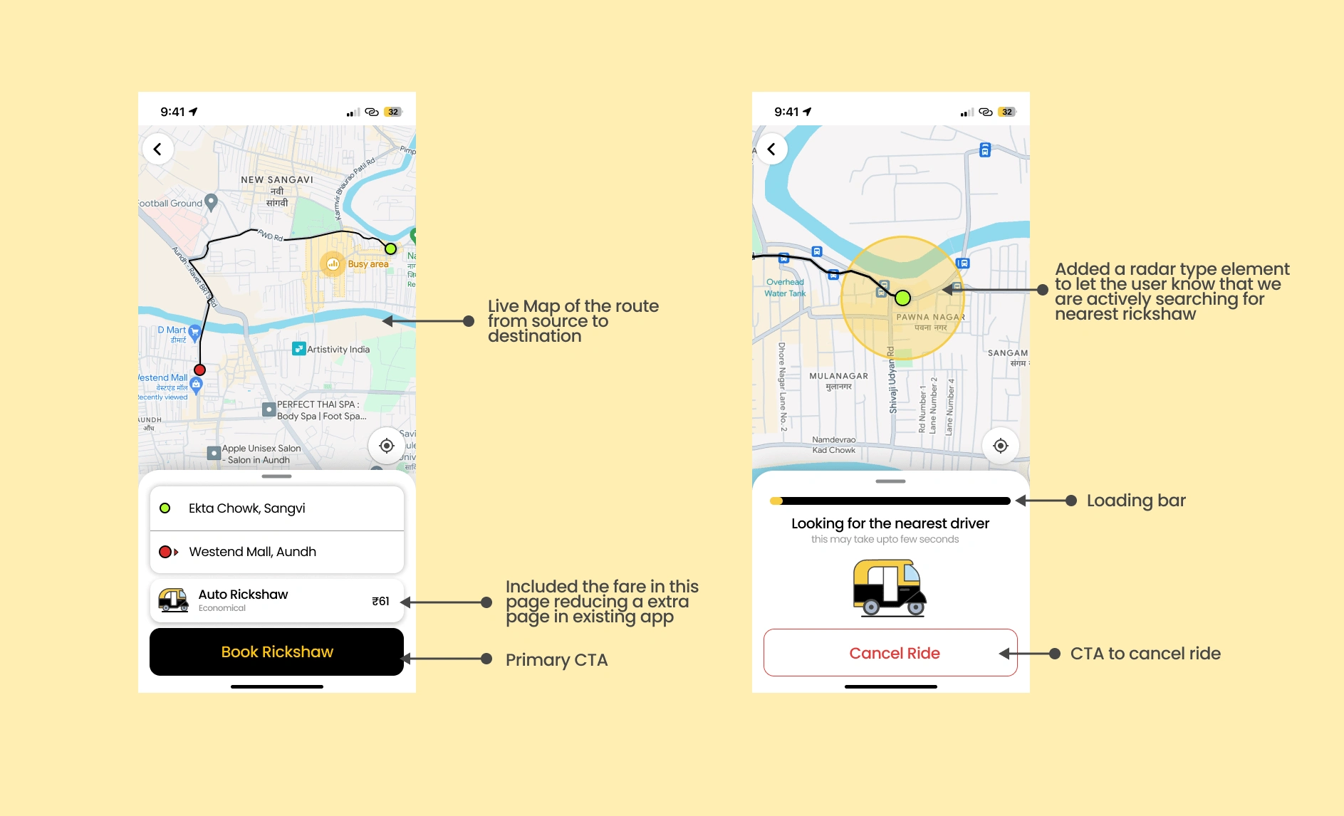
Redesigned the location confirmation page with a map for users to verify if the selected destination is correct.
Reduced a extra page from current UI of the app where it was showing the fare price by including it in the same page above the primary CTA.
After clicking the Book Rickshaw button the apps starts looking for nearest rickshaws. added radar type element to let the users know that the app is actively searching in the area.
A CTA added to cancel the search.

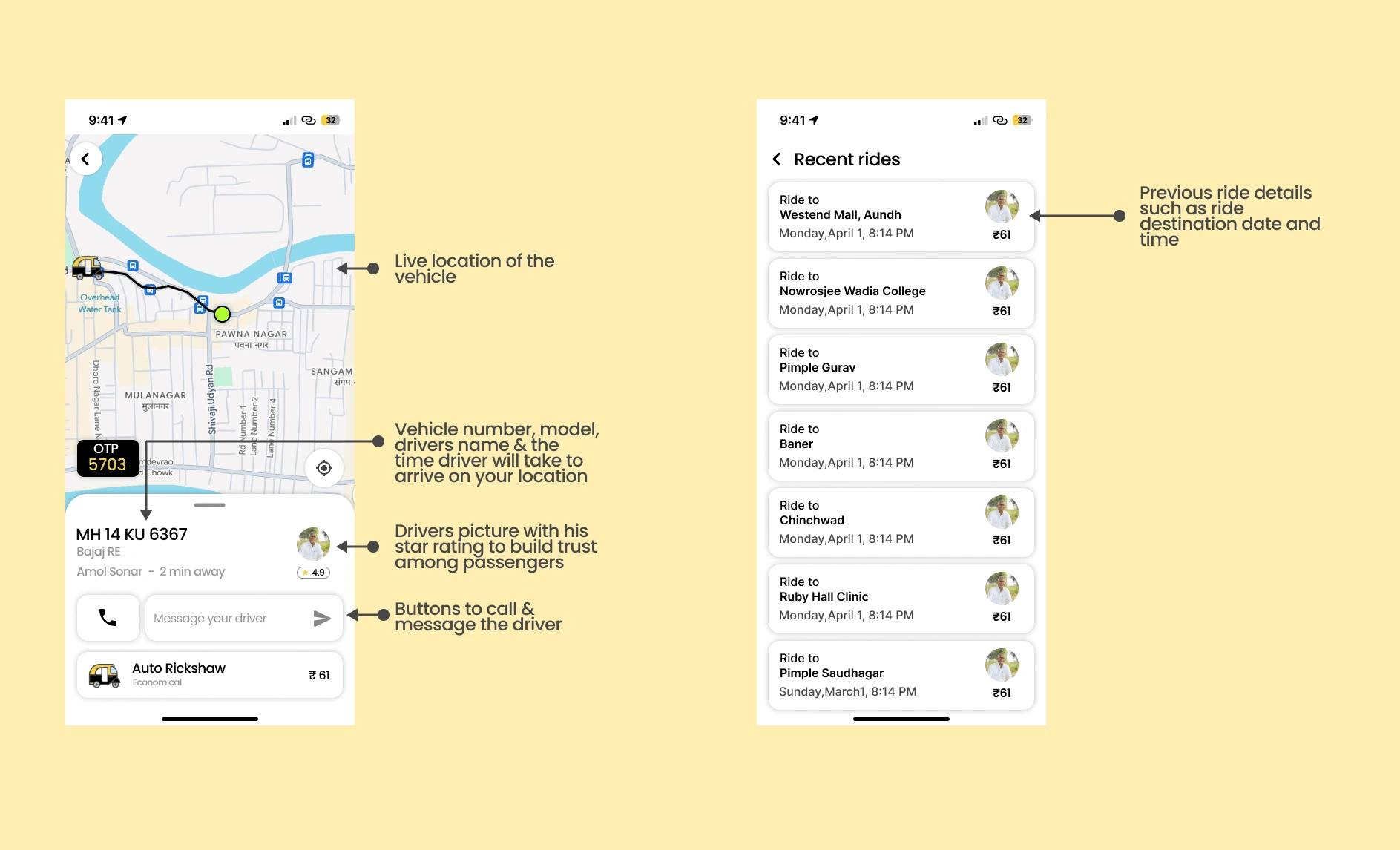
Added live location of the vehicle with vehicle number, model, drivers name, picture and his star rating. Added message box and an call option.
In the recents page added boxes with past rides with destination detail, time & date of the ride.
Account Page with basic information of the user and settings.
Removed options like birthdate which were causing trsut issues like why does an taxi app require my birth date (issue reported by a users).
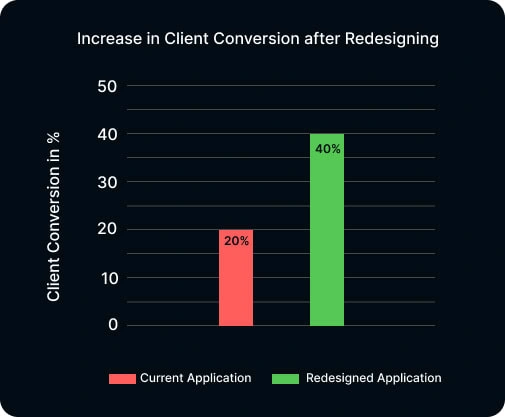
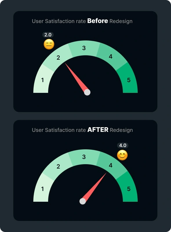
Growth assumption of the application
Client Conversion:
User Satisfaction:
And That’s A Wrap!
Thank you so much for Reading!✨ My Aim was to enhance the O Rickshaw transport app’s user interface (UI) and user experience (UX), aligning it with industry standards and user expectations, thereby improving usability, engagement, and competitiveness in the market.
As this was just a personal project i would love to work on the real app in future and make the app more efficient in real world. Actively looking for opportunities ✌️
Like this project
Posted Jun 6, 2024
Created an intuitive mobile app interface that resolved key pain points for users, significantly boosting customer satisfaction ratings.
Likes
0
Views
2


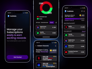
Made Subscription easy management across platform.
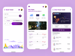
User Centric approach to Redesign Pune Metro's App.