Roomers.Co - Startup
Mantain the idea, but change your Way!
Ok! Lets understand the brand goals to do this:
Disruptive Company
Technology Applied
Fabulous Images and Spaces.
Right, and do Roomers.co already have any idea? Yes:

Let's make some changes, but mantaining the idea!
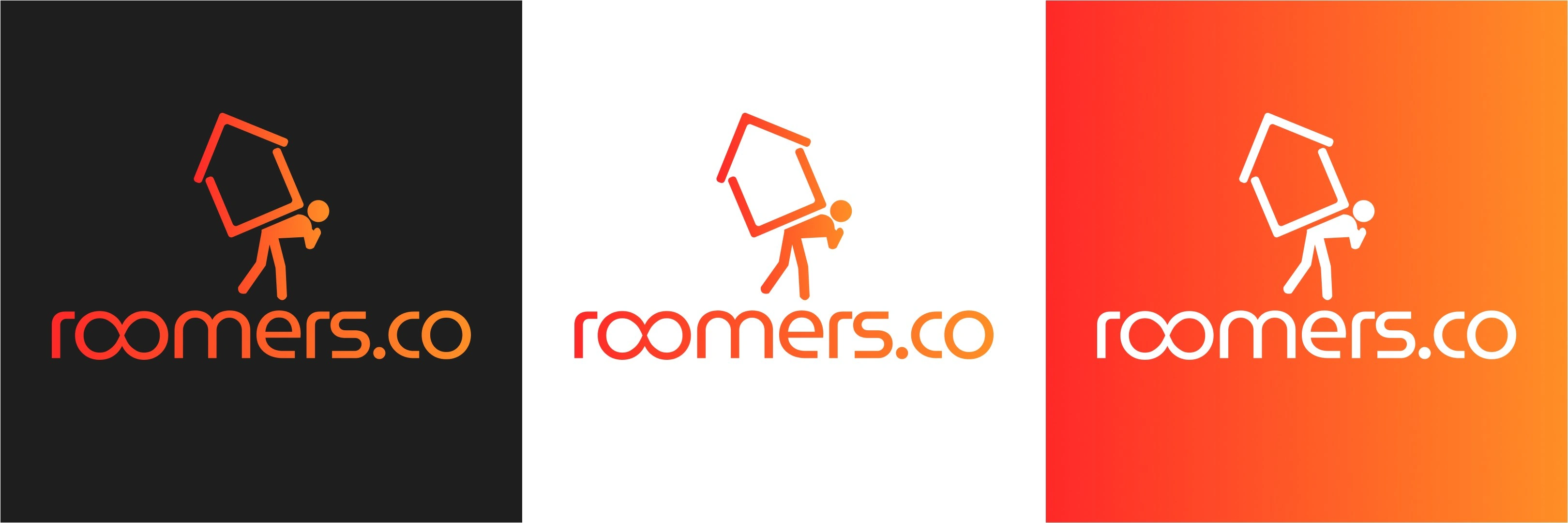
In the first moment, we realized it was too Hard, smooth was the first. Another insight was: the brand name is Roomers.co, not r.co, we have to change... And in the end, how to use this giant house? Well, we did it!

Whe smoothed the house, the man, typography, evething! Now it appears more "tech". But the name was too hard too only writen under the icon...Let's style it! Ok, now its better, making sense...
This project is starting now, soon we got more content 🤭
Like this project
Posted Jul 5, 2024
Startup? Let's Marketing it
Likes
0
Views
9


