Returnqueen - Revolutionizing Returns
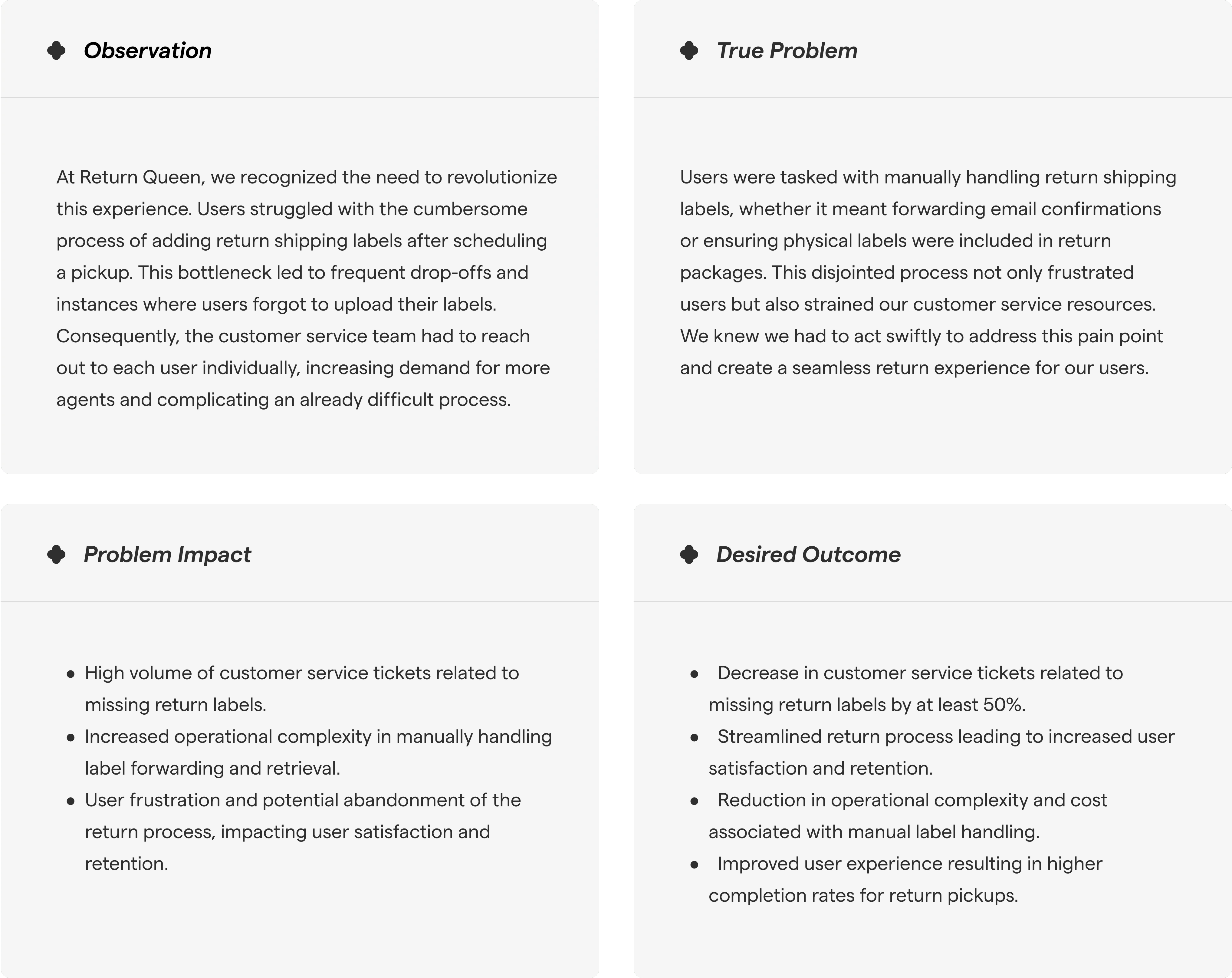
Unraveling the Complexity, A Journey of Discovering the Crux of the Issue
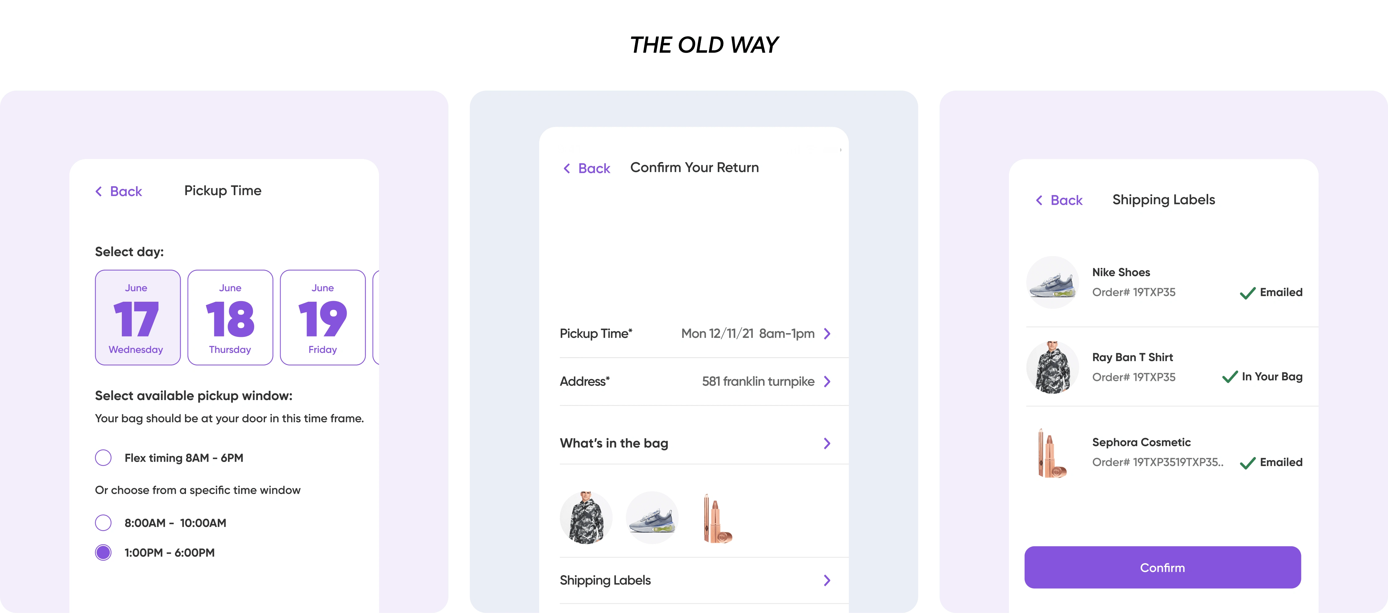
A Stroke of Innovation
Enter RQ Instant Label Retrieval
RQ Instant Label Retrieval - our game-changing solution.
By developing a sophisticated backend integration, we empowered our platform to automatically retrieve return shipping labels from users' email accounts. This revolutionary feature eliminated the need for manual label forwarding and ensured a seamless return process from start to finish.
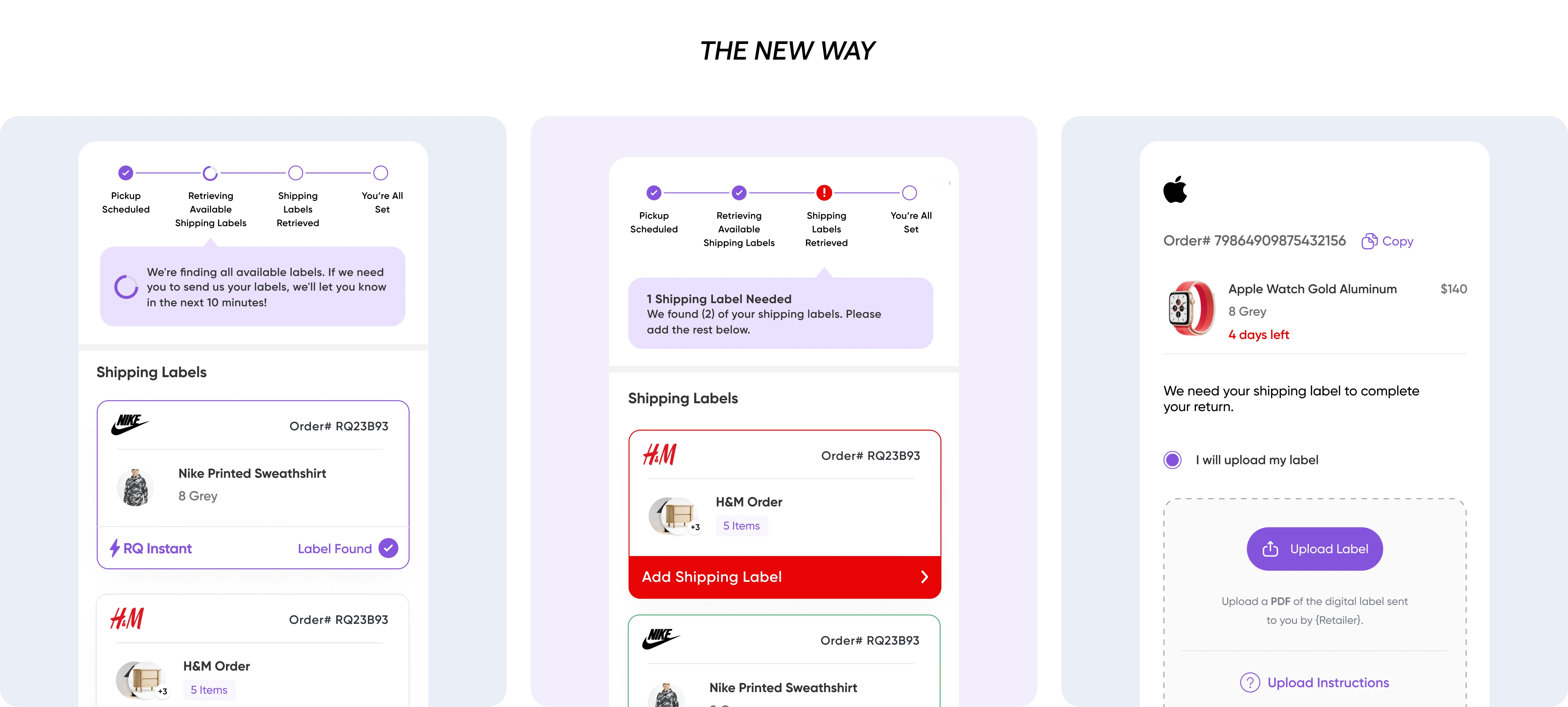
Simplifying the Process with Progress Bar Guidance
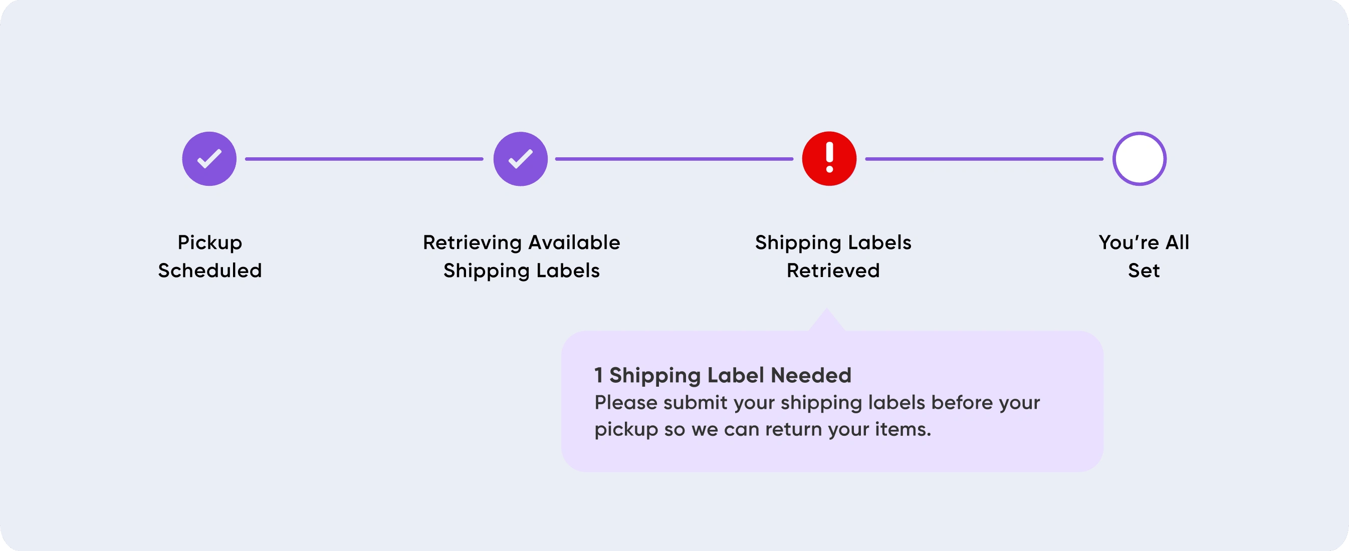
Progress Bar Guidance: Upon scheduling a pickup, users are presented with a progress bar indicating four stages: pickup schedule, retrieving available shipping labels, shipping labels retrieved, and completion. This provides clear visibility into the process and reduces uncertainty.
Real-Time Status Updates: Users are informed in real-time about the progress of label retrieval. If labels are found instantly, users are notified within seconds, eliminating the need for manual forwarding. If additional action is required, clear instructions are provided, ensuring users are always aware of the next steps.
Guiding Users Every Step of the Way
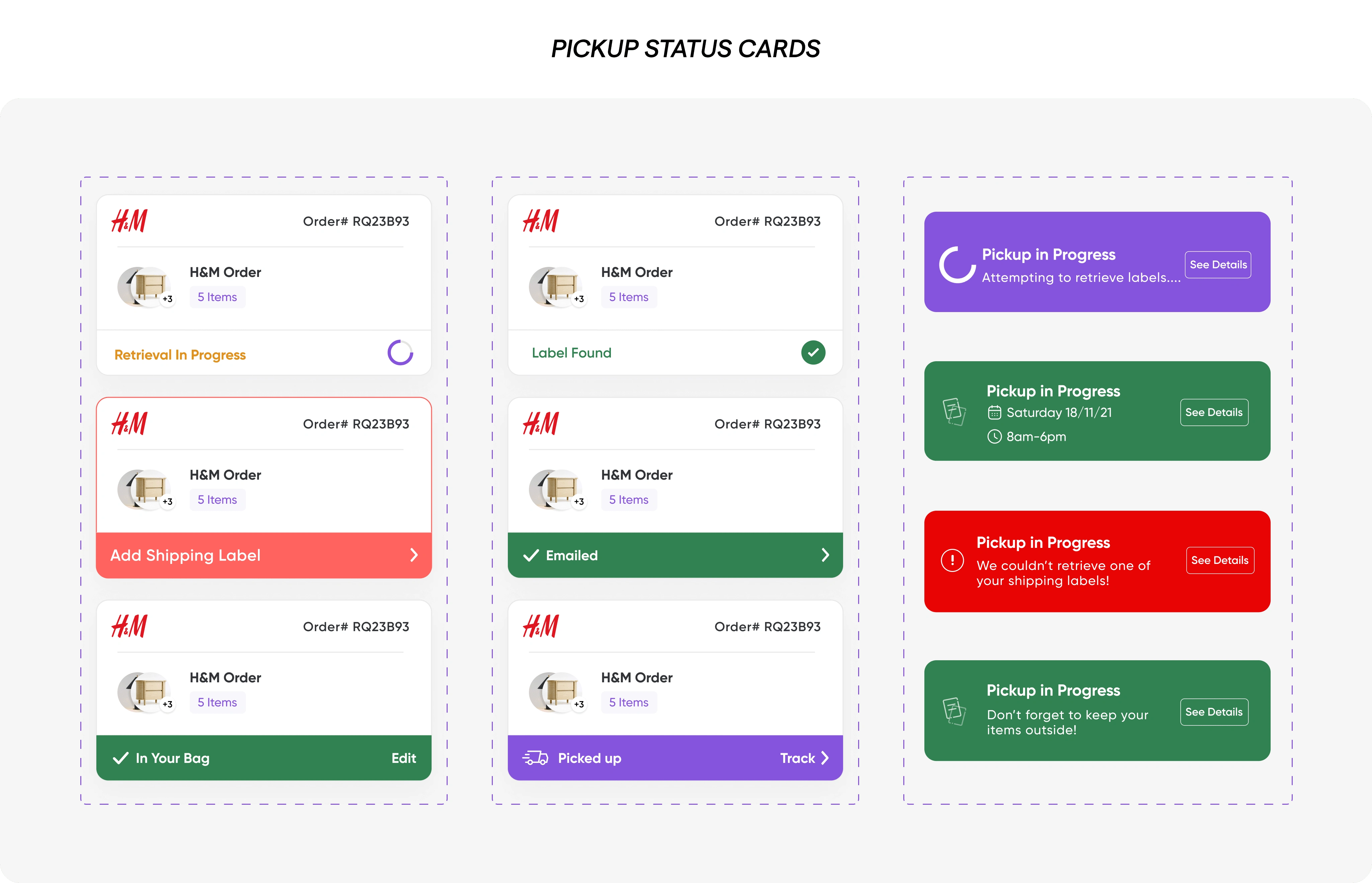
We introduced the pickup status card on the homepage, offering users a snapshot of their return progress. This card dynamically updates to reflect the status of the pickup, indicating whether all labels have been found or if any are missing.
To further ensure users stay on track, we integrated text message updates and push notifications into the platform. These notifications serve as gentle reminders, alerting users when all labels have been found or if any further action is required. Whether it's scheduling pickups, retrieving shipping labels, or completing returns, users are empowered with timely guidance and support every step of the way.
Visual Delight - Elevating User Engagement with Captivating Website Visuals
But our journey didn't stop there. We recognized the importance of providing a seamless experience not only on our app but also on our website.
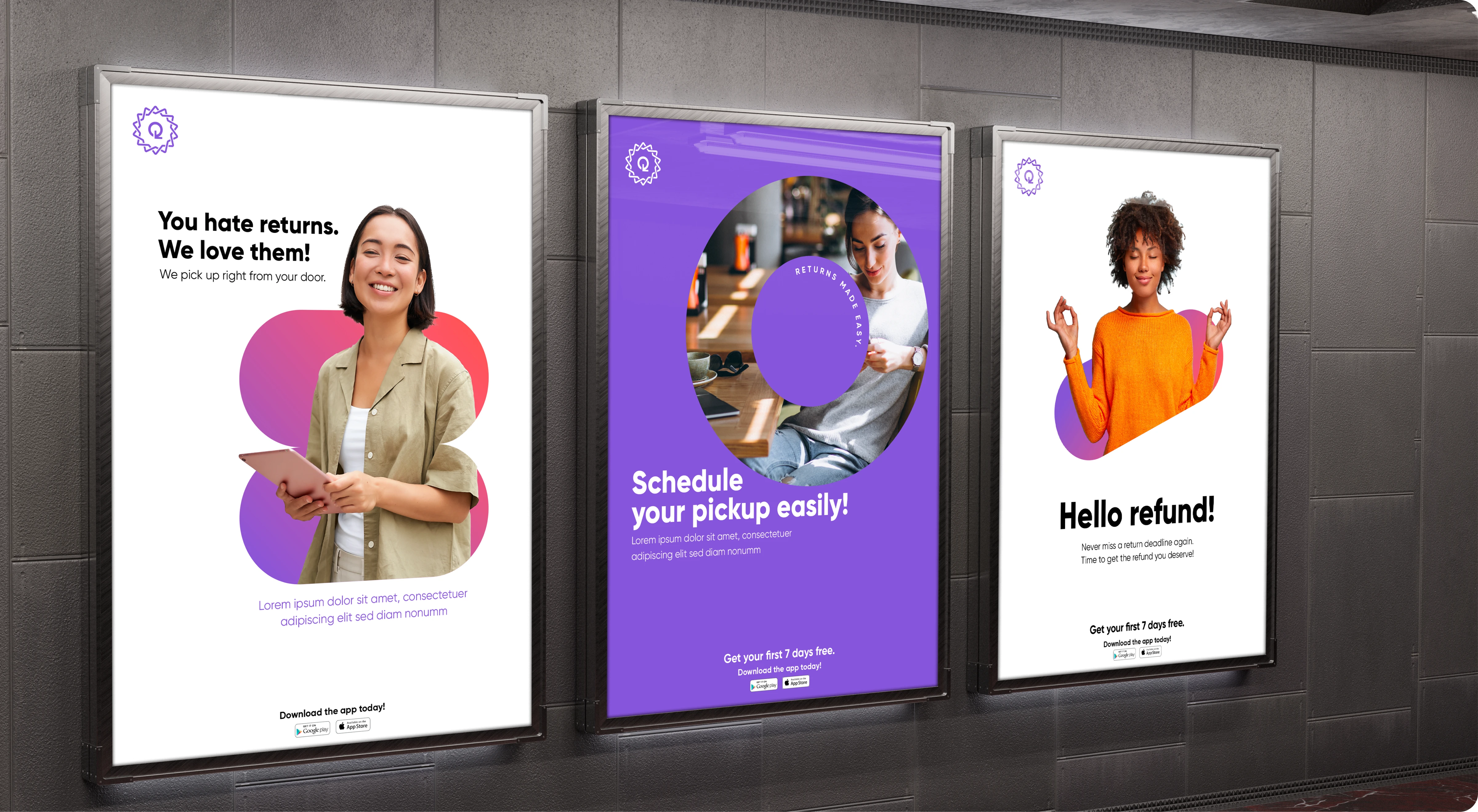
With a comprehensive update, we revamped the Return Queen website along with creating new branding elements to provide clear and intuitive guidance on the return process. From detailed steps to captivating visuals, we ensured that users could navigate the journey with ease and confidence.
As part of our rebranding efforts, we introduced a new primary gradient color scheme that not only captured attention but also conveyed a sense of modernity and vibrancy. Additionally, we incorporated new shapes and elements into our branding, infusing personality and dynamism into every interaction. From sleek lines to playful curves, these design elements harmonized seamlessly to reflect the essence of Return Queen – innovative, approachable, and user-centric.

Conclusion: Leading the Way in Hassle-Free Returns
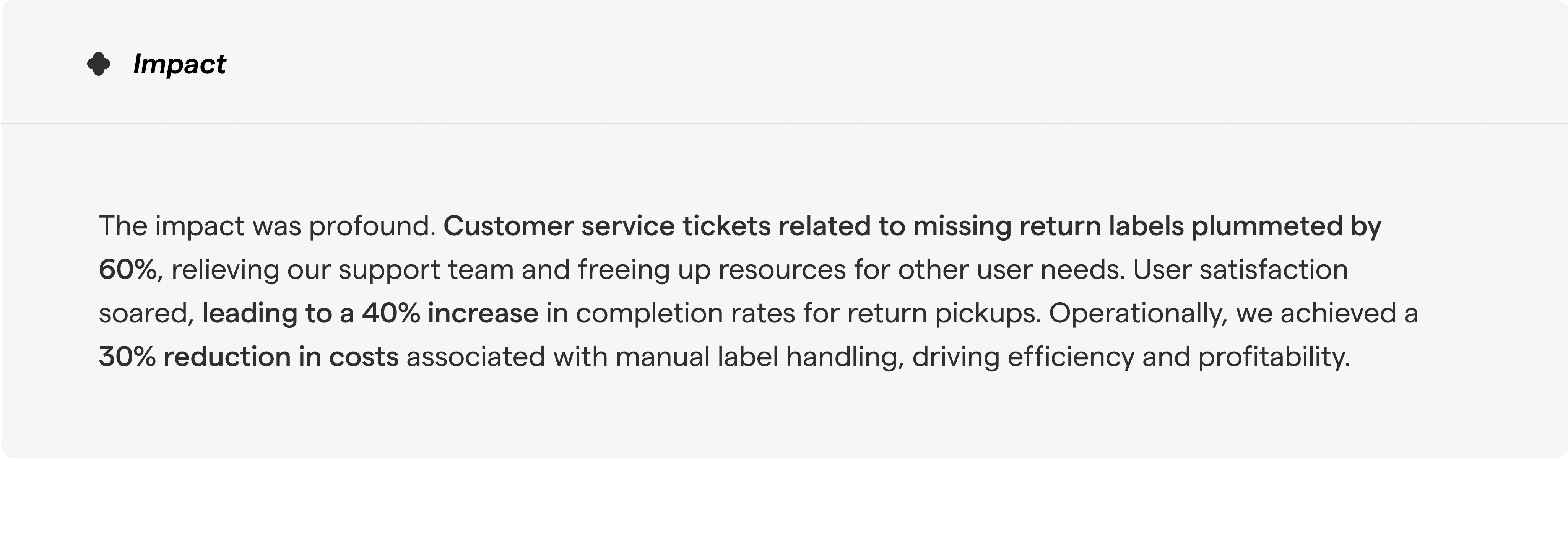
In conclusion, our journey with Return Queen exemplifies the power of innovation and user-centric design. By addressing pain points head-on and leveraging cutting-edge technology, we have redefined the return experience for our users. As we look to the future, we remain committed to continuous improvement and innovation, ensuring that Return Queen remains the go-to solution for hassle-free returns in the ever-evolving world of online shopping.
Like this project
Posted Apr 25, 2024
Crafted an engaging and user-friendly design for returnqueen resulting in a 40% increase in user retention.
Likes
0
Views
34
Clients
ReturnQueen

