BRAND REFRESH & EVOLUTION
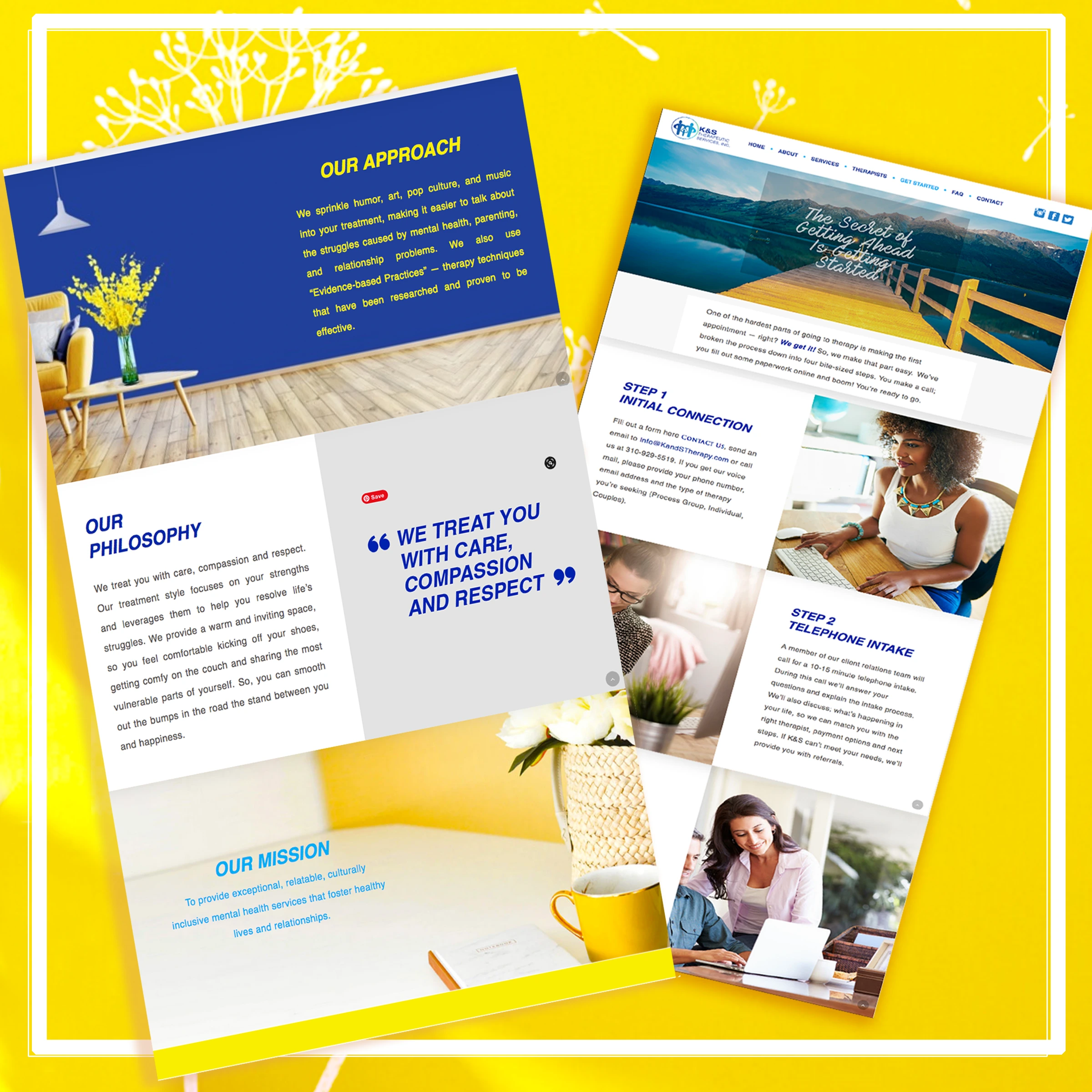
WEBSITE DESIGN
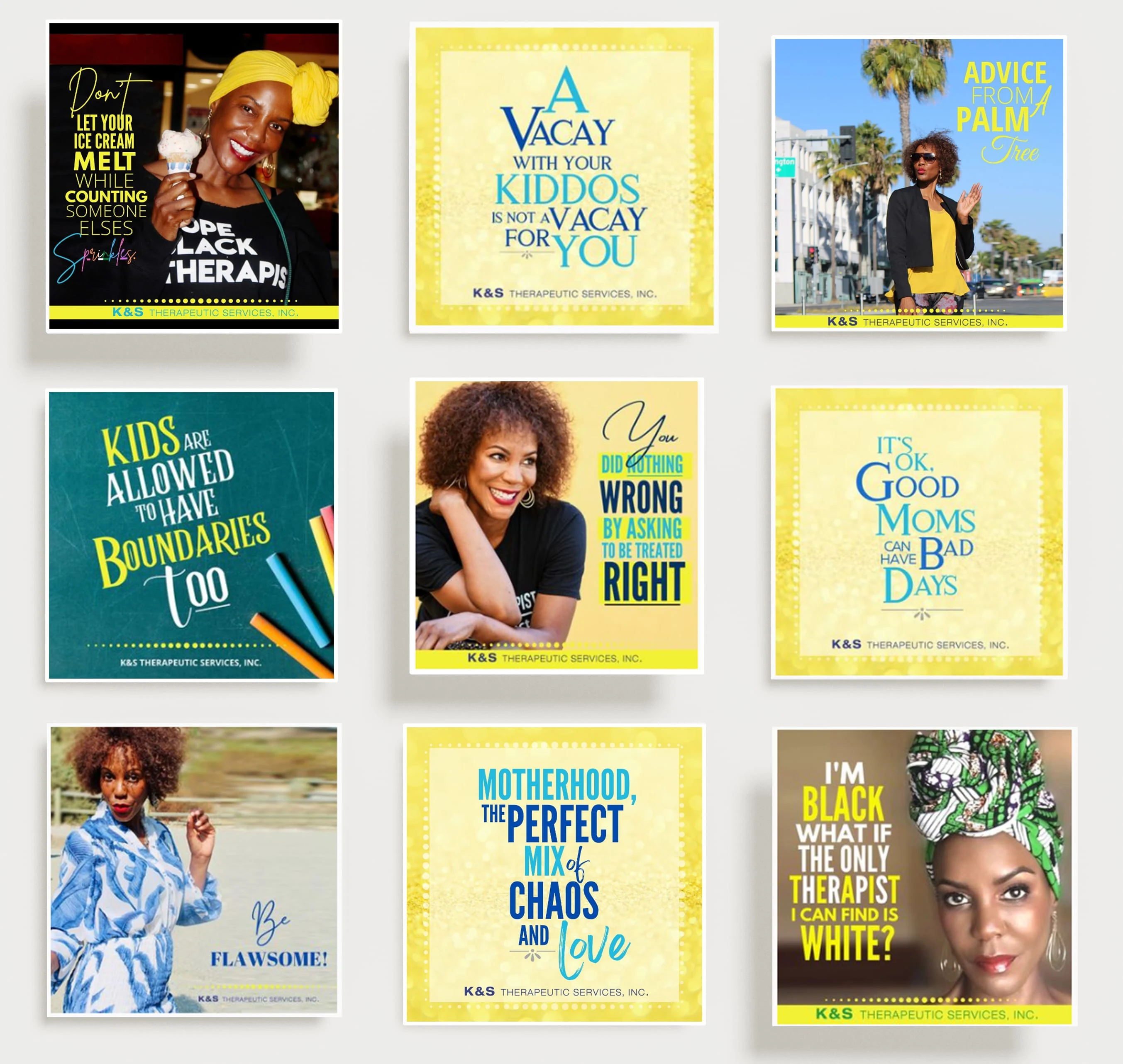
SOCIAL MEDIA DESIGN
After 10 years in business, this therapy group wanted a refresh.
I started working with them in the second year of their journey, with the logo in place but not much else. I worked with them over the years to build on their brand, but they kept it very simple.
The founder always loved the color yellow and wanted to incorporate it, as well as more personality, but was hesitant to expose that route. But that feeling never left.
As the brand evolved, and her with it, the brand personality took on it's own shape and destiny as brands do, and after a while we couldn't NOT update the look, feel, messaging, and positioning, to reflect that.
At the 10 year mark, she went all in on a brand refresh.
With that, we did the following:
• Updated the existing logo to include some dimension, new typesetting, and introduce yellow into the brand.
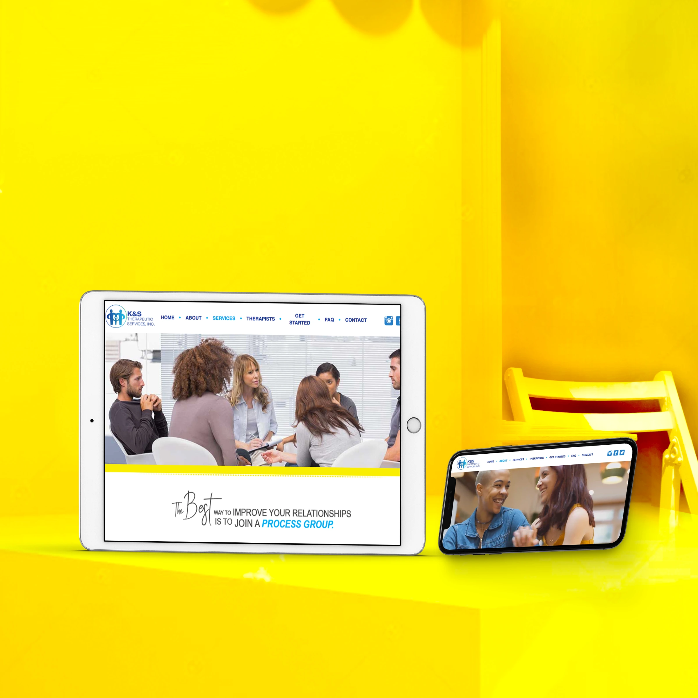
• Redesigned the entire website with the new look, as well as all new copy, services, approach, and positioning.
-- I did all the design and art directed the videography and developers.
• Embarked on a two year social media commitment to support all of the above.
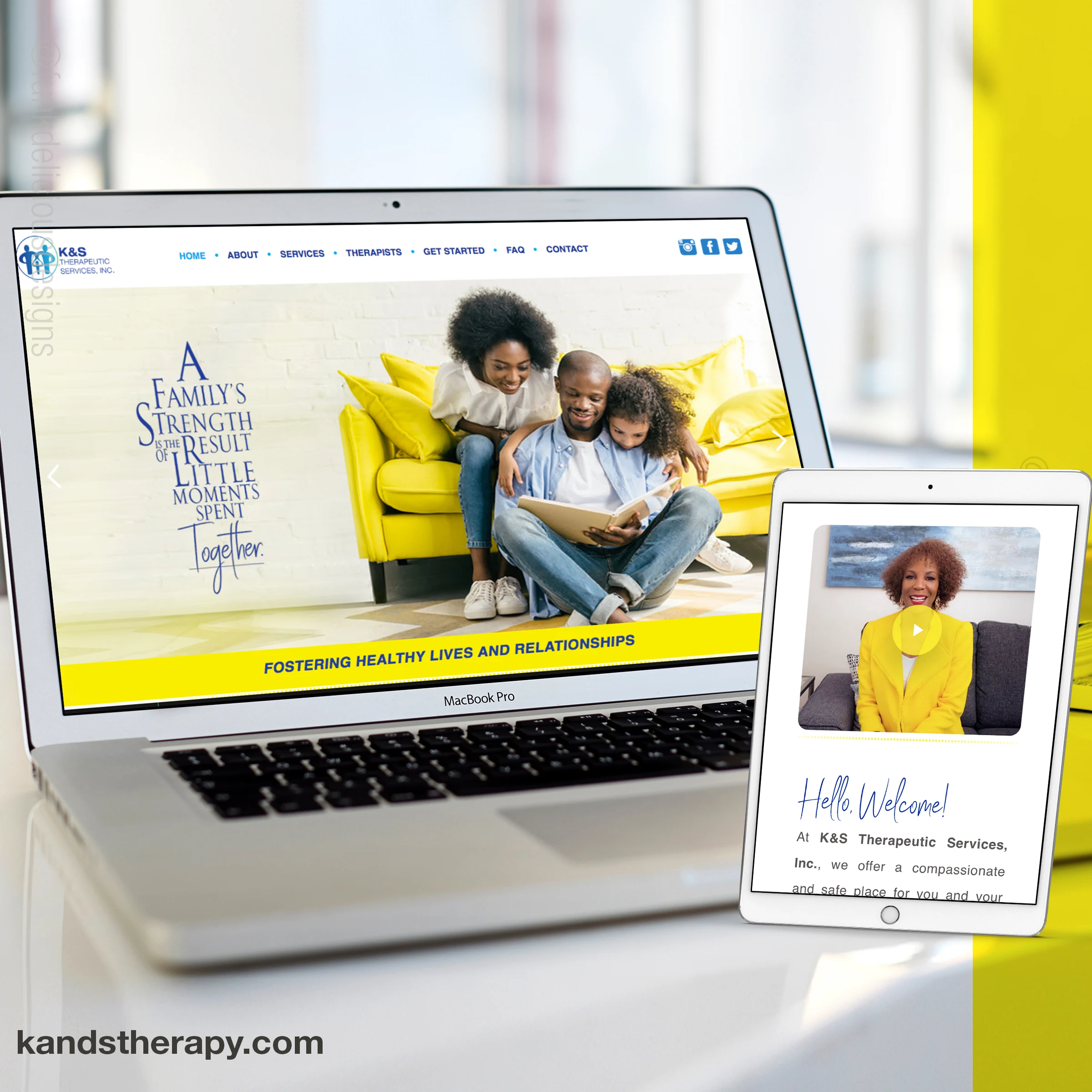
WEBSITE DESIGN
WEBSITE DESIGN
Like this project
Posted Jul 16, 2023
Graphic Design,Art Direction,Branding
