eCommerce Design System
Molham Bakir
This project culminated in different things I learned, from how a team operates down to the most miniature pattern that should be optimized for that purpose.
As we're moving towards migrating a new full-stack platform, I was assigned by my tech manager to quickly access and utilize what we have and work towards a single design system library to be used for all our future projects.
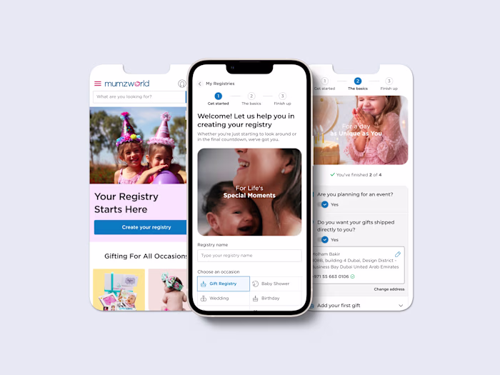
Mumzworld Design System
The Outcome
• Increased product development efficiency.
• Increased UX and perceived product quality through a cohesive design within the platform.
• Maintained 31+ design components in an easier and more automated way.
• Had fewer bugs within the product, reusing production-tested components.
• Shared language by simplifying the labels.
• Made the interactive elements in the Ul more obvious.
• Built a method for balancing traditional standards principles with our brand personality.
• Applied core brand components to essential touchpoints.
• Created user story maps to translate key brand components into digital.
• Presented a validated sequence of design exercises to let a team research customer needs and then conceive, create, and validate a prototype.
Learn more at:
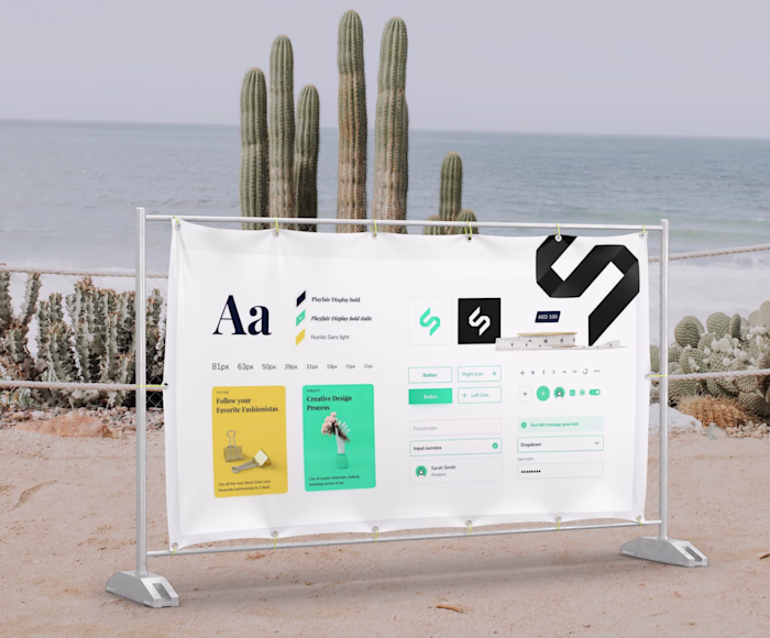
A high-level view of our design system and its core sections
This system should close the gap between designers, UI engineers, and developers who work on multiple products and often re-create or duplicate work done by other teams. The design team repeatedly used different design elements, reinvented the wheel, and risked unintended inconsistency. There is more strain on design resources and less focus on larger, more complex problems — a Lake of visual consistency across products and channels.
Pattern library page
Deliverables:
• Documentation of every atom, molecule, and organism.
• Extensive record-keeping for all components and patterns.
• Provide high-fidelity mockups to showcase the pieces.
• A helpful guide on how to import elements from the design system and use them.
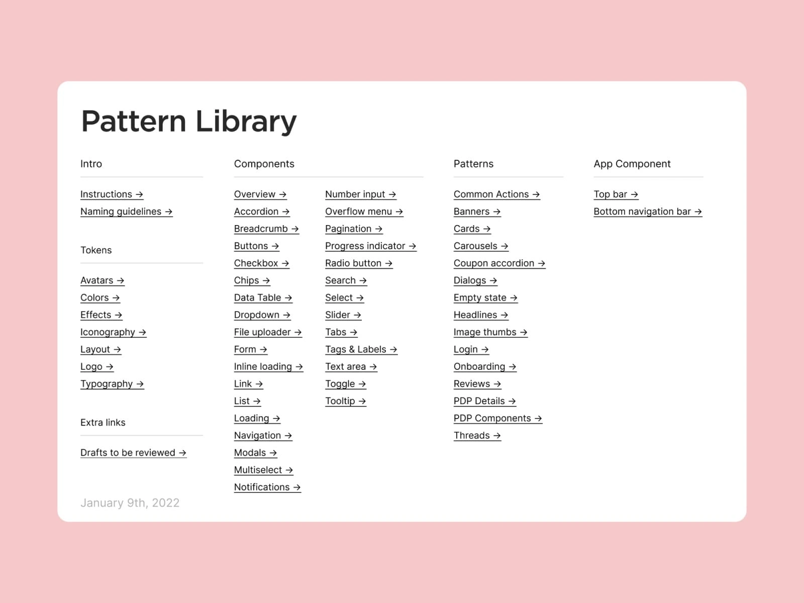
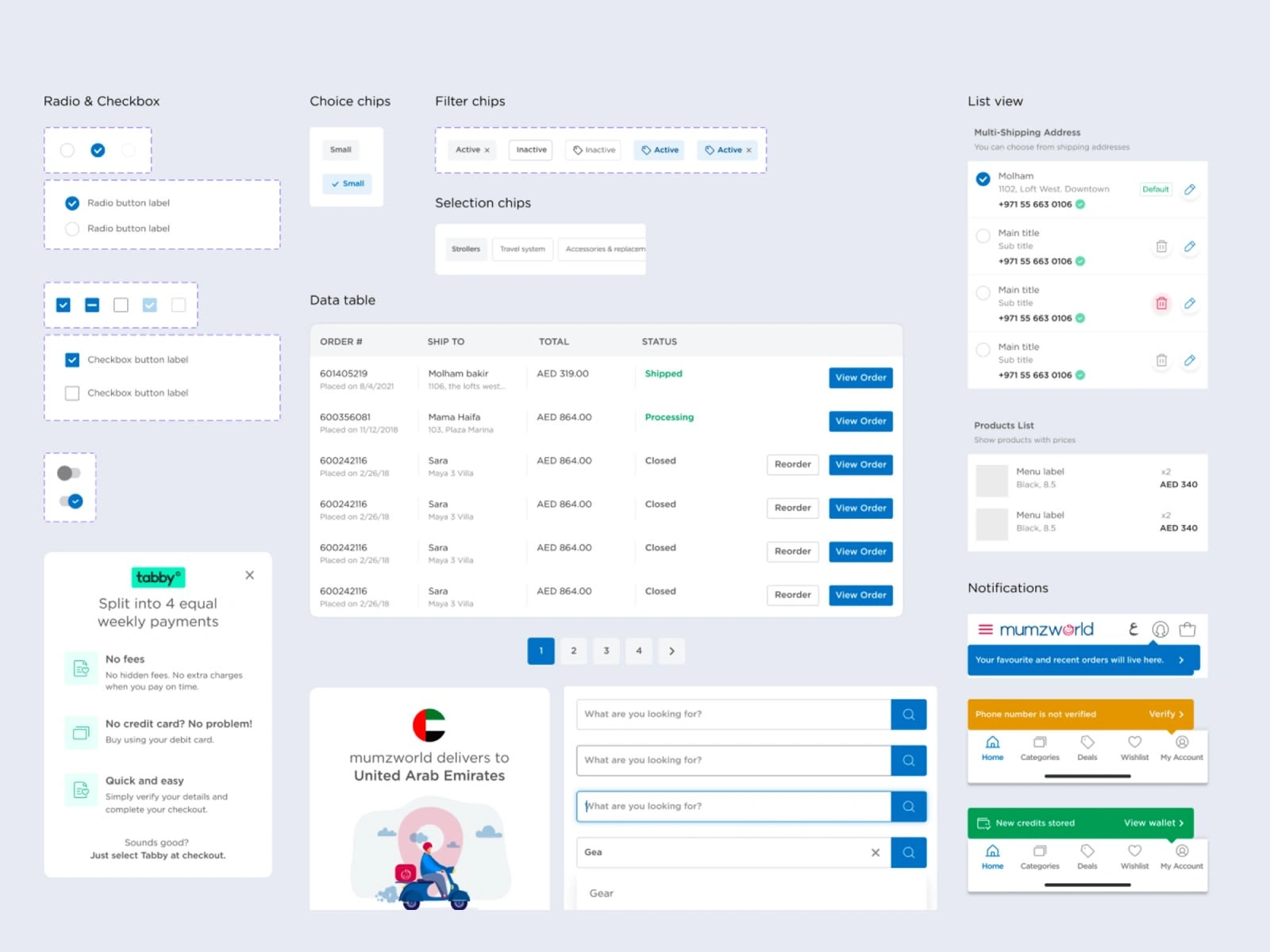
Patter Library index
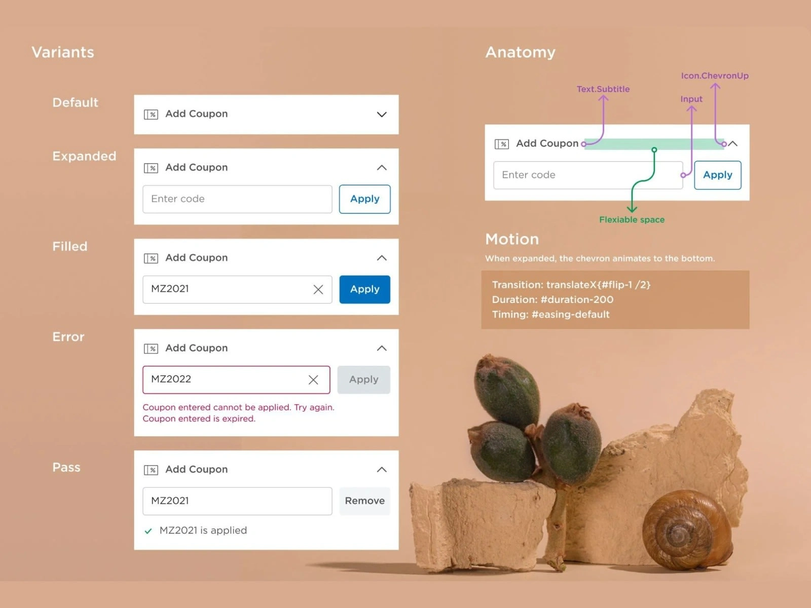
Instance swap property, documentation, and all states and interactions
Presenting component variants side by side makes it easier to see at a glance what interactions are available and for what purpose each is used, connected to the code and the state name.
Accordion interactions, variants, anatomy, and motion guidelines. Presenting components that vary side by side makes it easier to see what exchanges are available and for what purpose each is used, connected to the code and the state name.
Functional patterns
Mapping out our customers' needs, goals, and motivations. There's usually a clear understanding of the behaviors we want to enable in our users: explore what we're offering, add products to the bag, and seamless communication after purchase. And this is where our goal became clear.
Working on this will help us see how our patterns fit into a bigger picture and strengthen the connection between user behaviors and how to encourage those behaviors.
We started by auditing and printing many old and new designs. Laying the flows on a board, we could see where and how the experiences were breaking and where we needed to make changes.
I worked with the most critical components that must be documented to help devs and the more frequent components used across the web and app.
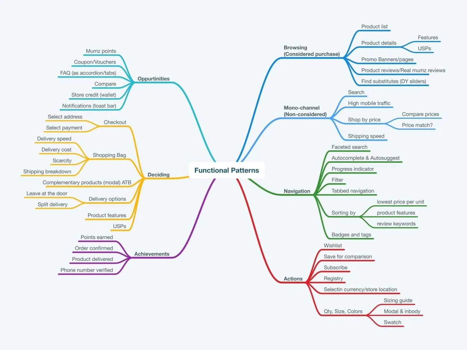
Functional Patterns
Spacing guide
Spacings are underestimated, scorned, or ignored. Blank spaces don't always receive good press! Even so, it's an integral part of designing and delivering information.
On a page, blank spaces strengthen readability, help prioritize your content, and even play a role in your brand positioning. As we saw before, everything is related to this famous cognitive load, and the presence of blank or empty spaces helps us remain focused on precise information.
So keep these words from Jan Tschichold in mind (German typographer and designer), "blank space should be considered as an active item, not a passive background."
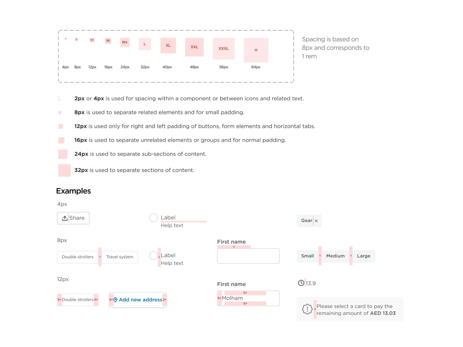
Spacing guide
Improve accessibility and localization
A design system also helped us build localization by planning how to cater to international users from the very beginning, long before localization began. We used internationalization best practices to ensure a genuinely cross-cultural experience, and we had part of our workflow.
The UX writer ensured we had a consistent voice in each language with high-quality translations.
We agreed to build localizations into every team's workflow and all-new features we had translated at the release.
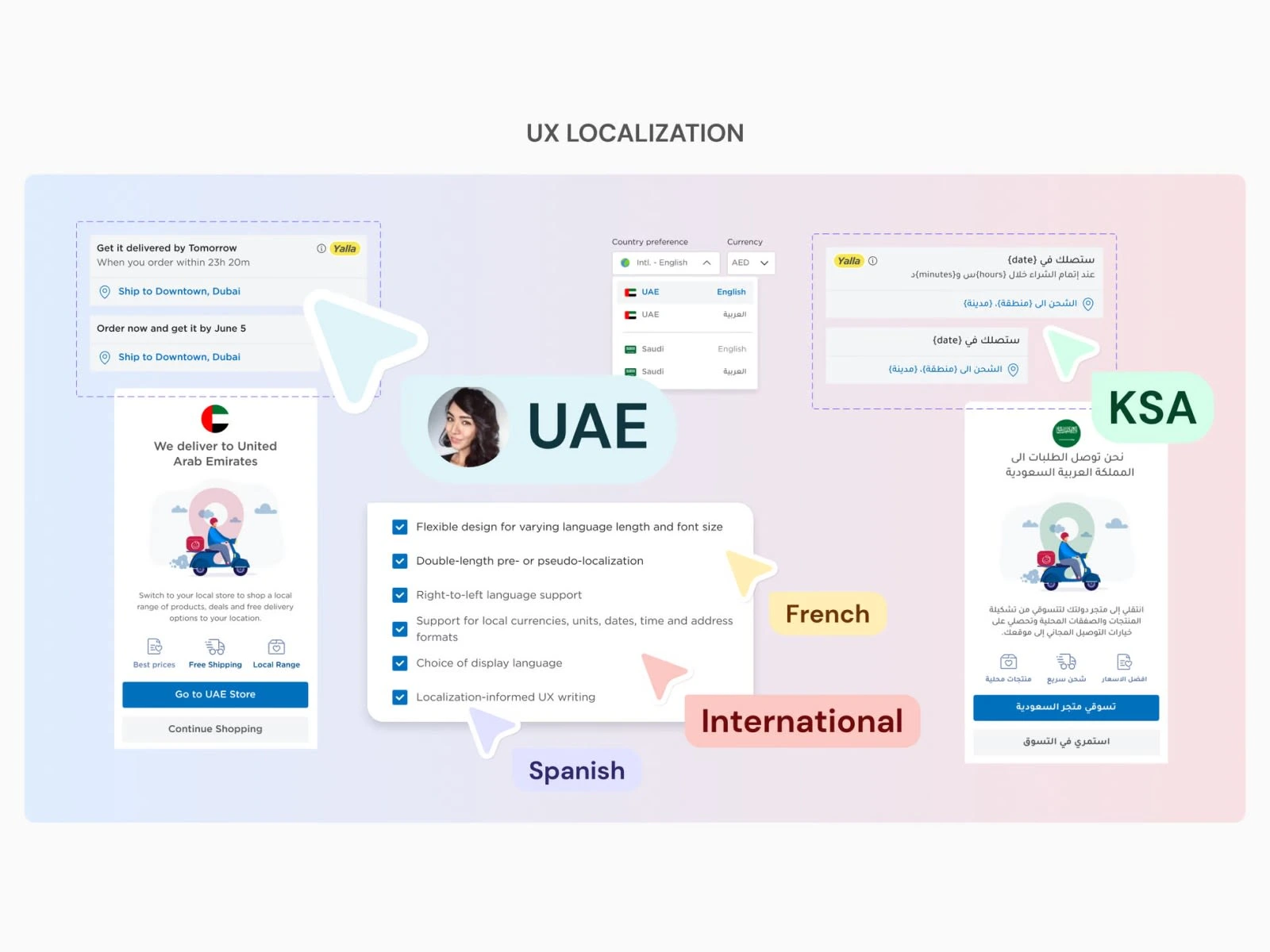
UX Localization
eCommerce Features and Micro-interactions
Catching up with today's trend in personalization, bringing your search close to what you like, and micro-interactions. They come into play when you're already well into building a digital project. It's like adding the finishing touches to a painting. All of this is to find new ways to make interactions with gadgets feel smooth and intuitive.
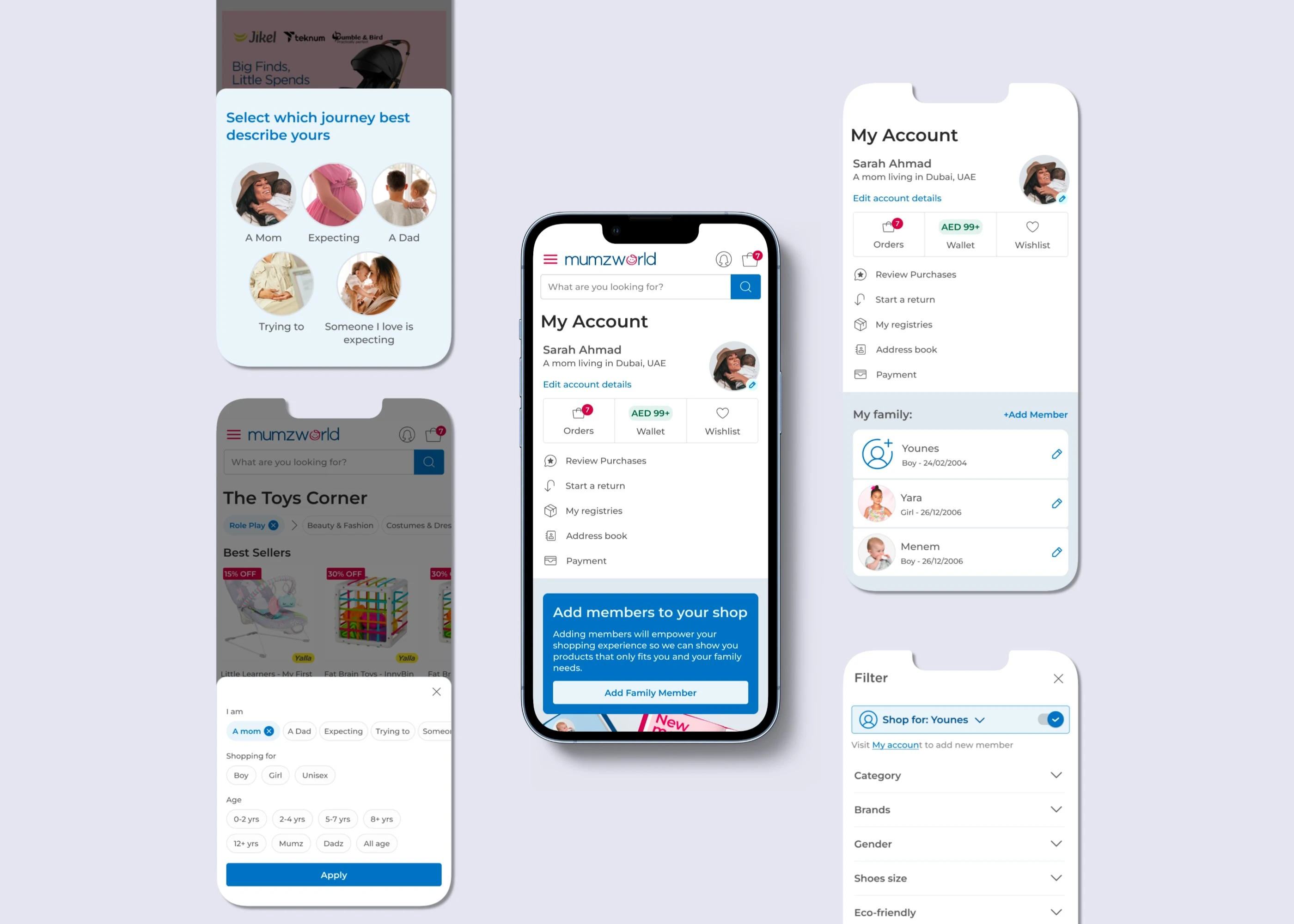
Personalized experience in shopping
It's like that friend who knows exactly what you like and improves your online shopping. It allows users to create profiles by adding members of their family.
Subtle animation in voice search
Subtle motion can be a simple way to lift an otherwise tired search page and be used to provide feedback on its current state, using a simple, straightforward idea to add fun and dynamism to the search page.
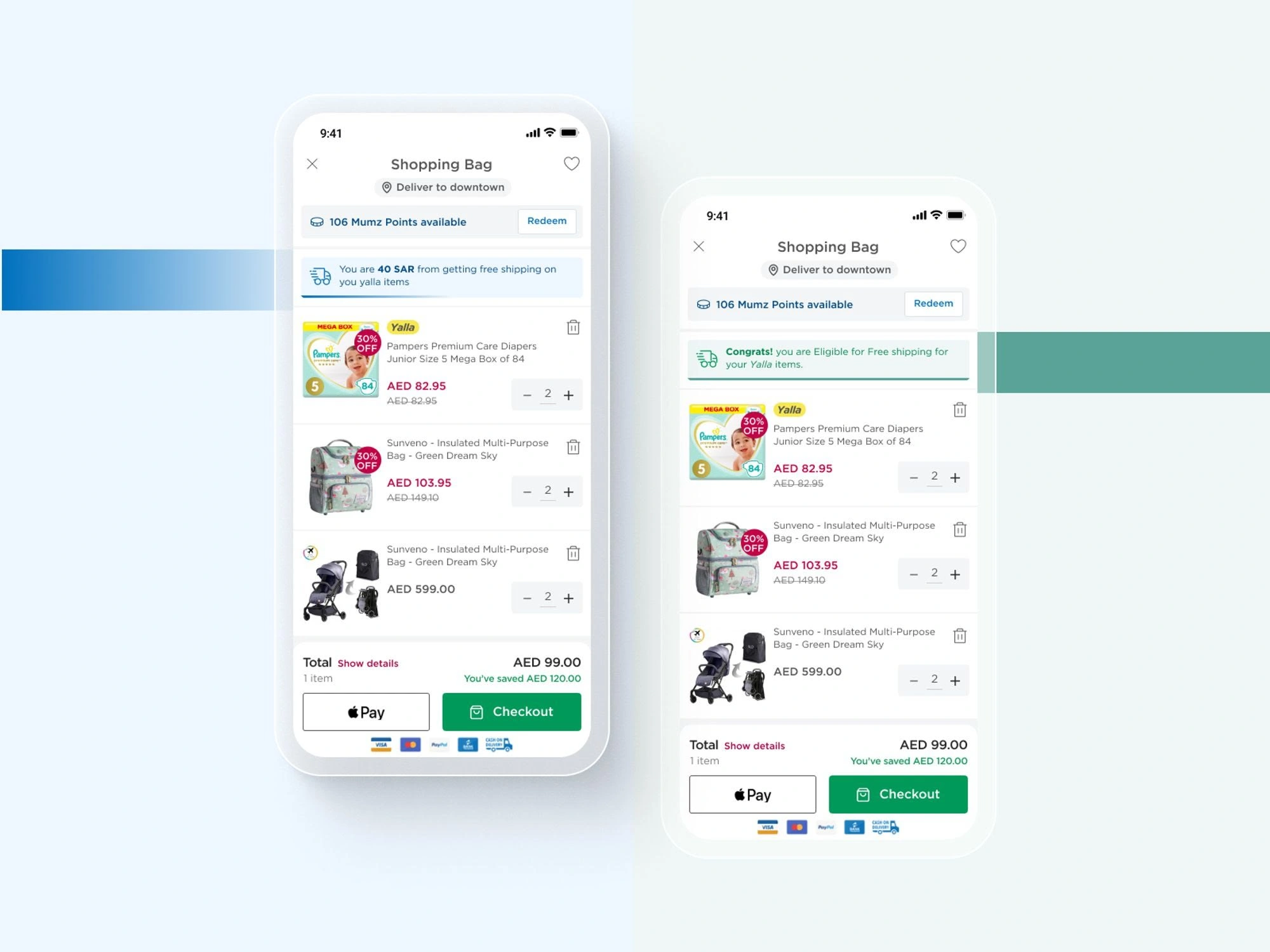
Post "Add to bag" success
Sometimes, this secondary animation (upselling sliders) might fail to load, so where do I base my design considering the possible causes? I used 300ms ease-out in the 1st stage and 500ms in the 2nd stage of the animation. I'm thinking of achieving a follow-through action, as it will make this modal look more natural.
Tour iOS native TipKit
The tour tip is a system-activated flyout. The purpose of the tour tip is to inform the user of some new feature or section on the page. A tour tip is open by default and must be explicitly closed by the user. Once closed, it cannot be reopened.
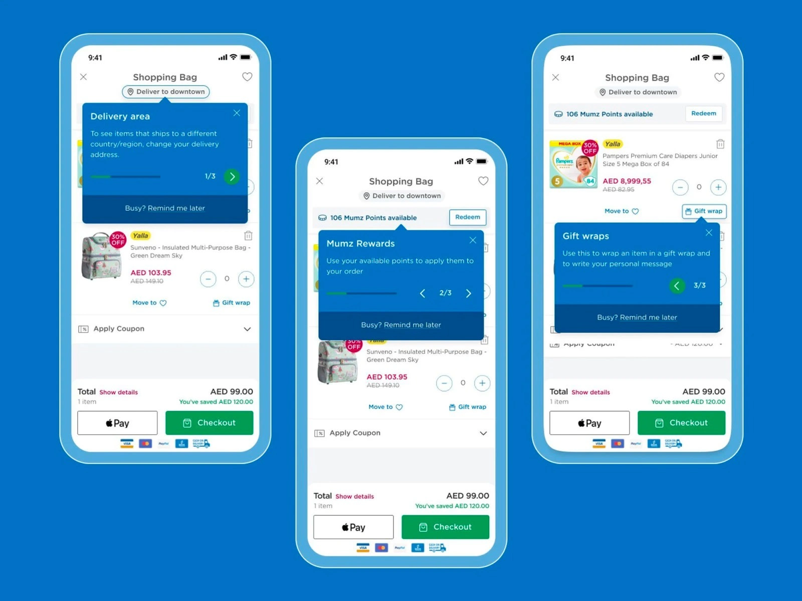
iOS native TipKit
Toast dialog
A passively spawned non-modal dialog. A toast dialog is a non-modal, non-intrusive dialog containing a system-level notification for the user.
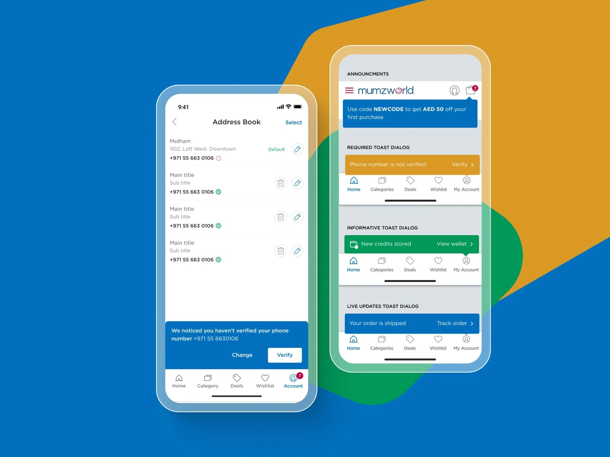
Toast Dialog
Inline notice
A custom landmark which appears prominently at the top of the page.
Like this project
Posted May 24, 2024
A new tool that blends your everyday work apps into one. It’s the all-in-one workspace for you and your team
Likes
0
Views
48
Clients
Mumzworld