Design System

Molham Bakir


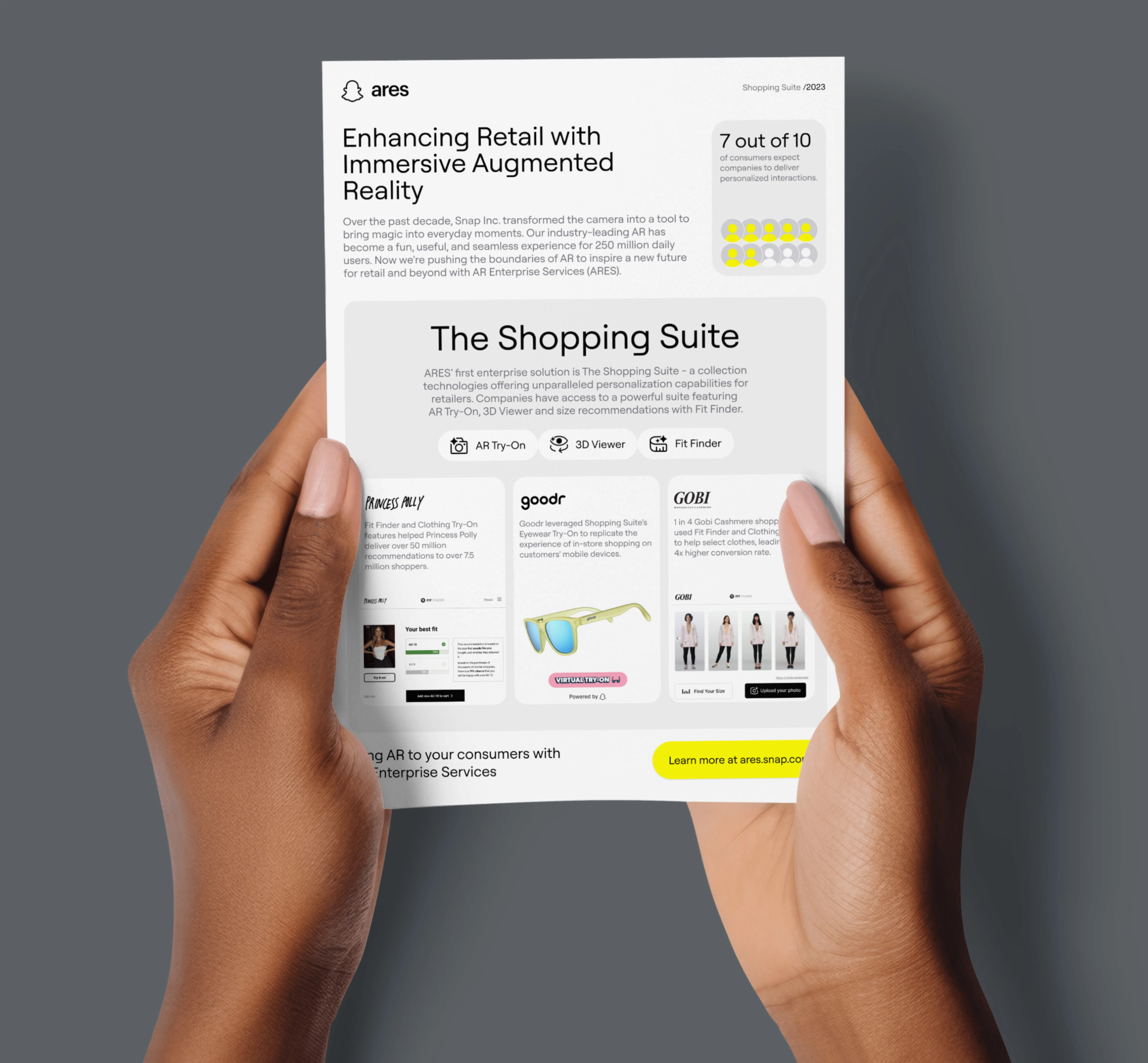
Augmented Reality Enterprise Services (ARES) Launch
I spearheaded creating and implementing a design system that was a smashing success. The system tackled various challenges—from inconsistent branding to accessibility issues to a lack of reusable components. To gauge its effectiveness, I kept a close eye on the number of components repurposed and bugs squashed, and—with the help of an external agency—we ran user testing and surveys. The results suggested we use a design system.
ARES design system
Overview
I played a pivotal role in launching ARES, an advanced AR product, employing two decades of experience in design systems and branding for SaaS products.
Project Brief
Build a unified ARES and Fit Analytics design system, ensuring brand consistency across all interfaces and materials.
Role
Branding, design systems, and website creation
Welcome to the style guide!
This guide is intended for teams, vendors, and authorized individuals who work on the brand.
Flyer design
The intention is not to stifle creativity or innovation; on the contrary, we want to value the creative spirit and see innovation as one of our core values. I aimed to deliver a coordinated, consistent, and compelling brand presence in everything we create. If we make something, we want to ensure people know where it came from.
Each execution template has internal documentation that is simpler to update, follow, and implement in today's digital environment. The focus of this guide is to empower designers, the creative, with the elements needed to create.
Visual inspiration:
- Juxtaposition of play and progress.
- Playful visual tropes suggestive of "magic."
- Propulsive animations inspired by electricity.
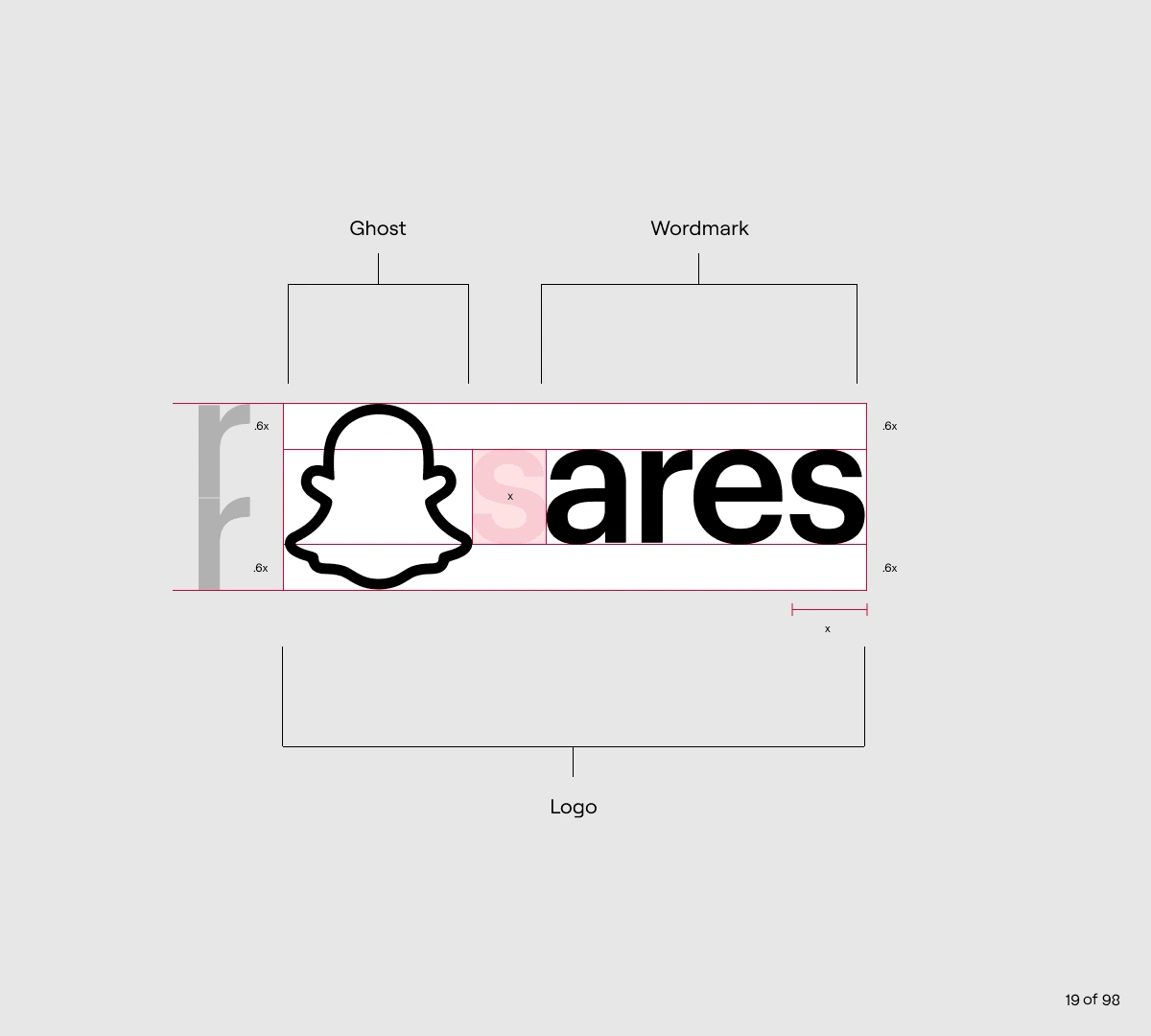
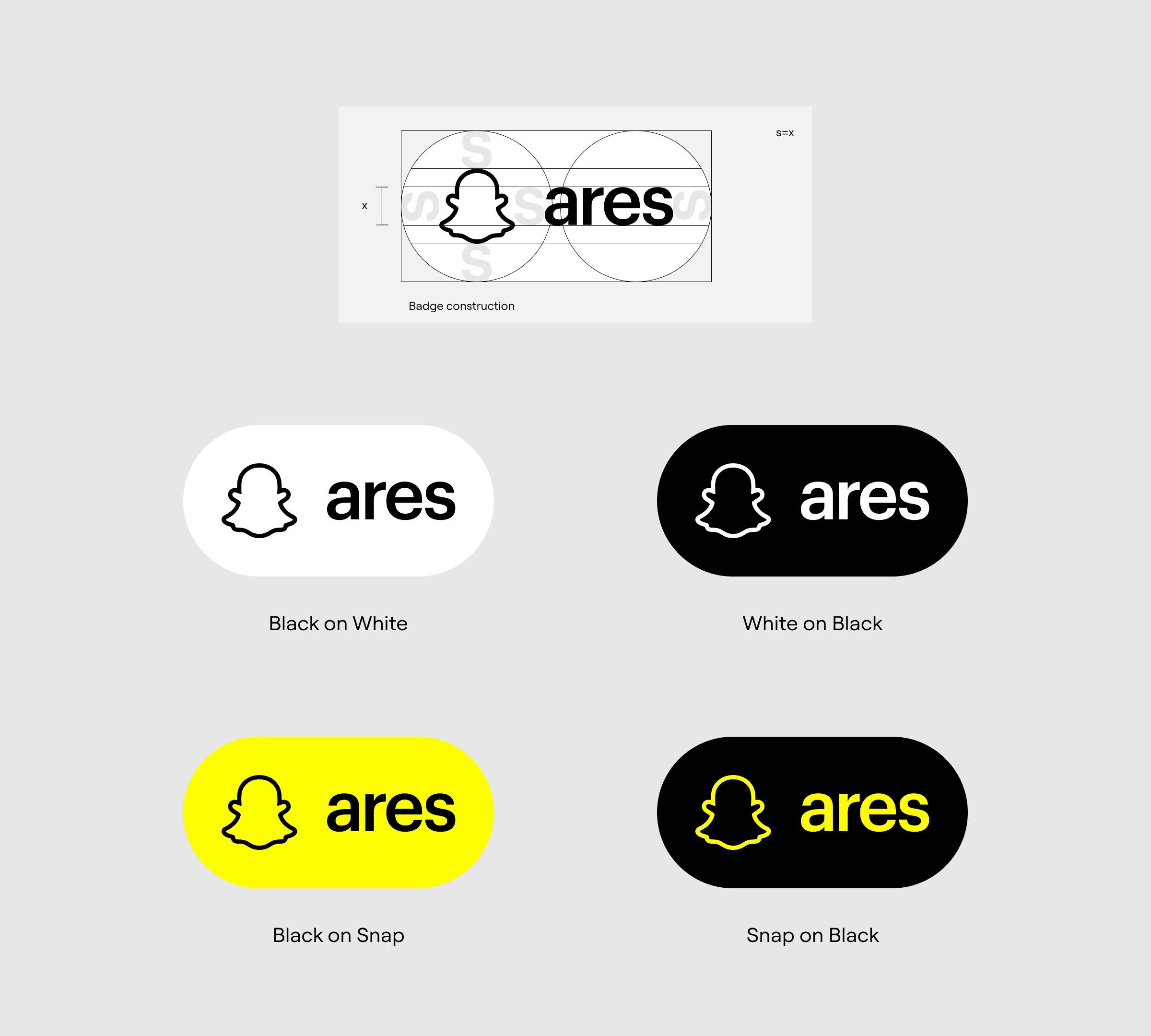
Logo Badge
Our merchants must promulgate the logo badge on products used within their digital commerce platforms.
Logo integrity is critical - any slight deviation from our logo's approved use could compromise our brand's integrity. When using the logo badge with partners, we must ensure compliance with our brand guidelines, just as we do with their logos.
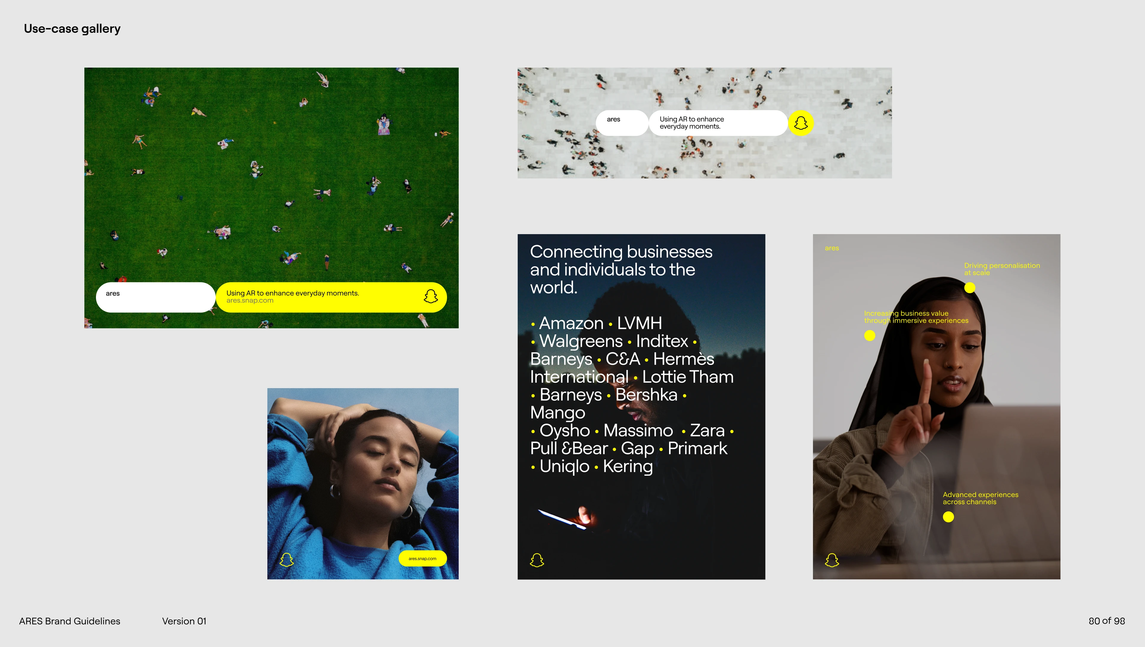
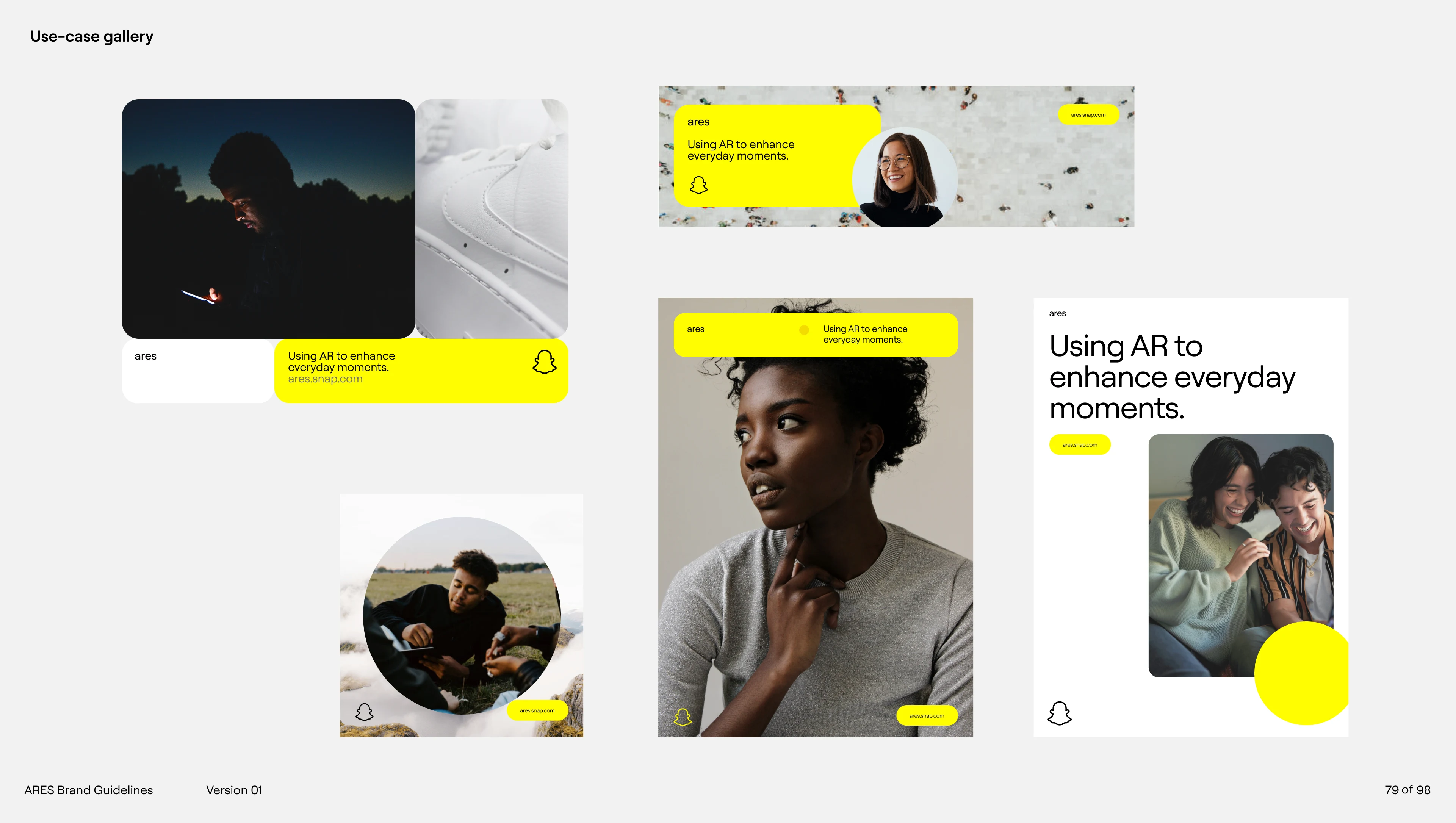
Brand Application
The ARES brand has applications across various environments, from digital to in-person. This section shows different use case examples and how the brand can be applied.
Methods
I led the creation of the design system, formed foundational principles, and headed user research initiatives. I also created a style guide, established design guidelines, collaborated across departments for product launches, and designed high-fidelity prototypes.
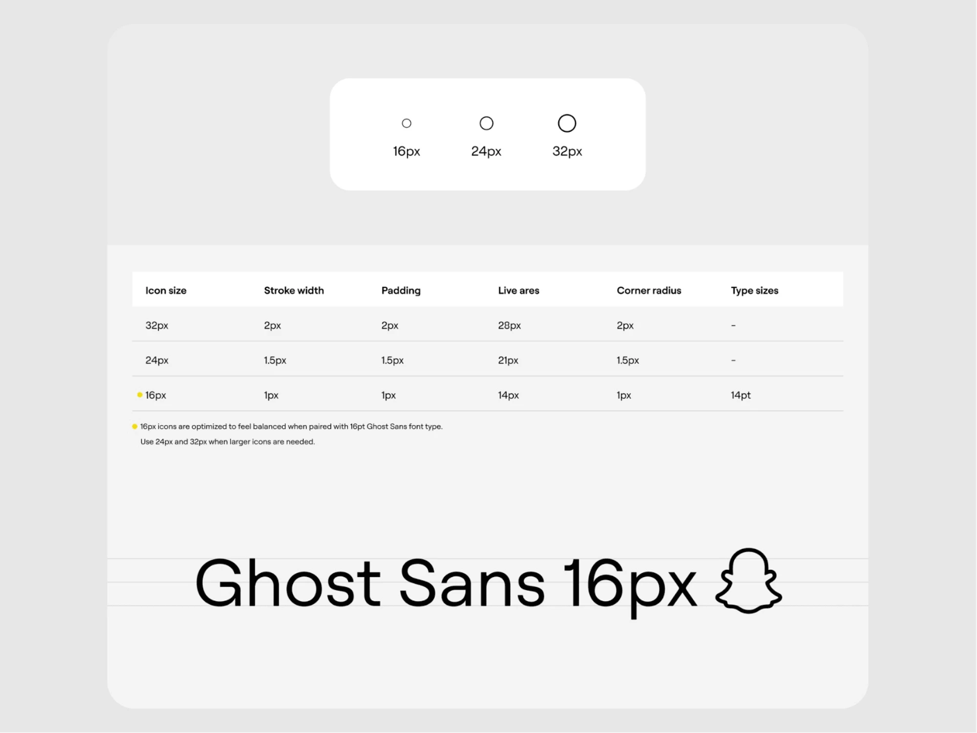
First, I devised a design system addressing challenges like inconsistent branding, accessibility, and reusability of components. I created a library of over 100 design tokens and conducted weekly design reviews. Next, we defined our design principles and values, streamlined the design-to-product workflow, and incorporated internationalization best practices. As a result, we successfully launched ARES, demonstrating the power of advanced technology, customer-centric design, and cross-functional collaboration.
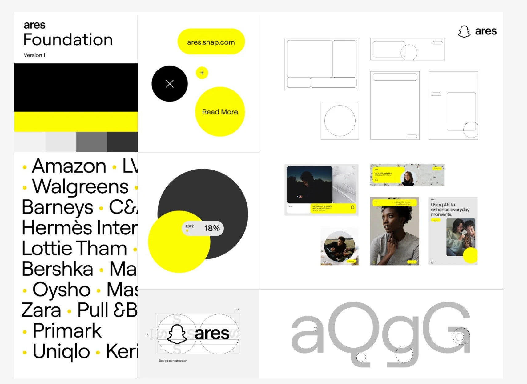
The Foundation
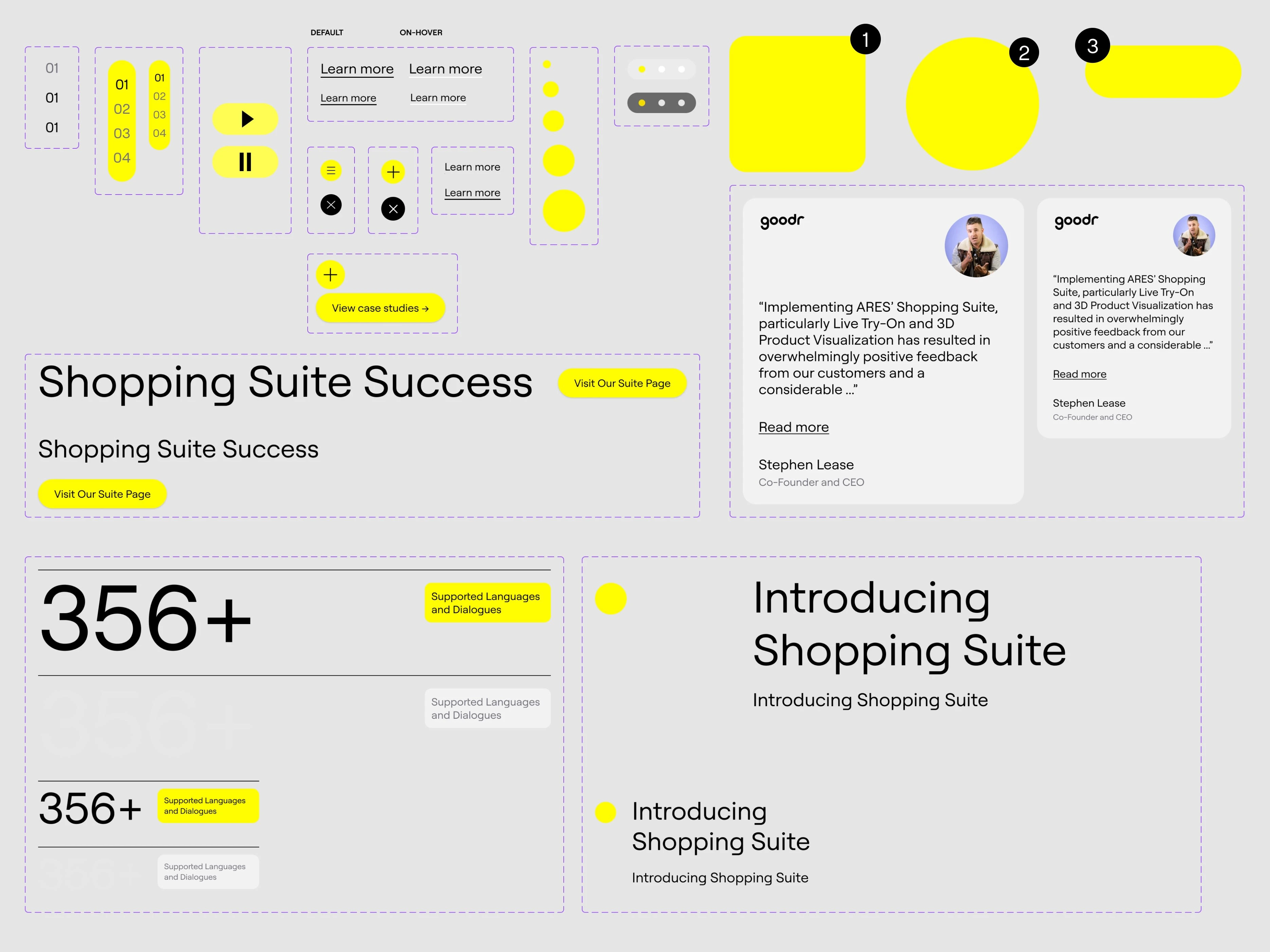
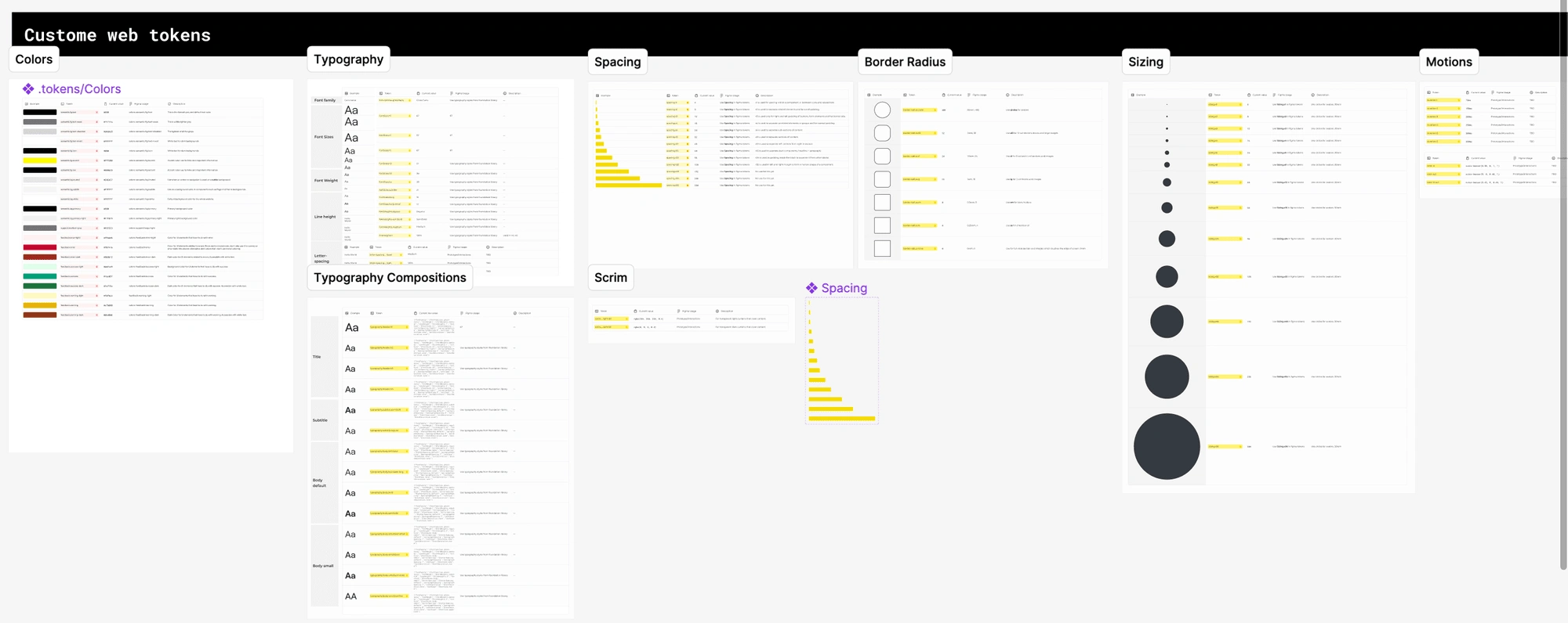
I built a library of design tokens containing over 100 tokens, including typography, spacing, and colors. I held weekly design reviews and created comprehensive documentation explaining their reasoning to ensure that the team was on board with our decisions. The design system is now used across numerous features and products, including the website, mobile app, and internal tools.
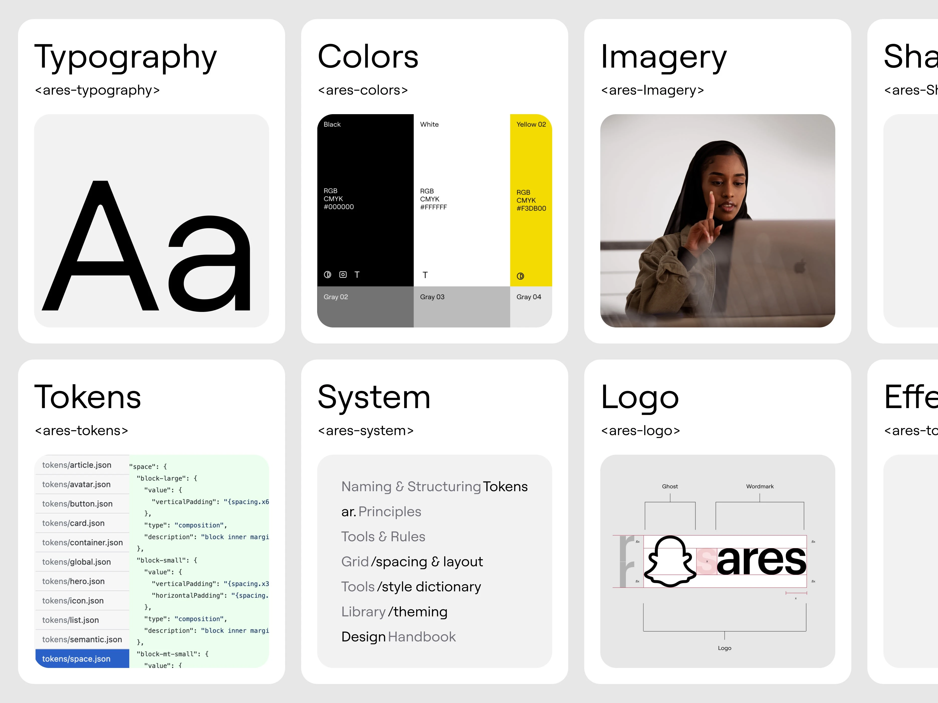
The Foundation
Components, variants, and tokens
We applied, managed, and synced design tokens from Figma to our internal supporting tools. We established the new brand at scale and brought efficient processes to our design and development teams.
We also identified an organic process to arrive at a practical system of systems for design tokens. We created a central repository for referencing past designs and design decisions. The design system also efficiently links each pattern with code that performs and is product-ready.
Components, variants, and tokens
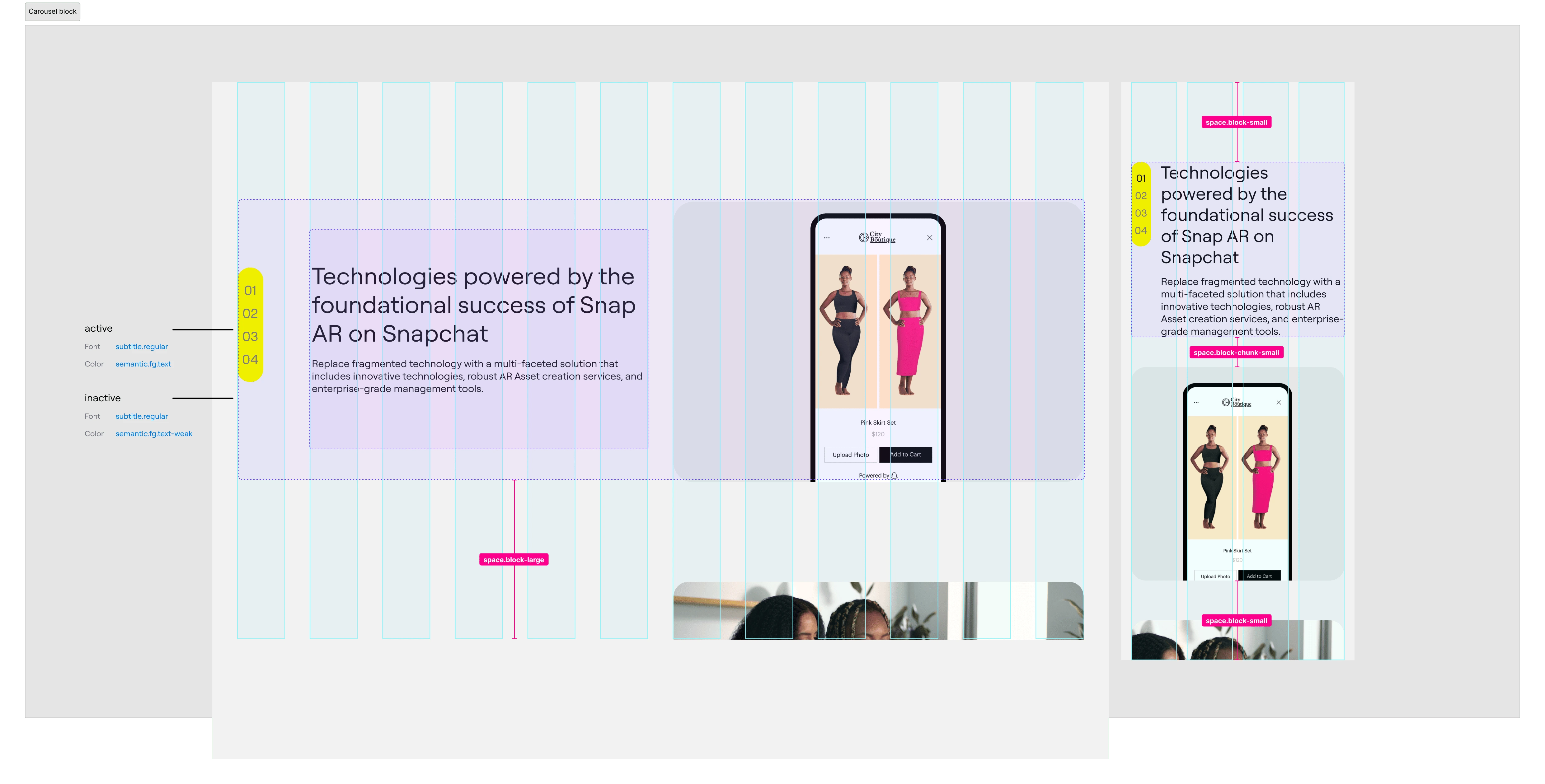
Nested components showcasing brand visual weight
We defined our design principles and values to create an effective design system. This step provided a solid framework that guided our decision-making process and resulted in a more consistent and valuable customer experience.
I acquired whatever tools and resources were used to plan quarterly initiatives and facilitate conversations about prioritization. I understood clearly what the feature teams planned to do in the next three months and how they broadcast those plans.
Nested components showcasing brand visual weight
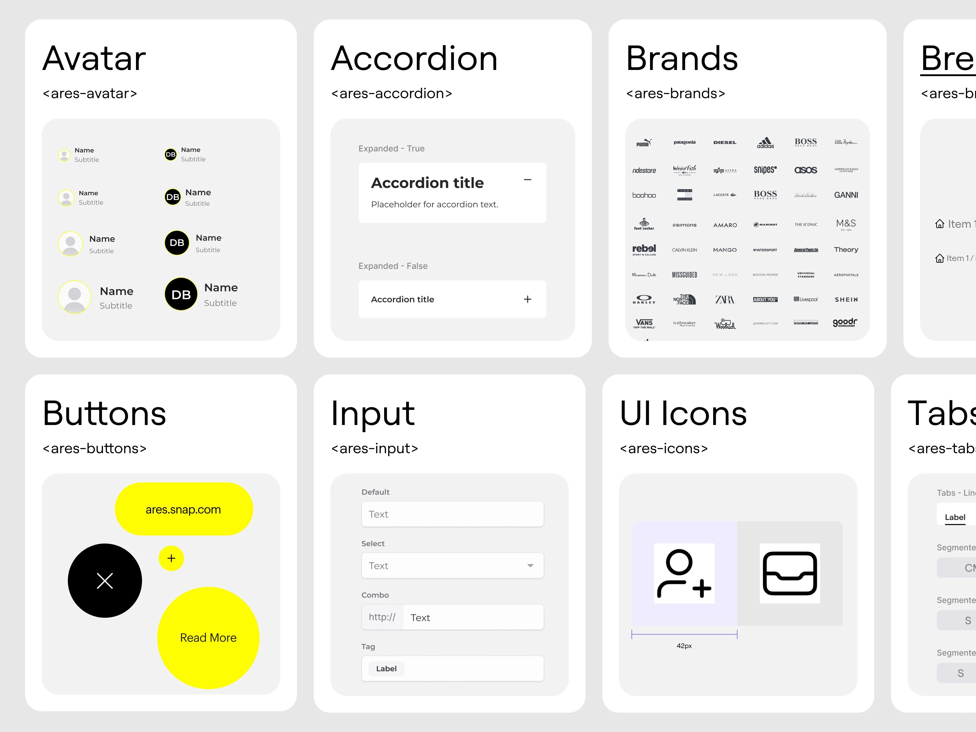
Interface inventory
We created an interface inventory showing all our product's solutions for in-app X and X. We ensured that each functionality was mapped to a single, production-ready pattern. Wherever that functionality appeared in our product, we applied a standardized pattern.
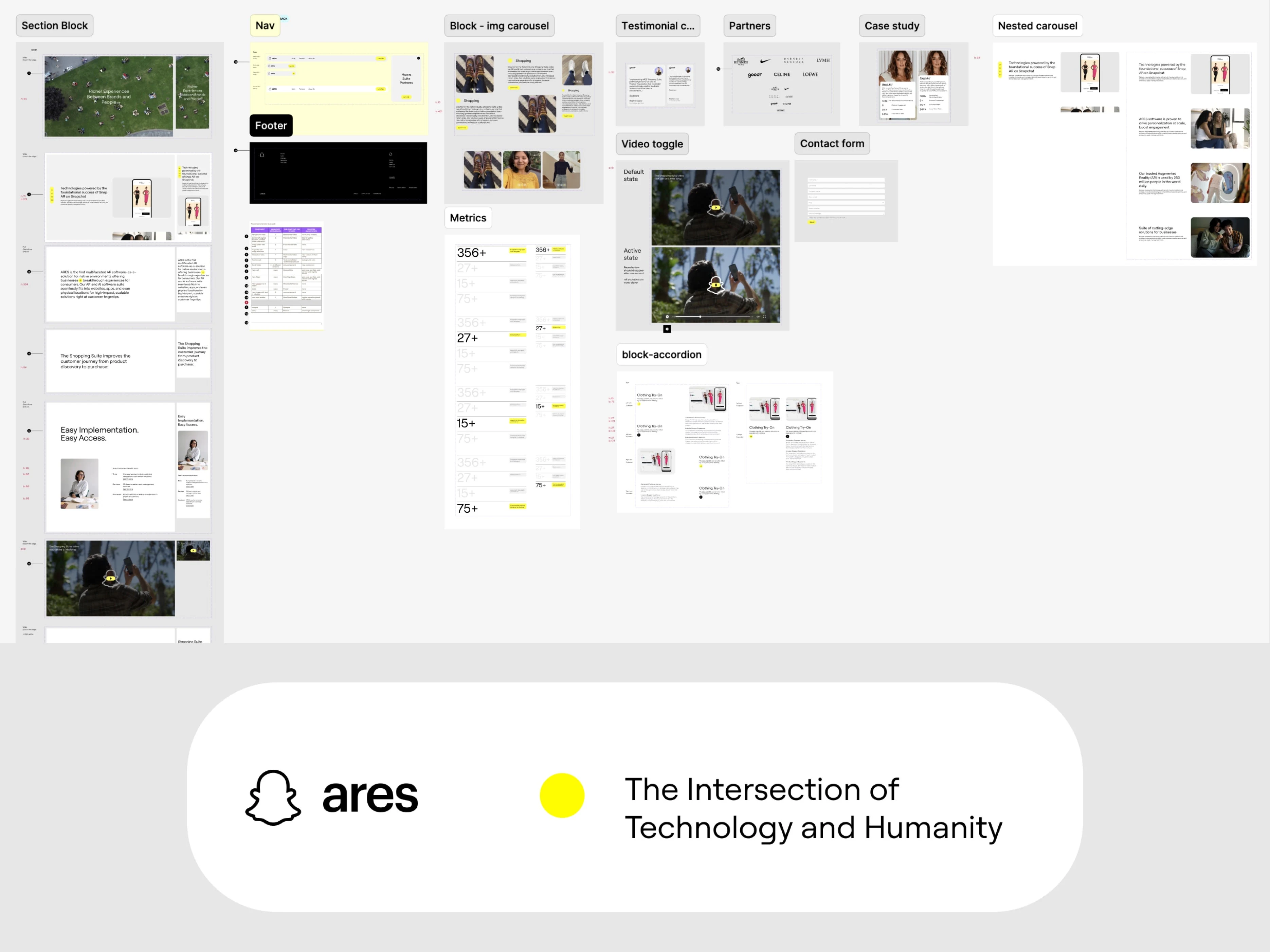
Interface inventory
Design language and documentation
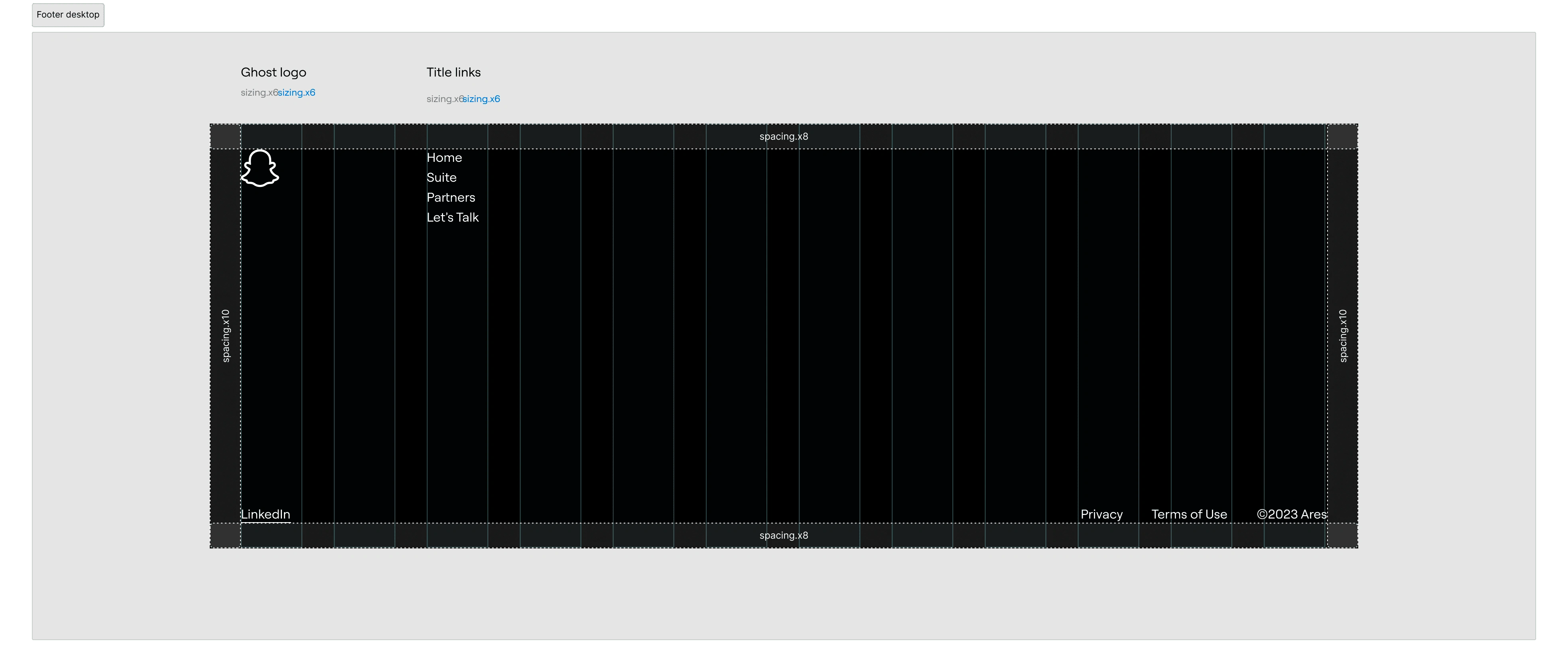
We streamlined the designs-to-product workflow, handed it over to a researcher for validation, and applied alpha testing. We also included internationalization best practices to ensure a genuinely cross-cultural experience, including flexible design for varying language length and font size, right-to-left language support, and support for local currencies, units, dates, times, and address formats.
Like this project
Posted May 14, 2024
Web design system and impactful landing pages using Framer + Figma. These designs were instrumental in enhancing user engagement and conversion rates.
Likes
0
Views
28
Clients
Snapchat


Molham – Senior Interaction Designer
Get your slice of the market
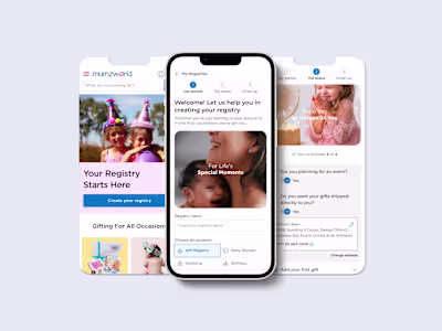
Gift Registry Feature in eCommerce App
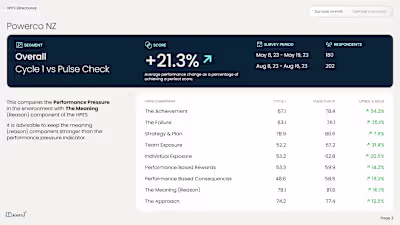
SaSS Dashboard Analytical tool