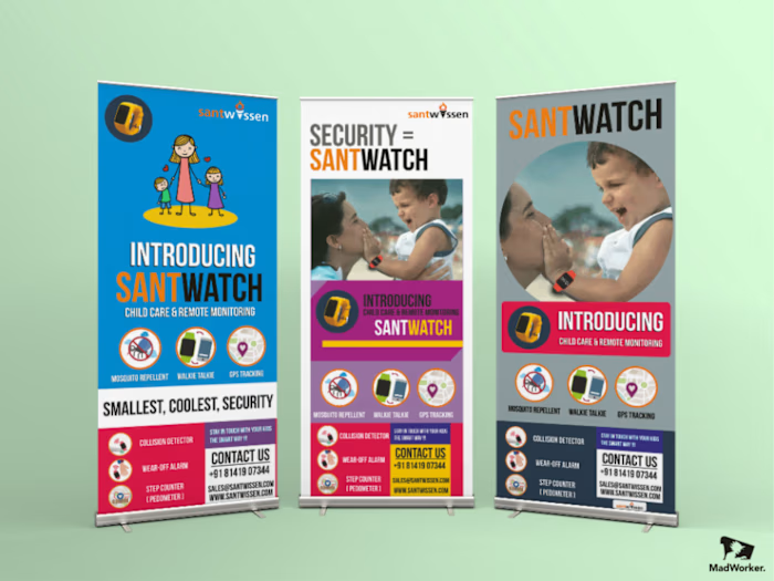
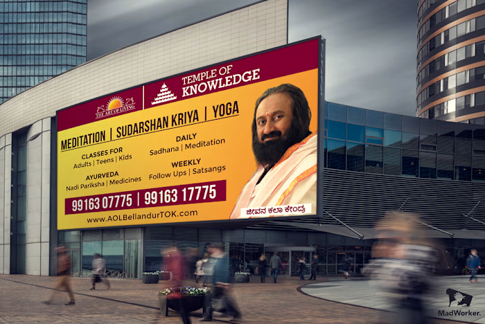
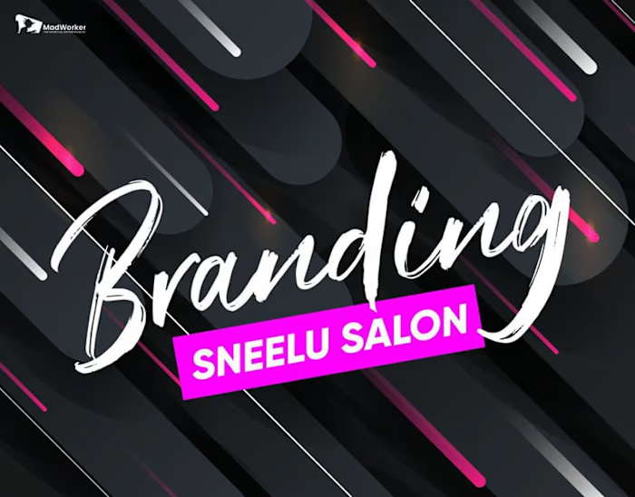
MadWorker Logo Folio | 2017 | Now BrandingBum

Madworker Logofolio 2017 – Designing Distinctiveness Across Domains
The Context
Back in 2017, before BrandingBum became a full-blown ecosystem studio, I was building identity systems under the name Madworker.
This logofolio was the visual foundation — a collection of logos crafted across industries, each built with strategic thinking, custom typography, and adaptive use cases.
These weren’t just “marks.”
Each logo in this collection solved a specific business need: recognition, recall, scale, emotion, or all of the above.
My Logo Philosophy (Madworker Era)
✔ Form Follows Function — The logo isn’t the brand. But it anchors everything.
✔ Timeless > Trendy — I focused on visual logic, not short-lived tricks.
✔ Modular Thinking — Designed logos with future packaging, signage, digital use in mind.
✔ Tone Matching — A logo must match the energy of the business, its founder, and the customer emotion it wants to trigger.
What’s Inside the 2017 Logofolio
Industries Covered:
F&B (Cafés, Catering Brands)
Education & Coaching
Proptech & Real Estate
Health & Wellness
Events, NGOs, and Social Campaigns
SaaS Startups & Local Tech Founders
Lifestyle & Beauty (Early D2C)
Design Styles Explored:
Iconic Marks + Wordmarks
Monoline and Geometric Forms
Typography-Driven Logos
Negative Space Experiments
Hindi + English Script Integrations (Bilingual brands)
What Made These Logos Effective:
Designed for multi-format use: signage, packaging, app icons, social media, event banners
Delivered in full logo systems: primary, secondary, stacked, monogram
Visualized in mock environments to help clients see the logo working in the real world
Clean handoff files: SVG, PNG, PDF, EPS, color variants + usage guides
What This Logofolio Taught Me
Business first, beauty second. The best logos came from deep founder conversations, not moodboards.
Your logo is not the flex—it’s the root. It’s what holds the brand steady across chaos.
Clients didn’t just want logos. They wanted clarity, storytelling, and confidence.
A good logo becomes a brand's decision filter. Once you nail it, everything aligns faster.
Why It Belongs In My Portfolio Today
Because Madworker wasn’t just my first design company.
It was the testing ground for the visual systems I now build at BrandingBum.
Every startup ecosystem I craft today—every book, product, AI agent—still begins with the same design rigor I used in 2017.
This logofolio proves:
I’ve been solving for brand identity with business impact since day one.
Like this project
Posted Mar 27, 2025
This is the Third & final edition of our logo design work done in 2017 , MadWorker is known for creativity and a balanced use of design to not only attract but…
Likes
0
Views
7
Timeline
Jan 1, 2017 - Ongoing


