Peard
Nikola M.
About Peard
Human connections have always been giving us a sense of acceptance, identity, and a feeling that we're not alone. In an age where people have never been as connected as today, surprisingly, it became difficult to form healthy relationships or establish deeper connections. On top of that, some people are seeking casual experiences as well.
Being a two-platform app, Peard paired people in a different way, separating the ones looking for a soulmate, and the ones looking for fun.
A new brand identity was created to help Peard communicate its vision to help people form more meaningful relationships, or just enjoy casual dates.
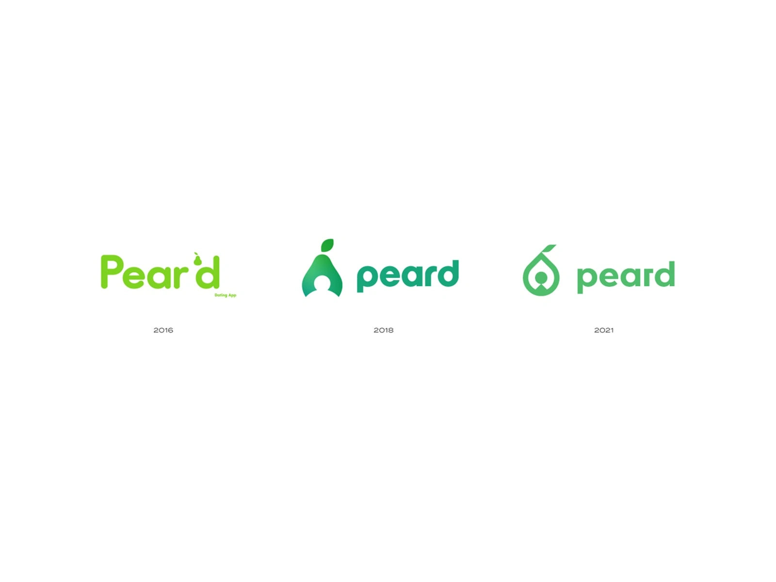
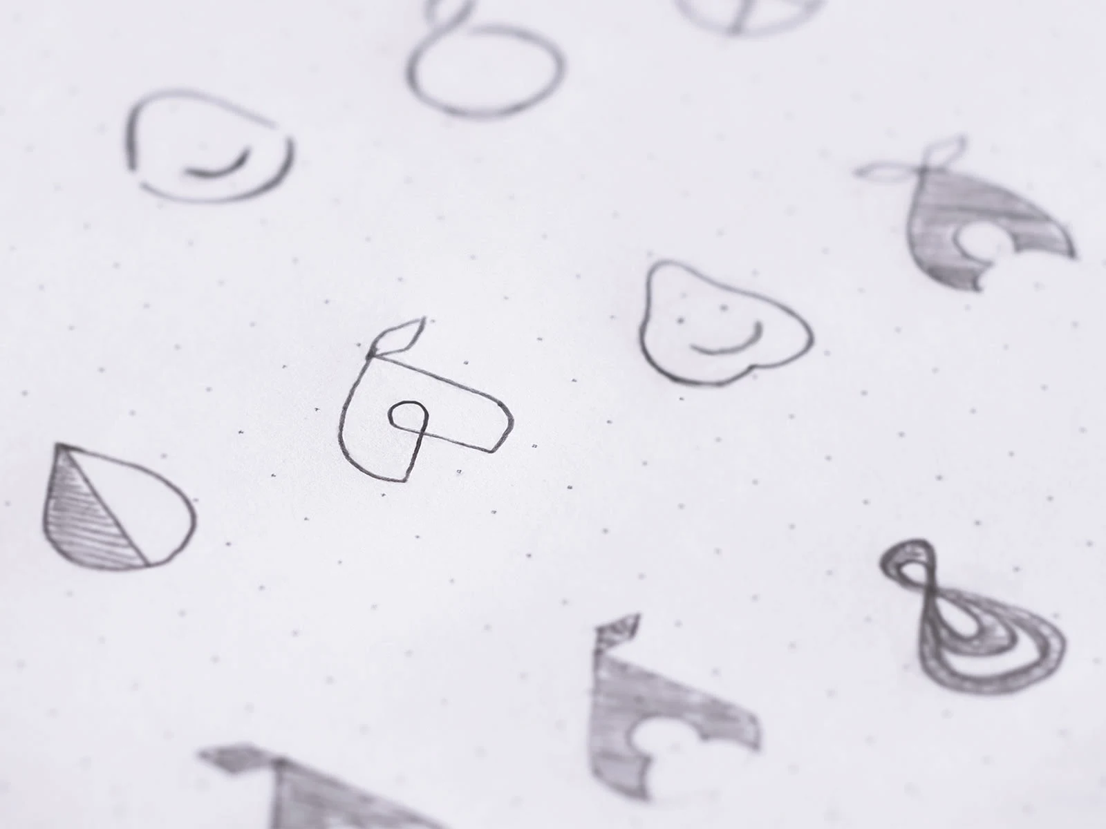
The logo went through multiple redesigns
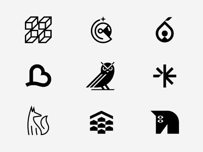
Logo concept
Some varieties like the Abate, are elongated, while others, Like Comice, are short. Asian Varieties like Nashi are round, and some others are more like... well, pears.
The challenge was to figure out an abstract yet detailed enough shape to be a vessel for all types of pears.
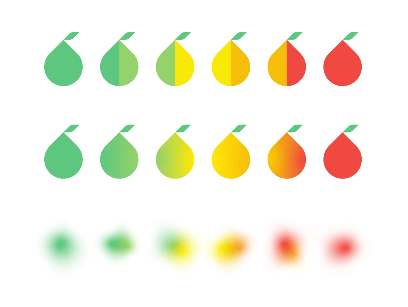
Color system
Unlike many other fruits, pears have a wide palette of alluring colors, ranging from chartreuse green to crimson red. Sometimes they're a canvas for an enticing blend of two colors offering an inspiration for vibrant gradients.
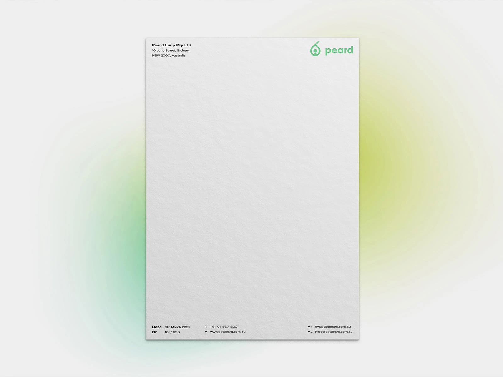
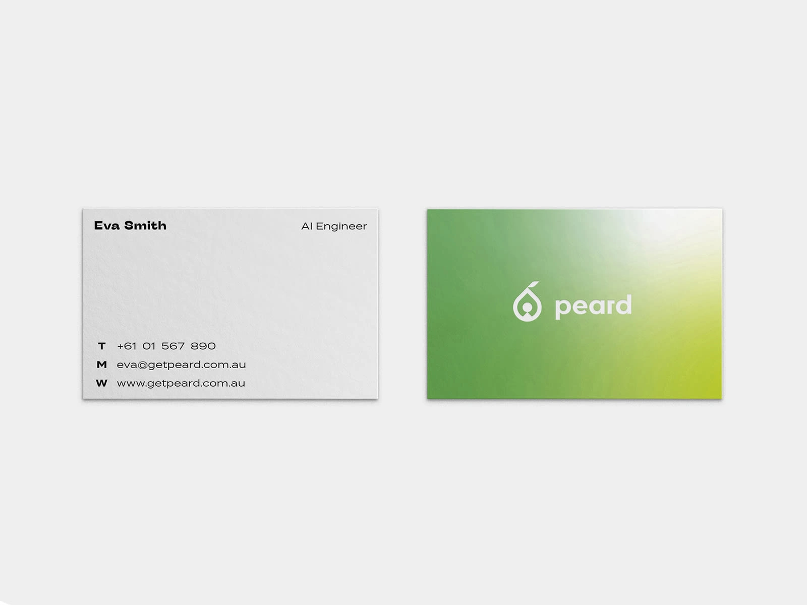
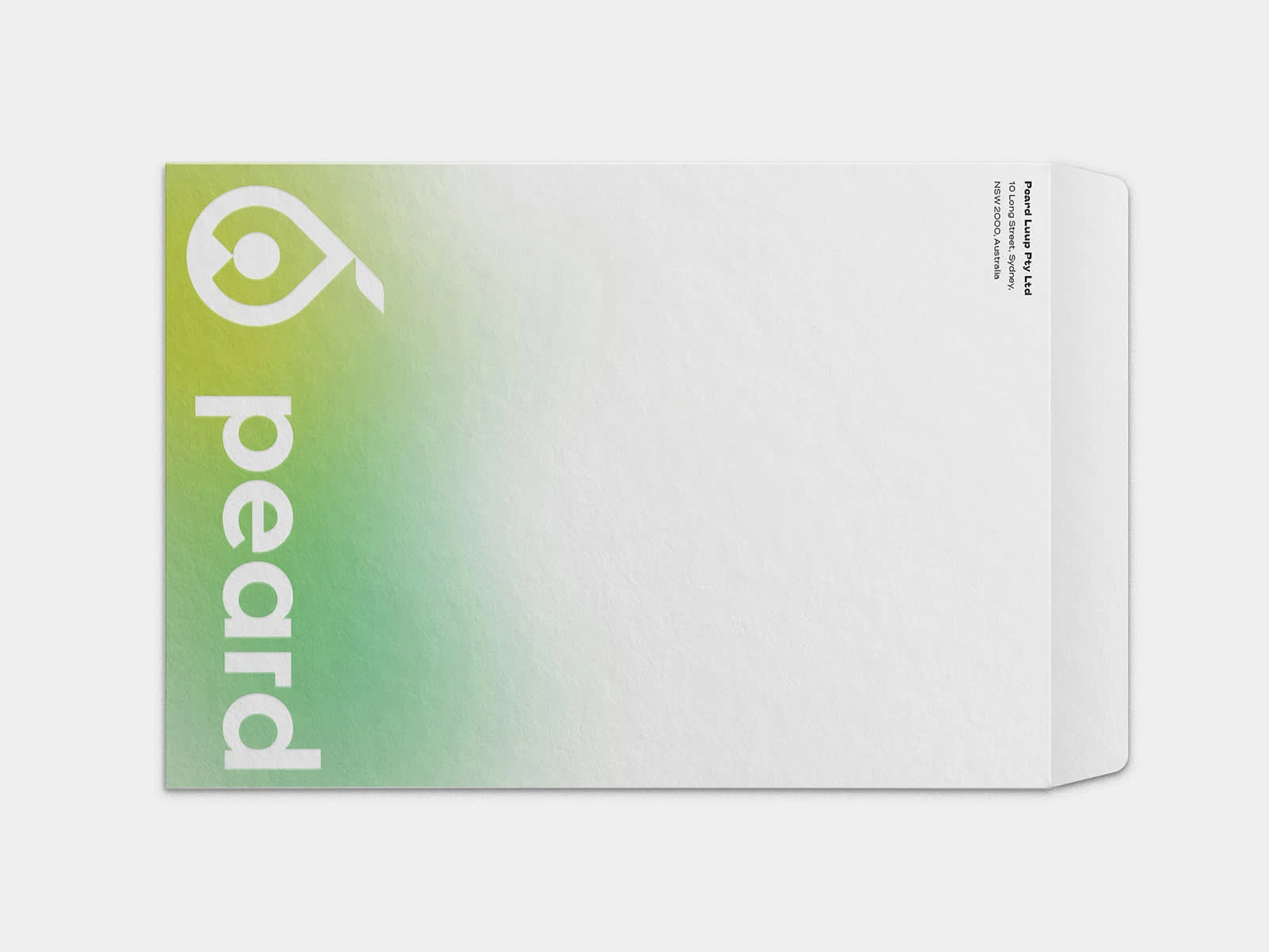
One of the services offered was the development of a comprehensive stationery design
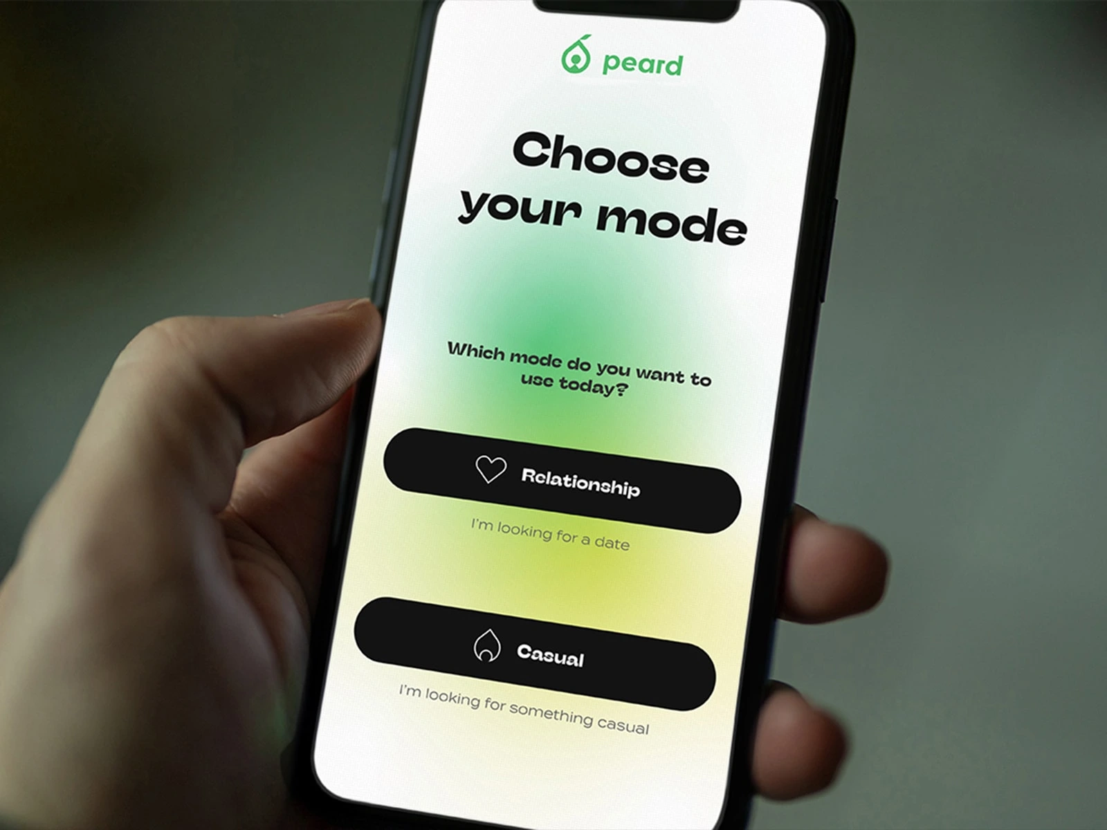
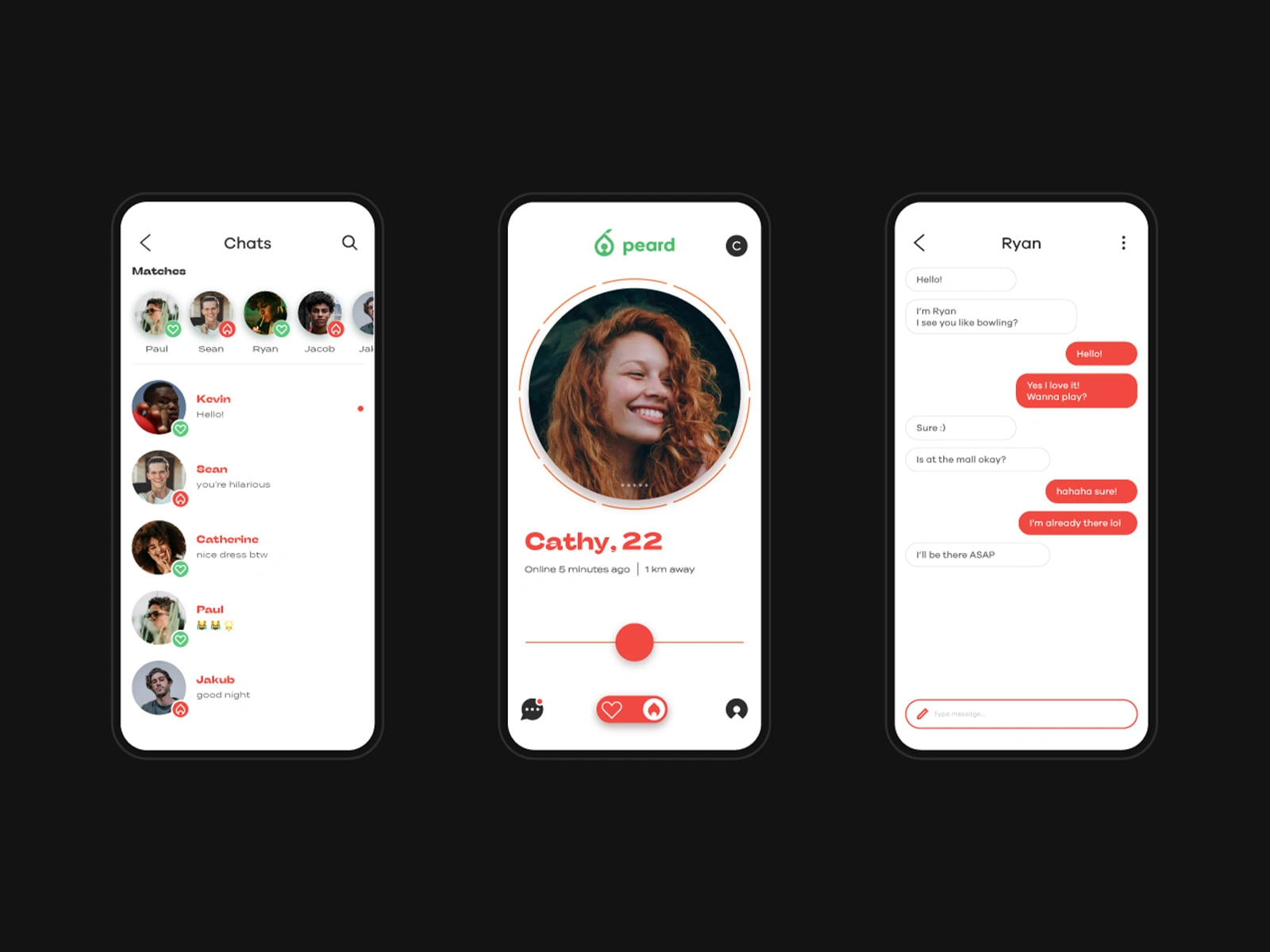
One of the services offered was UI and UX design of the app
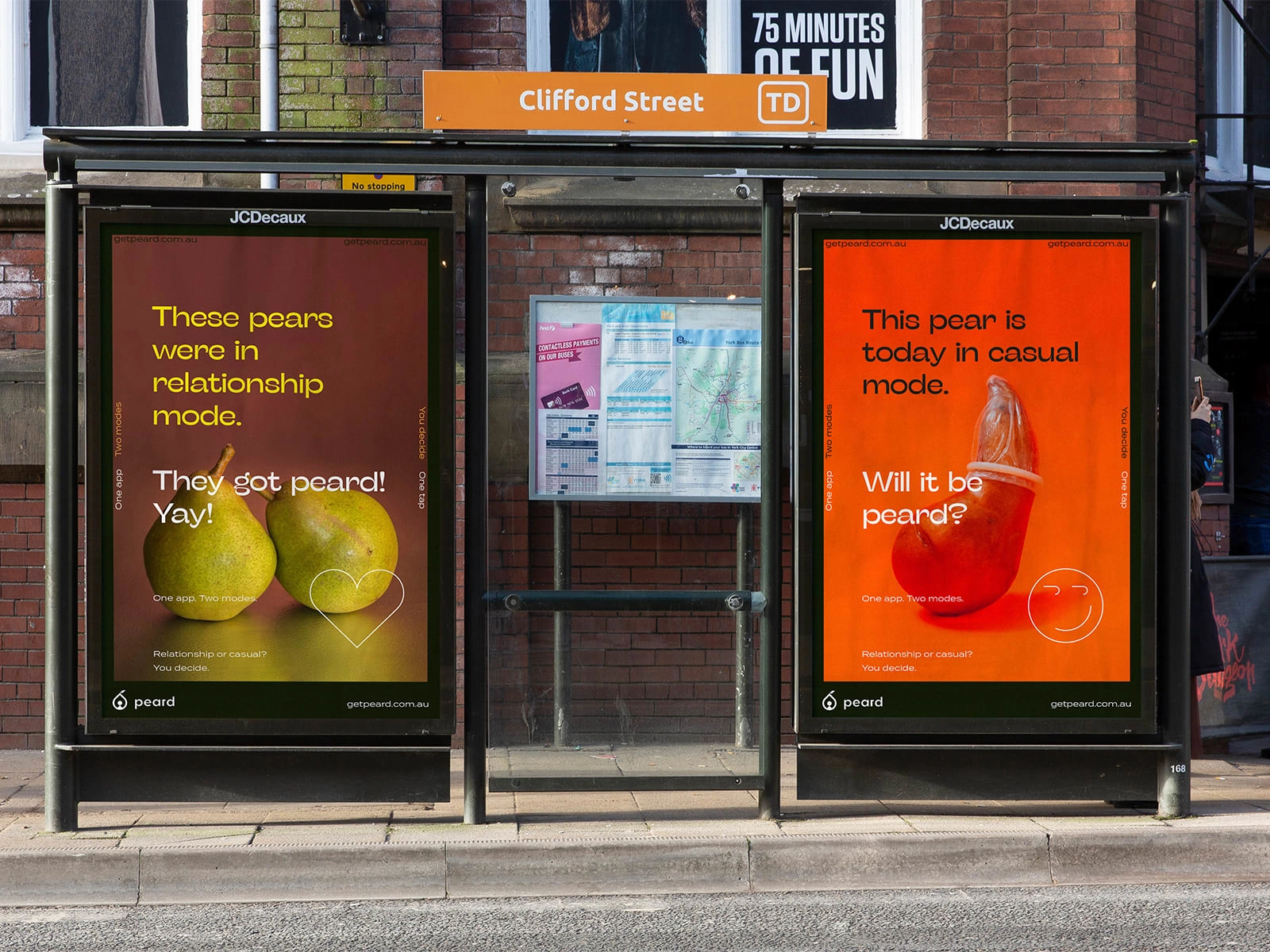
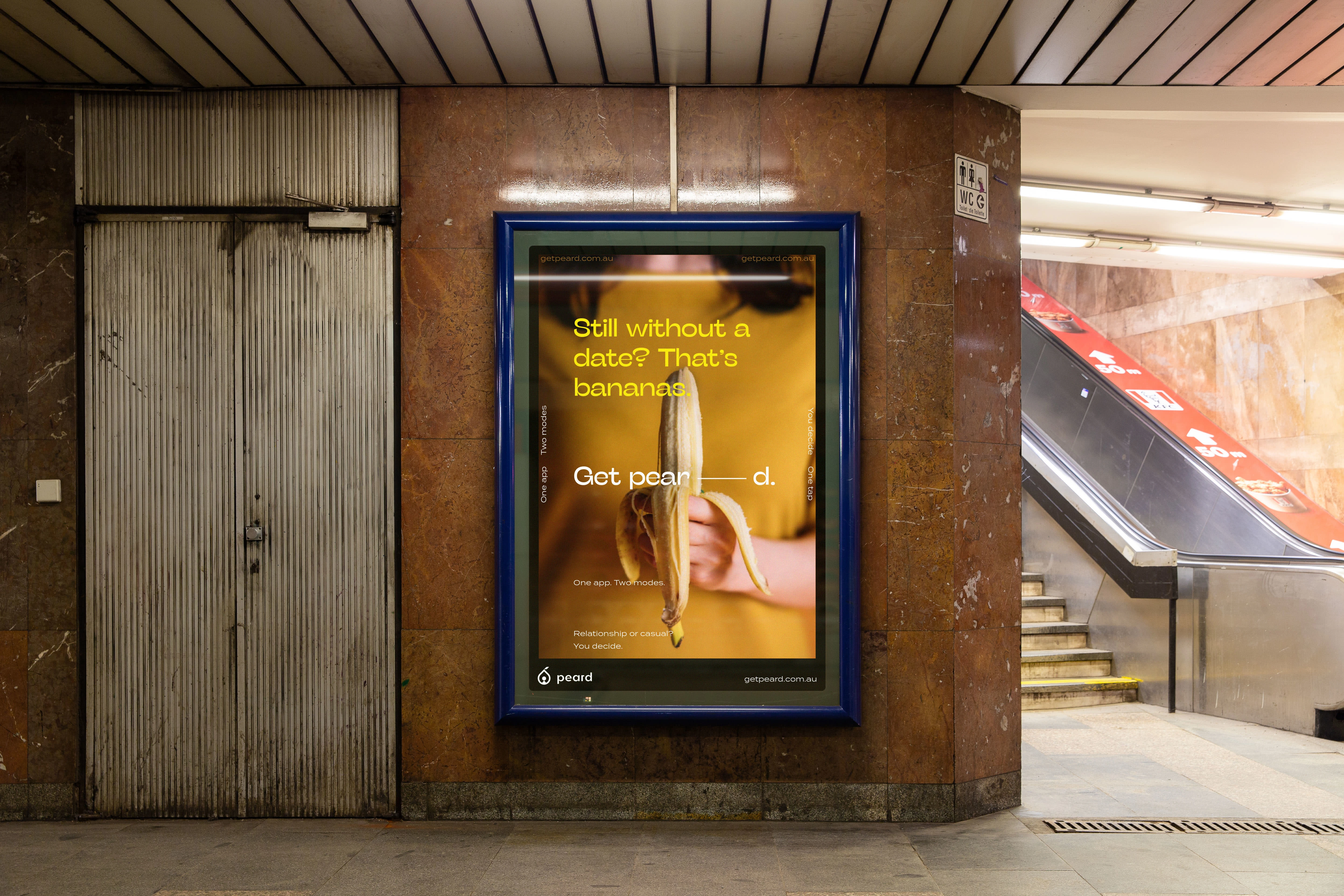
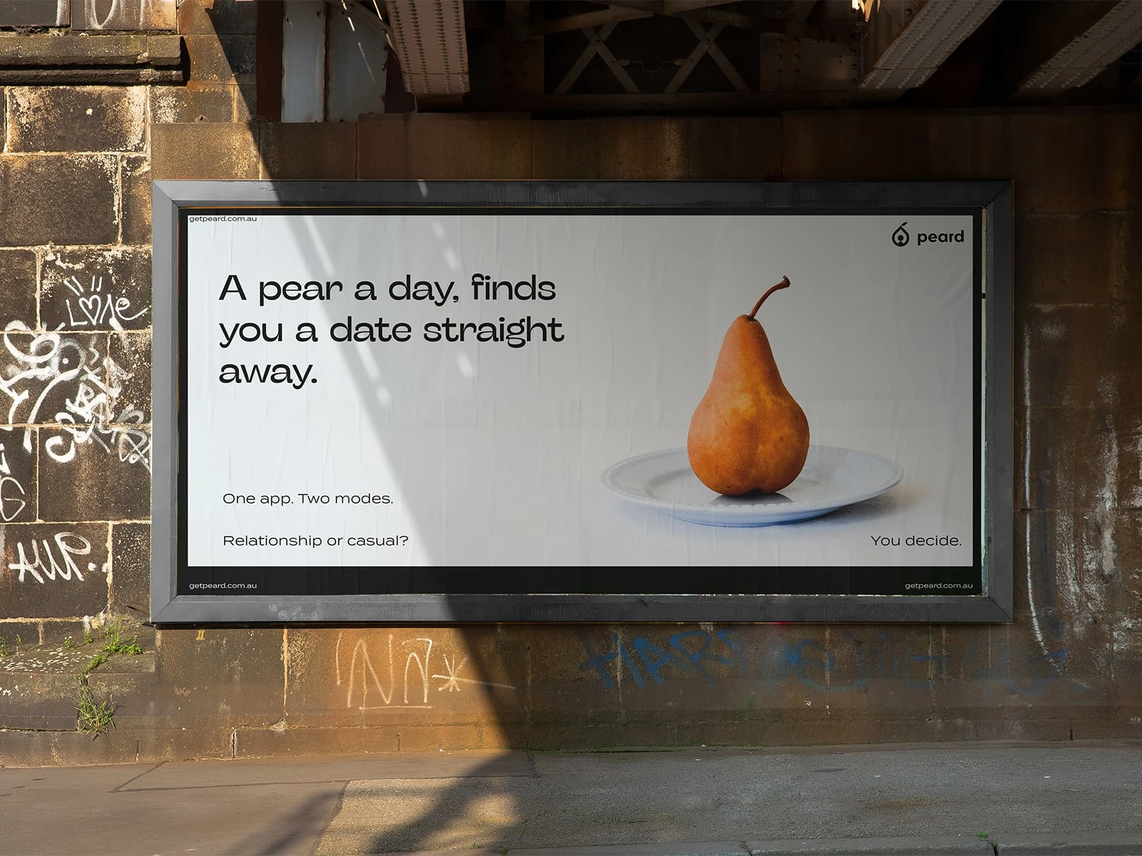
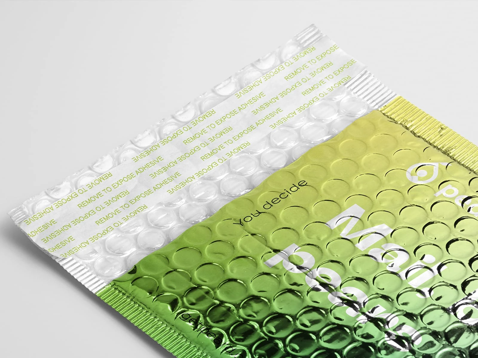
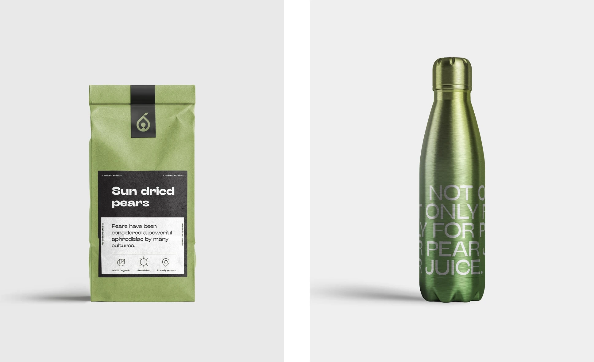
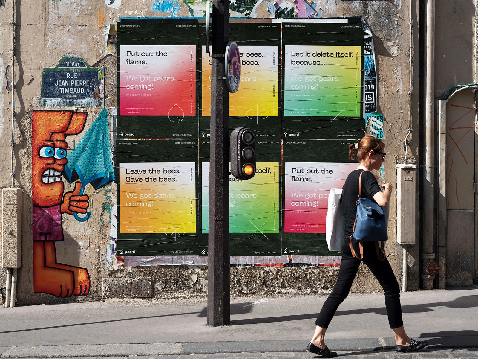
The project included also the creation of marketing assets such as posters and billboards
Check out the full project on Behance.
Like this project
Posted Mar 11, 2025
Rebranding for Peard, a dating app that pioneered the concept of two-platform dating apps.