Mobile App Redesign | Detrack Driver App UI Facelift (V5.0.0)
Zhi Nan Poh
Overview 🔎
This project is about redesigning the user interface of the Driver App to provide a delightful and intuitive onboarding experience for drivers.
For more information about this project, feel free to contact me!
My Role 👨💻
Analyse top-notch competitors in the market to brainstorm and iterate multiple design solutions
Collaborate with product owners, developers and engineers for technical feasibility
Finalise designs and release for implementation
Understanding Competitors in Detail 🧐
Analysed key screens and features of top-notch last mile delivery management software apps such as Track-POD, Onfleet, OptimoRoute and many more to gather design inspirations
Mainly focused on UI elements such as colours, typography (font size), spacing, information hierarchy, copy and micro-interactions to give a more refreshed yet distinct look and feel.
Problem Breakdown & Proposed Solutions 🎯
‼️ Top Problems to Resolve:
Visibility - unable to view and read key information clearly on Job List and POD page
Accessibility - buttons are too small to tap on, prone to making navigation errors
Organisation and Hierarchy - cluttered interface, components not evenly spaced, difficult to compartmentalise information, lack of prioritisation of elements
Content - extensive, redundant copy with lack of emphasis on key steps/instructions
Welcome Screen
Reduced spacing and increased button size for greater accessibility of key elements (i.e. CTAs)
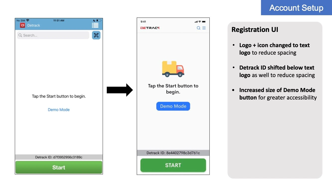
Registration UI - Existing Users
Menu Drawer
Colour change and addition of separators for greater visibility and distinction between various elements
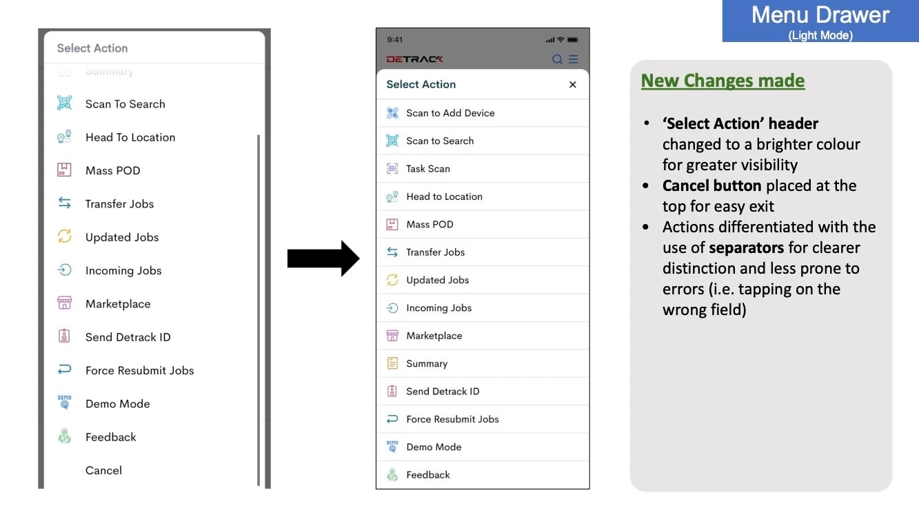
Menu Drawer - Light Mode
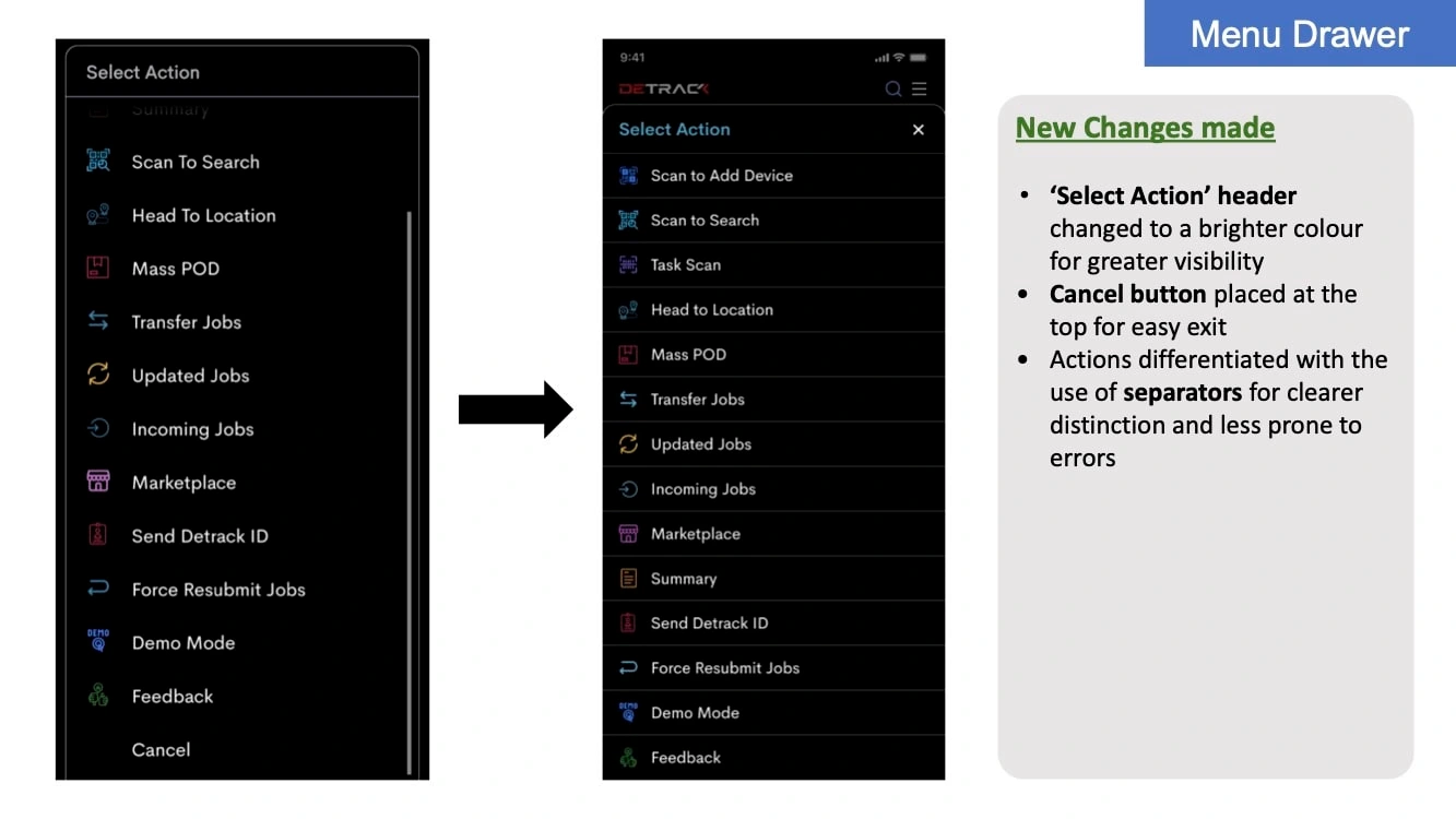
Menu Drawer - Dark Mode
Demo Mode
Added status indicator and changed copy for clearer differentiation between Demo Mode and Live Mode
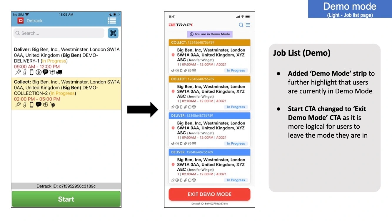
Demo Mode - Light Mode
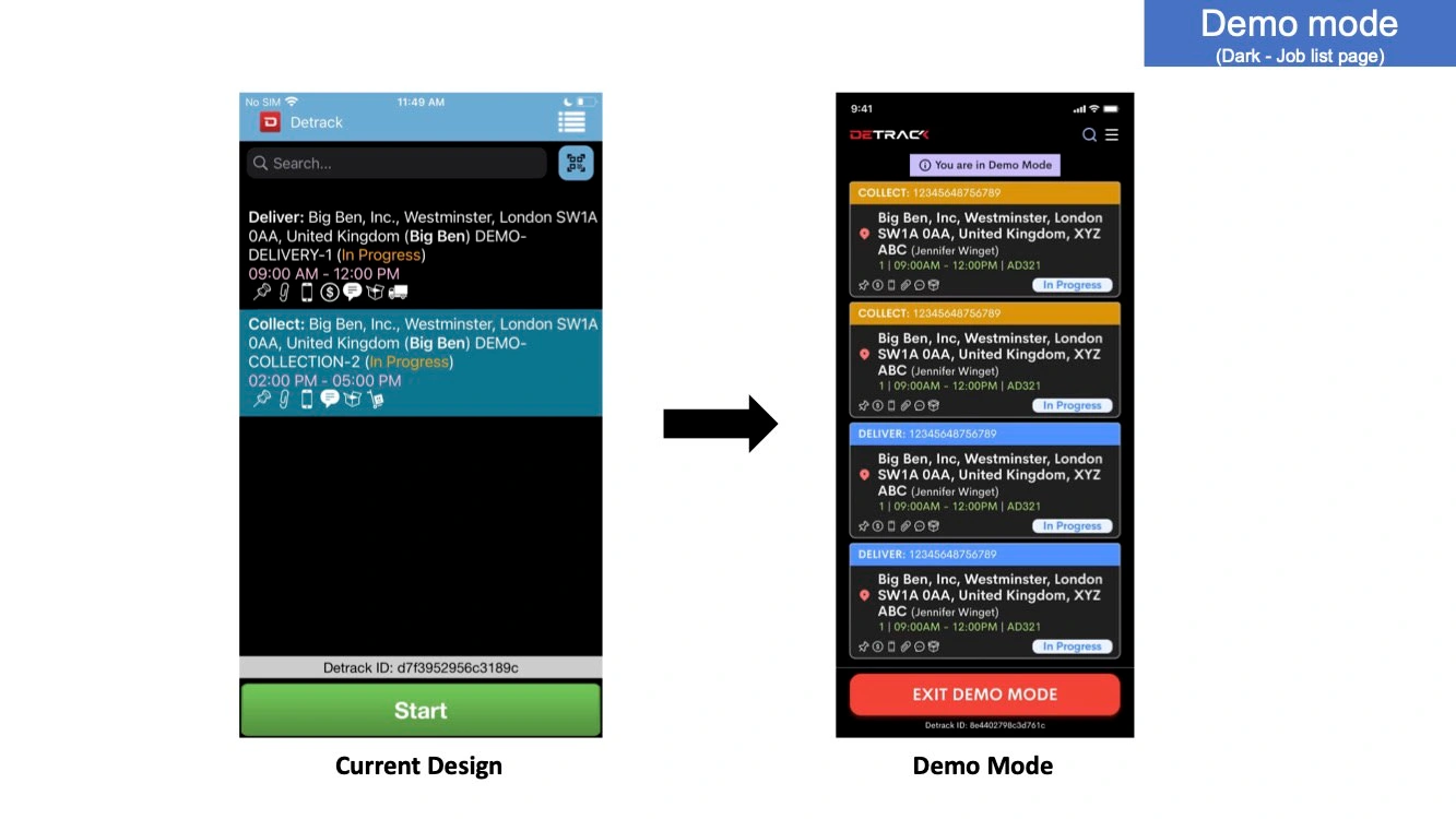
Demo Mode - Dark Mode
Job List
Addition of dropshadows, colour and typography (font weight) change, increased spacing for a cleaner, consistent, distinct look
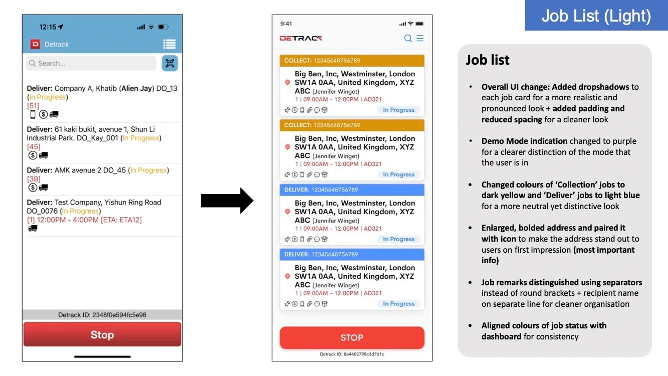
Job List - Light Mode
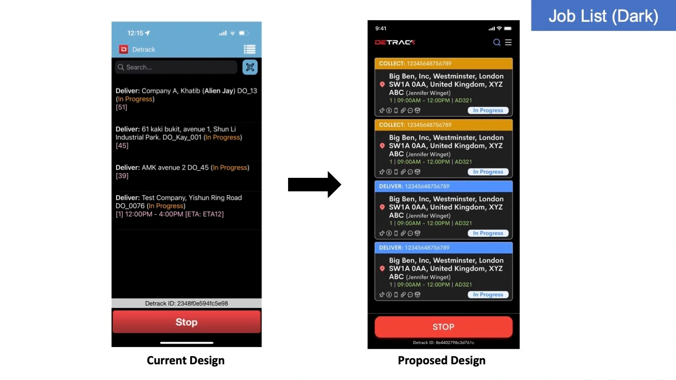
Job List - Dark Mode
Head to Location
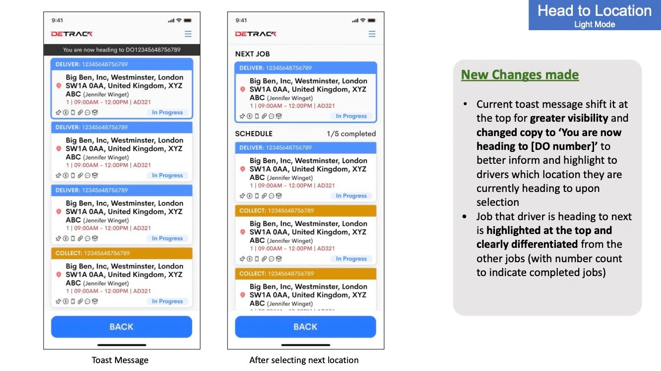
Head to Location - Light Mode
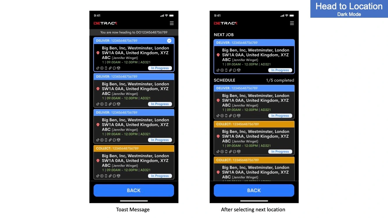
Head to Location - Dark Mode
Mass POD
Reorganised elements and added UI elements such as icons and strokes to increase visibility of system status
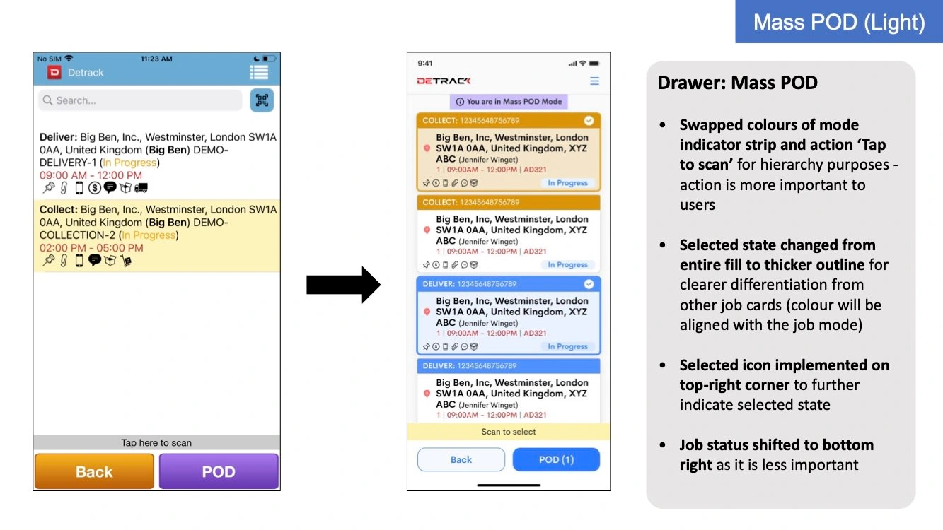
Mass POD - Light Mode
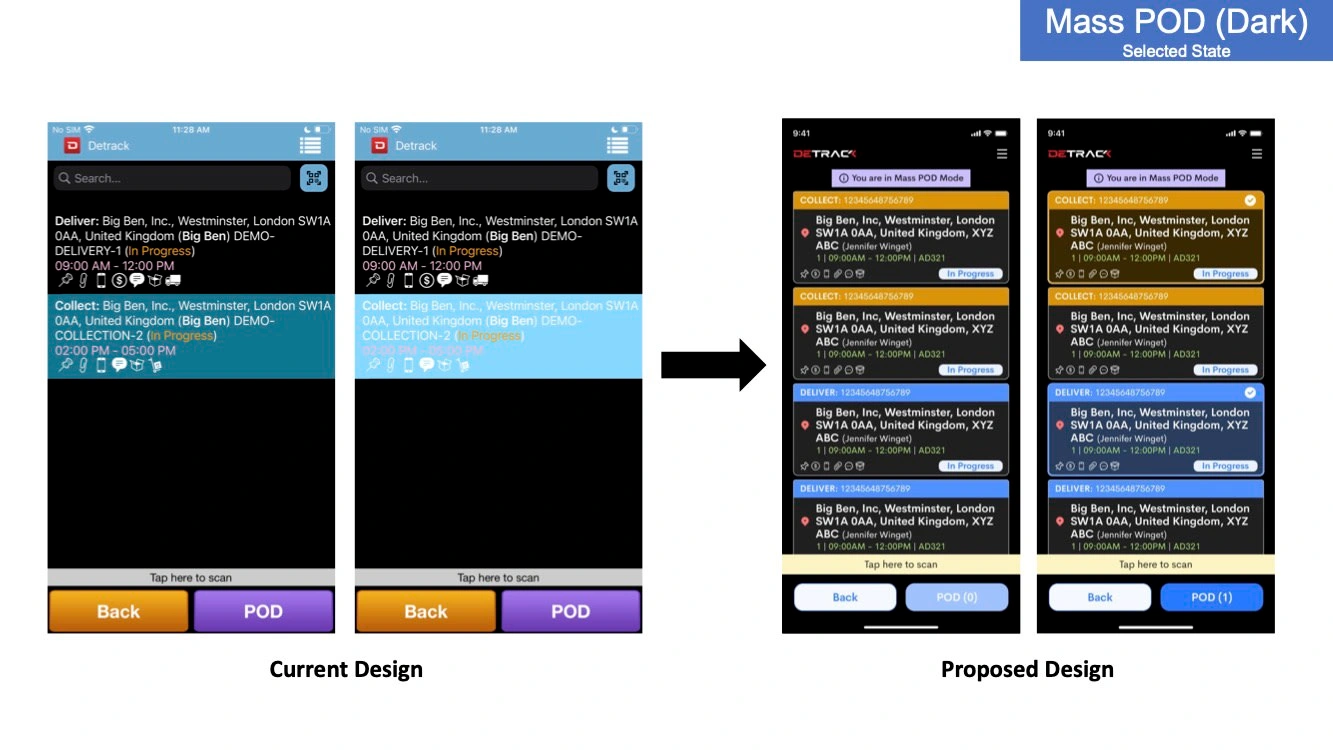
Mass POD - Dark Mode
POD page
Colour change and reduced spacing to establish information hierarchy as well as provide a more distinct look
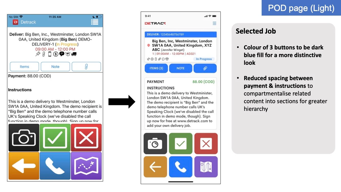
POD Page - Light Mode
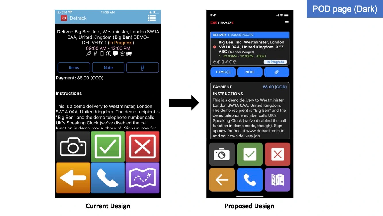
POD Page - Dark Mode
Takeaways 📣
Creating a streamlined user interface - Prioritising key elements and reduced clutter for a cleaner and more intuitive user experience
Improved visual hierarchy and consistency - Established a cohesive design language with clear visual cues and consistent elements
Enhanced accessibility - Designing with accessibility in mind by adhering to visual principles and conducted usability testing with drivers aged 30-50s (our target audience) for a more user-friendly and inclusive app
Like this project
Posted Aug 1, 2023
Redesigning Detrack's driver app with a brand new, refreshed look and feel