Website brand refresh: 9 pages, 3 collections, before and after

Vincent L. Anderson


Demo: fictional brand, not client work.
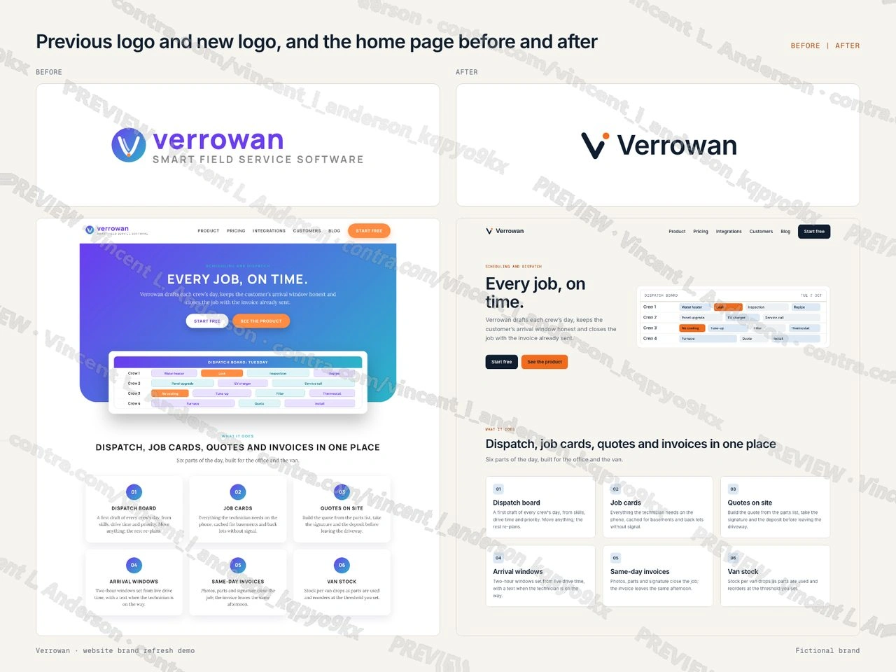
I made a website brand refresh for a fictional field service software brand, Verrowan. The brand got a previous logo and a new logo, both made for the demo, and the same 9-page site with 3 collections (Integrations, Customer stories and Blog, 13 items) was built twice: before, with the old identity, and after, with the new one. The after site updates the color palette (two primaries taken from the mark, with each text color pair on the after pages measured at WCAG AA), the typography (Inter in a six-step scale with mono labels) and the layout (a 12-column grid and an 8-point spacing scale), and applies them through shared components and style variables to every page and every collection item. The page map, the palette, the type, the layout and every page are shown before and after. The demo is structured like a Framer project.
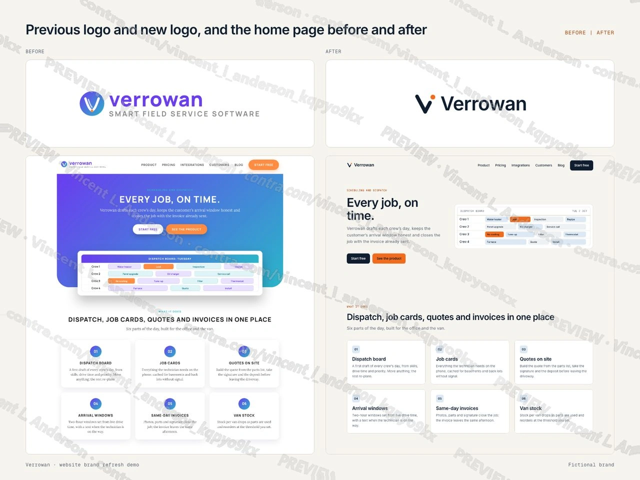
Previous logo and new logo, and the home page before and after
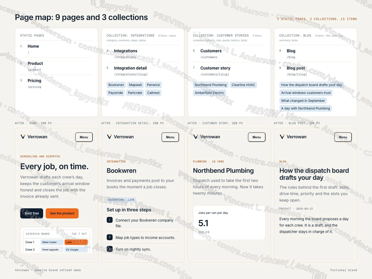
Page map: 9 pages and 3 collections
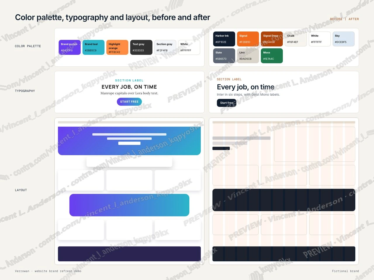
Color palette, typography and layout, before and after
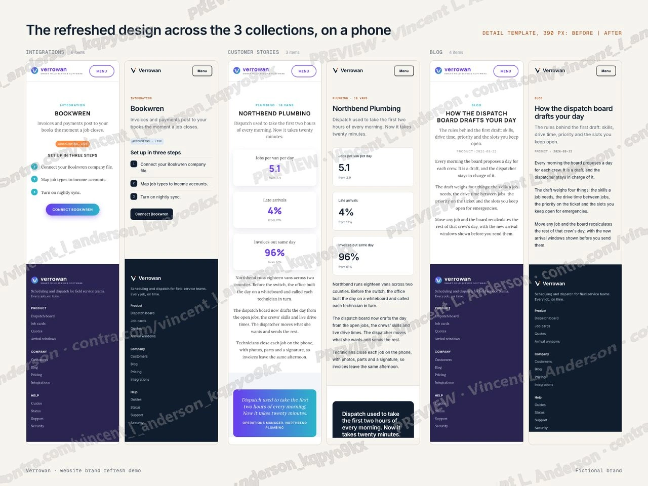
The refreshed design across the 3 collections, on a phone
Like this project
Posted Oct 7, 2026
A fictional field service software brand gets a new logo; its 9-page site with 3 collections is refreshed to match: color palette, typography and layout updated and applied to every page and collection item.
Likes
0
Views
2