Spinfluence Visual Identity Development

Julia Rakitina
Verified


Overview
Spinfluence is a music technology brand connecting producers with established artists, giving emerging creators access to meaningful professional feedback on their music.
I developed a visual identity that positions Spinfluence at the intersection of music production, technology, and contemporary nightlife culture. The project covered the core brand identity, custom logo design, typography and color systems, social media templates, and practical brand guidelines.
The goal was not simply to make the brand look music-related, but to establish a recognizable and scalable visual language that could grow across Spinfluence's digital ecosystem.
Challenges
Creating an identity that felt authentic to producers, artists, DJs, and nightlife culture without relying on predictable DJ or music-industry clichés.
Combining the energy of electronic music with the clarity expected from a modern technology product.
Making the letter "S" immediately recognizable while integrating a meaningful music-inspired concept into the logo.
Maintaining visual continuity with Spinfluence's existing digital presence.
Creating a social system that could produce varied content quickly without sacrificing brand consistency.
Ensuring the identity remained recognizable from small digital applications to larger-format executions.
Key Points
Complete visual identity system
Custom logo and isotype design
Vinyl groove-inspired brand concept
Color and digital palette
Inter-based typography system
7 modular social media templates
Post and Story design system
Figma Auto Layout implementation
Waveform-inspired graphic language
Brand moodboard and style guide
Logo clear-space and sizing standards
Scalable Figma design system
Tasks
Developed the overall creative direction and visual language for the Spinfluence brand.
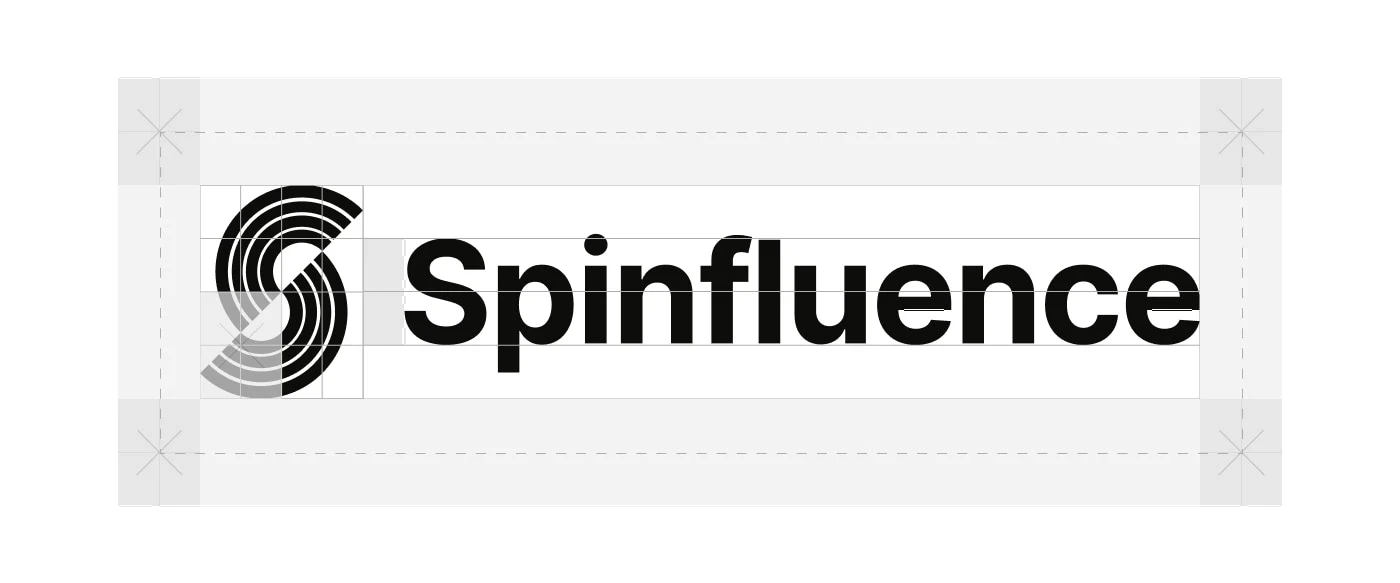
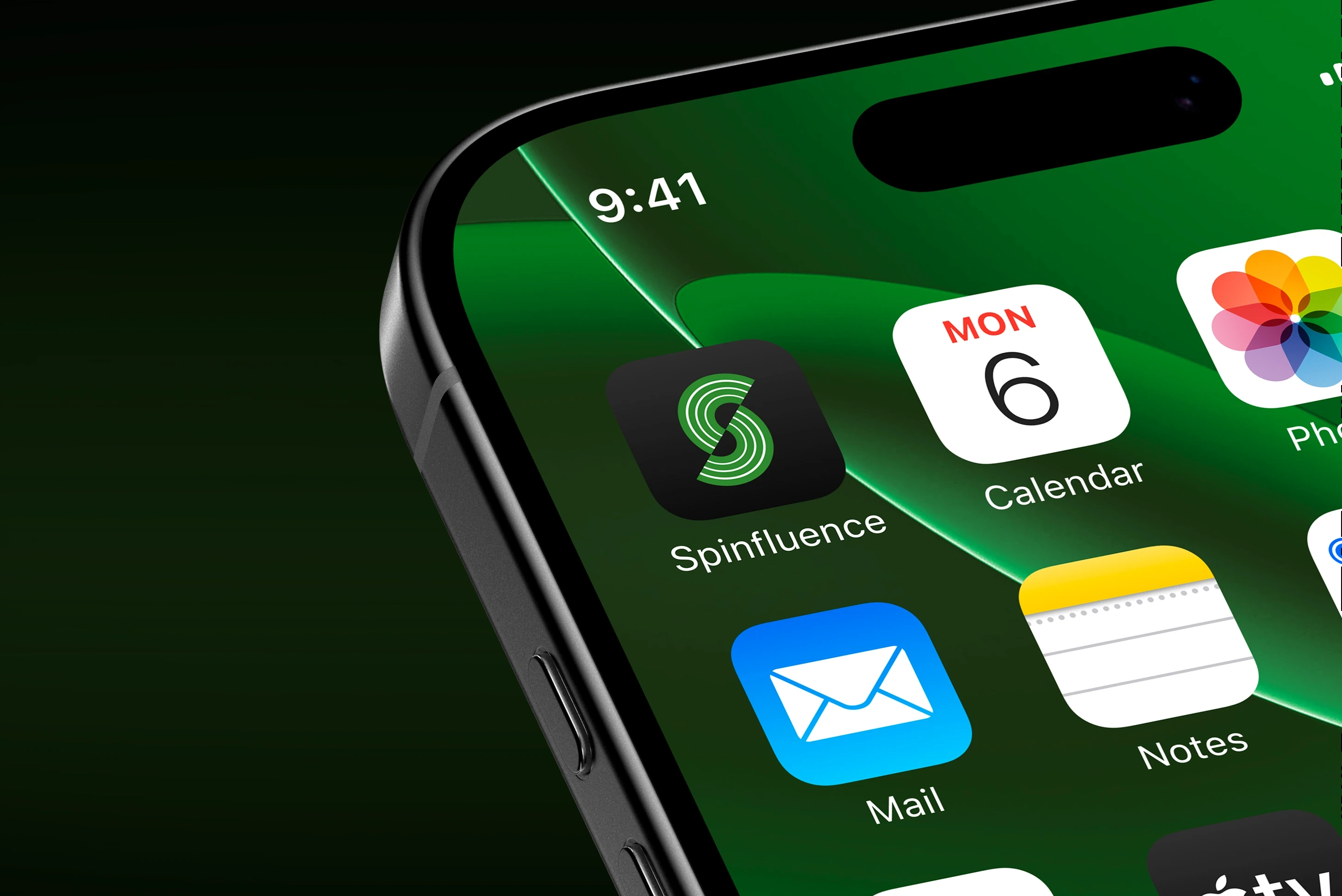
Designed a custom isotype combining the letter "S" with the concentric grooves of a vinyl record, creating a direct but distinctive connection to music culture.
Refined the logo's geometry, proportions, spacing, and scalability for consistent application.
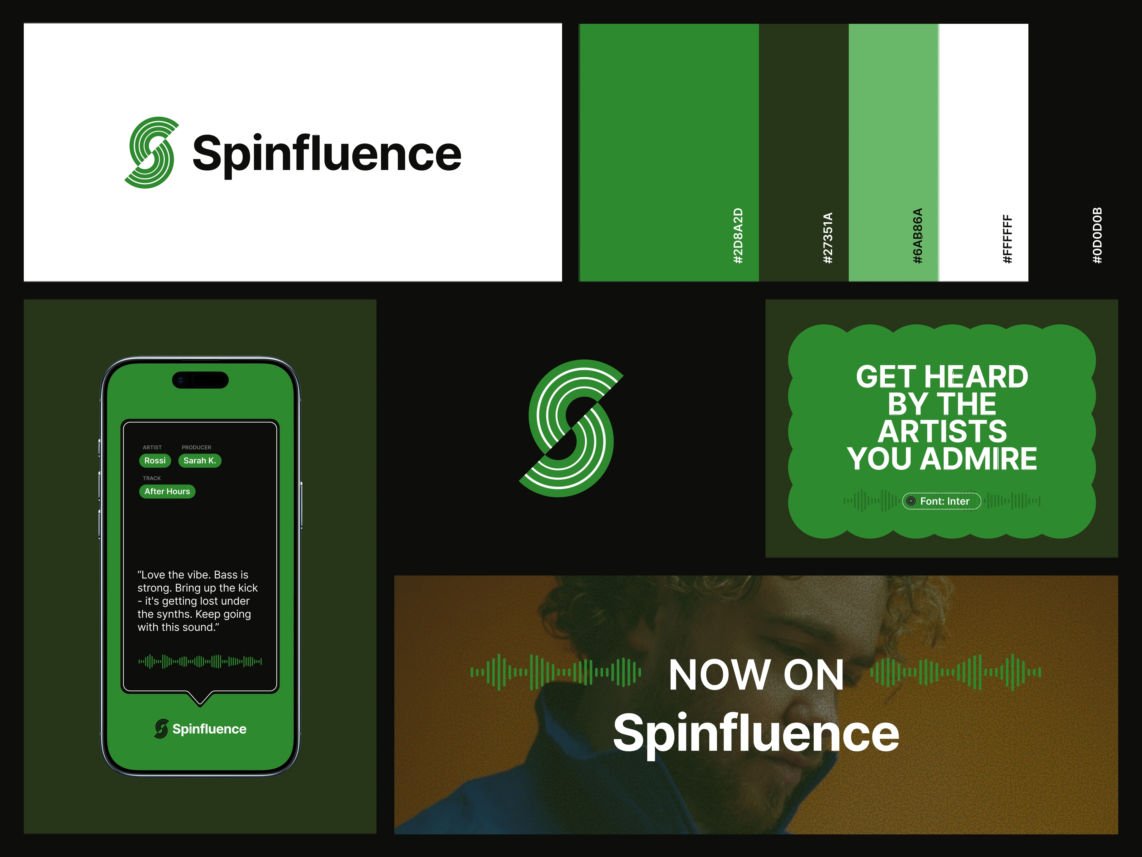
Built a cohesive color system and digital palette suited to high-energy music and nightlife content.
Established Inter as the core typography system, maintaining consistency with the existing website while supporting a clean, technology-driven aesthetic.
Developed waveform-inspired graphic elements to introduce rhythm and movement into static compositions.
Designed 7 flexible templates for social posts and Stories.
Built templates using Figma Auto Layout, enabling content to be updated efficiently while maintaining established spacing and hierarchy.
Defined clear-space rules, grids, typography hierarchy, layout behavior, and minimum logo sizes down to 24px applications.
Created a comprehensive brand moodboard and consolidated the identity standards into an easy-to-reference brand style guide.
Delivered organized, reusable Figma assets for continued brand and social content production.
Impact
The project gave Spinfluence a distinctive and unified visual foundation that reflects both sides of the product: the energy and authenticity of music culture and the sophistication of a modern technology platform.
The modular social system extended that identity beyond the logo into a repeatable content framework, enabling faster production while keeping posts and Stories visually recognizable.
Together, the identity, guidelines, and reusable Figma system provided Spinfluence with a scalable brand toolkit designed to remain consistent as its community, content, and digital presence grow.
Like this project
What the client had to say
Julia is a superstar. She is extremely diligent and professional. Service and responsiveness were fantastic. His expertise is at the very highest level. She treated my project like her own. Highly recommend her to mobile expert seekers.

Michael Gupta
May 13, 2026, Client
Posted Aug 19, 2026
Built a high-energy visual identity and modular social system for Spinfluence, connecting music technology, artist culture, and modern nightlife.
Likes
3
Views
13
Timeline
May 8, 2026 - May 13, 2026
Clients
Spinfluence