PlusCredit Website Redesign

Micheal Abiola
Verified


PlusCredit: Website Redesign for a Canadian Credit-Building Fintech
Role: UI/UX Designer
Client: PlusCredit Ltd., Calgary, Canada
Scope: Website design: wireframes, high-fidelity mockups (web and mobile), site architecture, design language, illustration and motion assets, design library, handoff
Build environment: Elementor / WordPress
Tools: Figma, Adobe (Illustrator, After Effects)
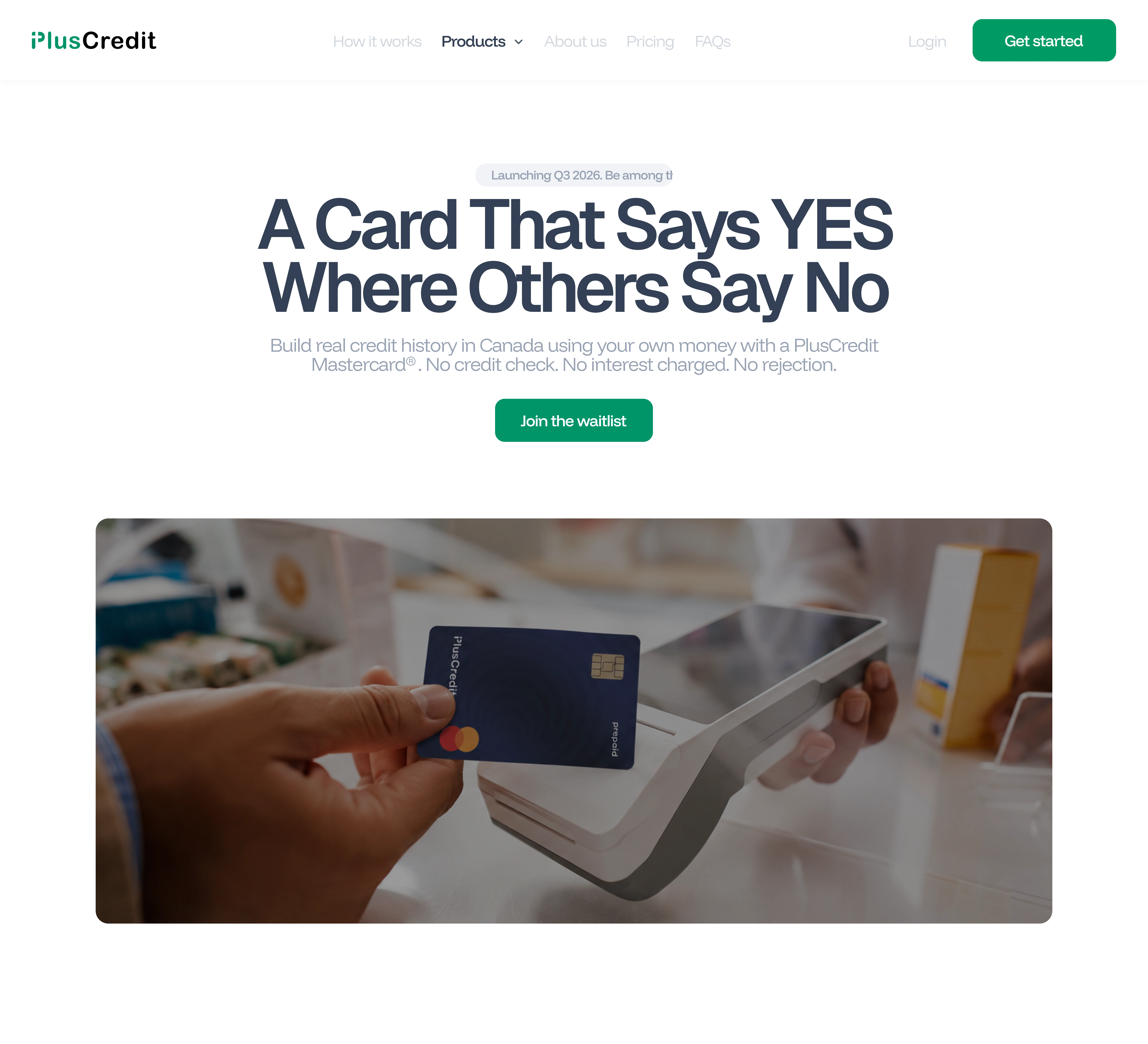
Home Section for the Prepaid Product
1. Overview
PlusCredit is a Canadian fintech that helps people build credit without taking on debt. Its products include a prepaid Mastercard, a secured card, and Jars, a way to set money aside for specific goals. The company needed a full website that explained these products clearly, built trust with first-time and rebuilding credit users, and gave their developers a clean system to build from.
2. The Problem
Credit products are hard to explain, and the audience is cautious. PlusCredit's customers are often newcomers to Canada, students, or people rebuilding after setbacks. Many have been burned by confusing fees or have no history for lenders to see.
The site had to do four things at once:
Explain several related products without making them blur together
Say plainly that these are not loans and carry no interest
Show progress and outcomes, not just features
Feel modern and approachable, not like a bank
3. Goals
Make each product understandable in one scroll
Give every page a clear, prominent primary CTA
Keep navigation, forms, and imagery usable on web and mobile
Deliver a design system the PlusCredit team can extend without needing an in house designer
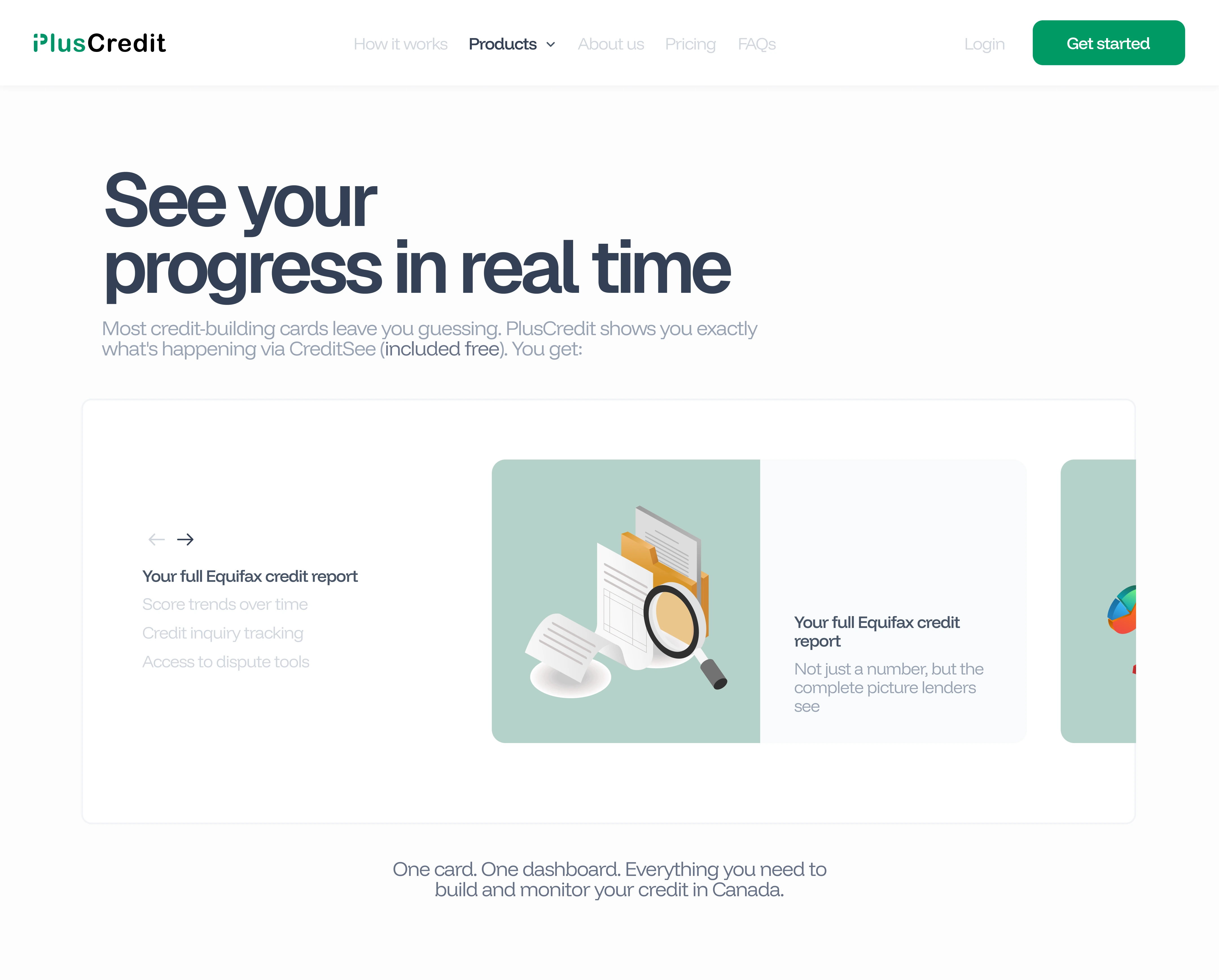
Benefits of the Prepaid Section
4. Process
Discovery. I ran a website design intake questionnaire with the PlusCredit team to document audience, tone, product priorities, and constraints.
Alignment with the team and founder. I held several syncs with the PlusCredit team and the founder throughout the project. These made sure the design matched what they wanted from the site, and caught misreadings early instead of at review.
Scope clarity. Some deliverables, such as "template page" and "sales page," left room for interpretation. I asked for a page-by-page brief before kickoff so both sides had the same definition of done.
Two design directions. I presented a proposal deck with two named directions, CLARITY and PULSE. PlusCredit chose PULSE.
Architecture and wireframes. Site map first, then low-fidelity wireframes for every page.
High-fidelity design. Desktop and mobile mockups, with typography, color, spacing, and visual hierarchy set against modern conversion-focused patterns.
Illustration and motion. I designed a set of custom illustrations and animations so the product concepts (transfers, prepaid cards, Canadian access, saving) could be shown instead of described. I also wrote an animation specification covering nine animations across the site, so motion was designed deliberately and was buildable in Elementor.
Systemization and handoff. Component audit for consistency and accessibility, new components documented, Figma library organized for developer handoff.
Work was delivered in five phases, with each page signed off in writing before the next phase began.
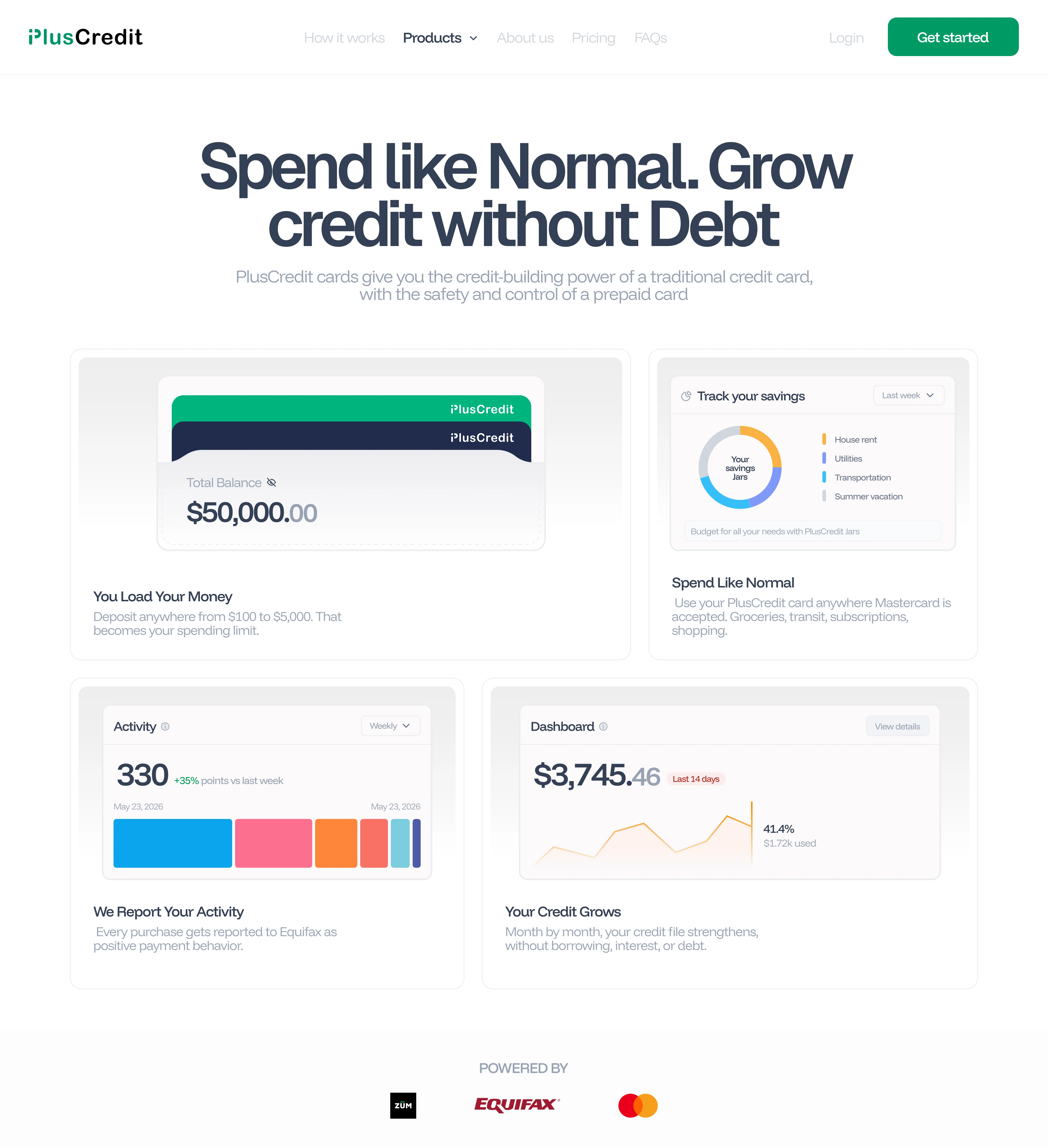
Features of the PlusCredit Prepaid Card
5. Expectations vs. Delivered
The project ran in five phases, each tied to written sign-off.
Phase 1: Core pages. Core marketing pages, including the prepaid card page. Designed for web and mobile. The prepaid page is live and covered below.
Phase 2: Credit building and templates. A credit-building sales page, a sales template, and a blog page. [Add one line on what was delivered, or remove this phase.]
Phase 3: Product pages. Product sales pages plus a contact and FAQ page. [Add one line, or remove this phase.]
Phase 4: Extra assets. Additional graphic assets and one extra template page. Delivered a custom illustration and motion set. [Add one line.]
Phase 5: Design system and handoff. Figma library, design system, component library, and handoff documentation. [Add: component count, structure, documentation.]
Only the prepaid page has launched, so it is the one shown in detail.
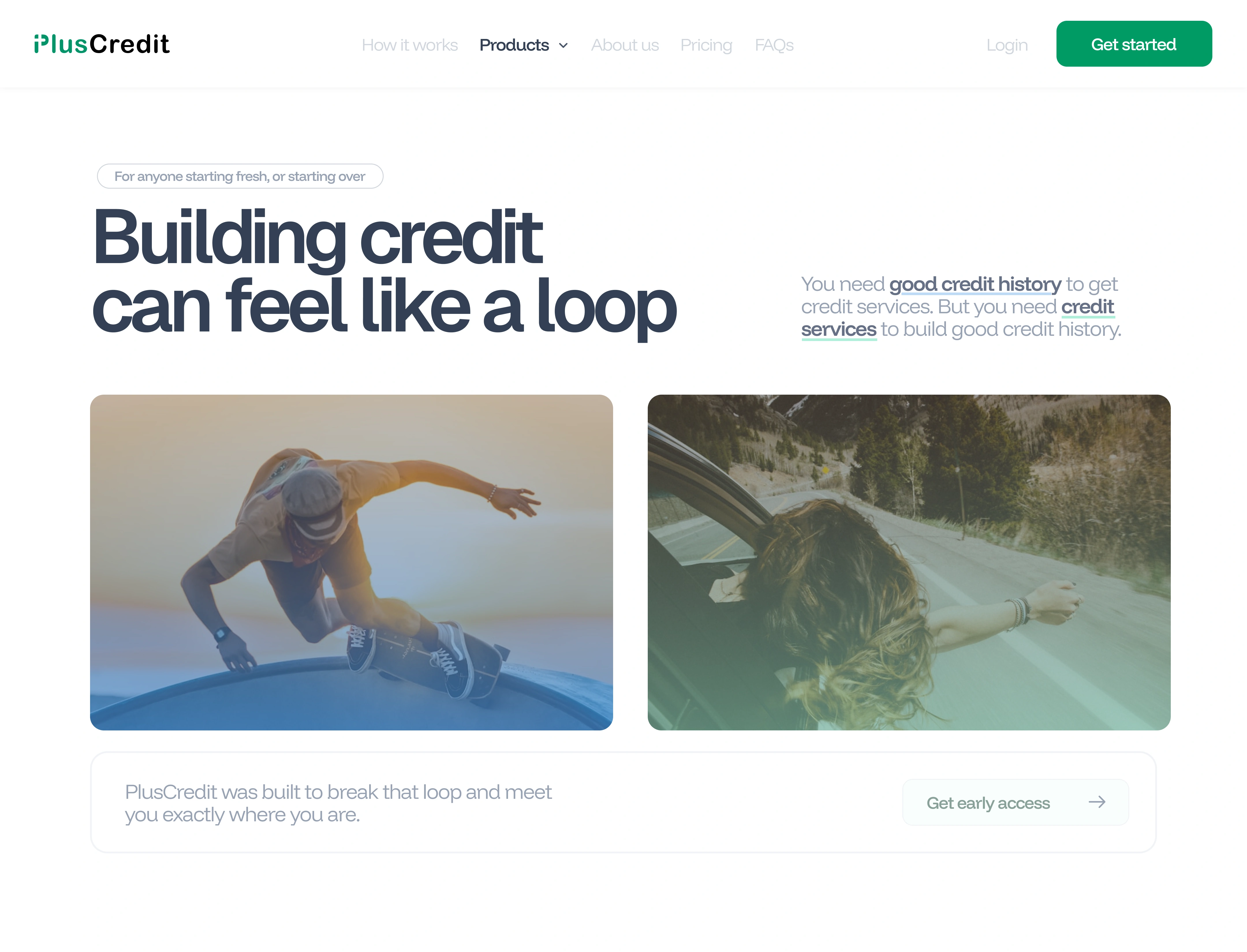
More Details on the Prepaid Card
Prepaid card page (live)
Expected: A full sales page for the prepaid card that explains how it builds credit without borrowing, shows what users get, answers the objections that block sign-up, and leads to one clear action. It had to work on web and mobile, with a prominent, compliant primary CTA and organized Figma source files for developer handoff.
Delivered: A single long page built as a sequence, where each section answers the question a visitor is likely to have next.
My process
Wrote the page as a question-and-answer flow, listing what a first-time visitor needs to believe before signing up and ordering sections to answer those in sequence.
Sketched low-fidelity wireframes to settle the order and content of each section before any visual work.
Built high-fidelity designs for web and mobile, checking that navigation, CTAs, and images reflow and stay usable on small screens.
Reviewed the work with the PlusCredit team and founder and revised it before sign-off.
Organized the Figma files and components for developer handoff.
Design decisions and rationale
Open with the problem. The first screen states the credit catch-22 in plain words. The audience already feels it, so naming it first builds trust before any product claim.
Show progress, don't list features. A carousel with custom illustrations explains what users can track. Visuals make abstract credit concepts concrete, and the carousel keeps the page short.
Use real interface fragments. The summary uses product UI cards instead of icons, so visitors can preview what they will use.
Answer objections in an accordion. An FAQ addresses the questions that stop sign-ups while keeping the page scannable on mobile.
Alternate light and dark sections. This paces a long page and marks where each idea ends.
One primary action. The CTA repeats at the same visual weight, so it never competes with other elements and the next step is always clear.
Consistent illustration style. One style and color treatment gives the page a single voice and makes it easy to extend later.
6. Things I Made Move
Beyond layouts, I designed and animated a small set of motion assets for the site: onboarding, world, transfer, and card. Each one shows a single idea and loops cleanly, so abstract concepts are understood at a glance without extra copy.
Card Animation
Transfer Animation
Around the World Animation
Confirmation Animation
7. Design Decisions
Plain language first. Headlines say what the product does in everyday words.
One CTA per section. Green for account actions, coral for the Jars action, so each button type means one thing.
Color as navigation. Pastel cards in step sequences separate ideas without extra copy.
Photography with real moments. Casual, everyday use of phones and cards, with a range of ages and backgrounds.
Illustration where photography can't help. Abstract ideas such as reporting to credit bureaus or sending money across borders are shown with simple, consistent illustrations and motion.
Dark and light sections alternate to set pace down a long page.
8. Challenges and Solutions
Challenges
Several similar products needed distinct pages without repeating each other
Ambiguous page definitions at the start of the project
Long pages with a lot of explanation had to stay scannable on mobile
Compliance-sensitive copy and CTAs
Solutions
Shared page patterns, with each product getting its own hook and visuals
A page-by-page brief agreed before design began, and regular syncs with the team and founder to stay aligned
Carousels, stacked cards, and FAQ accordions to break up dense content
CTAs and disclaimers designed as reusable components
Custom illustration and motion to explain concepts that text alone made heavy
9. Outcome
I delivered a complete, organized Figma file that PlusCredit's developers can build from.
Full site coverage: From the homepage and how-it-works to product pages, pricing, waitlist, about, FAQ, contact, a blog, and legal pages.
Web and mobile: every page designed for both, plus a connected mobile prototype for reviewing flows end to end.
Reusable templates: sales, blog, and content templates so the team can add pages without starting from scratch.
Structured for handoff: each page lives in its own labeled group, with desktop and mobile frames side by side and a shared component library behind them.
Live result: the prepaid card page has launched and is the first page from this work in production.
Collaboration: delivered through regular syncs with the team and founder, with written sign-off on each phase.
Like this project
Posted Oct 20, 2026
Redesigned PlusCredit's site for clarity, trust, and developer ease.
Likes
1
Views
0
Timeline
Jun 5, 2026 - Aug 31, 2026
Clients
Plus Credit LTD