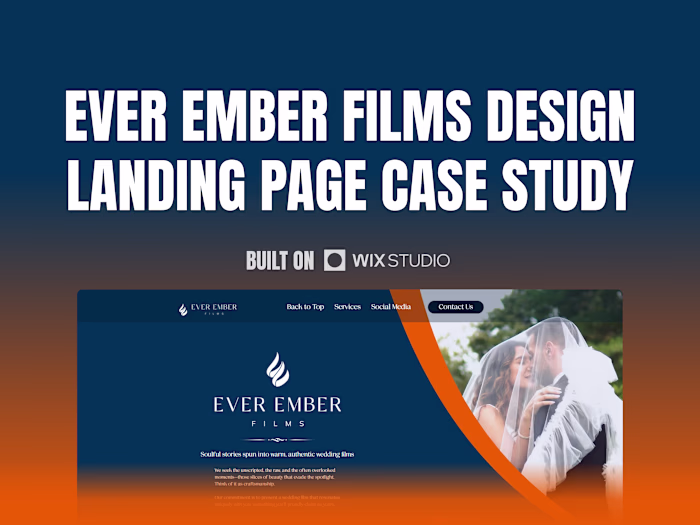
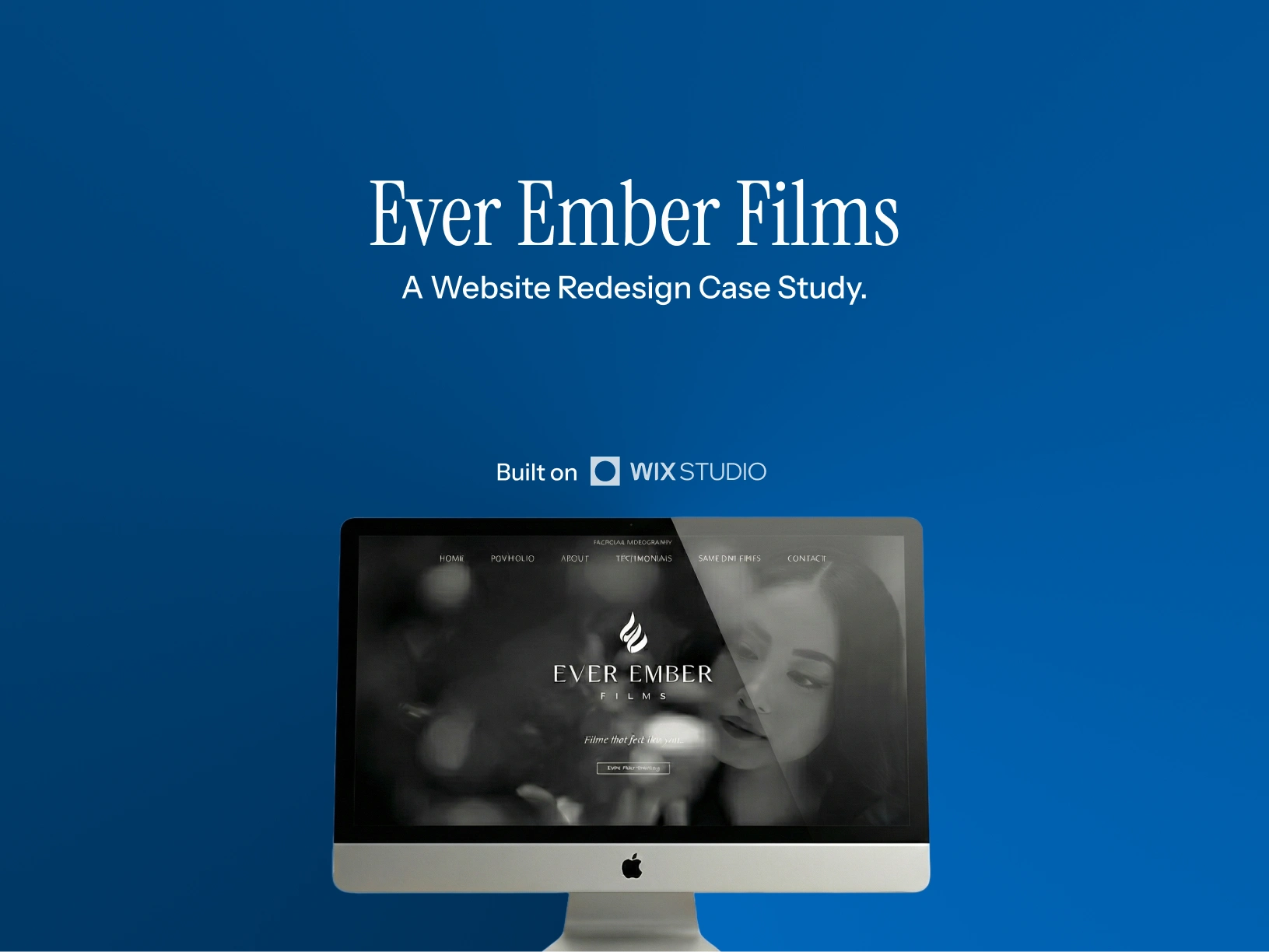
Ever Ember Films Website Redesign
Mark Villondo
Verified
Intro
Ever Ember Films, an agency I've worked with in the past contacted me again with a redesign request. They're a video production agency that specializes in weddings. They believe that marriage is a ceremony that deserves to be remembered as part of a legacy, using video to capture the warm, emotional moments that make them feel alive.
The goal was to redesign a website that showcased their work and provided service information while enhancing brand perception.
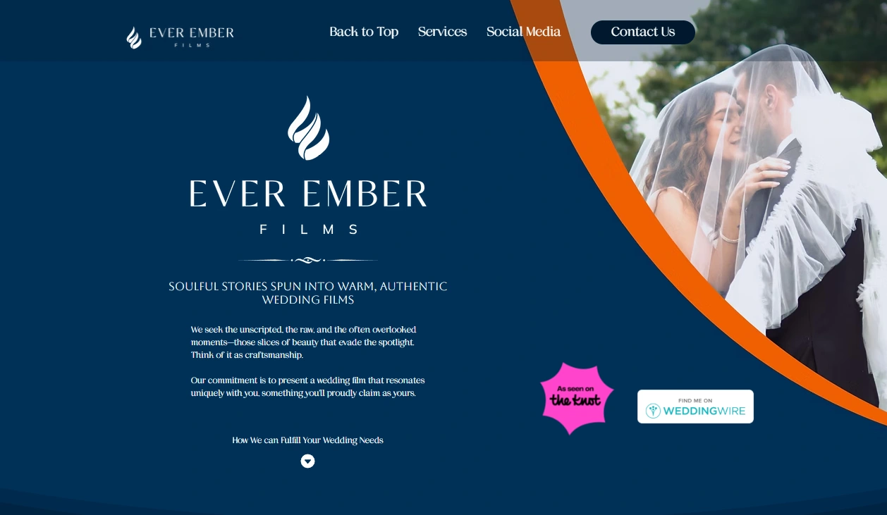
Redesigned Hero Section
Further Context
I designed and built their original website (now deprecated), and so I was happy to be of service again when they wanted a rebranding after the agency had moved to Texas. Service providers typically have a couple things in common even across different industries landscapes, meaning that there was a general idea of what content should be present on the site and what the information architecture would generally look like, further refined to suit their specific needs and priorities.
They wanted to push for elegance while doing an overhaul of their website, adapting a new style that was aimed towards usability and branding while retaining a handful of assets from the original site.
If interested, you can find the case study to the original site here: Link
Original Site Hero
Process
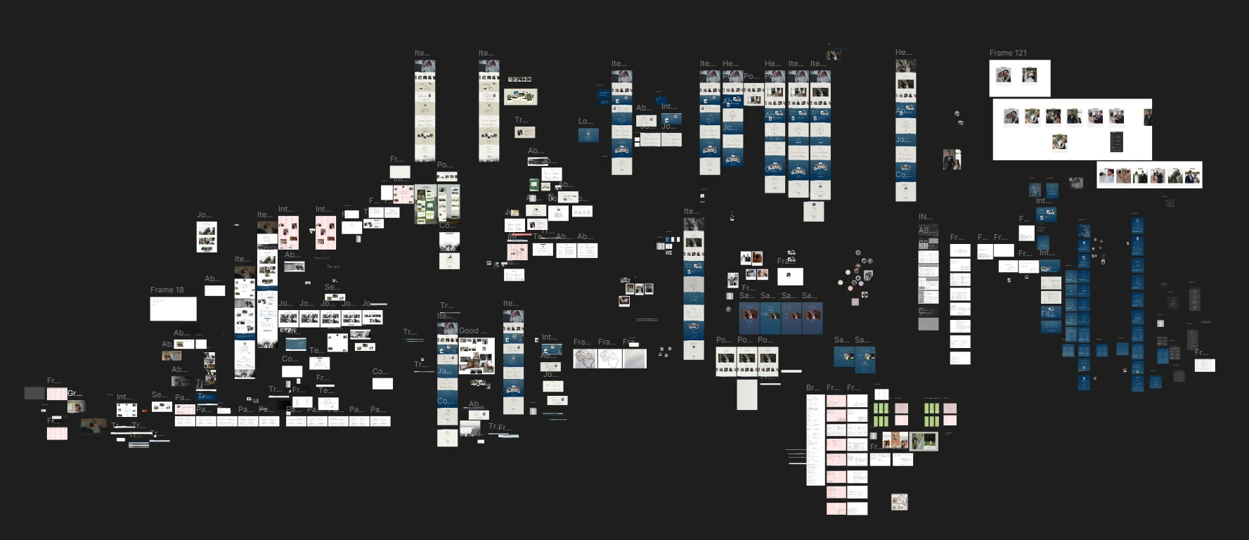
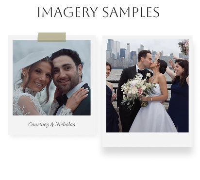
One of the first questions I asked over this new design was if there was a direction they had in mind. They wanted to take inspiration from scrapbooks and hoped the site would be reminiscent one, an idea that felt inline with the concept of a lasting legacy. This direction was a new constraint for me, and so balancing this with the agency's requests while adhering to design principles was a challenge.
Full Figma file
In total, the website took nine iterations to create a design that they were content with. The first couple of iterations helped establish a definite direction, inspired by a website design they provided and restyled to our branding, and later being refined through further iterations on top of some text changes and updates to the content. The studio emphasized a couple of characteristics that they wanted for usability and branding purposes:
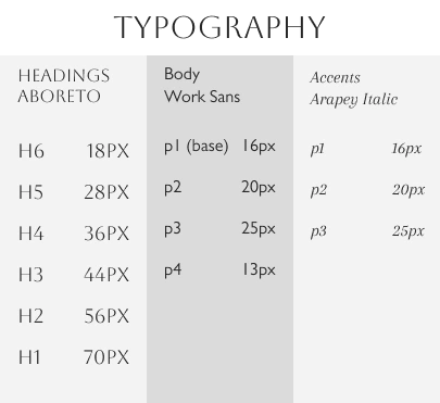
Readability - They wanted to ensure that site visitors could easily find and read through the written content. To resolve this, I used techniques described in Matej Latin's book on digital typography and measured each line of body text from forty-five to seventy-five characters in length (including spaces), although in some cases, I would resort to moving that number to eighty, and also made sure that the line heights complimented the text according to their typeface characteristics, leading each line of body text (16px Gill Sans) to have a line height of 1.3em (roughly 21px).
Elegance - This was a branding point that further clarified and communicated their niche focus. To ensure that the brand carried a sense of elegance, I needed to pay close attention to spacing and white space. By defining the relationships between elements (such as headers to body text or images), I came up with a spacing system that supported this idea of elegance. This would give special emphasis to the content, encourage user focus, and clarified visual hierarchy.
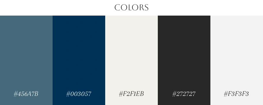
Minimalism - Being a matter of simplicity, the studio emphasized multiple times that they wanted everything to be minimal. This was further refined with every iteration and instance that involved layouts until they were satisfied. This was, on my end, one of the trickiest parts. Compared to sites in the same industry, it almost felt like we weren't doing enough to emphasize the the strengths of a videography-based agency. However, I would still look for ways to push for stylistic choices that supported this, such as the use of paper textures to capture the scrapbook look and gradients to support that sense of elegance.
Since the site was staying on Wix Studio, there were no major shifts in development compared to the first website. If anything, the development part of the process was the most straightforward.
However, after development was 95% complete, I was asked to create a wedding brochure to be featured as a downloadable PDF that held pricing information. This would go through an additional four iterations, following the styles of the site, and was subject to some content changes throughout the process by the studio.
After applying SEO and performing quality assurance checks with Ever Ember Films, the site was relaunched on Wednesday, November 26th of 2025, the night right before Thanksgiving here in the US.
The site is currently live and can be found here: Link
Thank you for reading. For any questions, you can message me through Contra or send me an email at mvillondo97@gmail.com
Like this project
Posted Nov 30, 2025
Redesigned the Ever Ember Films site using updated colors, typography, content, and spacing to produce a website that showcases both their brand and work.
Likes
0
Views
14
Timeline
Nov 27, 2025 - Ongoing
Clients
Ever Ember Films