expresso: your personalized space for gratitude
award-winning mobile app, by Capital One
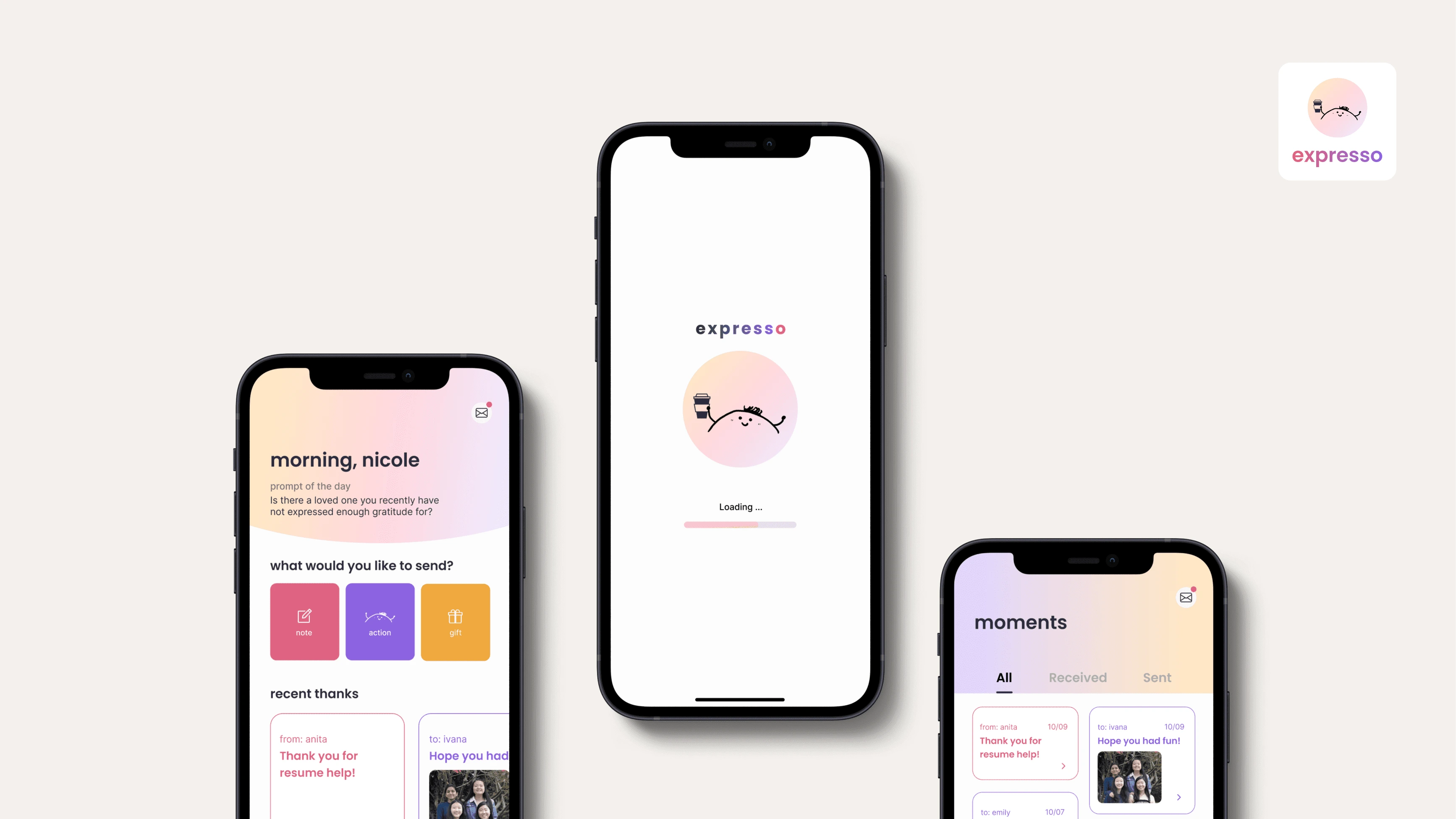
expresso: your space for gratitude
Role: UX Designer, Frontend Developer
Full Case Study: https://nicolexiang.framer.website/expresso
Context
Knowing you made someone's day can make yours too. But in today's fast-paced world, saying “thank you” has become something we do so often that we overlook the meanings and importance of those small moments of appreciation. From our research, text is one of the most frequent ways of saying "thank you". However, in a virtual format like this or a team setting on Slack, the person expressing gratitude often doesn’t know if gratitude is taken since there’s no feedback from the other side. Recipients often don't know if you mean it and want something more personal and intimate that can show effort and meaning toward the relationship. Hence, there's a disconnection and lack of feedback loop between the giver and receiver, causing there to be a loss of gratitude moments.
This was part of the course Mobile Application Design and Development, which is sponsored by Capital One and consists of students forming groups to develop their own apps over 12 weeks. It includes a contest with each team having to give a 15 minute pitch to Faculty and Sponsors. Our team received first place from Capital One out of 26 teams.
Overview
Problem
How might we help create genuine gratitude moments in a virtual setting, such that the giver’s message is channeled through to the receiver who is also able to reciprocate those feelings?
Outcome
We designed & developed a gratitude app that allows users to express appreciation through personal thank-you notes, small gifts, and virtual hugs & hearts.
Values
With the target audience being young adults and distant friends, expresso provides 3 main values:
Casual & virtual appreciation: expresso encourages an easy way to show casual appreciation anywhere, anytime, in any form from the convenience of your phone.
Feelings of delight: expresso is designed for social interactions that create moments of delight for both the sending & receiving parties.
Capturing all moments of gratitude: the Gratitude Gallery provides users with a collection of appreciation between friends and family, all in one place.
Process
Sketches & User Flow
Once the idea of a gratitude app and the preliminary features were set, I led a parallel design session where we all did our sketches and discussed how we could merge elements. Though we ended up using my design for further development, seeing other people's designs inspired me for future designs.
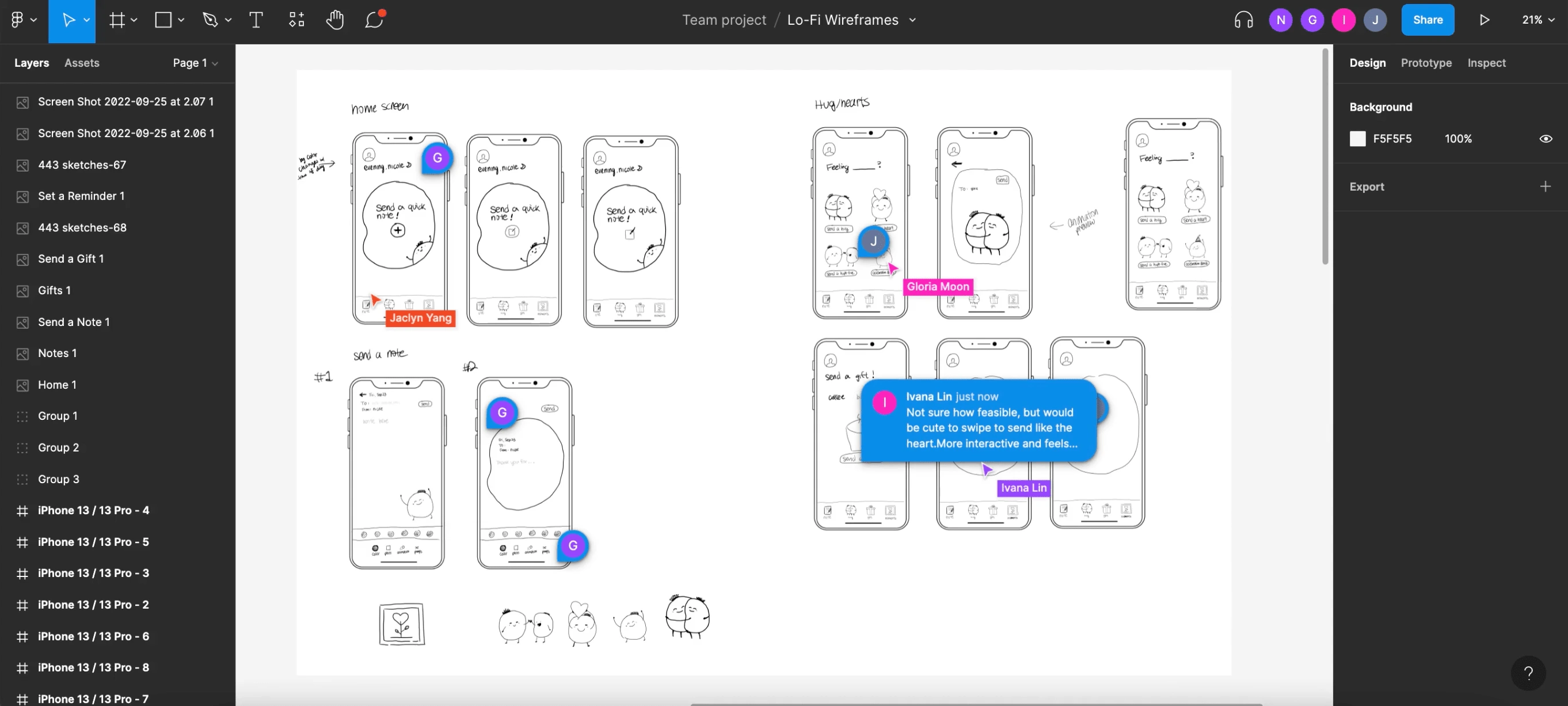
Parallel prototyping: feedback giving
At the same time, because there were so many features, I mapped out how users would interact with each and the order of these. This solidified my understanding of what had to be designed.
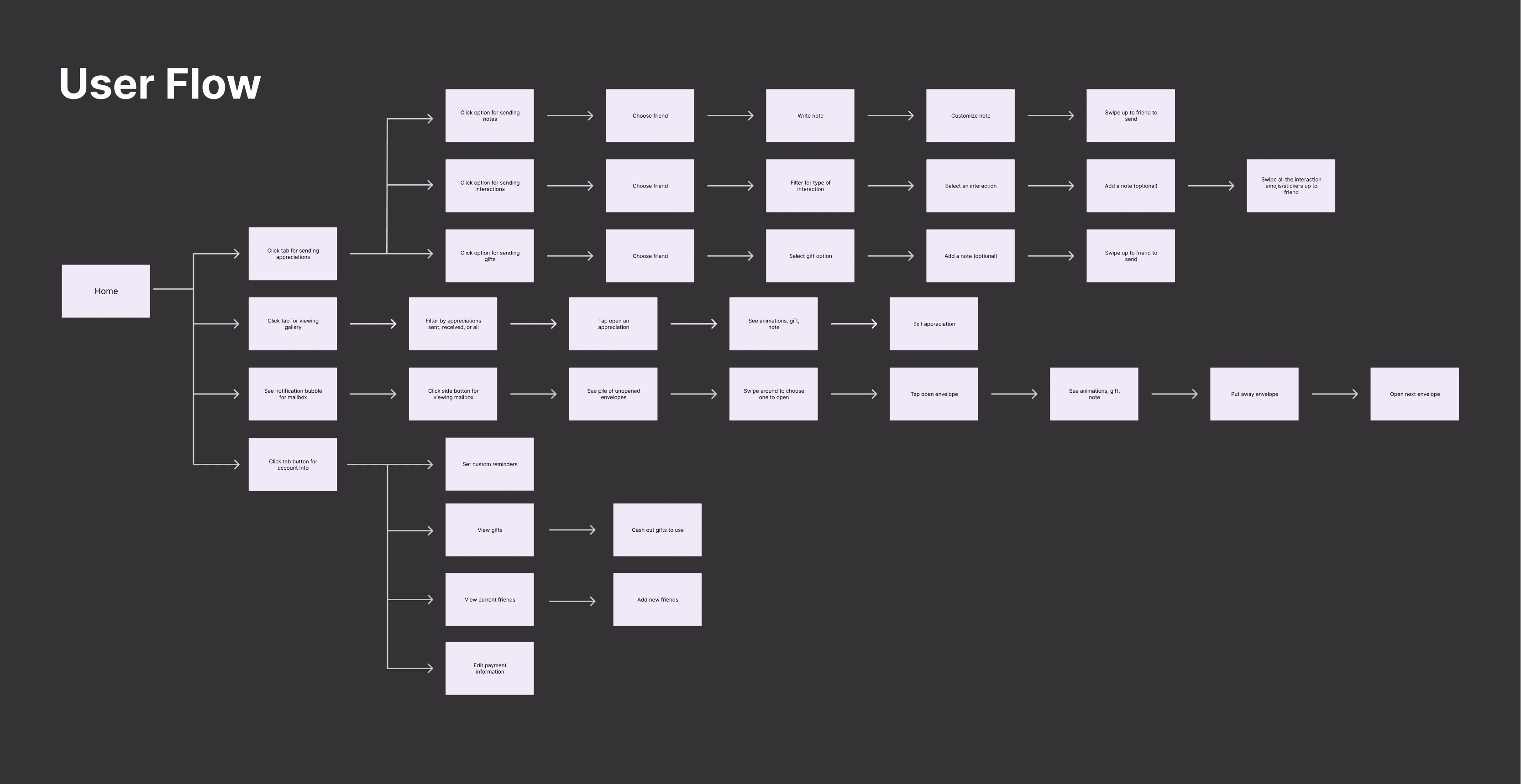
User flow
Prototyping & Branding
Following the user flow, I designed low-fidelity wireframes, and with 3 iterations, high-fidelity prototypes were developed to hand off for implementation.
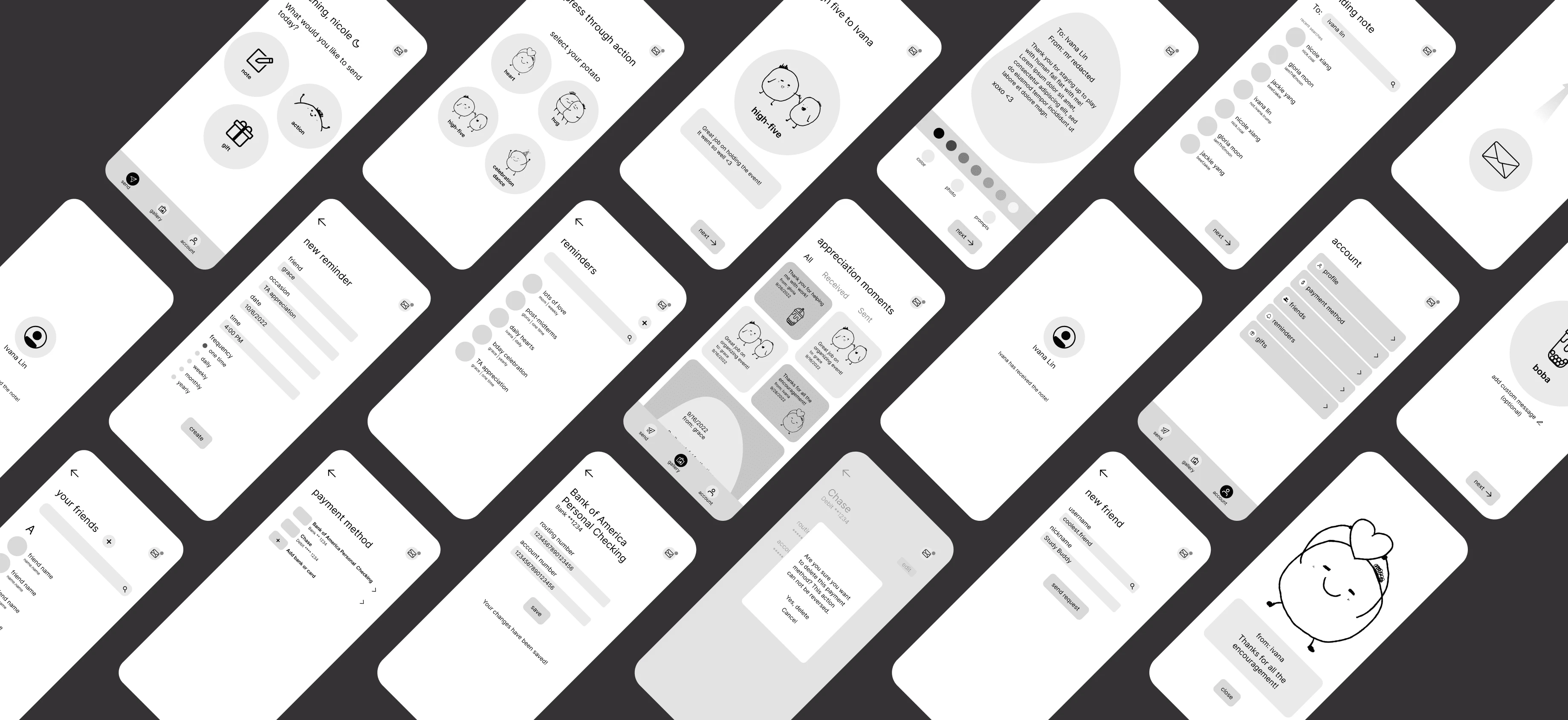
lofi wireframes
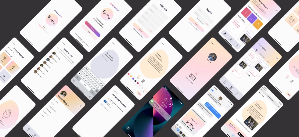
hifi wireframes
For better consistency, I created a brand guide, detailing the typography, styles, colors and components.
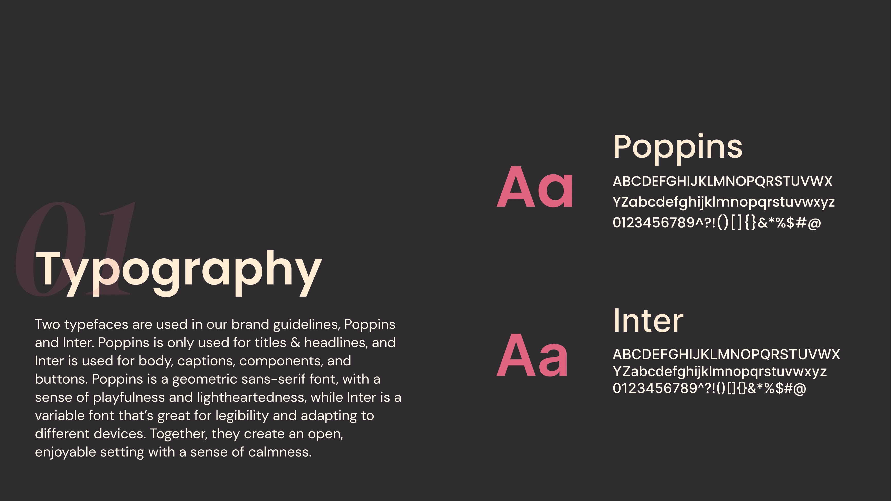
Brand guide: typography
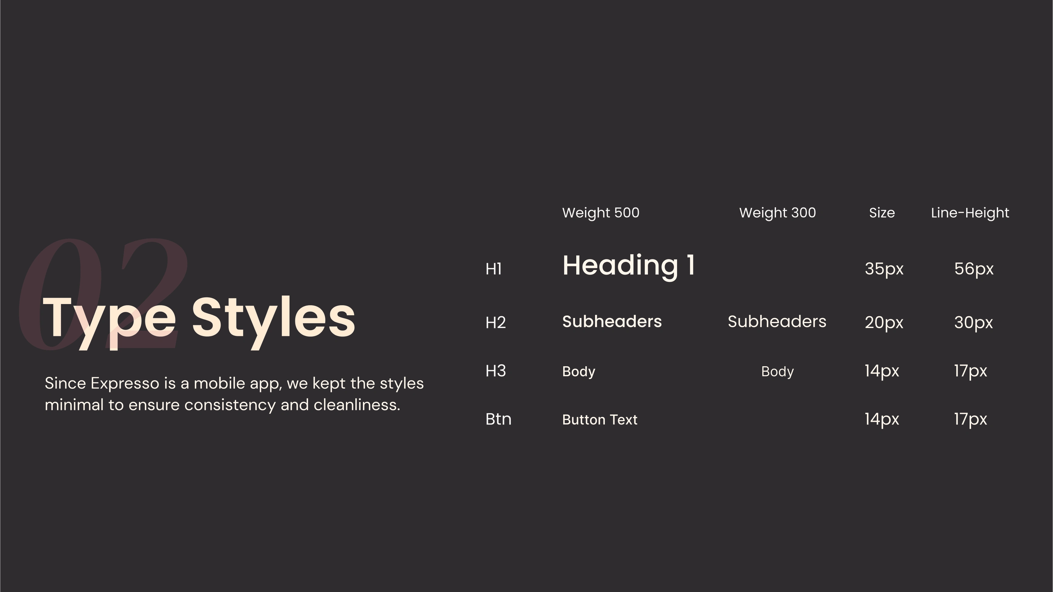
Brand guide: type styles
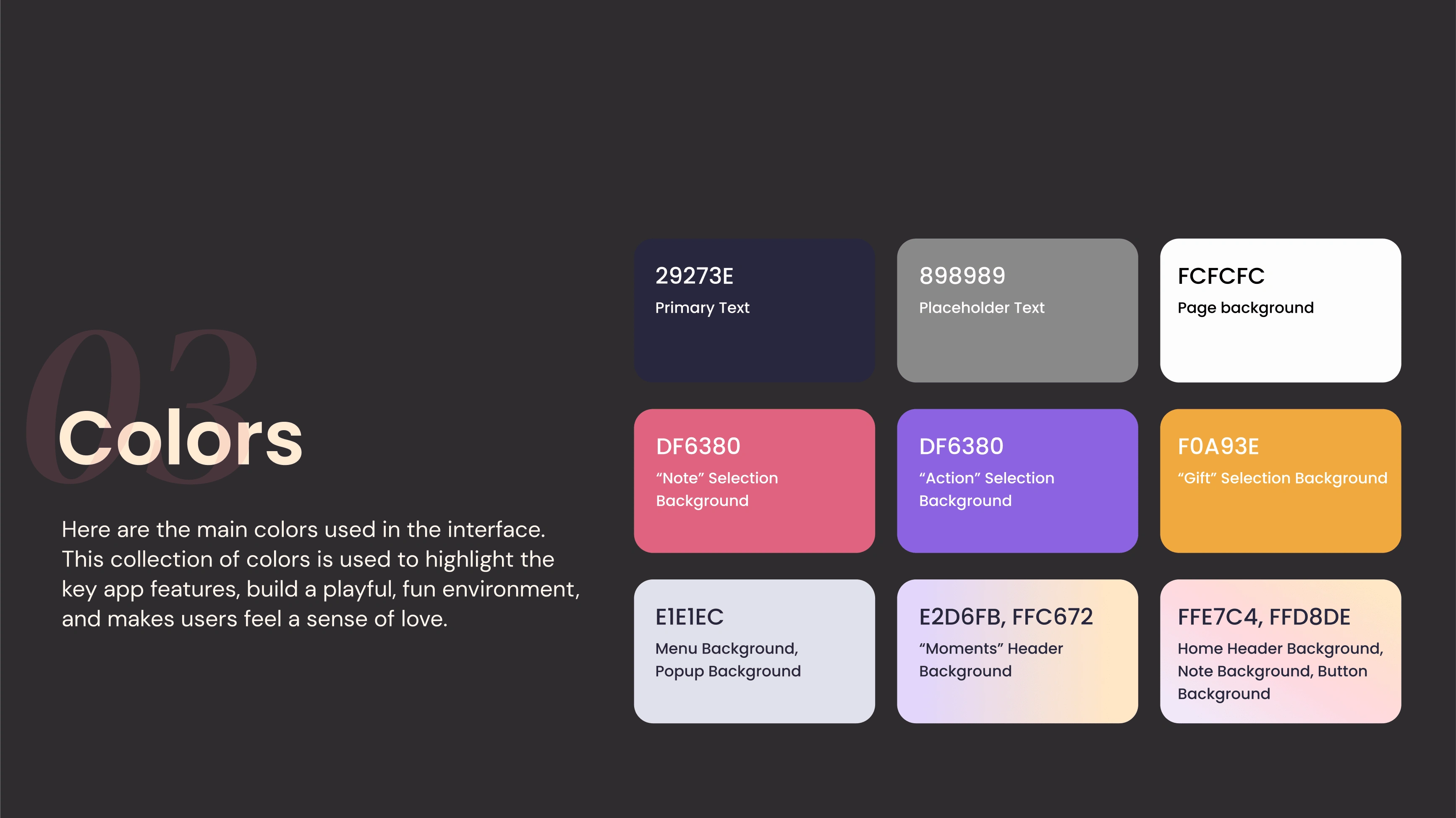
Brand guide: colors
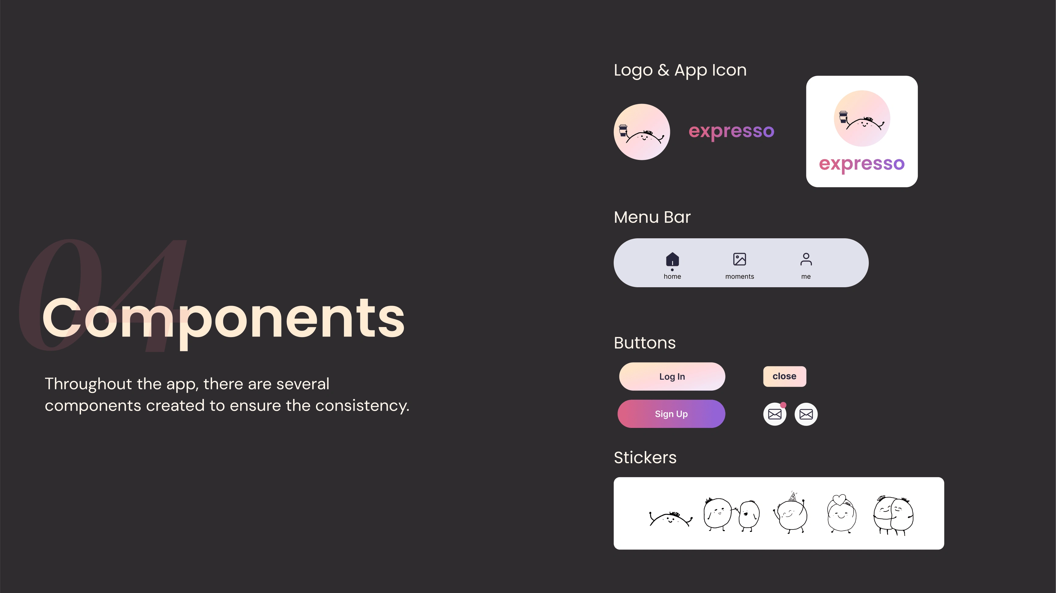
Brand guide: components
Design to Code from Scratch
To reach MVP within the timeframe of 3 weeks, we prioritized features based on user testing feedback and created "must have" and "nice to have" categories. To help translate design to code, I mapped out the data needed according to the hi-fi wireframes. Here's an example:
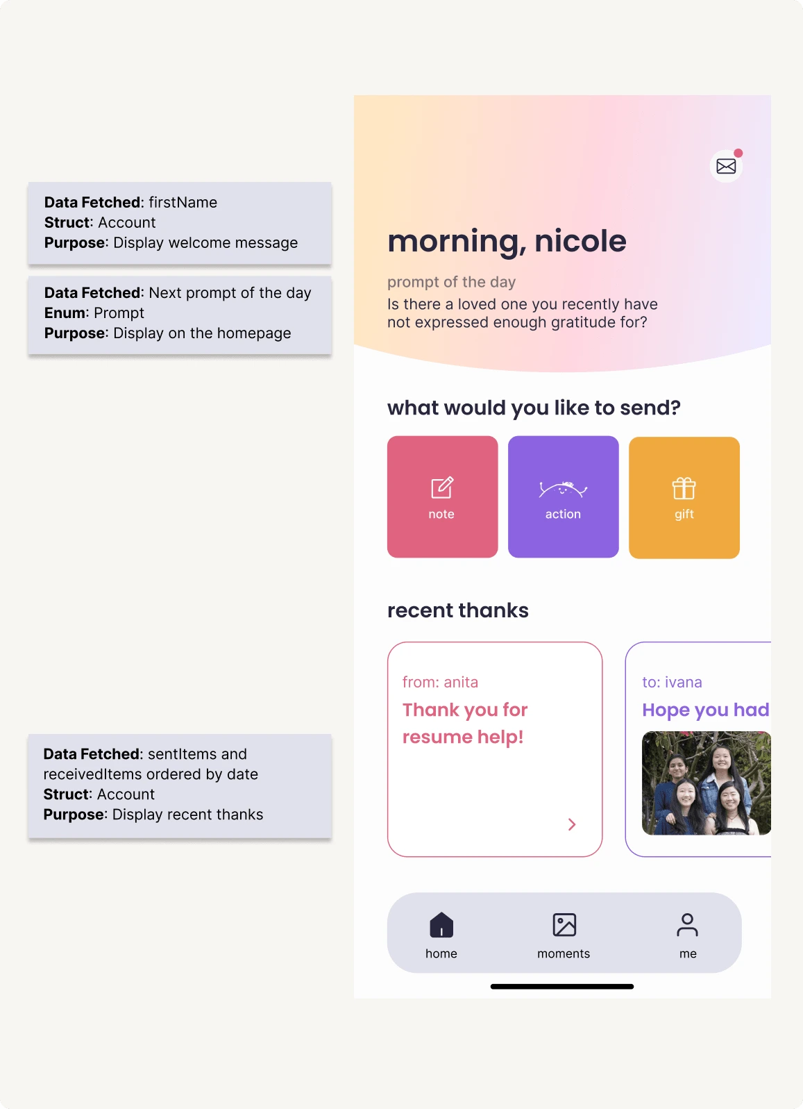
Data mapping
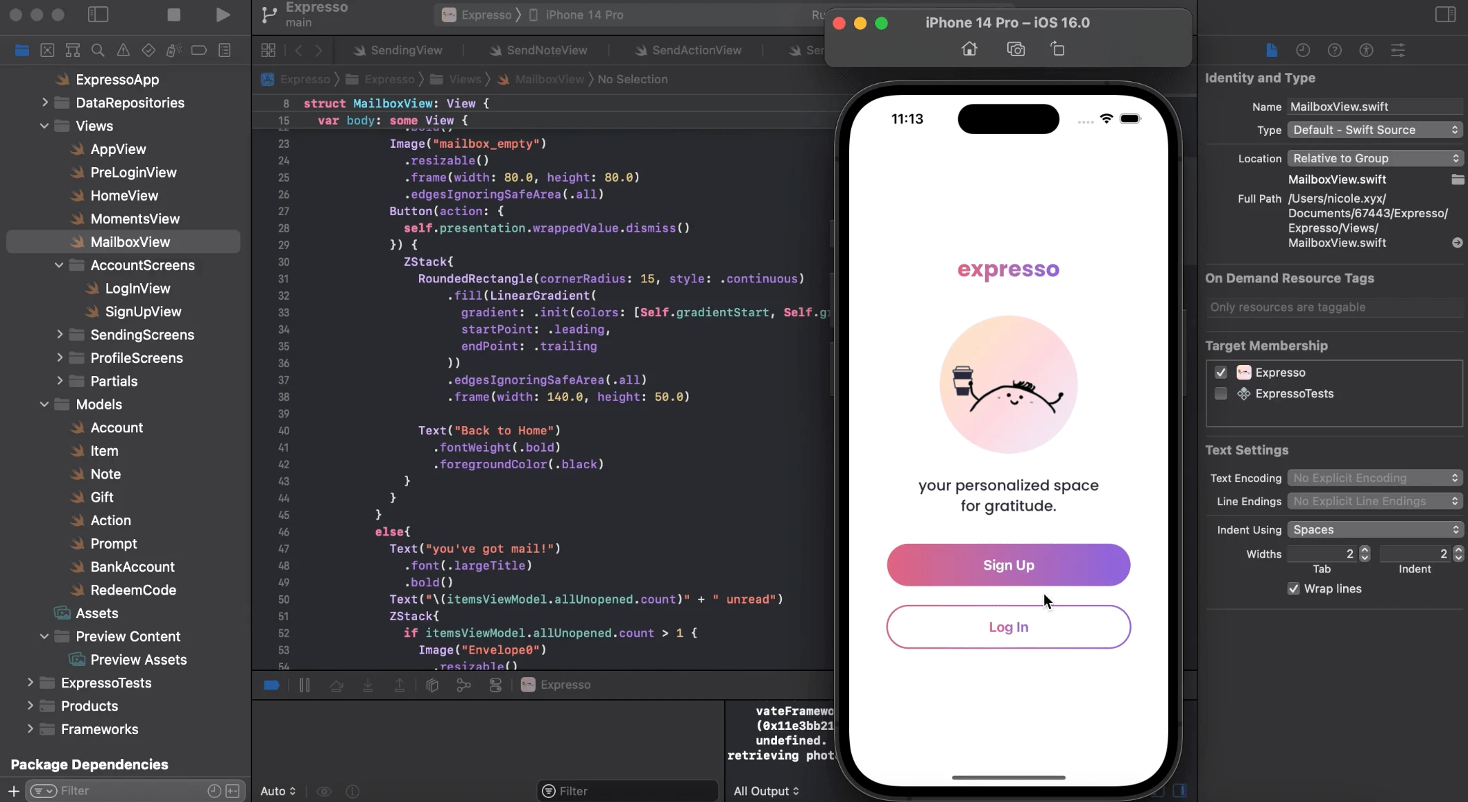
Implementation: Swift & XCode
Final Poster
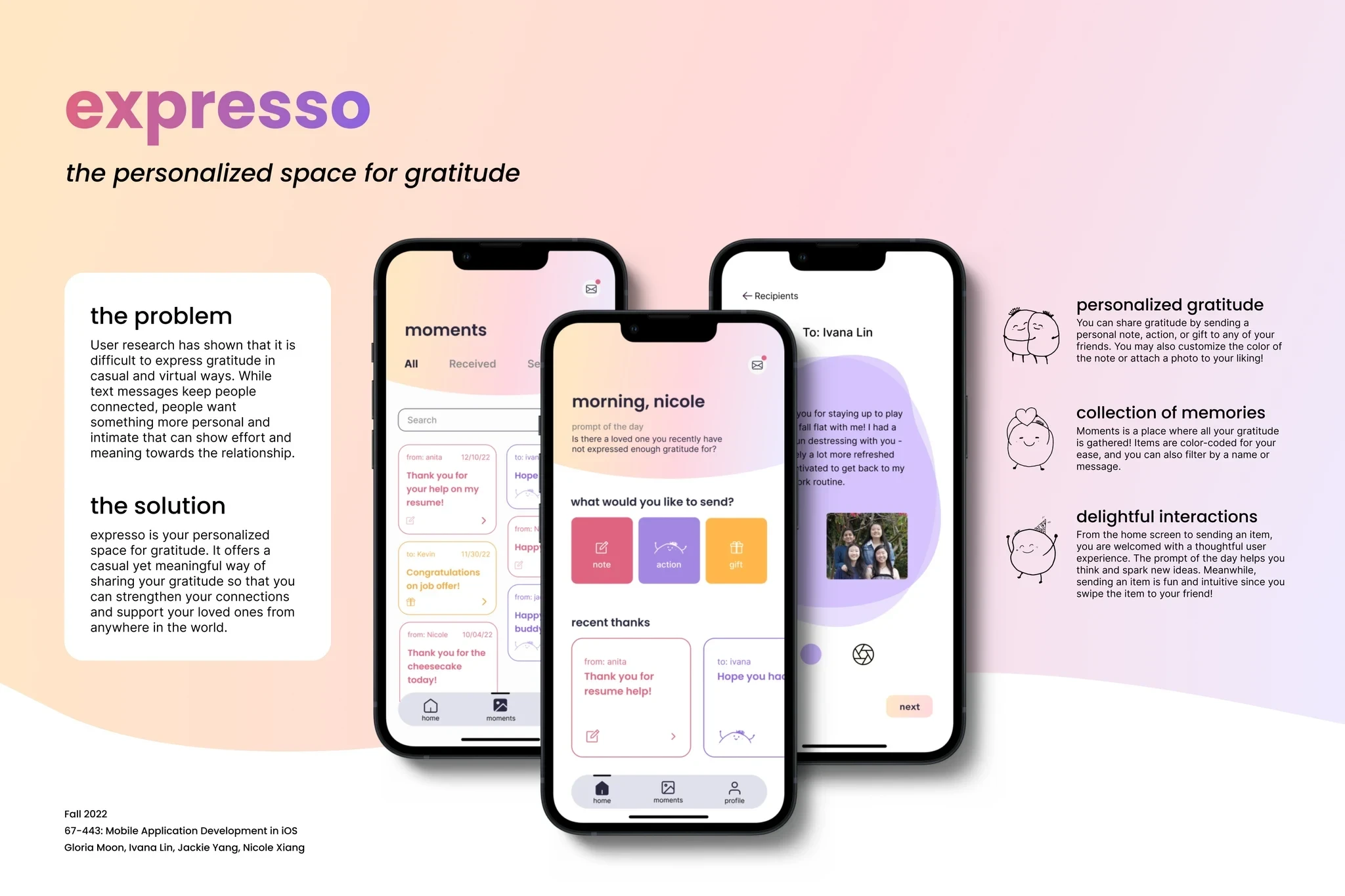
Like this project
Posted Jan 9, 2024
How might we help create genuine gratitude moments in a virtual setting? Meet expresso, an intimate space for your gratitude.
Likes
0
Views
31
