Bringing the future to design archives
Client: Nor (a Canadian design archive)
Project Duration: 4 months
Role: UX Designer
Tools: Figma, HTML/CSS
Overview
Nor is a living and open commons for design in Canada. It is a non-profit, co-operative and collective effort to document, preserve, and question Canadian material culture. Nor’s users include design practitioners, academics, students, librarians, archivists, design theorists, and more. Nor came to us with a very broad goal: improve the experience of Nor by challenging the idea of what a design archive should be.
Outcome
High fidelity designs with interactive prototypes:
Coded prototypes for demo
Product roadmap outlining implementation plan (with short term, medium term, and long term goals)
Recommendations doc
Discovery and Research
After diving deep into Nor with the founders, we narrowed down the project goal to modernizing the experience of engaging with a digital archive through interaction design.
We then conducted a comprehensive design research by talking to our target users directly through user interviews, contextual inquiries with users new to Nor, and questionnaires distributed to design & HCI communities. In addition, a landscape research consisted of a competitor analysis of 15 other digital archives & design collections was conducted.
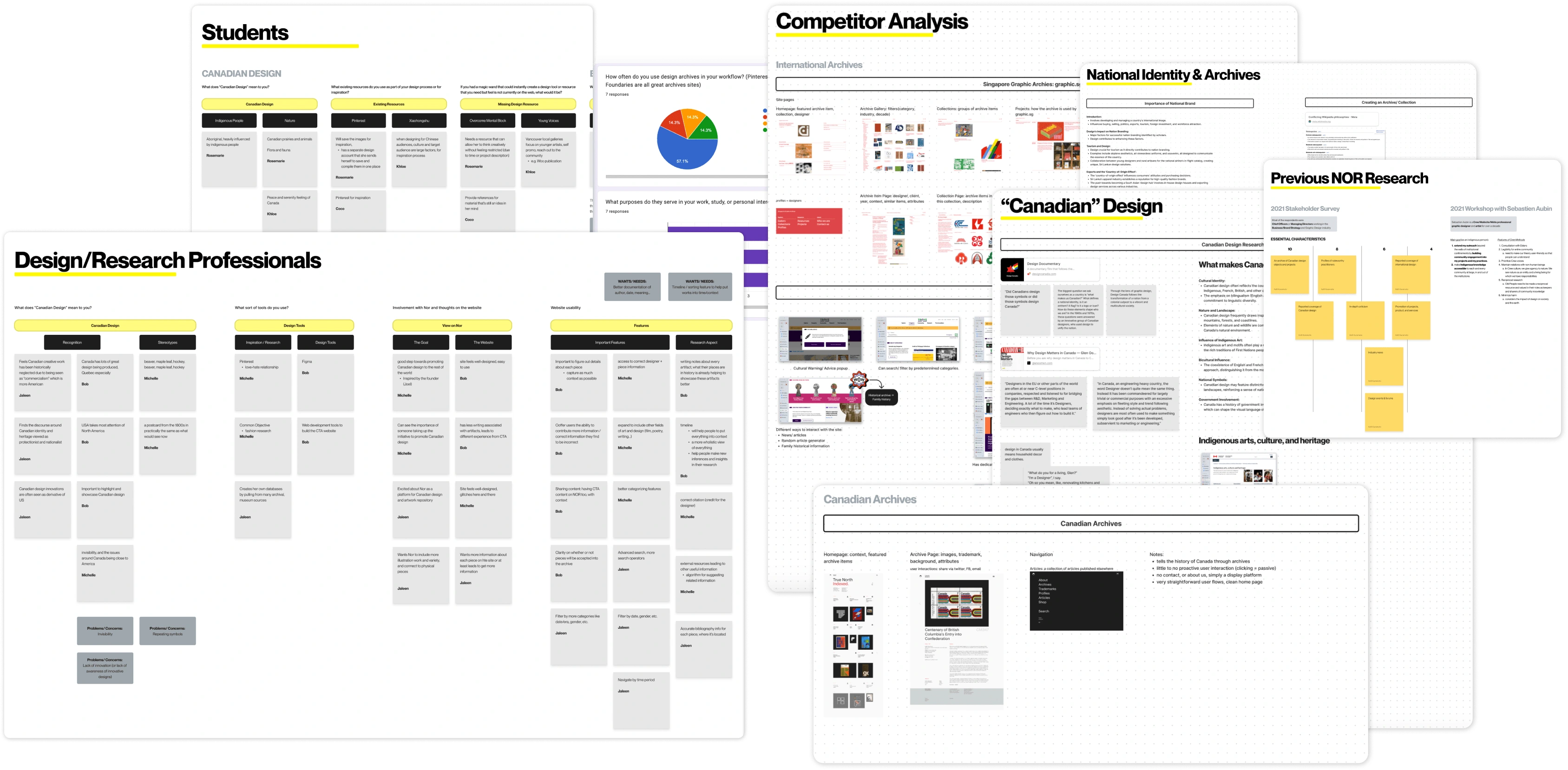
A snapshot of primary & landscape research
Design & Testing
From the research, we identified 4 key design directions and created storyboards to visualize potential features.
How could we make Nor’s purpose more clear?
How could we include a variety creative mediums and viewpoints?
How could we enable broader contextual exploration?
How could we nudge users into inspirational rabbit holes?
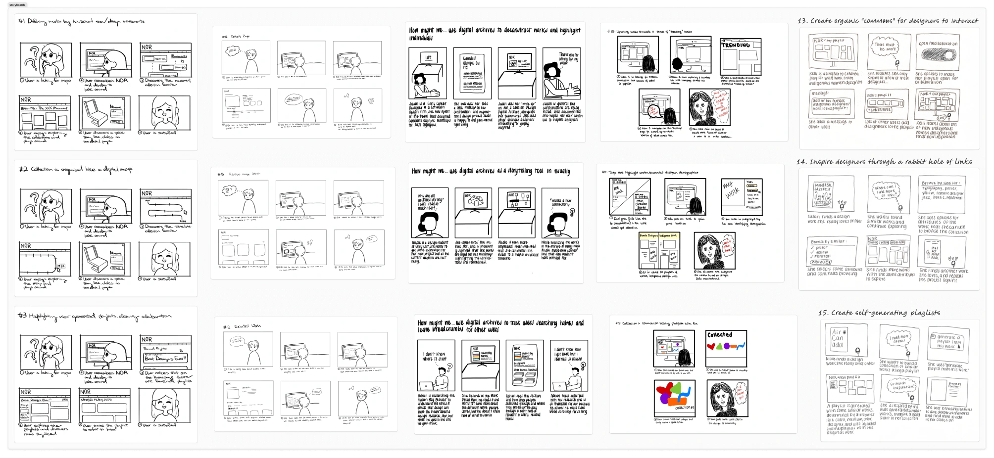
Top 15 storyboards
Through discussion with the clients, we aligned on the 5 design concepts they are interested in further exploring:
Visualizing works through multiple storytelling mechanisms
Leaving breadcrumbs of other users sense making and searching patterns
Self-generating playlists of works
Exploring similar works through multiple paths
Promoting collaboration of user curated playlists of works
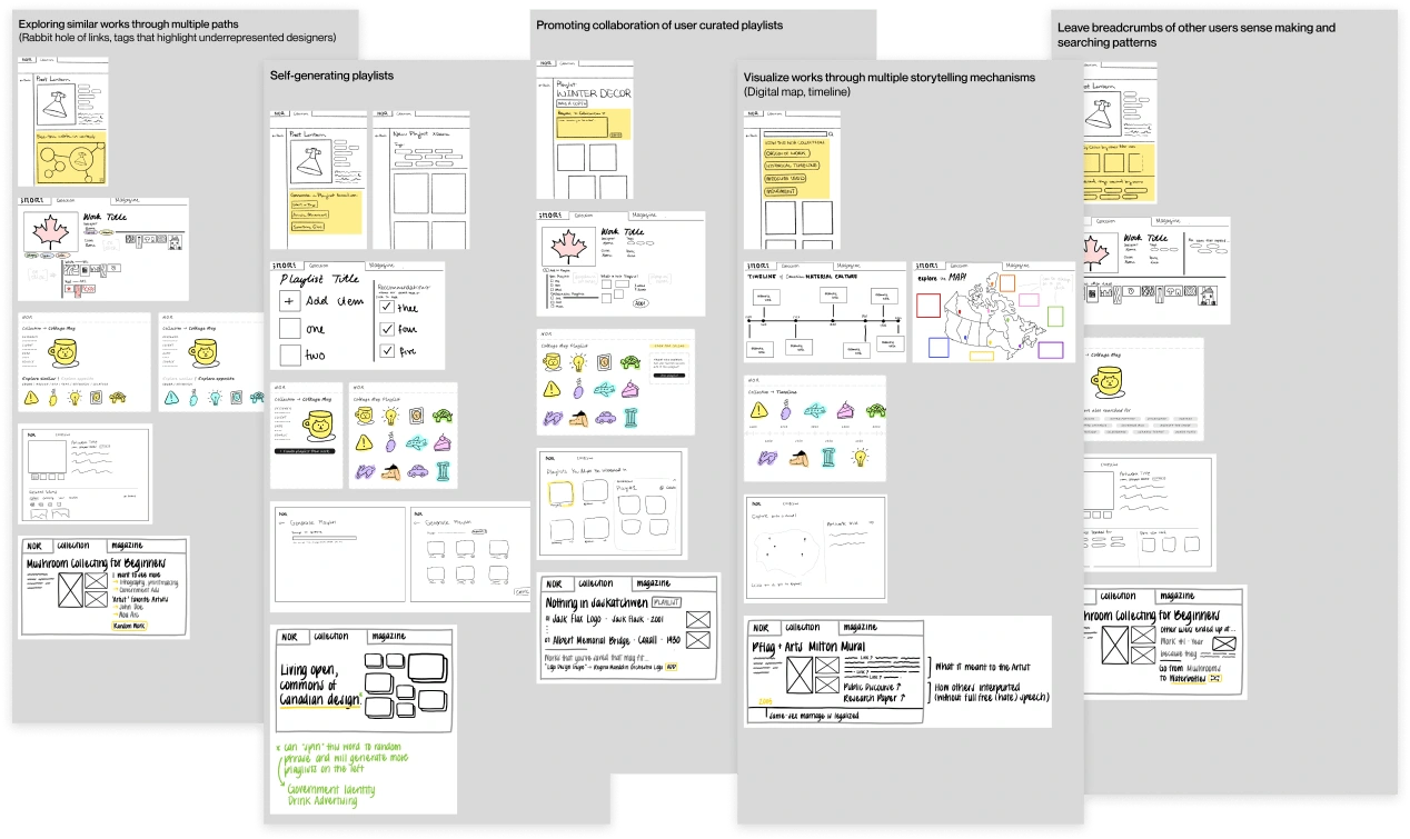
lo-fi wireframes of the 5 concepts
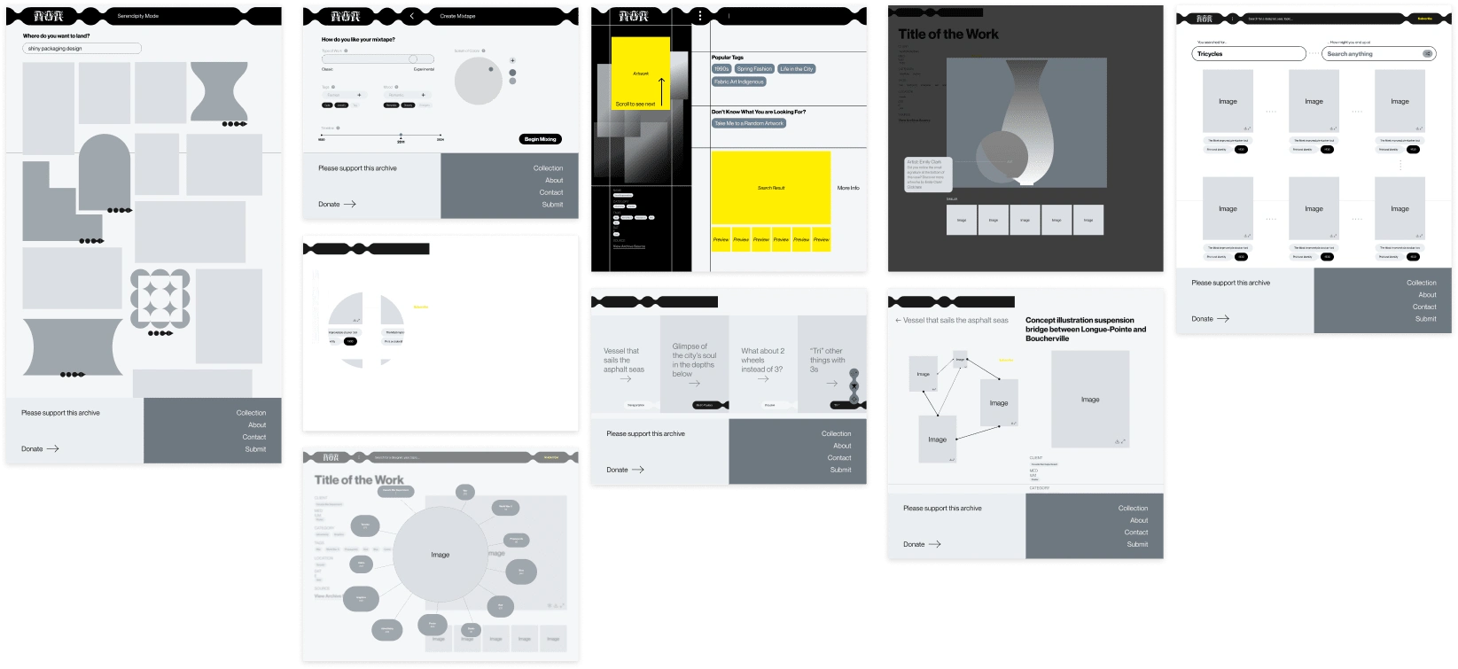
mid-fi
After synthesizing all of the user feedback from user testing sessions, we utilized the insights to refine our project scope and narrowed down to 3 key features:
Map and Timeline as alternative view of the Collection page
Serendipity Mode highlighted on the home page
Work Detail Page has tag-based related works
We visualized these new features within the existing site map of Nor, highlighting the different paths for our diverse set of target users and the corresponding features:site map with new feature entry points
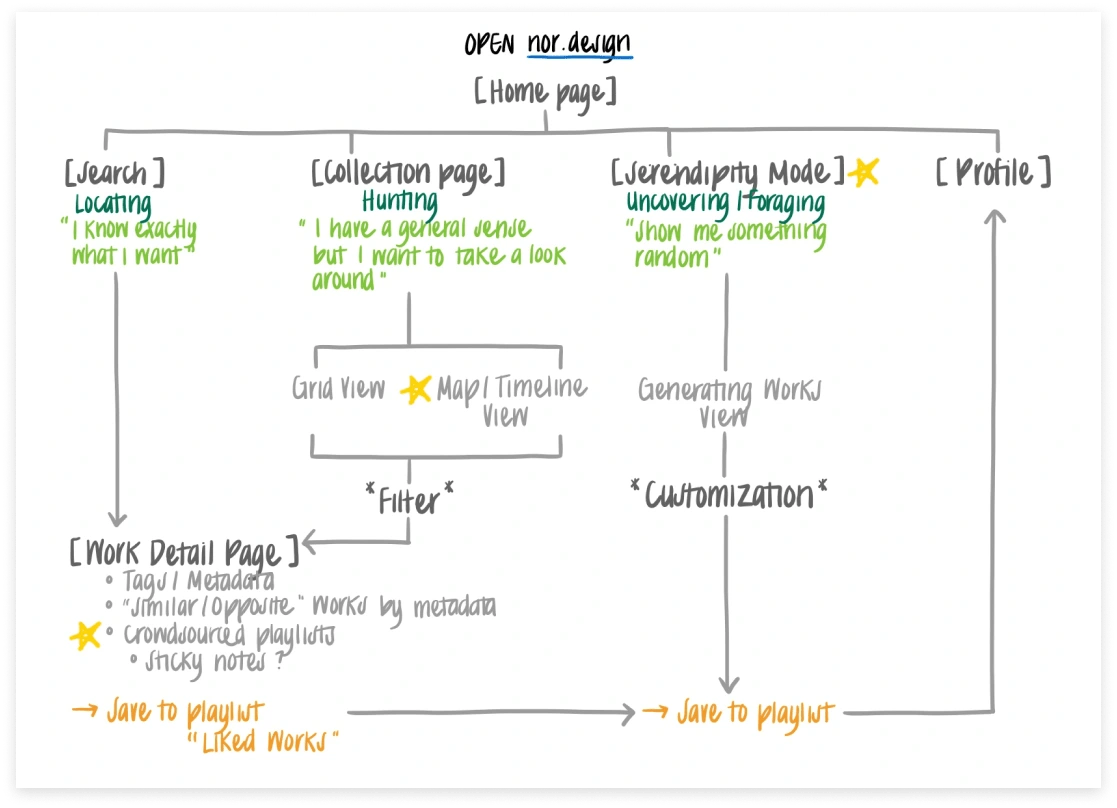
site map with new feature entry points
Final Designs
As part of the final design:
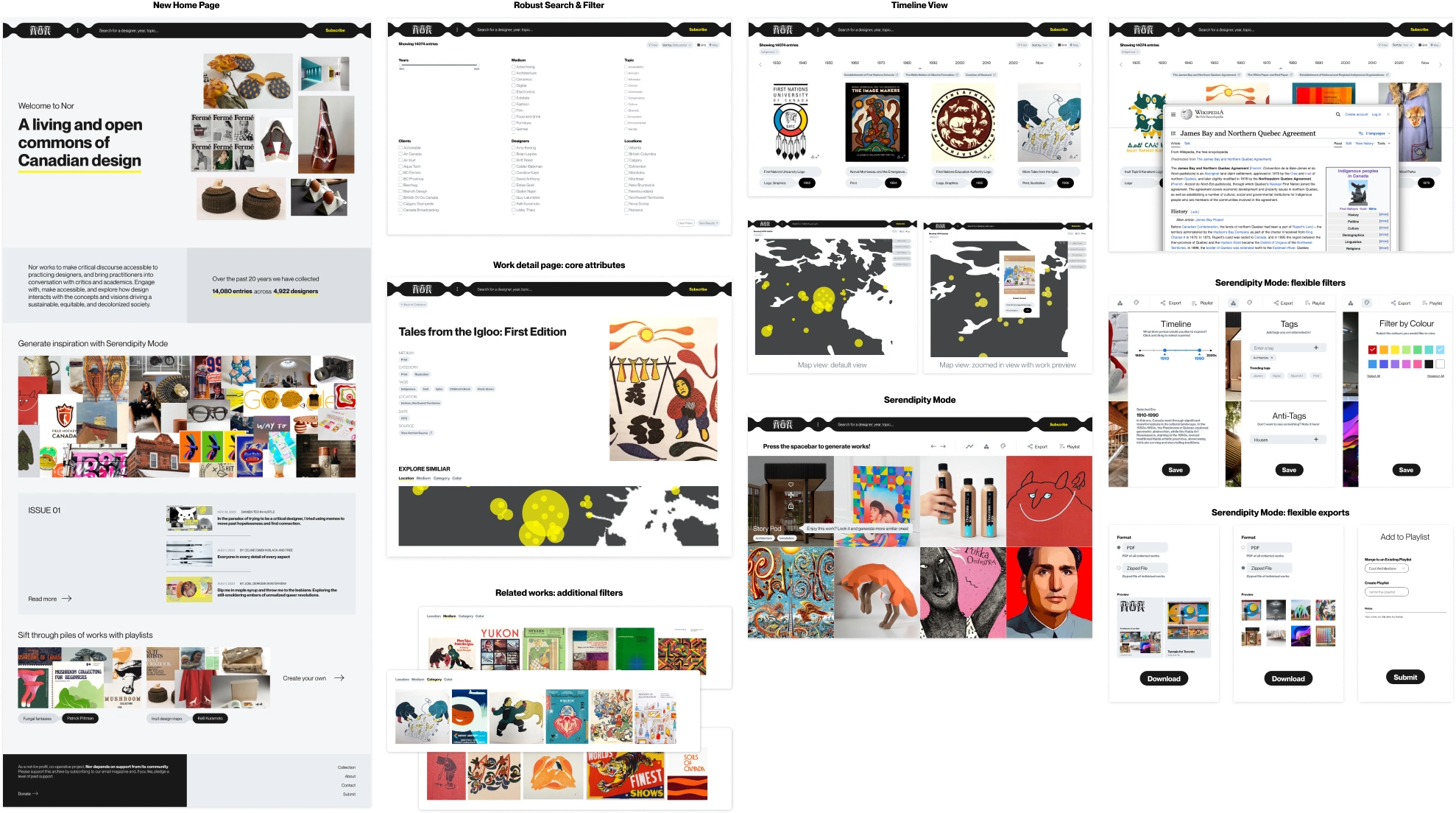
Introducing dynamic discovery tools such as "Serendipity Mode," which presents users with unexpected yet inspirational design finds. This feature encourages exploration beyond typical search parameters, fostering moments of creative surprise and delight.
Presenting the collection through novel storytelling mechanisms like the "Map" and "Timeline" views. These tools offer visual and chronological narratives of the designs, allowing users to understand the evolution of styles and trends within a broader cultural and historical context.
Inspiring and enriching user interactions on the Homepage with a suite of new features. These include curated sections for articles, user-generated playlists, and featured artworks, which not only highlight key pieces and creators but also provide a platform for community engagement and knowledge sharing.
Like this project
Posted Sep 13, 2024
Modernizing the experience of engaging with a digital archive through dynamic content discovery, storytelling, and delightful interactions
Likes
0
Views
12
