Nimesh Soni's Work | ContraWork by Nimesh Soni
Nimesh Soni

Nimesh Soni

Your dedicated visual content designer.

New to Contra

Nimesh is ready for their next project!

Followed by GALLERY L
Cover image for Ochre — Minimalist Fashion Brand
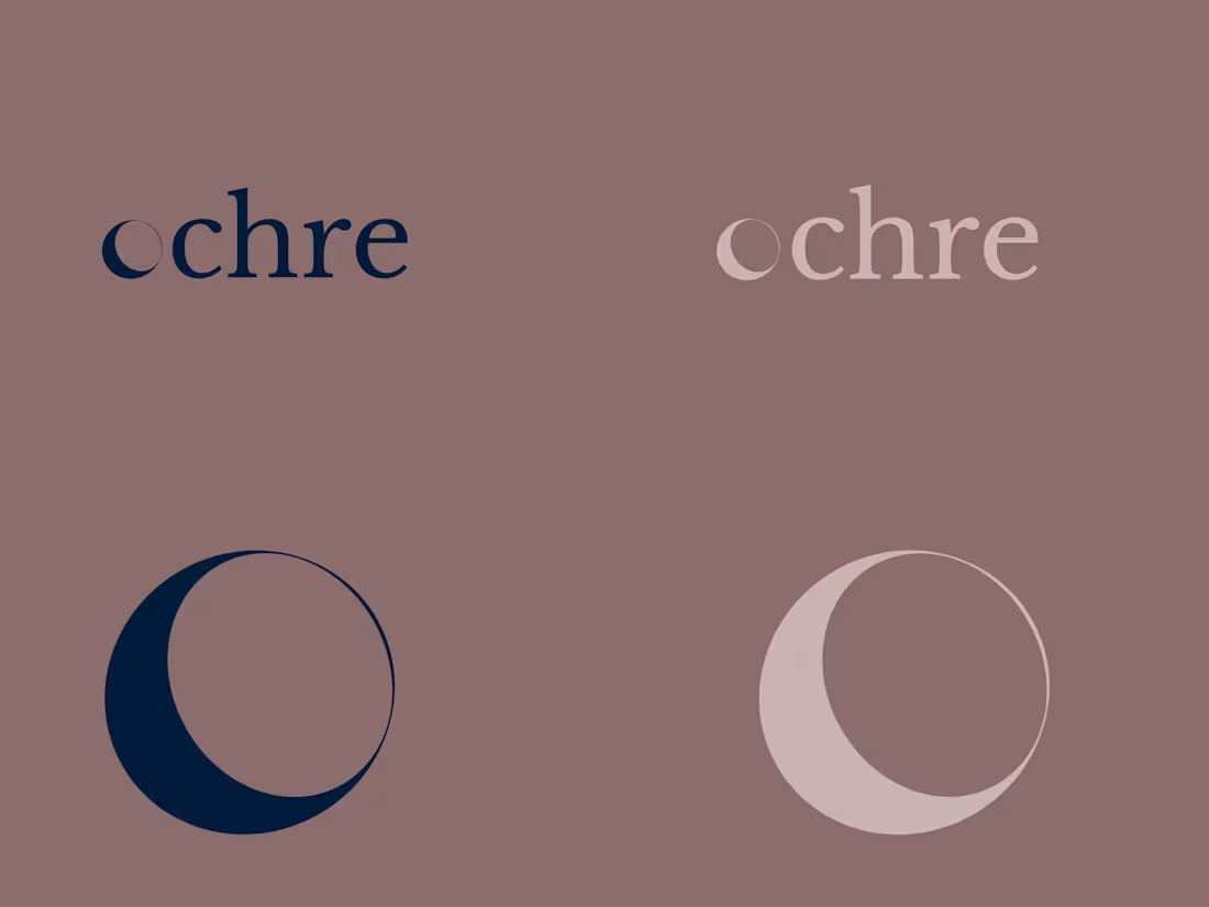
Ochre — Minimalist Fashion Brand Identity A contemporary clothing brand should feel effortless, scalable, and inherently elevated. For Ochre, my goal was to craft a visual identity rooted in quiet luxury and editorial refinement. The logotype features a custom crescent moon phase seamlessly sculpted into the letter ‘o’ — symbolizing timeless elegance and cyclical beauty. Flowing into a high-contrast serif typeface, the wordmark strikes a balance between bespoke artistry and modern simplicity. Grounded in a palette of midnight ink and warm cream, the identity evokes the tactile feel of luxury textiles. Designed with zero visual clutter, this brand system is engineered for longevity — from woven garment tags to high-end digital storefronts.
0
8
Cover image for Kejambi Design Studio is an interior
Kejambi Design Studio is an interior design studio specializing in organic modern, Japandi, and Wabi-Sabi aesthetics. The goal of this project was to create a complete, elevated brand identity system that reflects warmth, craftsmanship, and architectural simplicity. Developed a cohesive visual identity that bridges natural, handcrafted shapes with refined architectural structure. The identity system works seamlessly across digital platforms, print touchpoints, and physical spatial signage. Key Deliverables Included in This System: Primary Logo & Icon Suite: Created a custom, soft-edged house silhouette integrated with a subtle "K" cutout. To ensure adaptability across all brand touchpoints, developed a full suite of primary logos, submarks, and icon marks optimized for both dark (#5b4d4c) and light (#e3d5cd) backgrounds. Editorial Typography System: Paired Jost (a clean, geometric sans-serif for modern headers and logos) with EB Garamond (a timeless, editorial serif for body copy and brand messaging) to give the studio a sophisticated, high-end magazine aesthetic. Earthy Neutral Color Palette: Curated a warm, grounded color palette consisting of Charcoal Brown (#5b4d4c), Soft Beige (#e3d5cd), Warm Taupe (#ad9c92), and Off-Black (#1b1b1b) to evoke tranquility, luxury, and organic materials. Spatial Mockups: Designed spatial mockups showcasing how the brand mark translates into physical studio signage, wall plaques, and interior environments.
0
77
Cover image for This project was designed to
This project was designed to demonstrate how cohesive, high-end vertical content can drive organic community engagement and product sales across Instagram Stories, Reels, and TikTok. Key highlights of this design: Palette & Vibe: Warm, earthy, and neutral tones designed to evoke a modern lifestyle editorial style. Vertical Formatting: Built at the standard 1080x1920 px ratio for Instagram Stories, Reels covers, and TikTok. Content Architecture: Includes custom layouts for new collection launches, daily quotes, verified client testimonials, blog post announcements, community Q&A stickers, and promotional discount offers. Source Files: Created entirely in Canva, featuring direct editable template links.
0
93
Cover image for I designed this project to
I designed this project to demonstrate how clean typography, structured page layouts, and aesthetic color palettes can turn a simple PDF document into a high-converting lead magnet and workbook. Key highlights of this design: Palette & Vibe: Warm, earthy cream and beige tones designed to evoke a modern, high-end "slow-living" editorial style. Multi-Page Architecture: Includes a cover page, welcome introduction, an interactive 7-day checklist tracker, and a weekly reflections page. Typography & Layout: A premium serif header font paired with an easily readable sans-serif body font for strong visual hierarchy.
0
94