
pro
Nhelsen C Jo
Brand Designer focused on humane brand experiences
New to Contra
Nhelsen C is ready for their next project!
Hospitalogy by Blake is a podcast under Workweek focused on making healthcare insights feel easier to understand and more approachable for busy professionals.
I really enjoyed about this project was creating a visual direction that feels both modern and relatable. They wanted an icon people could instantly connect with when thinking about health — something simple, recognizable, and easy to remember across different platforms.
1
53
Babba was one of those projects that immediately felt meaningful to work on.
The brand’s vision centered around providing soft, high-quality diapers for families from all kinds of backgrounds and communities around the world. With that in mind, I explored a visual direction that feels approachable, comforting, and trustworthy, while still maintaining a clean and jolly identity.
I loved being able to create something so different from my usual work. I never expected I’d be working on a baby product 😄 , and the entire process became such a memorable journey.
#Babba (https://www.linkedin.com/search/results/all/?keywords=%23babba&origin=HASH_TAG_FROM_FEED) #Branding (https://www.linkedin.com/search/results/all/?keywords=%23branding&origin=HASH_TAG_FROM_FEED)
4
232
Hi expanding my circle! 🙌 I’m newly active here and would love to connect with clients and creators focused on purposeful design.
Showcasing design developed for NADVIT. In design, the best route isn't always the first one—it’s the one that resonates. This concept visualizes cellular renewal through fluid, continuous lines, moving away from "anti-aging" toward a feeling of true longevity.
The other directions were well created and concept, but this specific mark I felt the most "right." It balances the technical DNA of the product with a warm, human touch and contain the brand vision in a single mark. 🧠
2
129
Had the opportunity to collaborate on a branding project for Ospare — a brand centered around making premium-quality spare parts and accessories more accessible and affordable for everyday customers.
The project focused on building a visual identity that feels reliable, functional, and easy to navigate, reflecting the brand’s commitment to quality and customer convenience.
I always enjoy projects where strategy and design come together to communicate trust in a simple and human way.
1
112
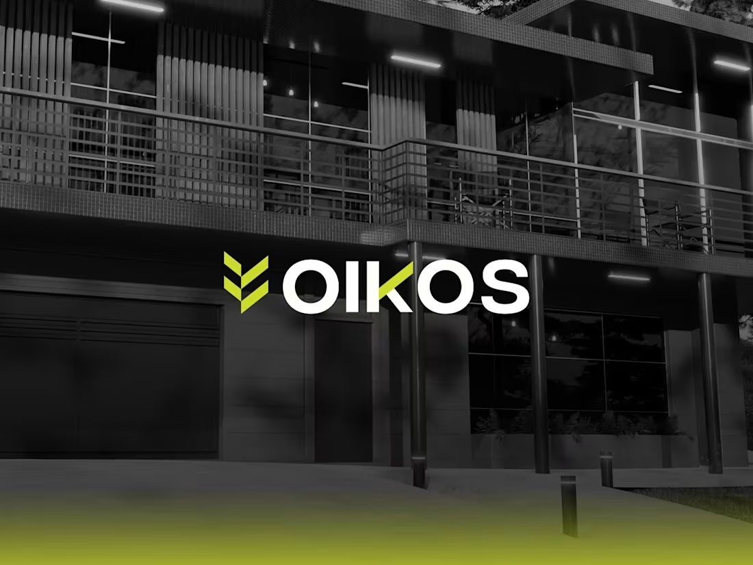
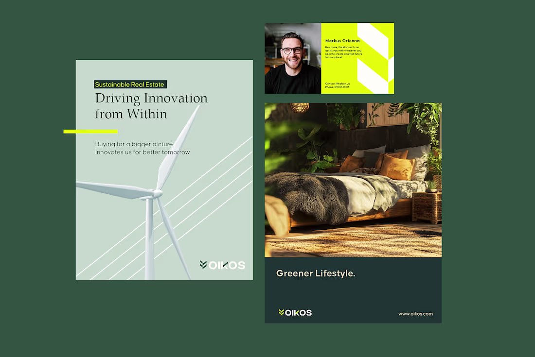
A Cohesive brand identity for Oikos that reflects its commitment to sustainable, modern living. This includes creating a visual identity, messaging, and digital presence that effectively communicates its mission to eco-conscious audience.
1
108
Oikos Branding Project
1
4
Coffee Business Rebranding
1
0