The network for creativity
Join 1.25M professional creatives like you
Connect with clients, get discovered, and run your business 100% commission-free
Creatives on Contra have earned over $150M and we are just getting started
Back to feedPost

Hi expanding my circle! 🙌 I’m newly active here and would love to connect with clients and creators focused on purposeful design.
Showcasing design developed for NADVIT. In design, the best route isn't always the first one—it’s the one that resonates. This concept visualizes cellular renewal through fluid, continuous lines, moving away from "anti-aging" toward a feeling of true longevity.
The other directions were well created and concept, but this specific mark I felt the most "right." It balances the technical DNA of the product with a warm, human touch and contain the brand vision in a single mark. 🧠


The network for creativity
Join 1.25M professional creatives like you
Connect with clients, get discovered, and run your business 100% commission-free
Creatives on Contra have earned over $150M and we are just getting started






Related posts

My latest branding project for the Atlanta Museum of Paleontology.
Check out the full project at maximjungle.com

A T-rex drawn in one thin outline is such a good mark 🦖 I'd happily visit that museum.


How far can you take a logo beyond the first draft?
I started with Recraft's Logo Maker and a fictional idea: Bibu's Paws, a cosy little dog rescue and adoption shelter.
I wanted the identity to feel warm, homely and full of character, so I explored a few logo directions before settling on the little dog tucked inside a house.
From there, I took the idea further, building out the visual identity with an earthy colour palette, typography, illustrations and a few real-world applications: the shelter space, dog merchandise and an adoption welcome kit.
I enjoyed seeing how a small starting point could grow into a brand with its own personality and world.
Now I'm curious: if you were building a brand around this logo, what would you create next?






It turned out so cozy, you did great

This one made me stop scrolling....
Love the playful wordmark and that olive-pistachio palette.
Sharing so others can enjoy it on their feed a little longer. 🙌

Can AI create a professional-looking logo?
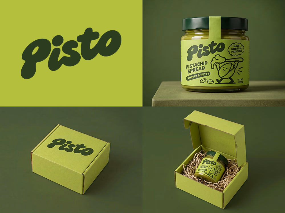
I tried to create a logo concept for a pistachio spread brand using Recraft Logo Maker.
After answering a few questions about the brand and going through several variations, I finally landed on a logo that felt right and captured the fun,...

Wow