Mohit Ramdham
Product Designer for Startups & SaaS


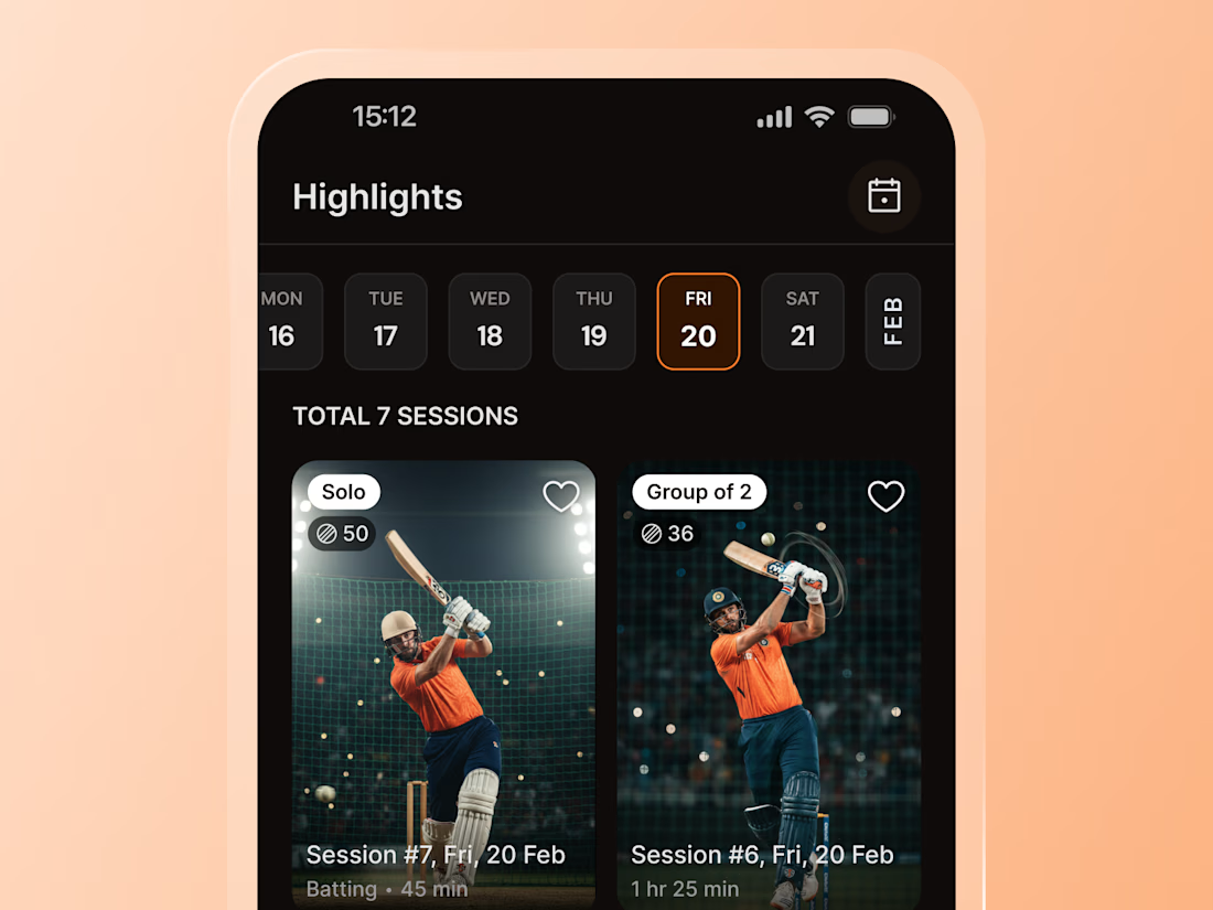
Ever scroll Shorts without thinking twice?
That's the pattern I borrowed for CrickRoo's sessions screen. Tall thumbnail, quick tags, duration at a glance.
Players already scan content this way, so finding a session needed zero learning.
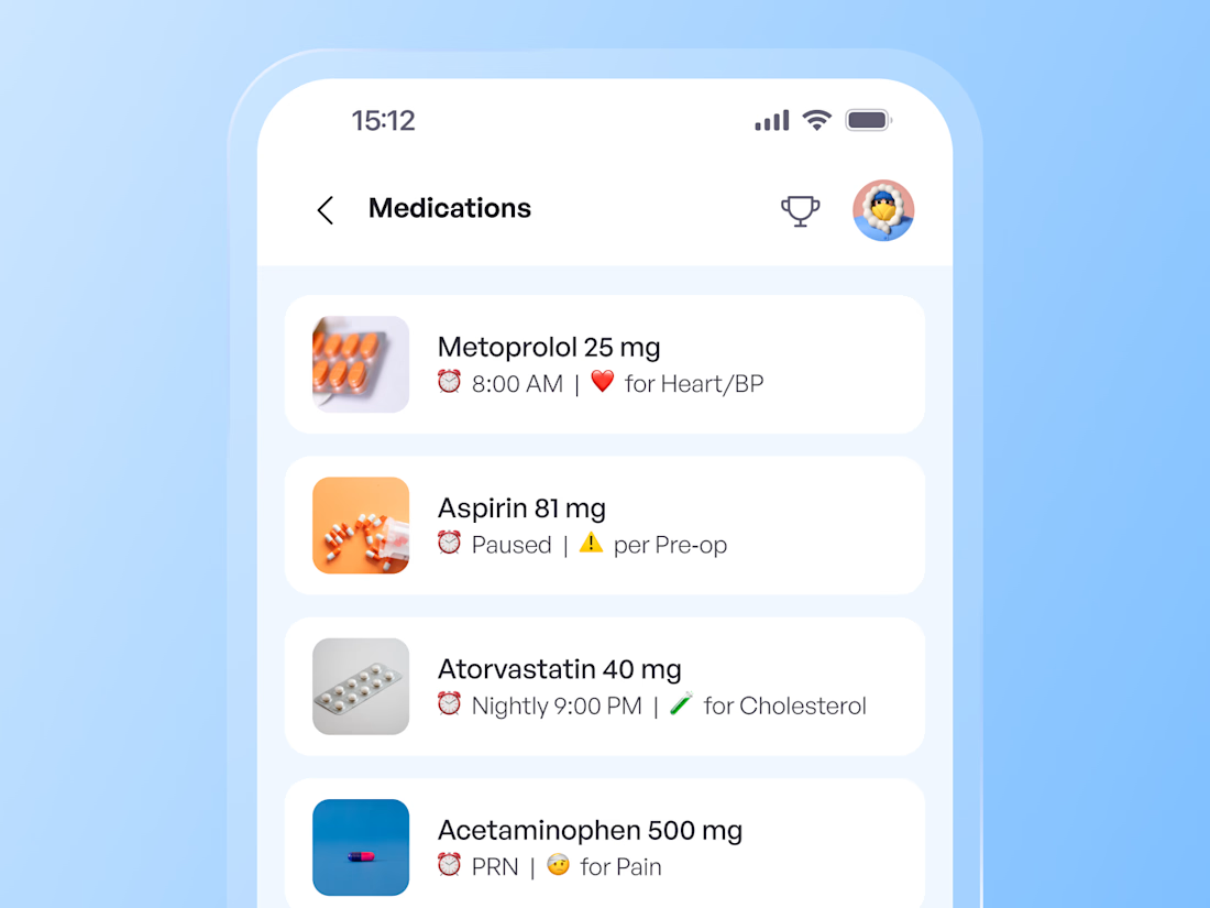
Small detail, but an important one
For Sara, I designed a medication card that combines the medicine image, name, and its uses in one place, making the information easier to scan and understand.
A simple way to make a clinical experience feel a little more human.
Made it to the Last day 😅 of Makeathon 🚀
Play Design Duel ✨- Higher or Lower Game 🎮 for Designers
Guess 🤔which UI component/pattern was searched 🔍 more last month
Perfect for a mini‑refresh of design fundamentals while having fun 🧠✨
Can you unlock the “Design Legend”...
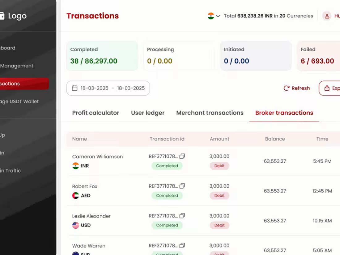
As a designer, whenever I see a table UI, I start counting the columns...
Could this be 6 instead of 10?
Does the user really need all of this at once?
That was one of the things I kept thinking about while redesigning the PKI admin panel for global payments
The goal wasn't to...
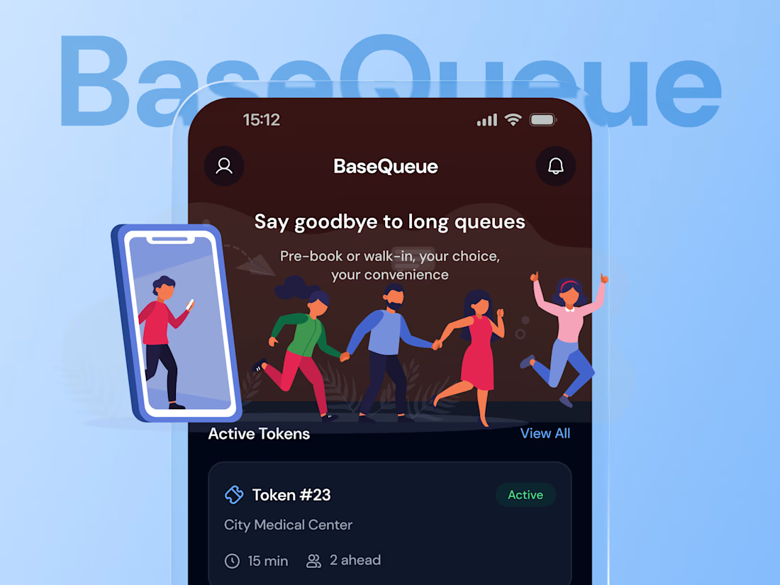
Rethinking how people join a queue
BaseQueue started with a simple booking experience, but the more I explored the flow, the more I felt the experience could work differently
I redesigned the journey around the actual queue experience, making it easier to join, understand your...