BaseQueue - Rethinking how people join queues

Mohit Ramdham


BaseQueue
A user flow suggestion that changed the pricing model
Role: Product Designer
Timeline: 3 Weeks
Responsibilities: UX Research, User Flows, Wireframing, UI Design, AI-assisted Prototyping, Dev Handoff
Outcome: Proposed a queue-based flow that delivered 2x faster queue creation and 40% less booking time
Context
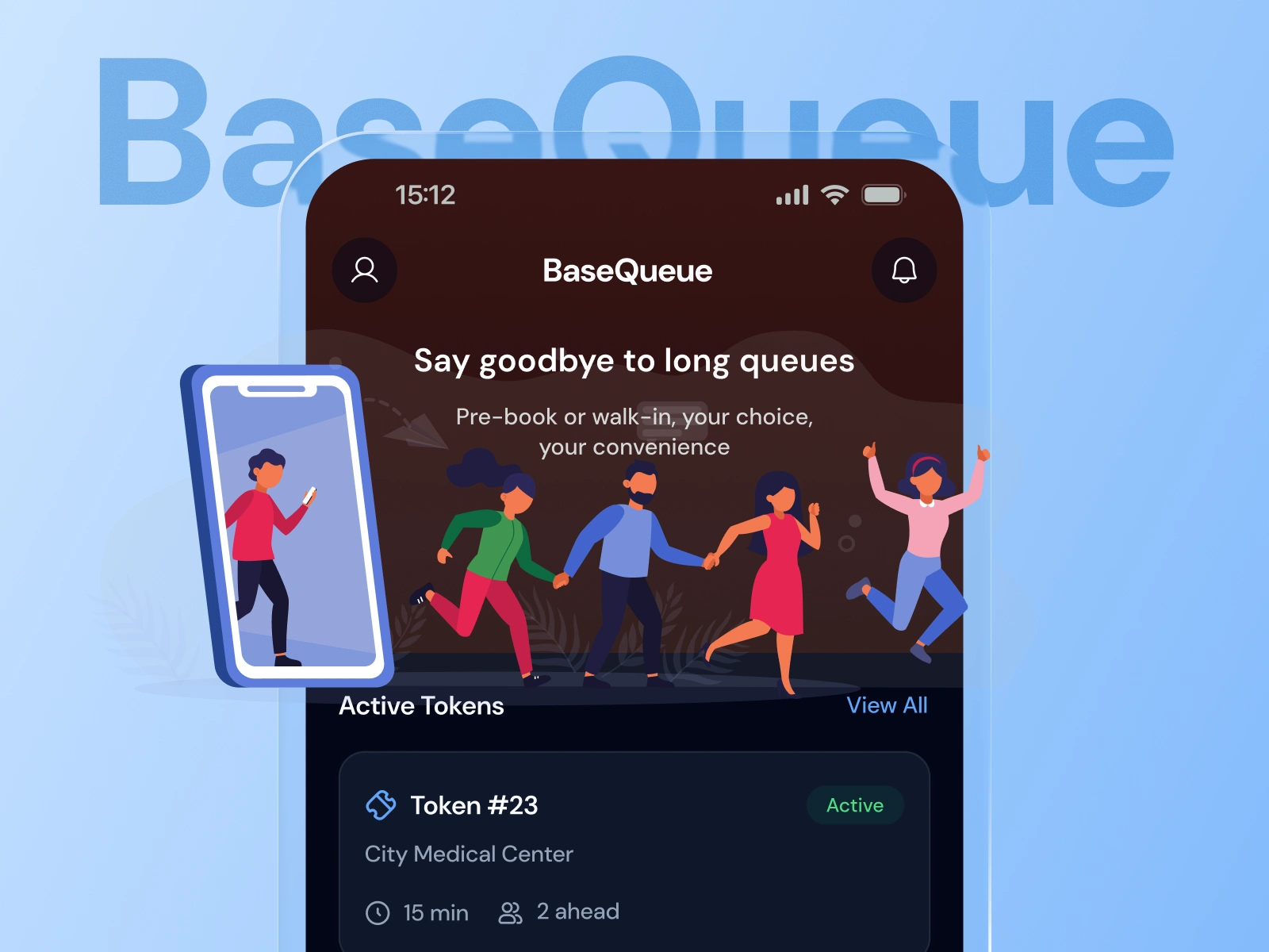
BaseQueue helps people avoid physical waiting. Discover a service, book a token, and track your position from anywhere.
Providers create queues. Customers join them. Simple in concept. Before opening Figma, I noticed something in the PRD that changed the product's direction.
Understanding the Problem
The original flow was built around time slots. It read like an appointment app.
"What time do you want?"
That worked for scheduled services. It didn't work for a token-based queue, where the real question was different.
"What's the next available place in line?"
That gap looked small inside a user flow diagram. It wasn't. It decided how flexible the whole product could be, and how providers would eventually price it.
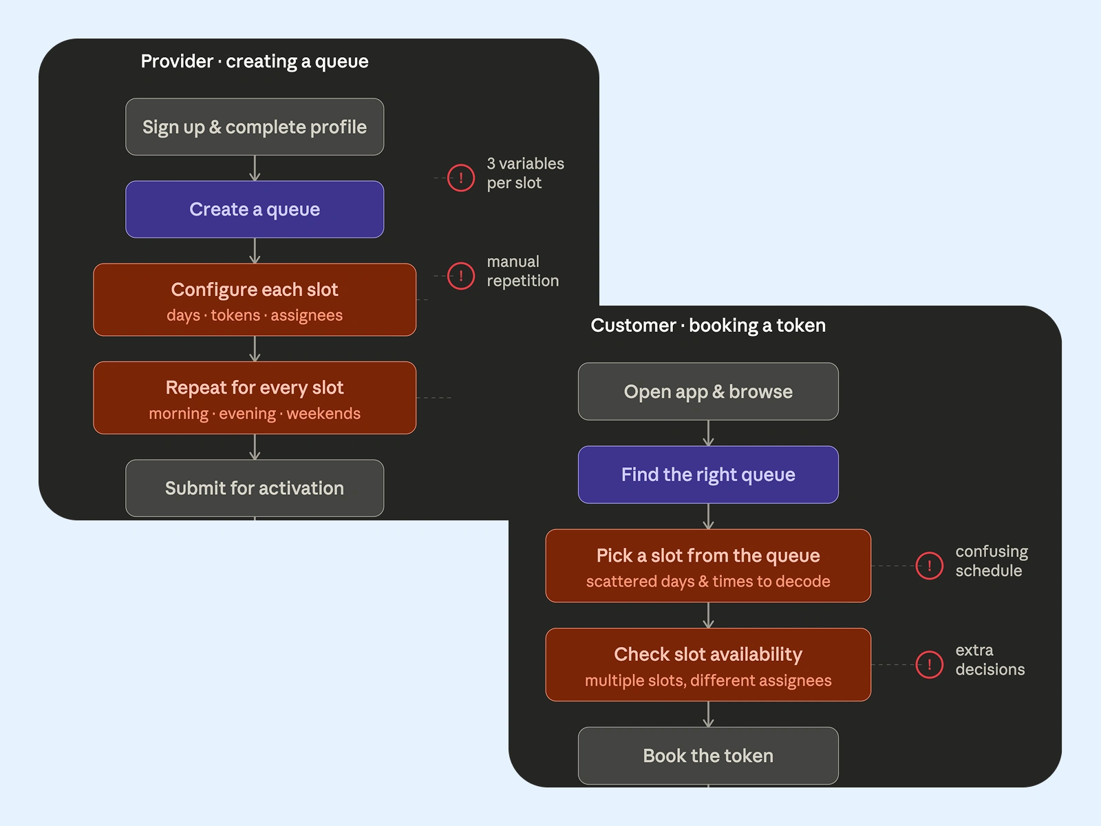
Existing user flows in PRD
The Suggestion
I proposed moving away from slots entirely. Make the queue the product, not the time slot.
One queue, one time range, one set of assignees. Duplicate it if you need more. No appointment logic forcing every business into the same mould.
The client took time, then came the Yes that changed the whole product
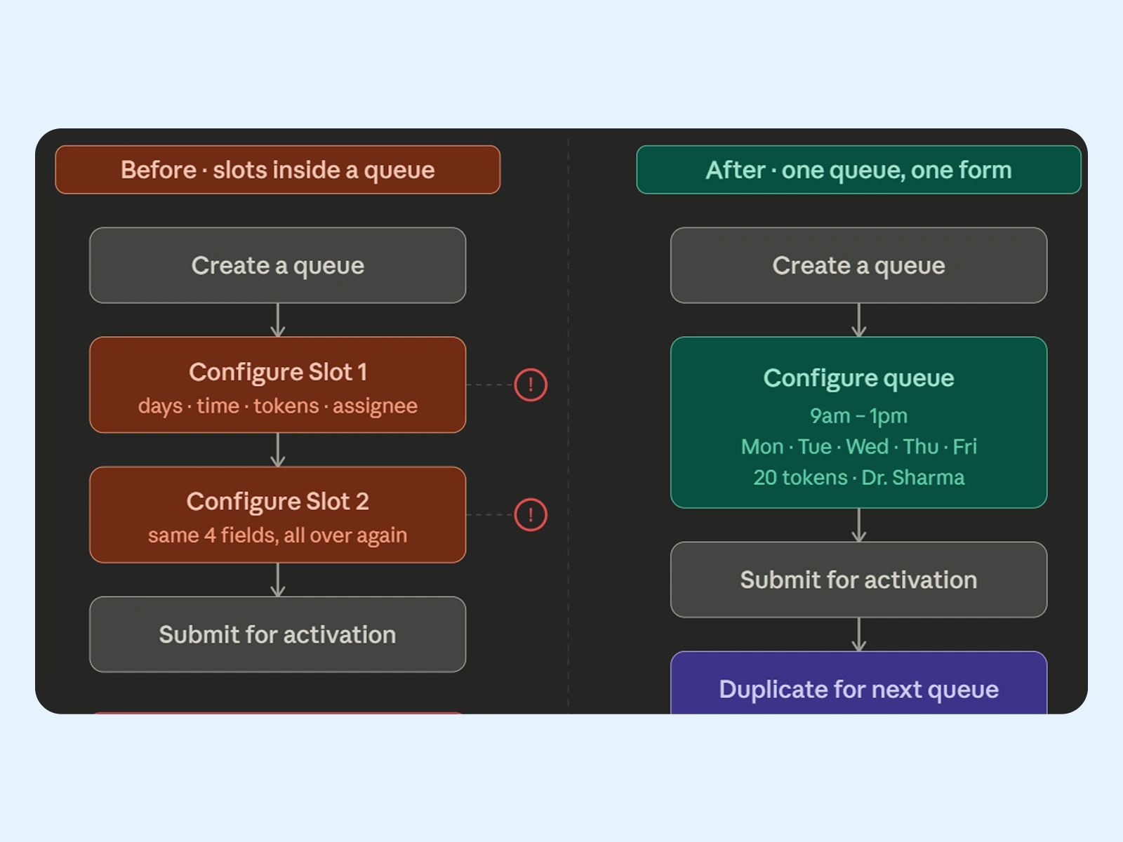
Before and after comparison
Business Impact
Queues becoming the core object gave providers a reason to create more of them. More queues meant more tokens, and more tokens meant more revenue for BaseQueue.
It also reshaped how the product could eventually be priced and packaged, since queues were now something providers configure and manage directly.
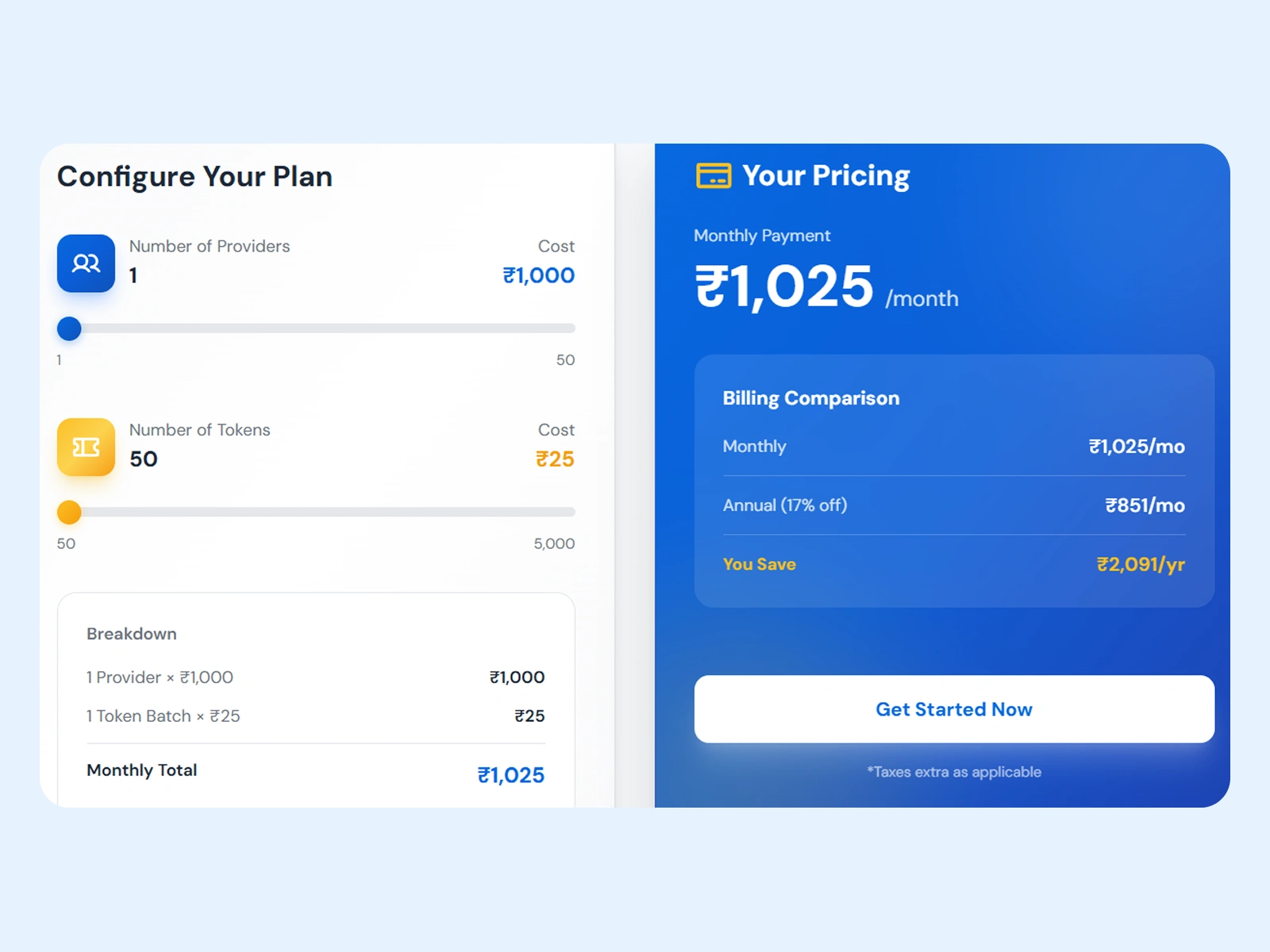
Impact
Queue creation 2x faster after removing slot logic
Booking time cut by 40% for customers
140+ screens delivered across both customer and provider apps, light and dark mode
Pricing direction reshaped off a single flow decision
Closed the loop by designing the basequeue.com website too
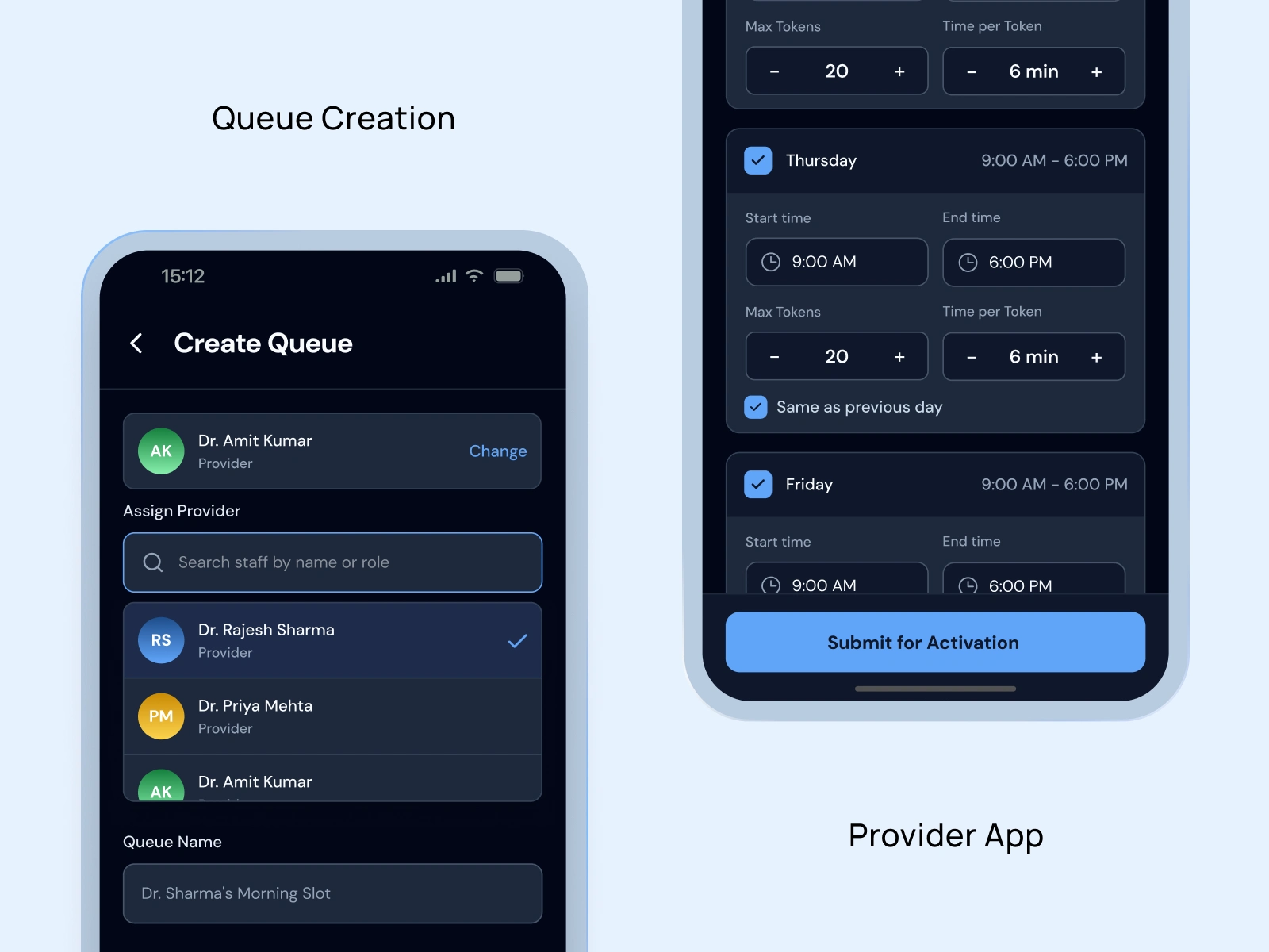
Provider app screens
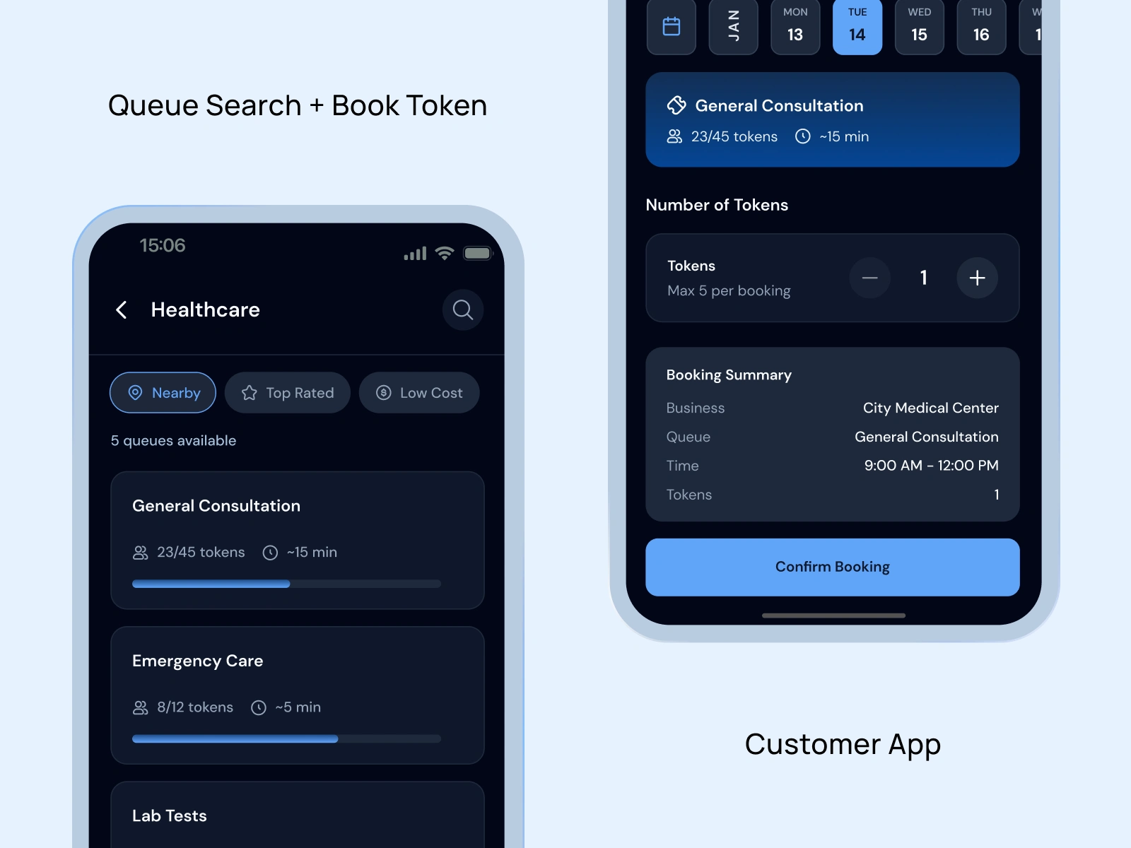
Customer app screens
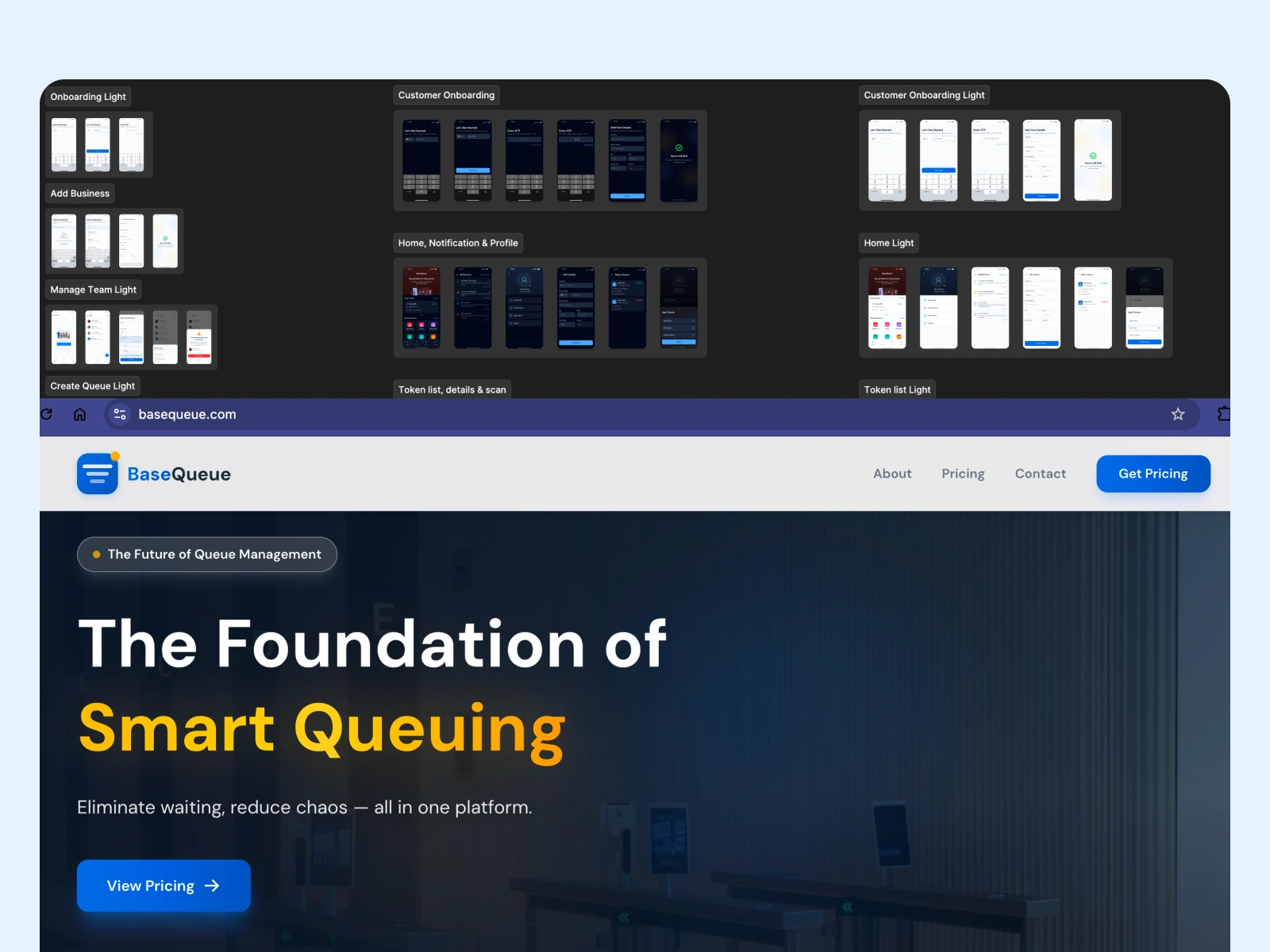
Dev handoff and website
Takeaway
This project reminded me that some of the most important design decisions happen before the UI
A small question in a user flow can expose a much bigger product decision.
I manifested this exact moment while learning UX, suggesting something that helps users & the business at once. Basequeue made it real & the feeling was everything.
Like this project
Posted Sep 6, 2026
An experience that helps people join queues remotely, understand their position, and know when it's time to arrive.