Markus Zeljak
Visual identities, motion systems & brand tools
Ready for work
Markus is ready for their next project!
Visual asset generator for Daya Ventures
2
18
aktor-e: the hyphen that stuck.
The venture explored software that could help factories modernize aging machines and reduce energy use.
The hyphen became the symbol for the journey from old to new: a–e.
My teammate flipped the a into the e. I thought it broke the readability. He said, “Exactly.”
We tested it; I was happily wrong, and the mark stuck. It makes you stop for a second, without making the brand feel loud.
Team: 2 designers (me), 1 motion (me)
2
507
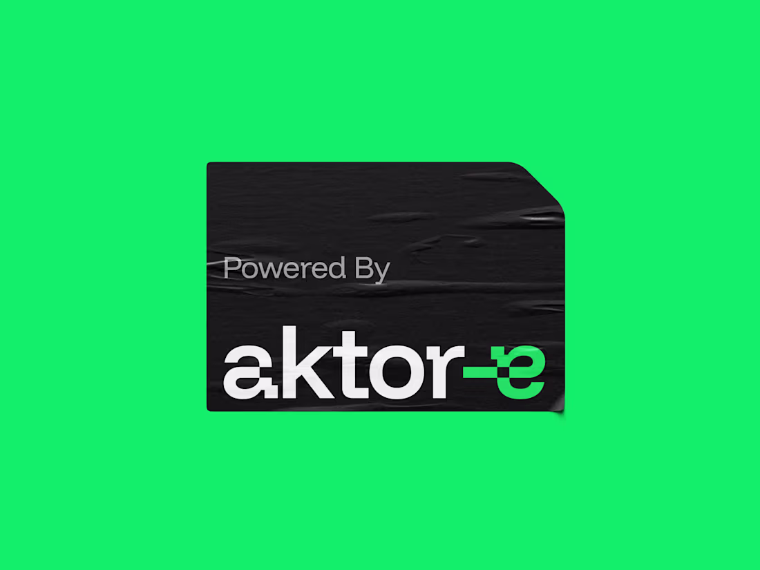
aktor-e: solution flexes, logo flexes.
The venture explored software that could help factories reduce energy use.
Using only circuit boards and some code, they could make aging machines digital, letting them run smarter and use less energy.
However, they could also connect entire production lines and let factories run in symbiosis.
They weren't just energy optimizers. They could transform entire factories.
The hyphen became the symbol of that journey. It also flexes and adapts just like their solution does.
Team: 2 designers (me), 1 motion (me)
2
507
aktor-e: from strategy to identity.
The venture explored software that could help factories reduce energy use.
I led the brand work from workshop and strategy to visual identity, motion and final delivery.
During discovery, we understood that the way the venture presented itself didn't match the scale of what they were building.
So the direction had to feel technical and industrial, but still simple enough to explain a smoother move from old to new.
The result was a brand built around the hyphen: a small symbol that could carry the strategy, the identity and the motion system.
Team: 2 designers (me), 1 motion (me)
2
3
484
aktor-e: building the brand system.
The venture explored software that could help factories reduce energy use.
The brand system needed to feel engineered, but not cold.
The beveled corner became a simple visual rule that could show up across layouts, icons and interfaces.
It gave the identity a mechanical edge, while the green direction and gradients kept it connected to smarter energy use.
The main learning was that the system didn't need many tricks. One strong behaviour, used consistently, could carry a lot.
Team: 2 designers (me), 1 motion (me)
1
373
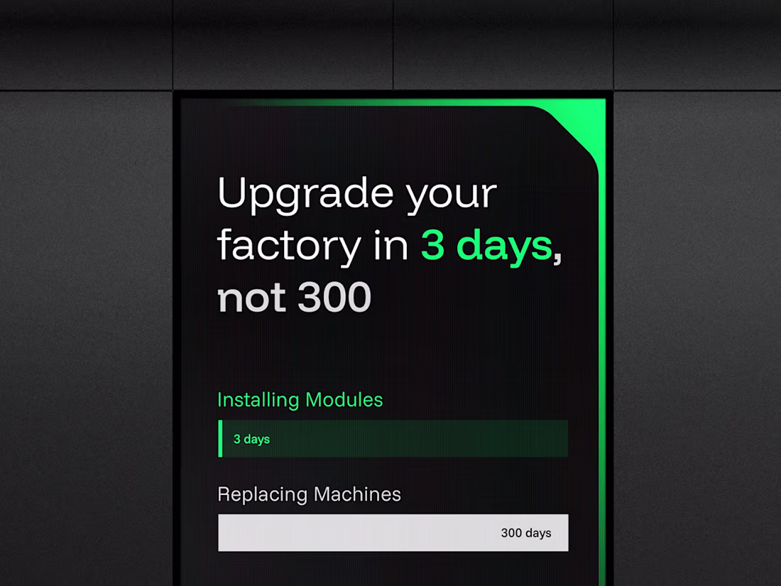
UFAB numericals + motion system for logo and numericals,
via Ebb Scandinavia.
The new logotype symbolized their mastery in CNC manufacturing.
Based on client feedback on early numeral explorations, I redesigned the set to feel coherent with the final logotype.
The numerals are now used on factory signage.
But the brand needed more ways to express smart connected manufacturing.
I built a motion system inspired by their CNC & measurement machines, where the same movement could carry across both letters and numbers.
This made the identity easier to extend without losing coherence.
Logotype: Ebb Scandinavia
Numericals: 1 AD, 1 designer (me)
Motion: me
90
156
19.6K
UFAB numeral siblings to the logo,
via Ebb Scandinavia.
The new logotype symbolized their mastery in CNC manufacturing.
Based on client feedback on early numeral explorations, I redesigned the set to feel coherent with the final logotype.
The numerals are now used on factory signage.
Team: 1 AD, 1 designer (me)
1
474
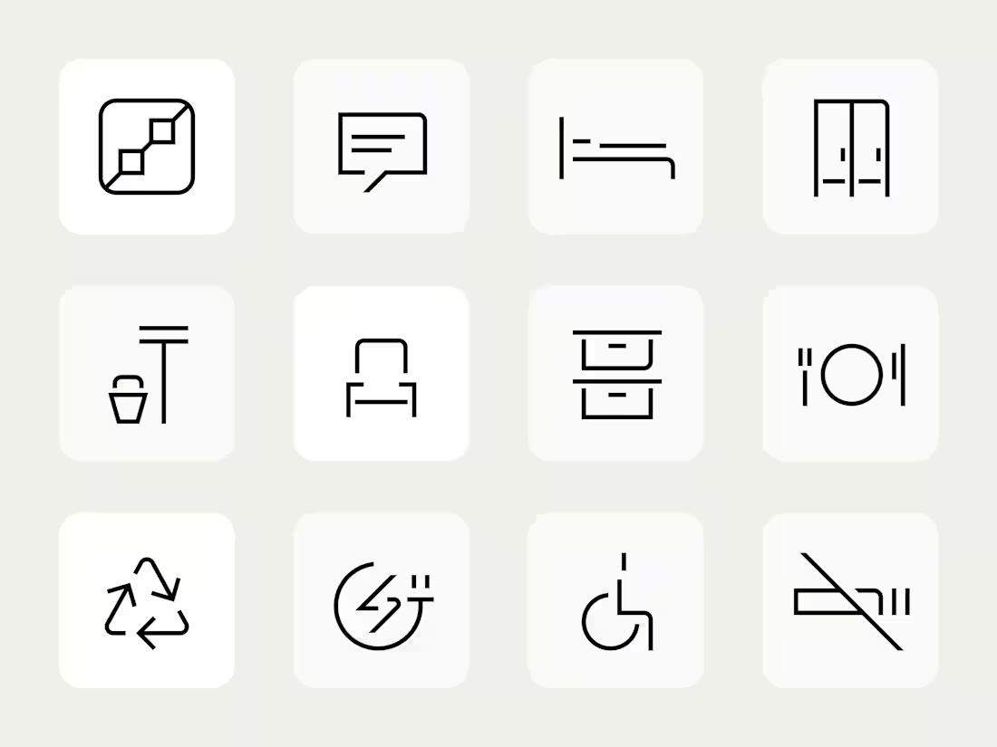
UFAB pictograms for factory wayfinding,
via Ebb Scandinavia.
Their new factory needed signage people could understand quickly.
We used pictograms to make wayfinding more glanceable.
I designed the set with flexible rules inspired by the logotype, keeping each icon consistent but unique.
I worked closely with an AD throughout the process.
Team: 1 AD, 1 designer (me)
2
437
UFAB pictograms for factory wayfinding,
via Ebb Scandinavia.
Their new factory needed signage people could understand quickly.
We used pictograms to make wayfinding more glanceable.
I designed the set with flexible rules inspired by the logotype, keeping each icon consistent but unique.
I worked closely with an AD throughout the process.
Team: 1 AD, 1 designer (me)
1
363