


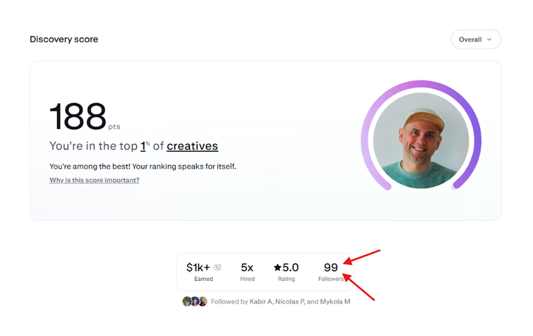
Today my Discovery score reached 188, but that doesn't make me happy because I'm still looking for my 100th follower. That means the algorithms love me, but real people only think of me when they need to borrow money😊 😂 ::

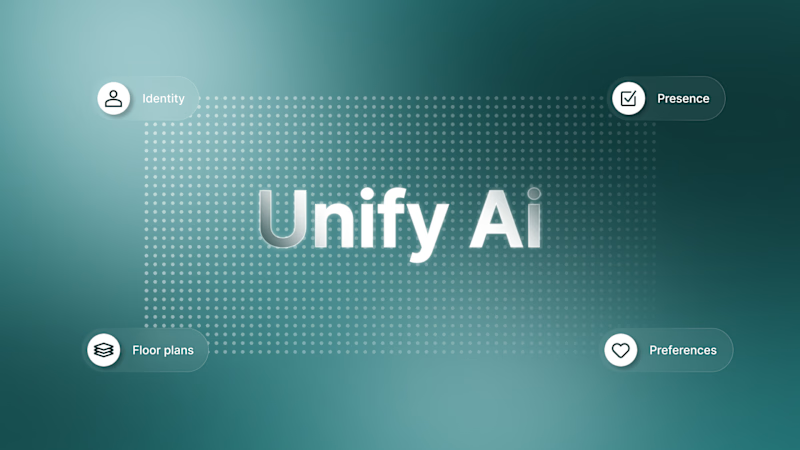
That video animation project was when we decided to move away from the currently popular black-and-white interfaces and try something different.
Which concept is more aesthetically attractive?
19 voted
79%
5 voted
21%

24 votes
Closed
Want to depict the rebirth of the phoenix. We initially created it with a plain background, but then decided to add a fiery outline.
4 voted
40%
6 voted
60%
10 votes
Closed
To be honest, we like both options. So we're curious—which one appeals to you more?
10 voted
48%
11 voted
52%
21 votes
Closed
We’re launching a new project on Monday and would like to get the community’s input on which direction we should take.
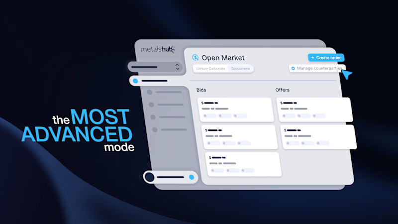
The client is in the metals and mining industry, so we’re debating whether to go with a sleek, minimalist style or something lighthearted and unconventional.
5 voted
83%
1 voted
17%

6 votes
Closed