The network for creativity
Join 1.25M professional creatives like you
Connect with clients, get discovered, and run your business 100% commission-free
Creatives on Contra have earned over $150M and we are just getting started
Back to feedPost
Taste Test

We're currently working on this animation for a mobile app. We're debating whether to use fall colors, like seasonal ones or stick with the app's current color scheme.
Community, which color scheme would you vote for?

8 voted
38%
13 voted
62%
21 votes
Closed

Option 2 was stunning🔥🔥🔥🔥
Mostafa, thanks a lot 🙌
Pardon Mark❤️
🙌

Option 2! The existing color palette feels more cohesive, and the blue curtains work really well with the rest of the interior. 😊
oh, thanks for your detailed feedback

I voted for option 2
Fatima, realy apreciate your vote 🙌

App's current color scheme also looks ok with the design
Muhammad, thanks fot your opinion

Option two looks great mark!
Thanks, Manav

Nice work.
Thanks, Shakil

Thanks 👍

Fall colors could be a fun seasonal moment, but I'd keep the main scheme so the brand stays recognizable. Maybe save the seasonal one for a limited drop?
Thanks 👍

Upgoating option 2
Thanks 👍


option 2 for me. in option 1 the whole room sits in the same warm yellow so the depth kind of flattens out, the blue vs sand in 2 keeps the space readable
Thanks 👍
The network for creativity
Join 1.25M professional creatives like you
Connect with clients, get discovered, and run your business 100% commission-free
Creatives on Contra have earned over $150M and we are just getting started





Related posts

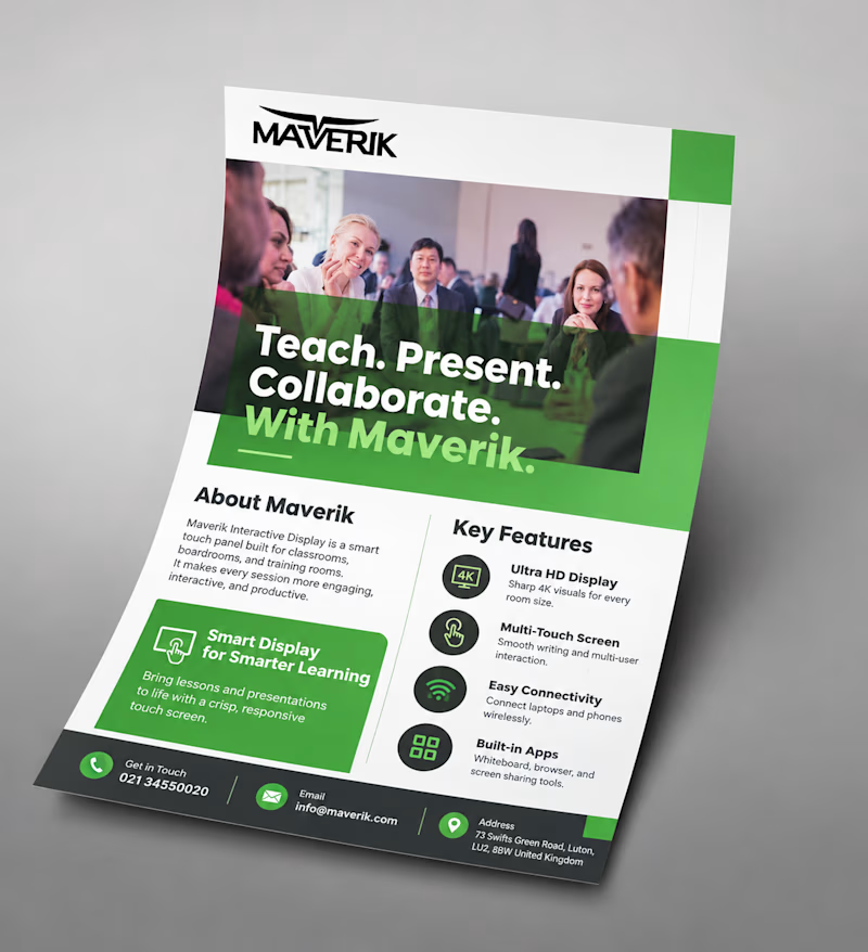
Same goal, different approach: a light, icon-based flyer vs a bold, photo-driven one.
Which would make you stop and read? Vote and tell me why!

2 voted
50%
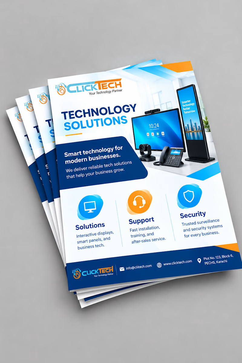
2 voted
50%
4 votes
Closed

Malaika both are good but the first one (Maverik) would make me stop! Photo-driven creates instant trust and human connection, especially for education tech. Icon-based is cleaner but photo wins for engagement. Great work!

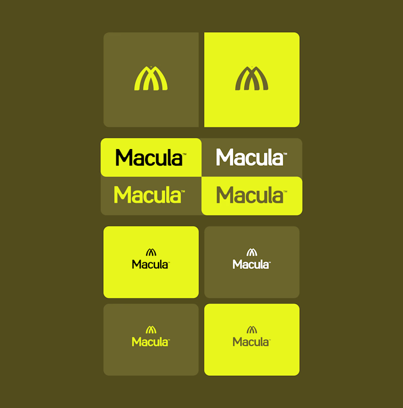
Trying out two symbols for this identity.
The type and colors stay the same, but the feel changes.
Which one would you go with?

6 voted
50%
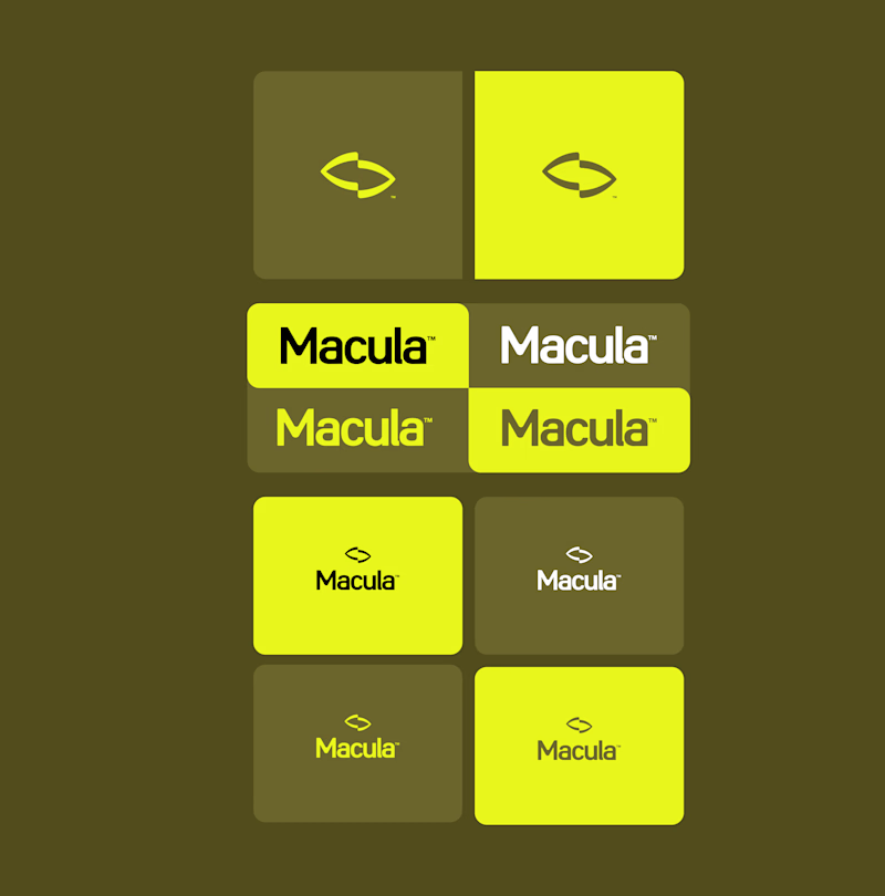
6 voted
50%
12 votes
Closed
Converge is great but Spotlight feels an updated macdonalds logo ❤️
Great job Gabriel 🎉🎉🔥🔥
Can’t take your eyes off this one. Literally, the eyes are the whole test A or B? Go with your gut, don’t overthink it.
P.S. The client already picked one. I’ll tell you which after you vote.
2 voted
25%
6 voted
75%
8 votes
Closed

Going with my gut: Option 2, Mark. The unobstructed eye ring with NOTICE is hypnotic on its own, while the Maison Cura card in Option 1 covers the best part of the eye. Curious if the client agreed.