The network for creativity
Join 1.25M professional creatives like you
Connect with clients, get discovered, and run your business 100% commission-free
Creatives on Contra have earned over $150M and we are just getting started
Back to feedPost
Taste Test

If you do motion, you know this choice is never small. Two fly-ins, same scene. A or B?

12 votes
Ends in 1d

B hits different for me! That glowing orb trail adds so much more personality than a plain text fly-in. But A is cleaner if you want minimal. I'd ship B! 🚀
Thank you for your detailed response

I love option 2
Thanks, Samuel

I’d go with Option 1! I’m a big fan of kinetic typography, and I love how the moving text builds curiosity before revealing the message. 🙌
I'll know that you're fans of kinetic typography

Thanks a lot
Can you share what exactly do you like in this animation?
Thanks

2...
good from the start...
Thanks, Ebad 🙌

Option 2 is unique ❤️
thanks, Mostafa. Apreciate it

2. The orb actually does what the line says: it travels the path and links the apps, so "connecting the dots" is shown, not just typed. In 1 the words, the phone and the flying icons share the frame at the same time, and my eye didn't know where to land first

Good work🔥 I choose 2 ; feel more solid 🚀

Option 2 creates more curocity where they are going. It looks interesting.

Option 2 is unique, but readability and access is better in Option 1, so will go with 1
The network for creativity
Join 1.25M professional creatives like you
Connect with clients, get discovered, and run your business 100% commission-free
Creatives on Contra have earned over $150M and we are just getting started





Related posts


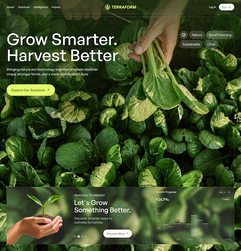
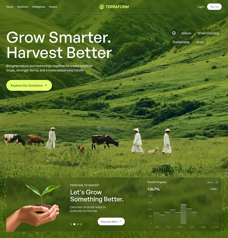

Both look great, but A feels more memorable at first glance.


dithered reads calmer against the blue pill icon. pixelated competes with the card edges more.

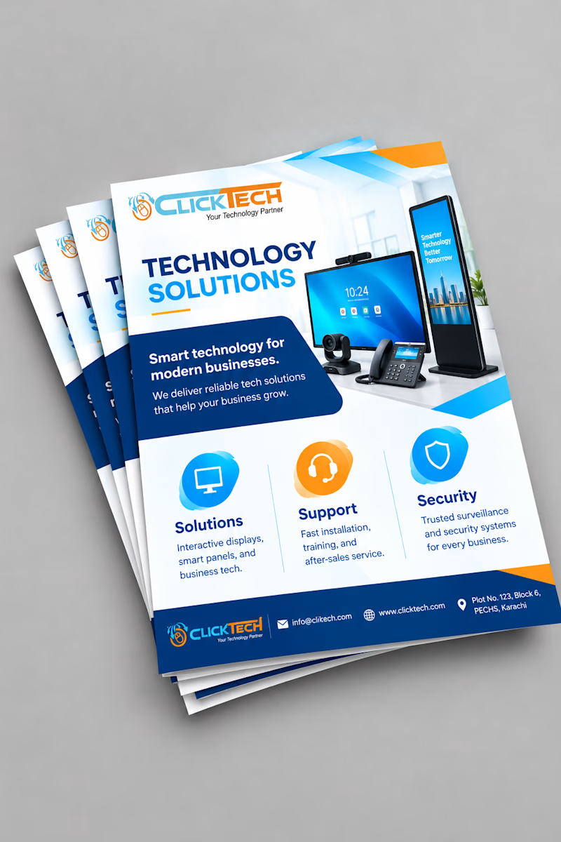
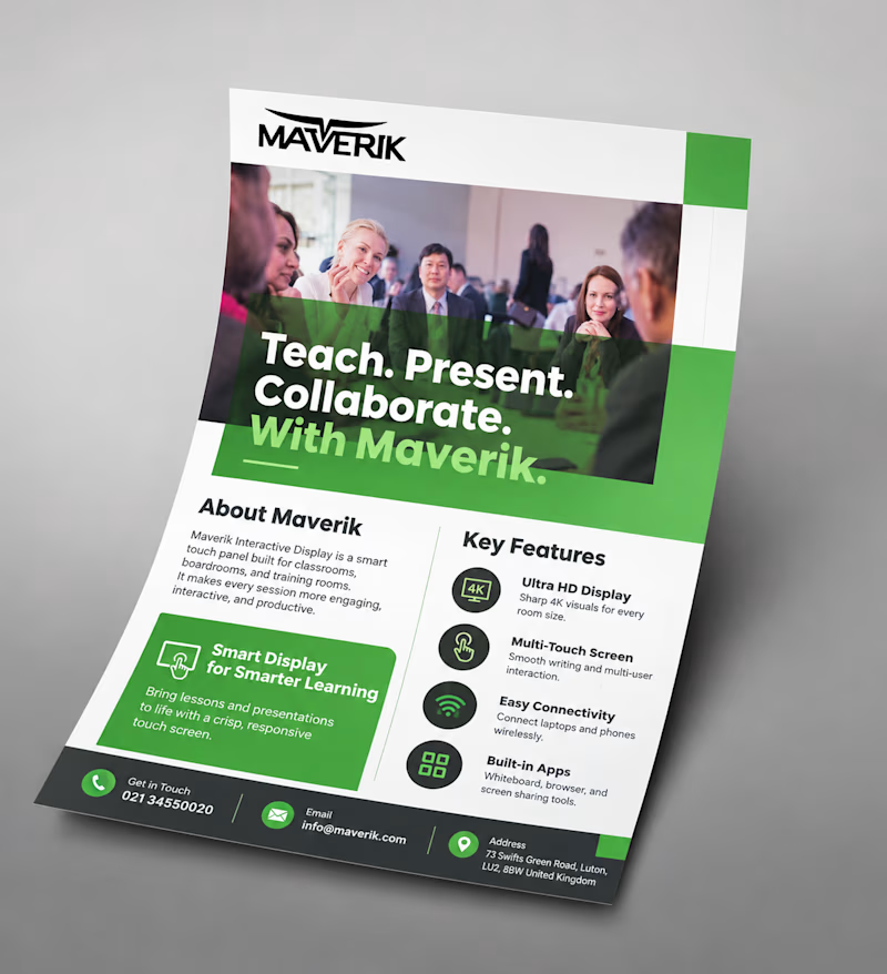
Same goal, different approach: a light, icon-based flyer vs a bold, photo-driven one.
Which would make you stop and read? Vote and tell me why!

2 voted
50%
2 voted
50%
4 votes
Closed
Malaika both are good but the first one (Maverik) would make me stop! Photo-driven creates instant trust and human connection, especially for education tech. Icon-based is cleaner but photo wins for engagement. Great work!