The network for creativity
Join 1.25M professional creatives like you
Connect with clients, get discovered, and run your business 100% commission-free
Creatives on Contra have earned over $150M and we are just getting started
Back to feedPost
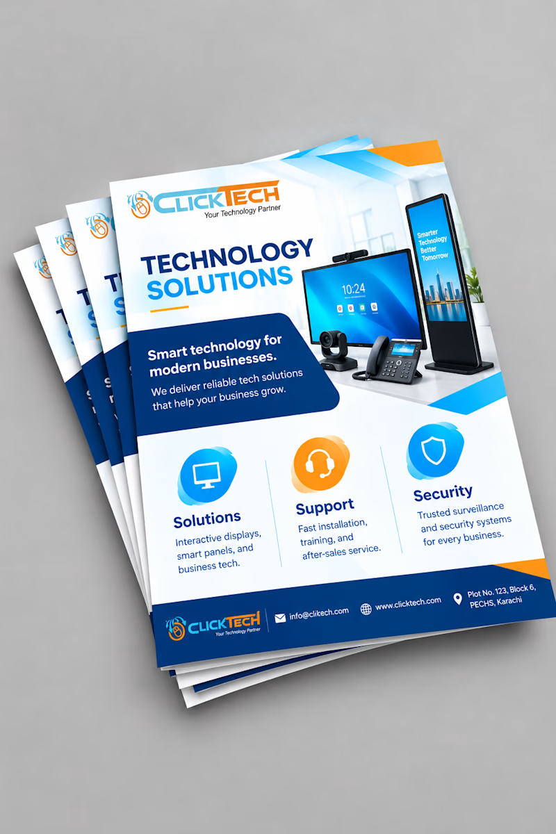
Taste Test
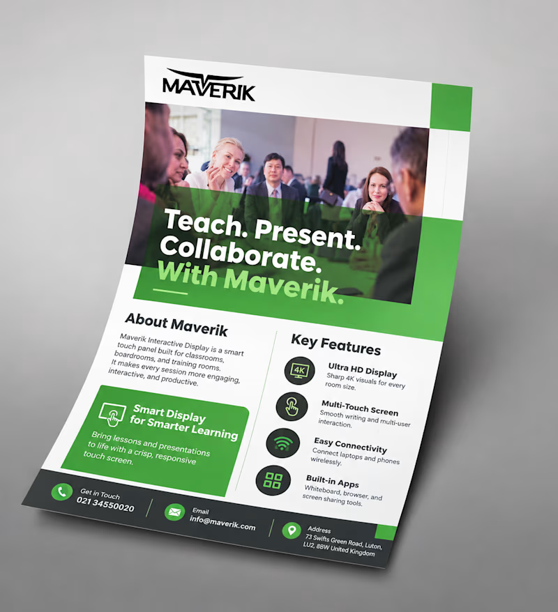
Same goal, different approach: a light, icon-based flyer vs a bold, photo-driven one.
Which would make you stop and read? Vote and tell me why!

4 votes
Ends in 12h

option 2

Thanks for voting!

Option 2 stopped me first. The people photo and green blocks pull the eye in.
Great observation! Do you think the photo-led layout works better for tech brands, or does it depend on the audience?

Malaika both are good but the first one (Maverik) would make me stop! Photo-driven creates instant trust and human connection, especially for education tech. Icon-based is cleaner but photo wins for engagement. Great work!
Thank you so much! Education tech really does benefit from that human element, so it's great to hear the photo-led approach came across that way.
Exactly Malaika! Edu tech needs that human touch to build trust - you nailed that balance. Keep it up!
Thanks! The feedback on this poll is helping me plan my next flyers.

Great job Malaika🎉🎉🔥🔥
Thank you so much! 🙌
Pardon Malaika❤️

BEAUTIFUL 😍

Light Icon based is more professional
The network for creativity
Join 1.25M professional creatives like you
Connect with clients, get discovered, and run your business 100% commission-free
Creatives on Contra have earned over $150M and we are just getting started











Related posts

Hey everyone! 👋
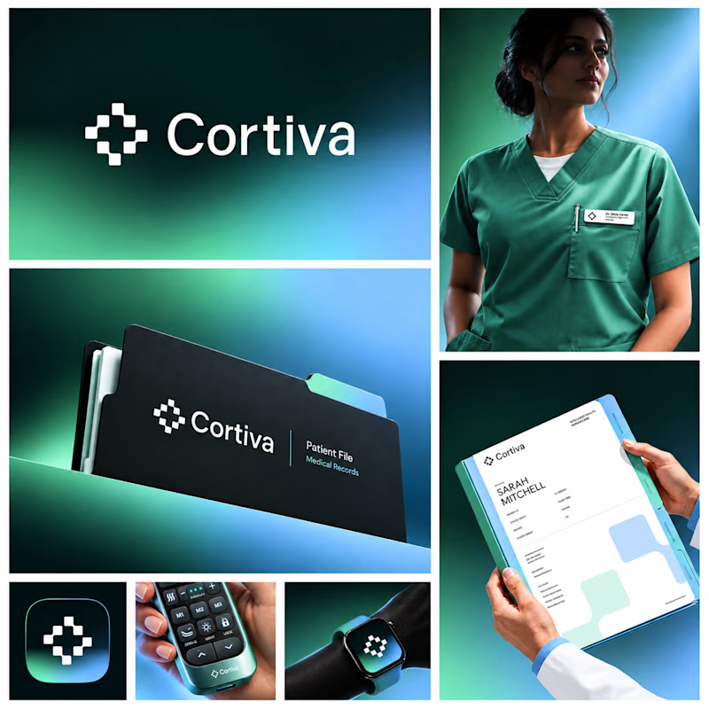
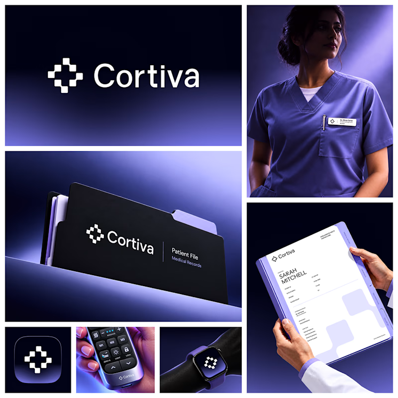
Working on Cortiva, an AI-first hospital branding project.
I've already finalized the color direction, but I thought it would be fun to explore two different moods.
Option 01💚 or Option 02? 💜
Both have their own personality, and I'm curious to see which one you prefer!
Let's see which one wins! 👀
5 voted
33%
10 voted
67%
15 votes
Closed

Both directions are strong, but I'm leaning towards Option 01. The green feels instantly like "care" and trust, which is perfect for a hospital. Option 02 looks more techy and premium. Curious, which mood are you aiming for - clinical and calm, or friendly and modern?

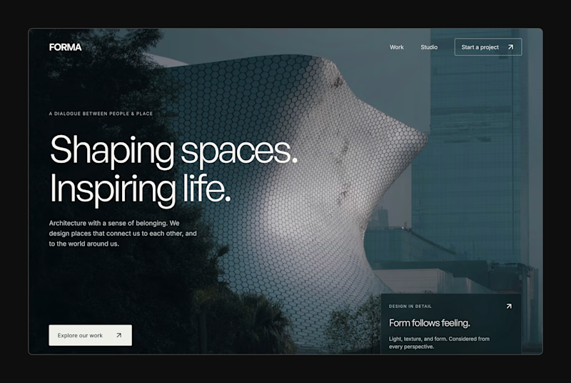
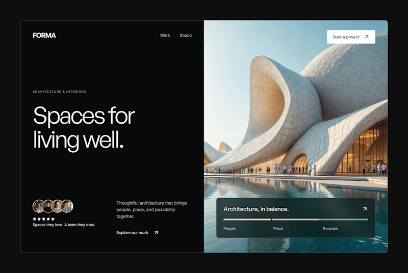
Design Exploration: Hero Section of Architecture Website. Which one do you think much better?


12 voted
43%
16 voted
57%
28 votes
Closed


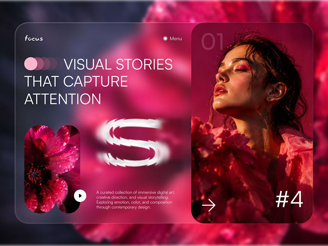
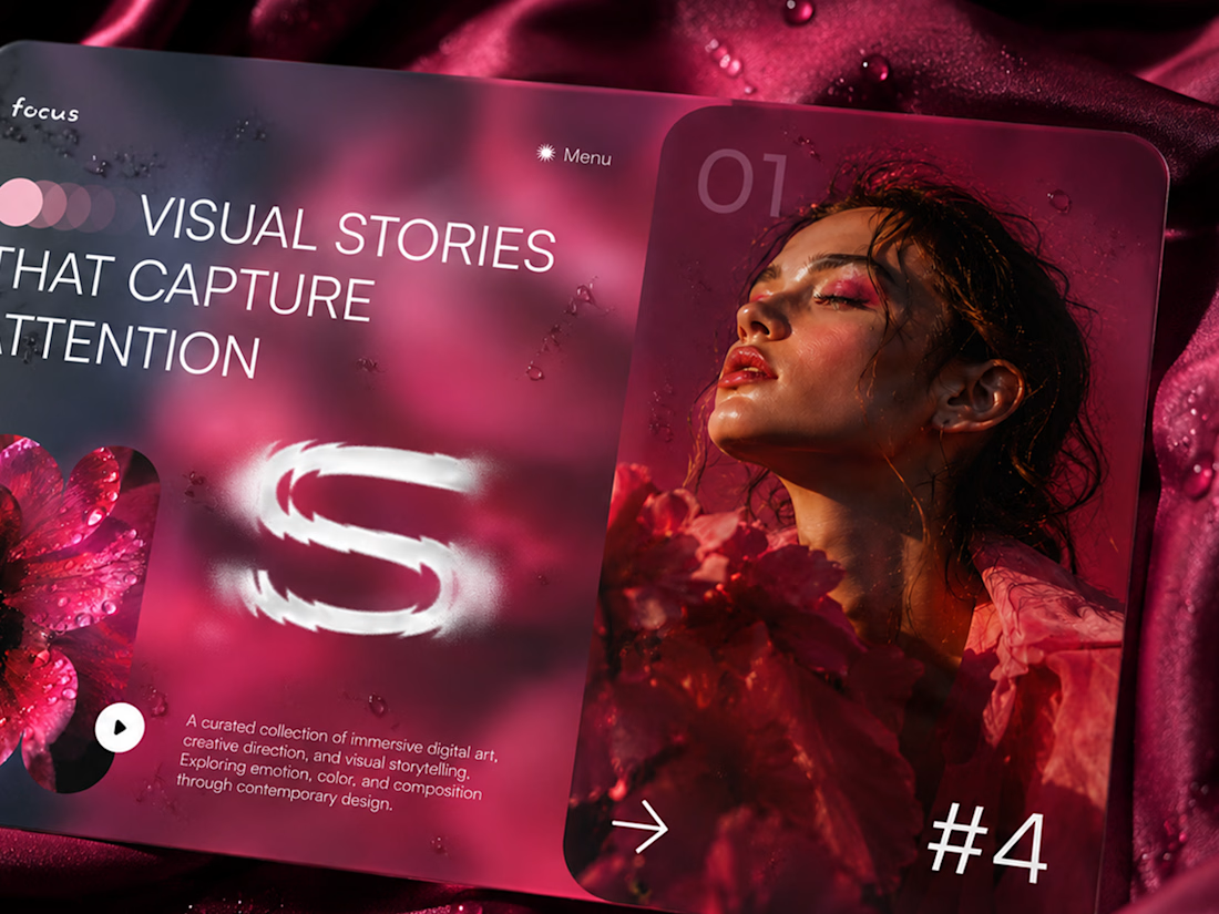
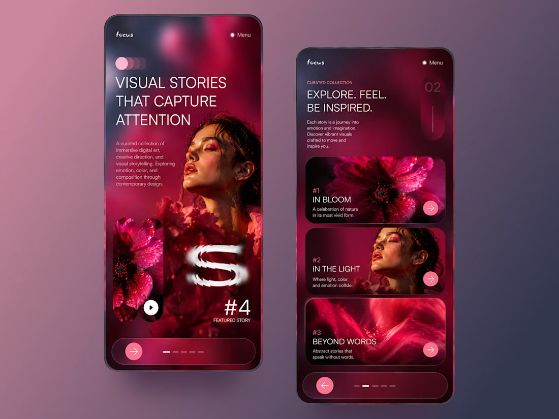
FOCUS — Creative Portfolio & Digital Art Website 🌸✨
A visually expressive website concept for a creative portfolio, built around digital art, bold imagery, and visual storytelling
The design combines vibrant pink tones, soft gradients, experimental typography, and immersive photography to create a distinctive editorial experience
Special attention was given to:
• Bold editorial hero composition
• Vibrant pink and dark color palette
• Experimental typography and visual details
• Immersive photography and digital artwork
• Creative project gallery and navigation
• Responsive mobile experience
• Clean layouts with a strong visual identity
The result is an expressive digital experience that puts creativity, emotion, and visual storytelling at the center of every screen 💗
Looking to create a standout portfolio or website for a creative brand? Let’s connect 🚀