
Lucas Campos
Art Director building brand identity
Ready for work
Lucas is ready for their next project!


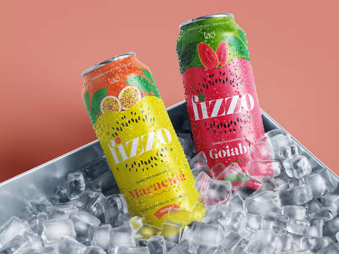
Fizzo is a conceptual packaging design project, developed as a portfolio exercise: a fictional sparkling kombucha line imagined as a brand extension of Tao Kombucha.
The project explores how a brand built on health and purpose can enter the "ready to drink" kombucha movement, closer to a premium soda than a supplement, without giving up the identity it has already built, creating a sub-line endorsed by the parent brand, free to communicate energy and instant pleasure.
The work covers naming, positioning, a flavor-based color system, illustration direction, and typography, applied across 4 SKUs: passion fruit, cashew fruit, açaí, and guava.
Conceptual project, not affiliated with the real brand.
Full project on Behance: https://www.behance.net/gallery/254205011/Fizzo-Kombucha-Packaging-Concept
14
16
406
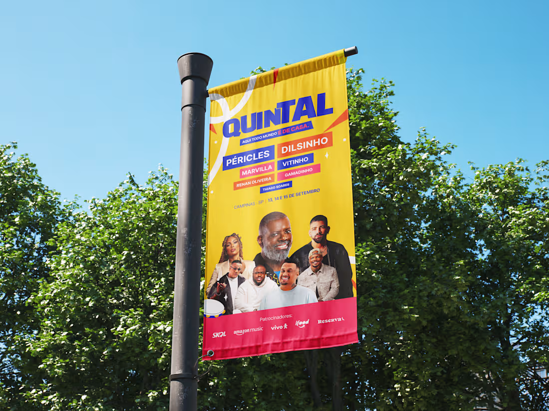
Over the last few weeks a study project was developed combining everything that has been explored in art direction: visual identity, key visual, social media and motion design.
QUINTAL is a fictional modern pagode festival, built from scratch to practice the full process, from briefing and reference research all the way to the final pieces animated in After Effects.
No shows scheduled, no tickets on sale. But a lot was built with care: logo, palette, typography, individual lineup posts per artist, a flyer and motion.
The full case is published on Behance.
Link: https://www.behance.net/gallery/251788261/Quintal-Festival-de-Pagode
20
20
1K
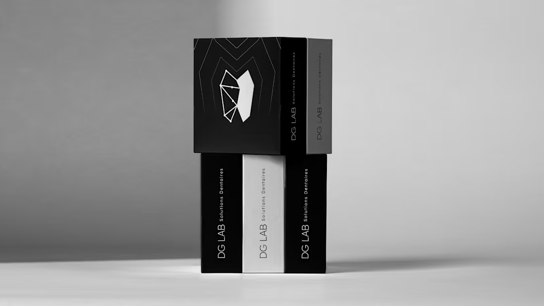
Translating technical excellence into visual authority
Client: Dental prosthetics laboratory Challenge: Generic visuals not reflecting quality work Scope: Complete visual identity system
Delivered:
Naming simplification (60% shorter, 300% more memorable)
Logo system (primary + variations)
Brand guidelines
Applications (stationery, packaging, social media)
Key insight: The low-poly geometric tooth isn't just aesthetic—it's conceptual. Each facet represents millimetric precision. Structural lines visualize their process: mapping → building → connecting → result.
Differentiation: While competitors use literal dental imagery, we went geometric and sophisticated.
Impact: Premium positioning. Visual consistency. Ready for growth.
Design that works understands the business first, then translates strategy into pixels.
1
101

A identidade visual da BORBA foi desenvolvida para refletir a modernidade e a versatilidade do seu posicionamento no mercado. Atuando na produção de eventos que abrangem diferentes classes sociais e tipos de experiências, a marca se posiciona como um elo entre a exclusividade e a acessibilidade, oferecendo eventos sofisticados, mas inclusivos, com um alto padrão de profissionalismo. 🚀 👊
Projeto completo no behance:
https://lnkd.in/dMtfbWpT
3
8
147