The network for creativity
Join 1.25M professional creatives like you
Connect with clients, get discovered, and run your business 100% commission-free
Creatives on Contra have earned over $150M and we are just getting started
Back to feedPost
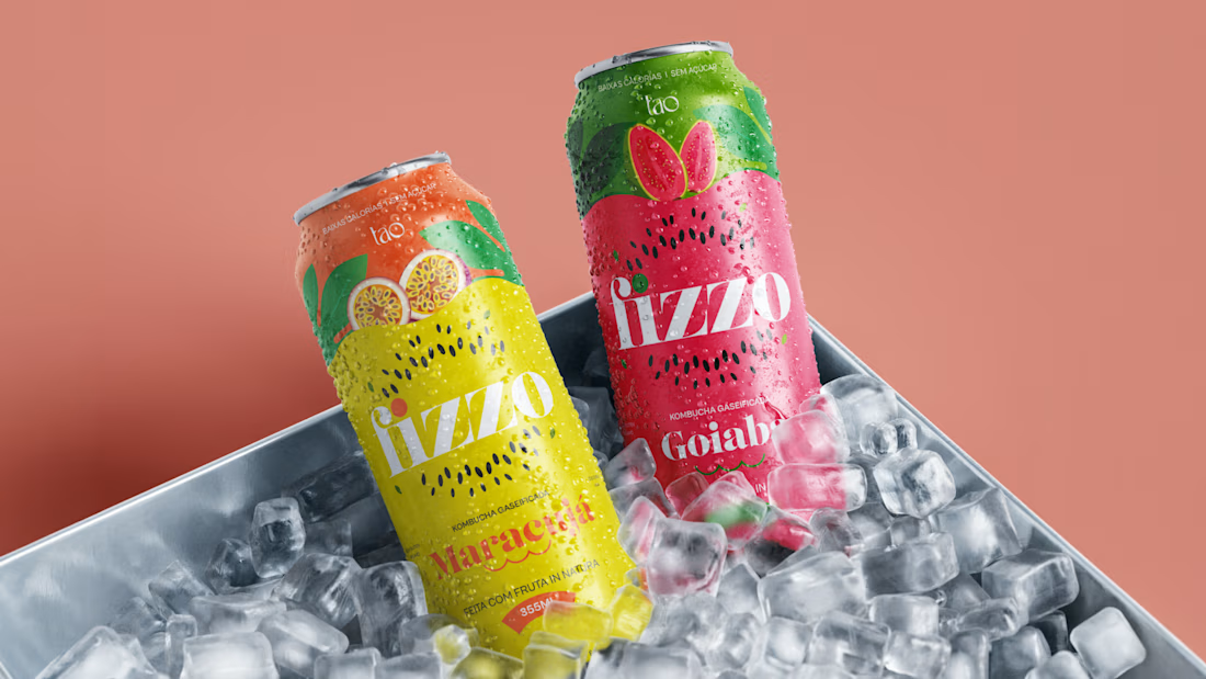
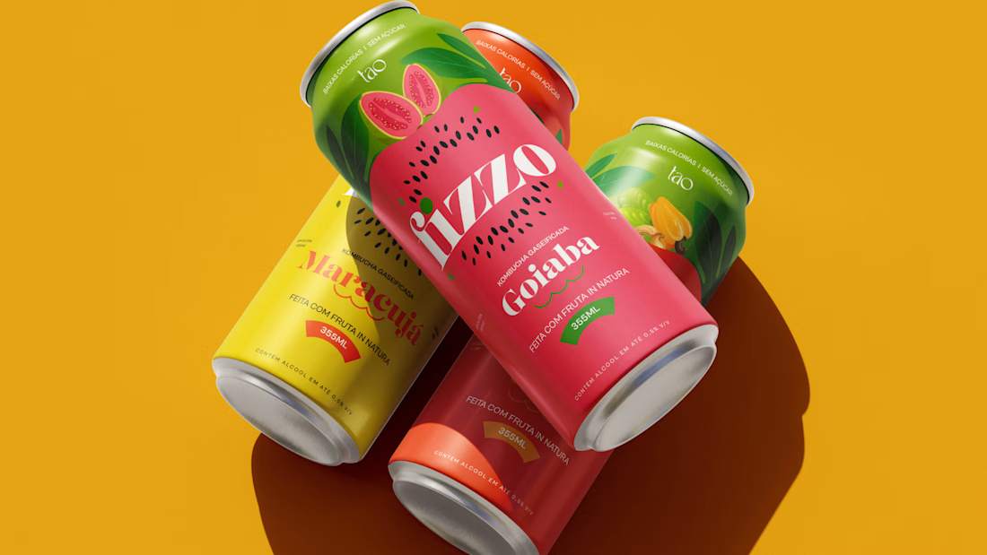
Fizzo is a conceptual packaging design project, developed as a portfolio exercise: a fictional sparkling kombucha line imagined as a brand extension of Tao Kombucha.
The project explores how a brand built on health and purpose can enter the "ready to drink" kombucha movement, closer to a premium soda than a supplement, without giving up the identity it has already built, creating a sub-line endorsed by the parent brand, free to communicate energy and instant pleasure.
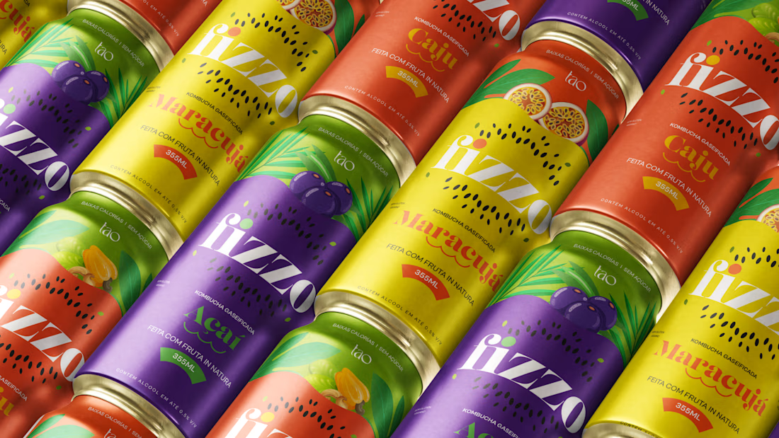
The work covers naming, positioning, a flavor-based color system, illustration direction, and typography, applied across 4 SKUs: passion fruit, cashew fruit, açaí, and guava.
Conceptual project, not affiliated with the real brand.
Full project on Behance: https://www.behance.net/gallery/254205011/Fizzo-Kombucha-Packaging-Concept
Product DesignProduct StrategyAdobe IllustratorAdobe PhotoshopFigmaproductdesignerpackageartdirectorPackaging Design


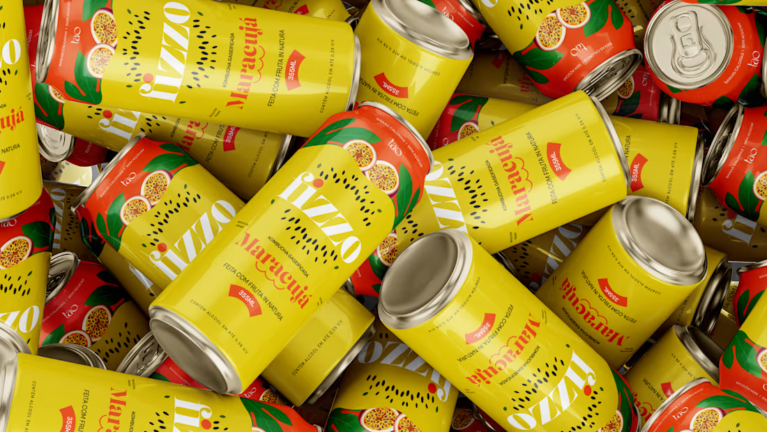

Such a satisfying final result!

tks bro!

looks super refreshing, sparkling kombucha sounds like a dream.
tks nicolette!

Love these!
tks!

Four SKUs each getting their own flavor-coded palette while still reading as one family is the hard part of packaging systems like this. Which flavor's color story did you land on first, and did the others follow that logic or fight it a bit?
Passion fruit came first, its golden yellow was the natural anchor since the fruit already has strong recognition abroad. Cashew and açaí followed that same logic pretty easily. Guava pushed back a bit though, it's a less familiar flavor for a gringo audience, so the color had...

Super packaging design Lucas🔥
tks!

Nice work, deserves to be on a real product. Keep it and see the opportunity when you can use it in a real case.
tkss!

great designs
tks!
The network for creativity
Join 1.25M professional creatives like you
Connect with clients, get discovered, and run your business 100% commission-free
Creatives on Contra have earned over $150M and we are just getting started

Challenges
View all


Related posts


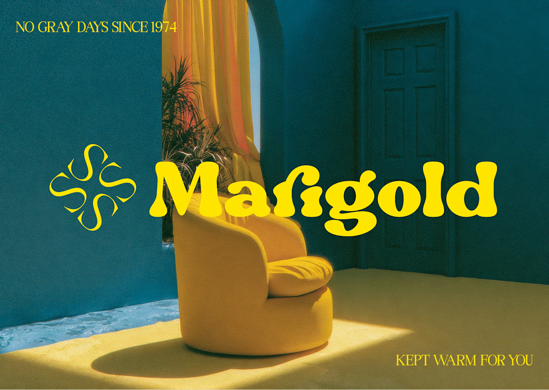
Marigold is a one day concept for envato's human by design challenge. i set the direction in real photography first then generated against that standard.


Making productivity a little more colorful. 💜
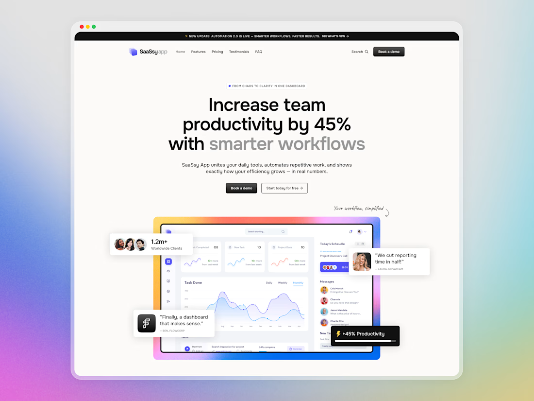
Hey Contra community! Today I want to share a closer look at SaaSsy App – a landing page concept for an all-in-one productivity platform.
The product has a lot going on, so the main challenge was presenting all those features without making the landing page feel overloaded. I kept the structure simple and used colorful gradients and bold typography to make the content easier to follow and a bit more memorable.


Creative work and UI Flow

👐🏻🏡 Our new case is a care home website built so a local authority and a future employee each get the answers they came for.
See how it's structured inside the case.


Choosing what to leave out is the part of the work that pays for itself once development begins" exactly right for a trust-driven site like this. Showing the house room by room as it really looks, rather than styled, is what actually earns that trust.