The network for creativity
Join 1.25M professional creatives like you
Connect with clients, get discovered, and run your business 100% commission-free
Creatives on Contra have earned over $150M and we are just getting started
Back to feedPost
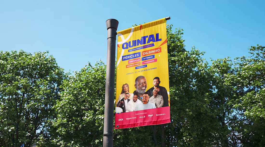
Over the last few weeks a study project was developed combining everything that has been explored in art direction: visual identity, key visual, social media and motion design.
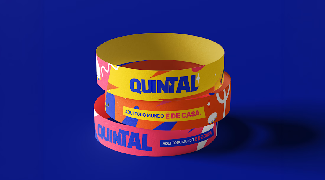
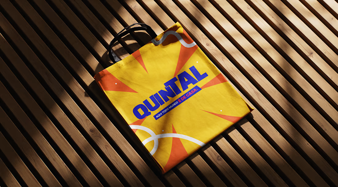
QUINTAL is a fictional modern pagode festival, built from scratch to practice the full process, from briefing and reference research all the way to the final pieces animated in After Effects.
No shows scheduled, no tickets on sale. But a lot was built with care: logo, palette, typography, individual lineup posts per artist, a flyer and motion.
The full case is published on Behance.
Link: https://www.behance.net/gallery/251788261/Quintal-Festival-de-Pagode




This looks great!

tks, bro!!

tks buddy!

Sick work 🔥
tks Celia!! APPRECIATE 🙌


I like the vibe i got from this. Great design
Tks mann!

The full case study on Behance is a great touch, love that you took it all the way from briefing to motion instead of stopping at a few mockups. Bookmarking this as a reference for how to structure a self-directed brand study.
Tks Maty! APPRECIATE bro!

This deserves more than just liking, this deserves to be featured! 🏆 The visual storytelling across these assets is exactly what a modern web layout needs.
Tks buddy! APPRECIATE!

Fabb👏🏻
Tks 😍


This looks clean and well thought out. How long did it take you to bring everything together?
Tks guys! About few weeks. The challenges were awesome to resolve. 🔥
Wow nice!
Tkssss!

Great work man, nice to see a brazuka design with amazing presentation.
Thanks, buddy! Brazuka is the best visual identity! 🔥
The network for creativity
Join 1.25M professional creatives like you
Connect with clients, get discovered, and run your business 100% commission-free
Creatives on Contra have earned over $150M and we are just getting started

Challenges
View all


Related posts

A little interactive experiment for Verdant 🌱
Writing unique code for animations makes iterating on reactive micro-interactions so much smoother. It completely transforms how a brand narrative feels in the browser.


Great job


New case study!
Artist portfolio website design and Webflow development for Teri Sanders, a New York-based artist.


The way the editorial grid lets Teri’s work lead while the oversized name anchors the page feels beautifully restrained. Nice balance of art direction and a usable Webflow portfolio structure.


Love this concept 🧡