
pro
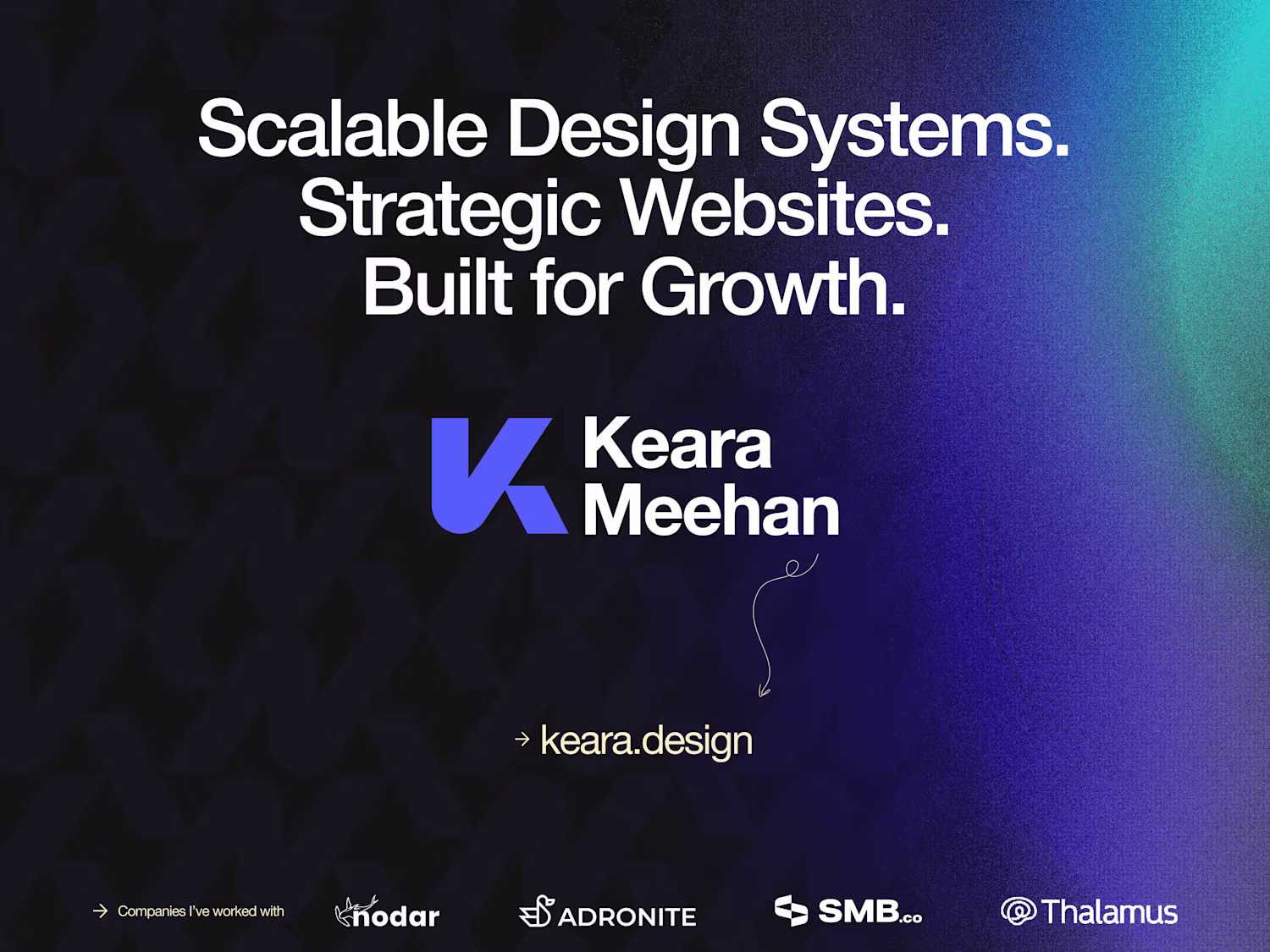
Keara Meehan
Scaling B2B Tech Partner: Design Systems & Websites
- $50k+
- Earned
- 12x
- Hired
- 4.91
- Rating
- 786
- Followers
1
10
139
Adronite Website Redesign and Framer Development
15
262
1
96
1.9K
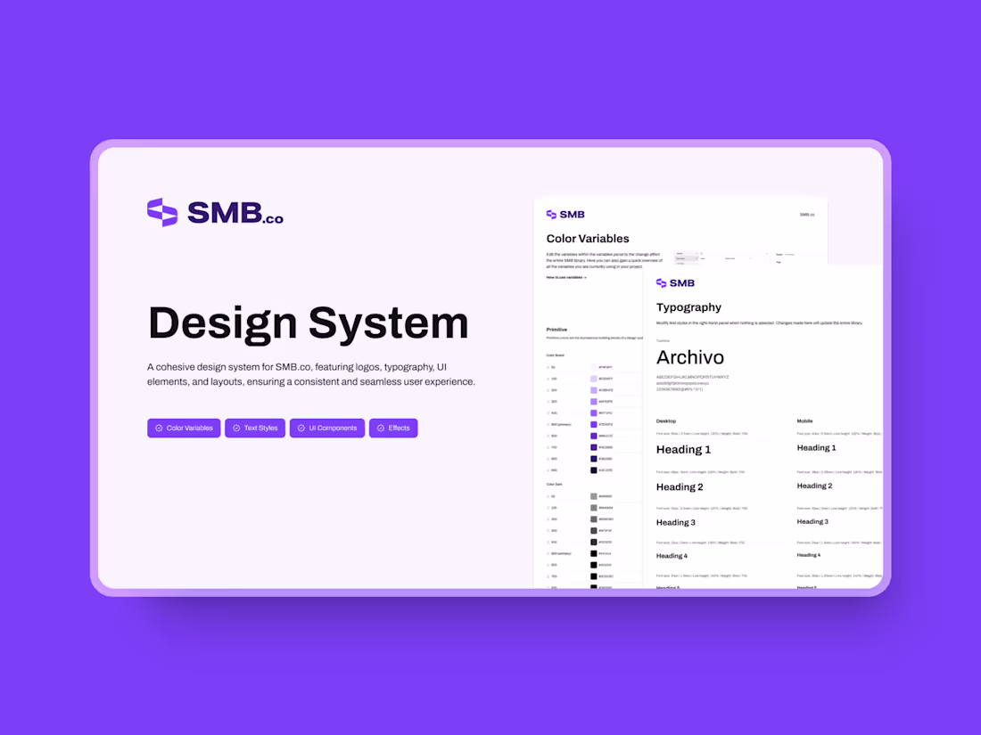
SMB.co Design System
49
943
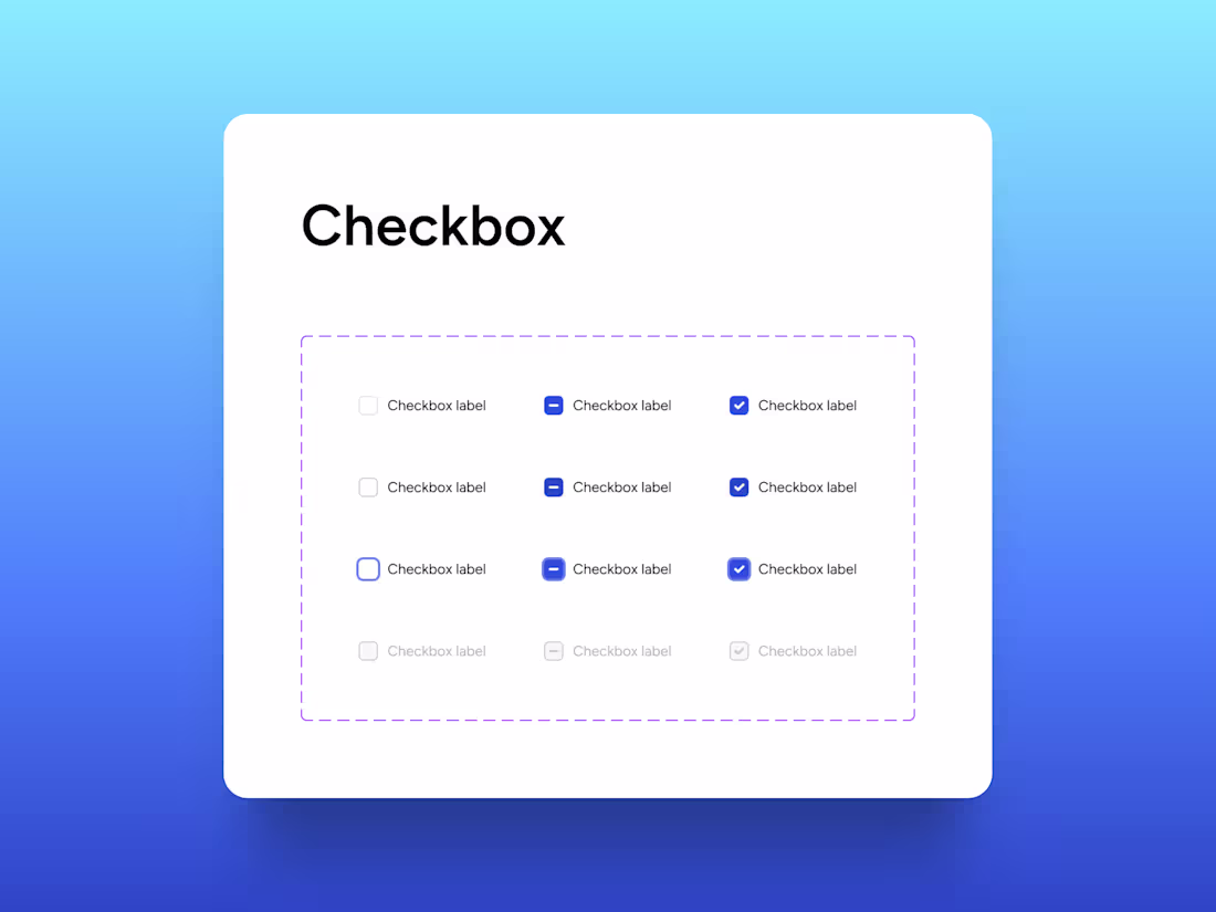
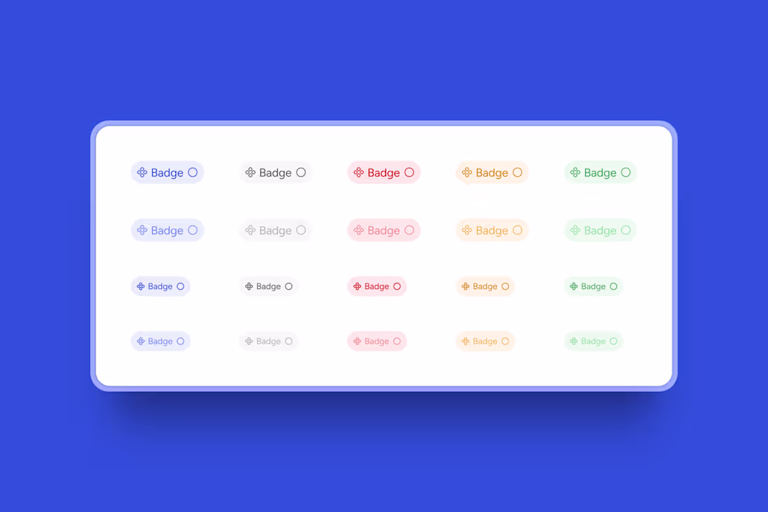
Design all the states, not just the happy path.
When creating a design system, it's easy to focus only on the default state, but developers need much more.
In the case of checkboxes like this component, devs require unchecked, indeterminate, and checked states, as well as focus states for keyboard navigation, and disabled states that meet contrast requirements.
This isn't just extra work; it's essential for accessibility. Screen readers need accurate state communication, and keyboard users need visible focus. If you skip these steps, the devs may make incorrect assumptions, leading to inconsistencies.
Investing a little bit of extra time in designing states can save hours of back-and-forth later. Your component isn't complete until every state is thoughtfully designed!
2
58
1.9K
Experimenting with some designs in Figma today 💫
Can't wait to bring these to life in Framer! Planning some fun microinteractions for this upcoming project.
32
2.3K
Things designers get excited about: cool buttons!
Building buttons like this for project is always a highlight! Adding these small details is such a fun way to enhance the feel and interactivity of a website.
Who else loves a good button interaction? 🔘
7
10
1.6K
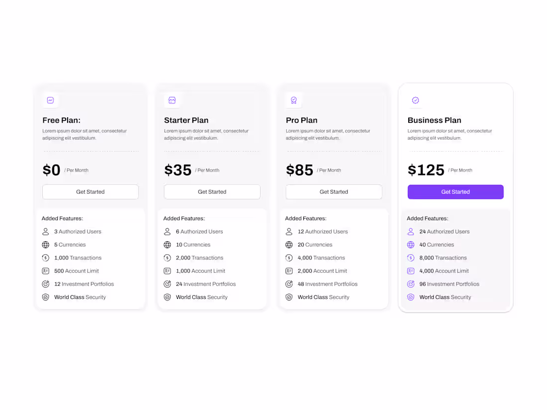
Recently crafted some nice, streamlined pricing cards for a client’s design system! Excited to take on more design system work soon—it’s always fun seeing cohesive visuals come to life.
Anyone else here love working on design systems? 👀
9
19
1.4K
Nothing beats the satisfaction of building consistent components for a design system 🎨
Been slowly building this UI kit in my spare time (what spare time? lol) with hopes to complete it in 2025.
Design systems are one of my biggest passions. There's something so satisfying about creating components that work seamlessly together and scale beautifully.
What's your favorite part about building design systems?
4
35
1.4K
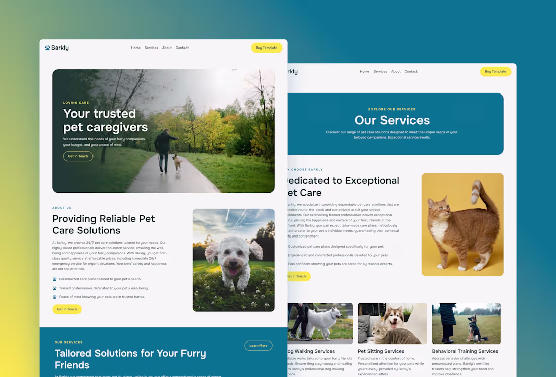
Barkly — Framer Pet Care Website
4
108
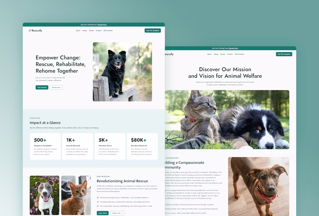
Rescuify — Framer Non-Profit Website
5
166
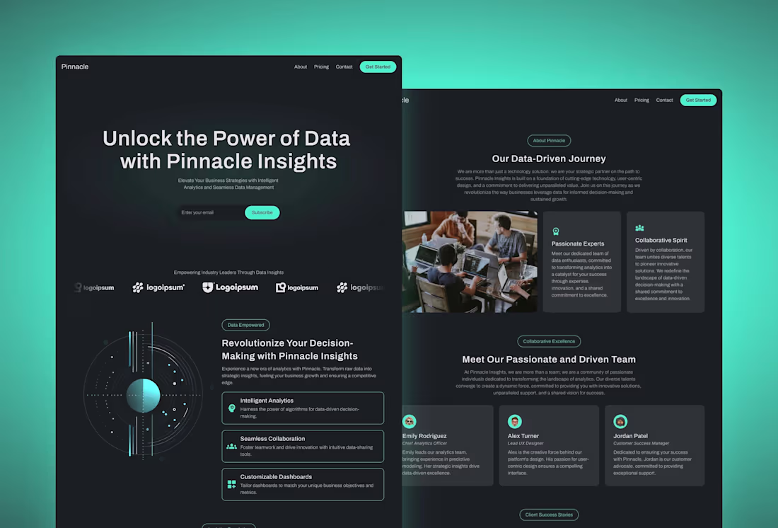
Pinnacle — Framer SaaS Website
3
92
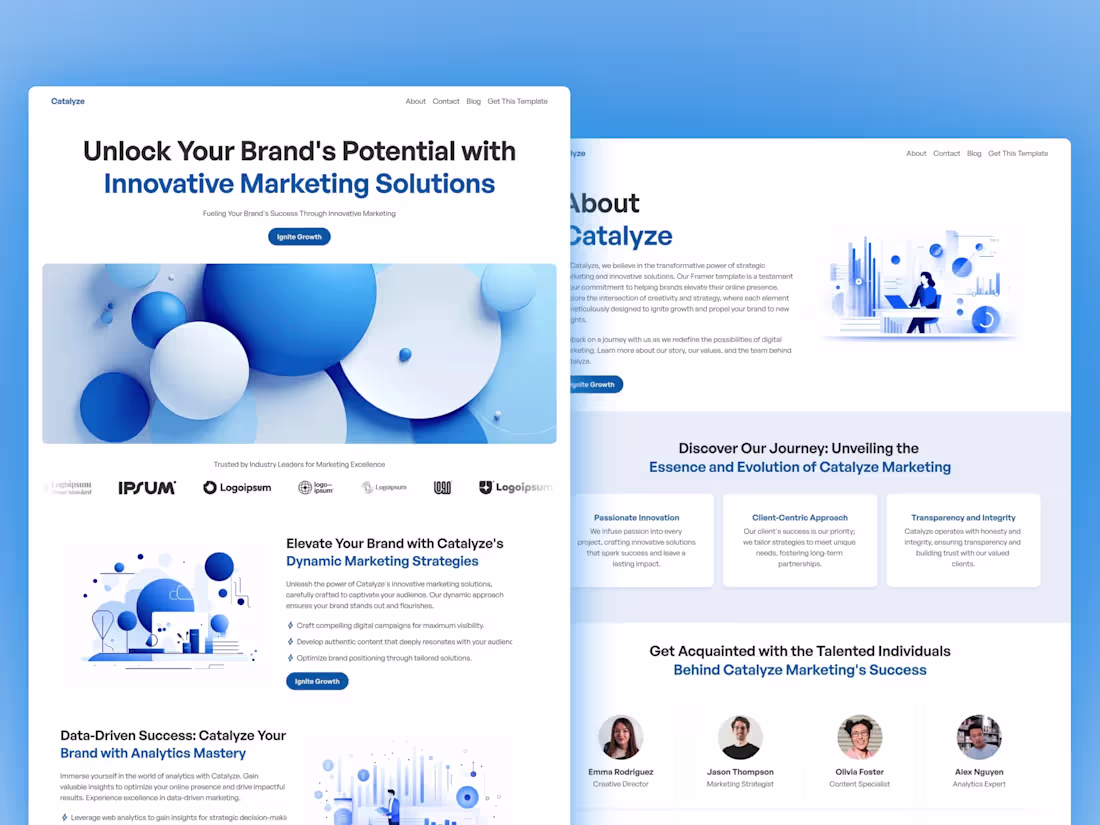
Catalyze — Framer Agency Website
6
96
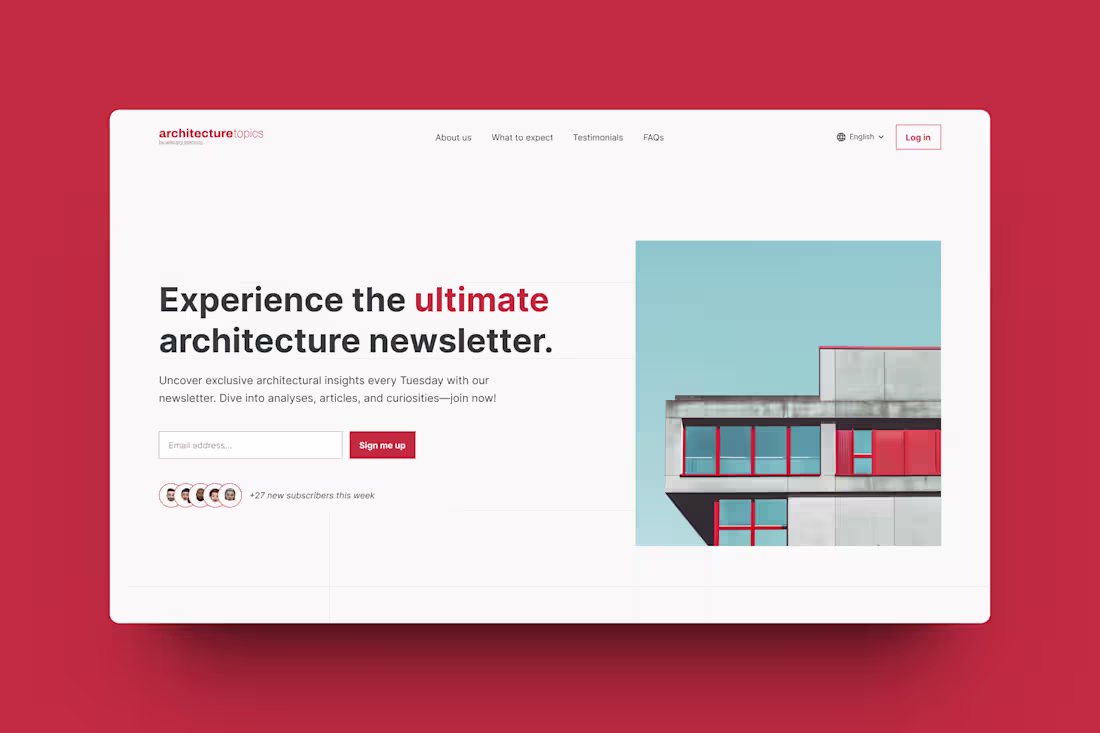
Architecture Newsletter Website Hero Section Redesign
3
73
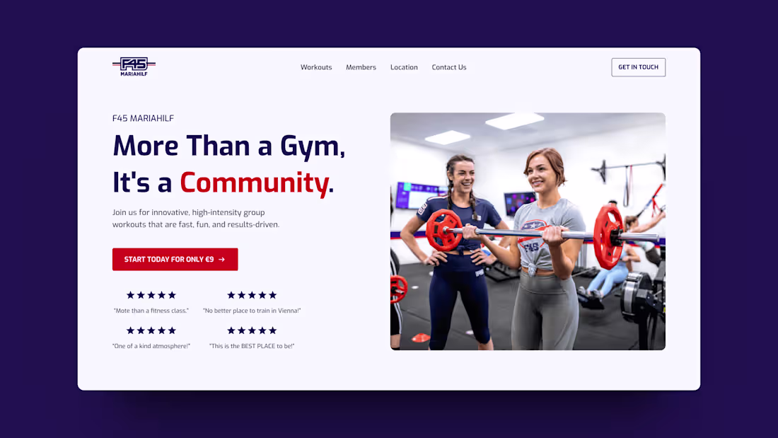
Fitness Studio Website Hero Section Redesign
2
75