Architecture Newsletter Website Hero Section Redesign
Revitalizing an Architecture Newsletter's Hero Section: Elevating Engagement and Ease of Access.
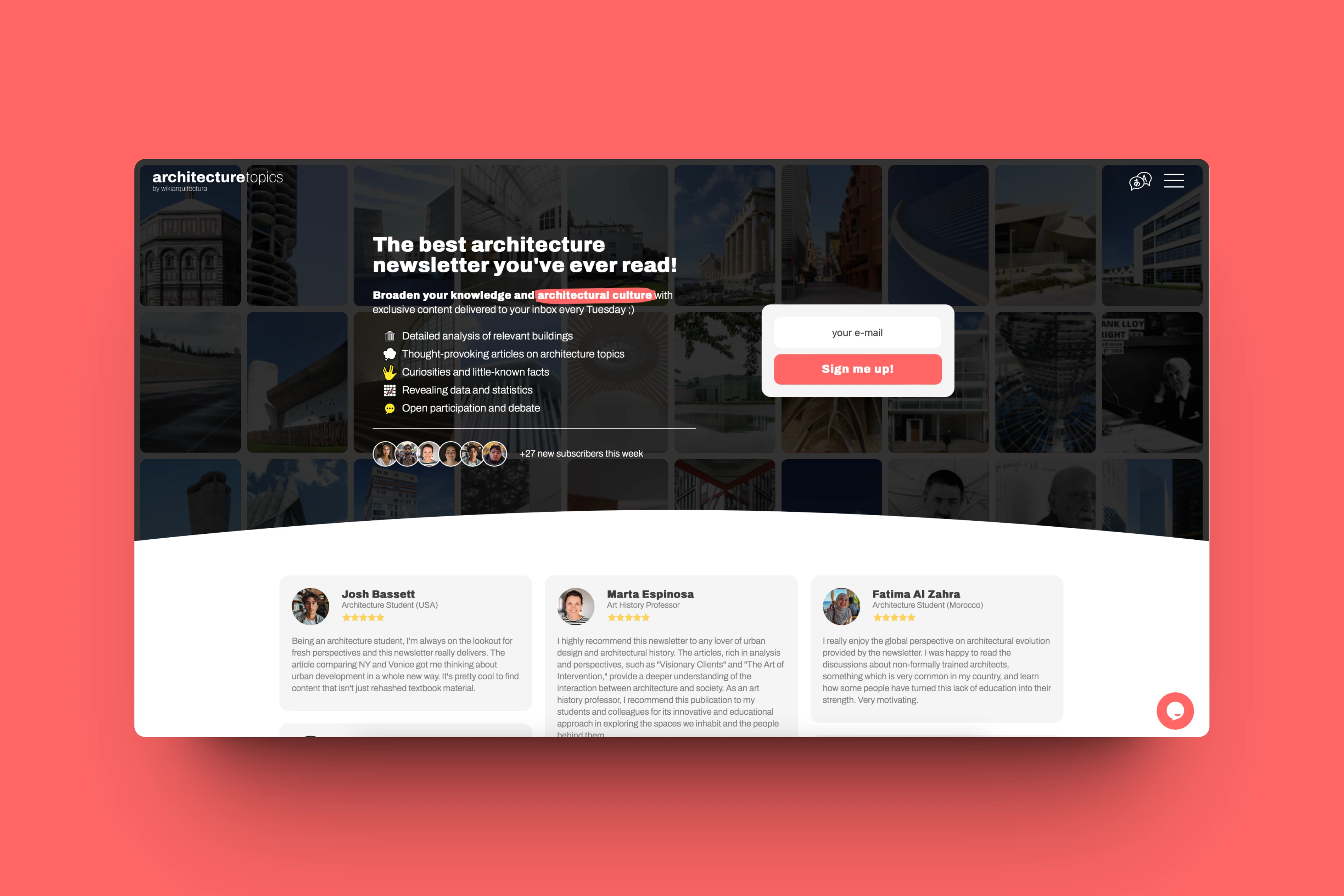
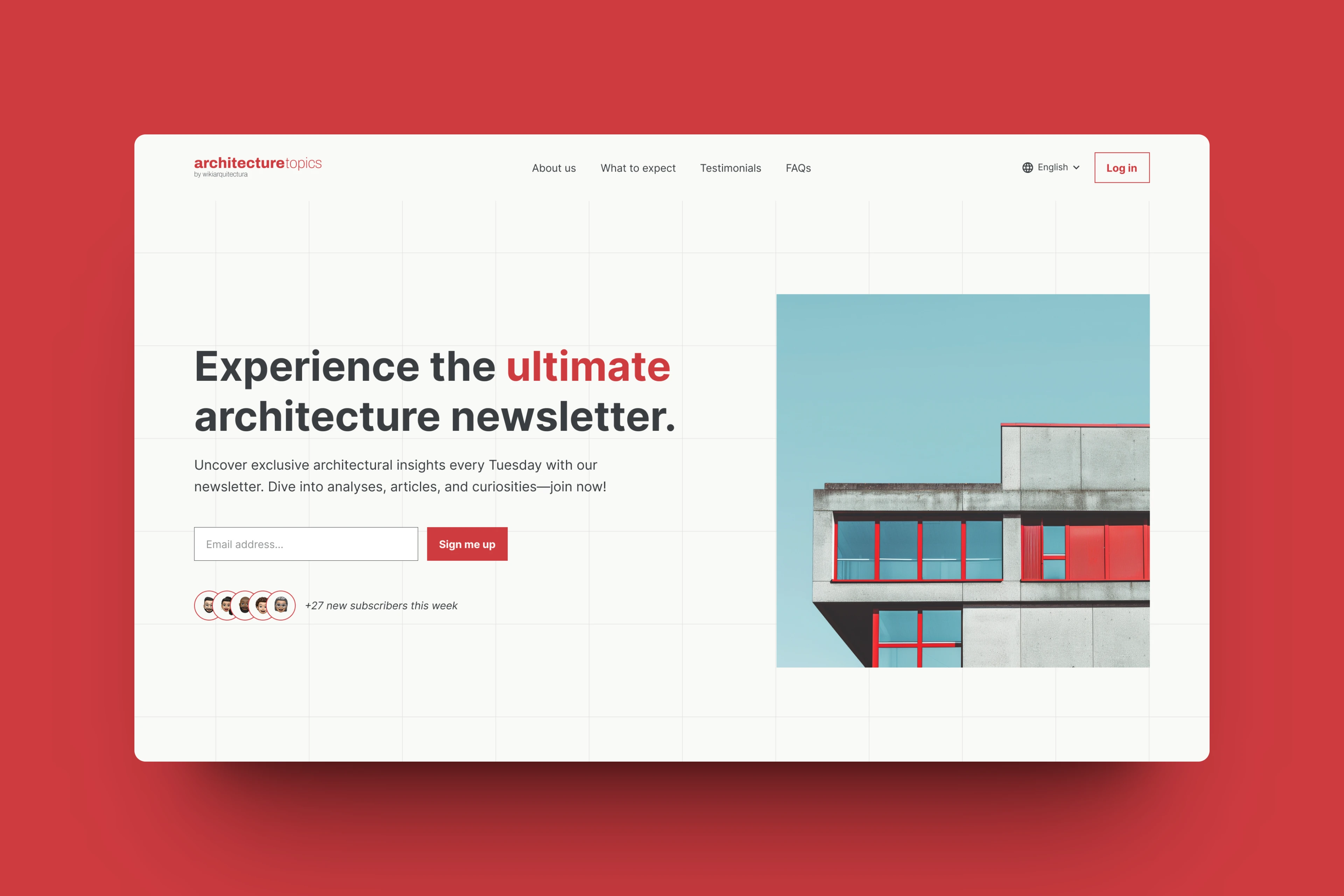
I've introduced a vibrant, accessibility-friendly red color to infuse energy and accessibility into the hero section. By refining the design with cleaner aesthetics while preserving the original grid layout, readability has been significantly enhanced. Accessible navigation links, a language selector, and a prominent login button ensure seamless navigation for all users. Additionally, the copy has been refined for clarity and brevity, featuring prominent CTAs to drive subscriber engagement and interaction.
Before:

After:

Like this project
Posted Apr 19, 2024
Enhanced clarity, accessibility, and engagement. Vibrant design, intuitive navigation, and compelling CTAs.
Likes
3
Views
67


