Fitness Studio Website Hero Section Redesign
Vienna Fitness Studio Hero Section Redesign: My Personal Touch for Enhanced Engagement and Navigation.
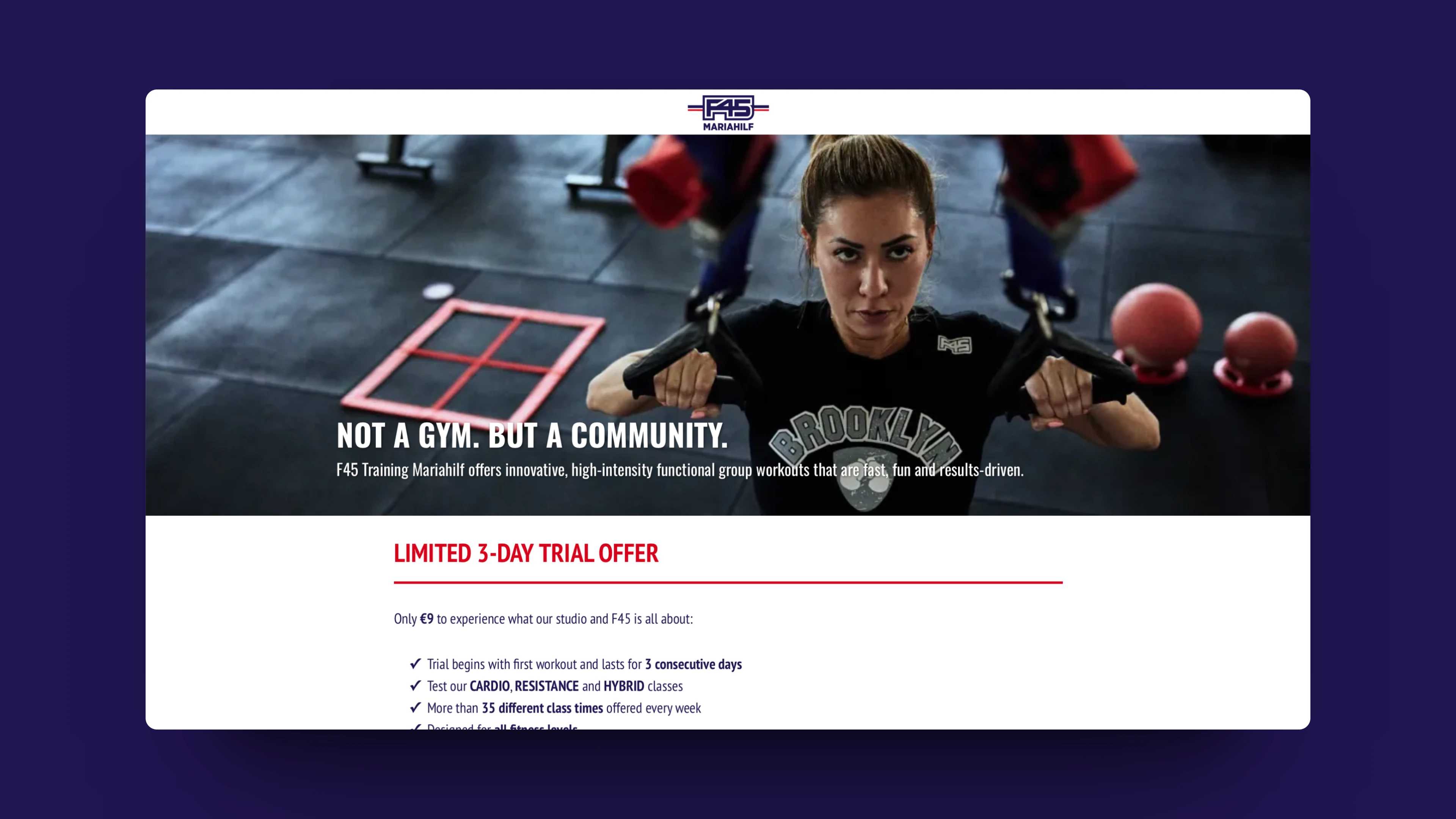
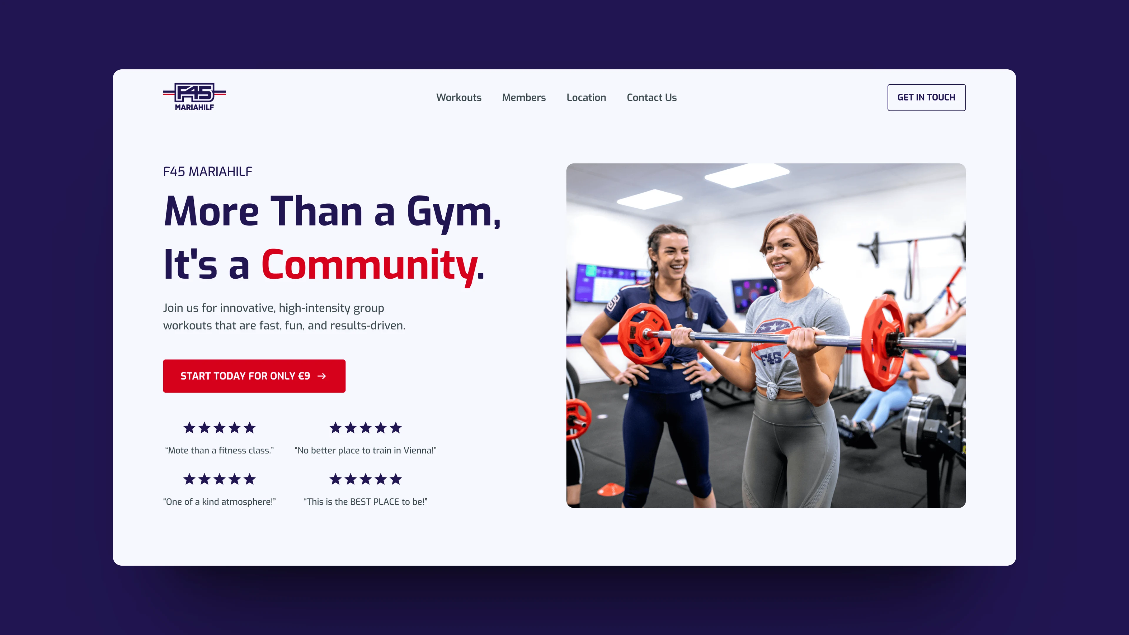
I've given the hero section a fresh look, focusing on clean design and impactful elements like clear CTAs and compelling testimonials. With an inviting layout and improved readability, navigating the site is now smoother for visitors. I've also personally selected a fitting font to match the studio's vibe. This redesign reflects my dedication to crafting a seamless and inspiring online experience for the studio.
Before:

After:

Like this project
Posted Mar 27, 2024
Vienna Fitness Studio Hero Section Redesign: My Personal Touch for Enhanced Engagement and Navigation.
Likes
2
Views
67


