



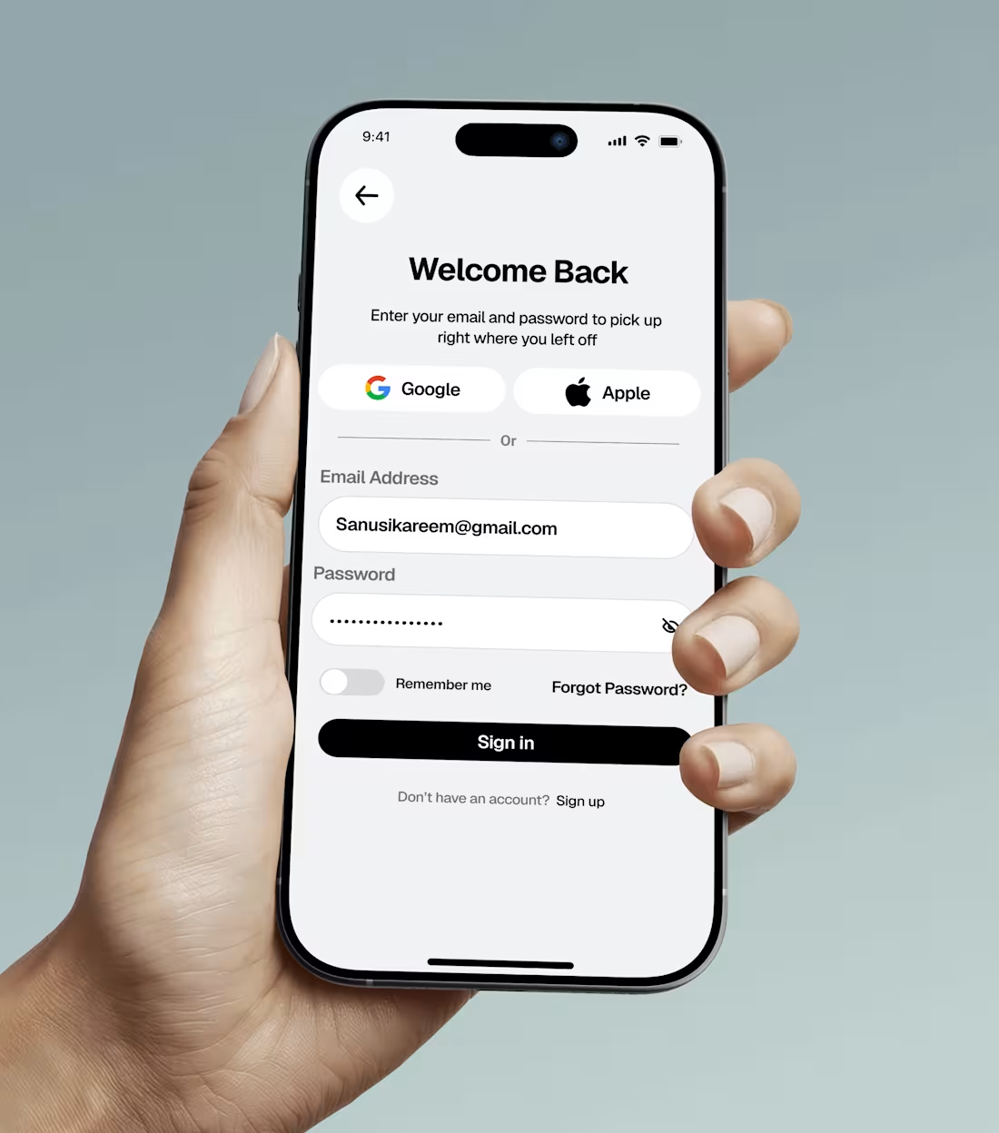
Welcome back. Sign in and pick up where you left off. A clean, focused login flow for a mobile app.
3
41
Project Title: ZestDrop: High-Conversion Food Delivery Landing Page UI
Role: Product Designer / UI Designer
Project Type: Concept Design / Web Design
Tools: AI-Assisted Prototyping (Stitch AI) & UI Direction
Overview
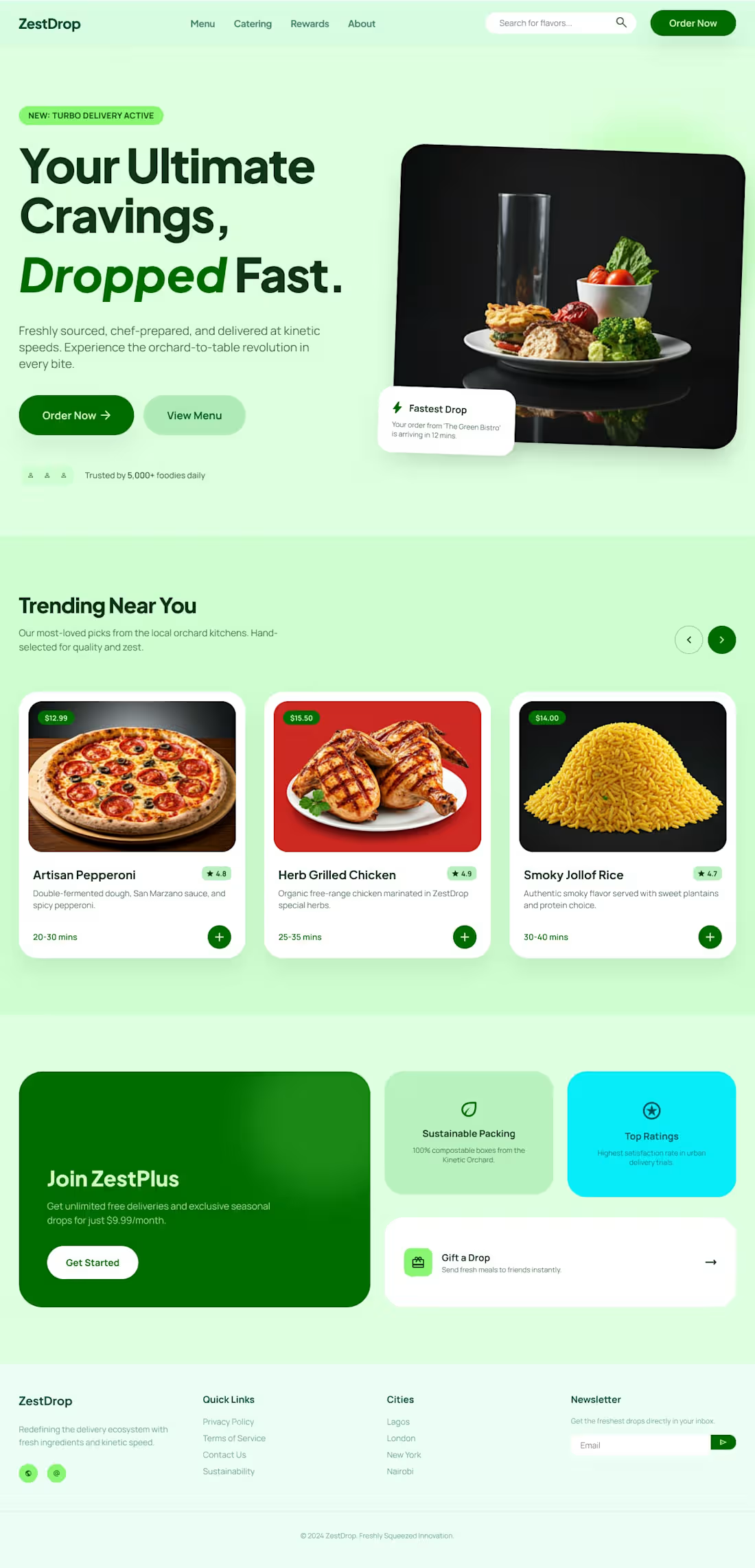
ZestDrop is a conceptual fast-food delivery platform designed for speed, freshness, and ultimate cravings. The goal of this project was to architect a high-energy, high-converting desktop landing page that immediately draws the user in and drives them toward making an order.
The Challenge
Food delivery landing pages often look cluttered with too many competing restaurant logos and overwhelming menus. The challenge here was to design a clean, highly curated experience that balances a bold, vibrant brand identity with standard e-commerce conversion principles. It needed to showcase diverse comfort foods—from artisan pizza to local favorites like Jollof rice—in a cohesive, appetizing way.
The Solution & Design Choices
I directed the layout and visual hierarchy to prioritize user action and visual breathing room:
Vibrant Color Palette: Utilized a dominant mint and emerald green color scheme to psychologically signal freshness, kinetic speed, and "go" (action).
Hero Section: Designed a split-screen hero layout with a bold, punchy headline ("Your Ultimate Cravings, Dropped Fast") paired with dual CTAs, ensuring the primary "Order Now" button stands out with maximum contrast.
Trending Grid: Created a uniform card UI for the "Trending Near You" section to display diverse food options (Pizza, Chicken, Jollof Rice) neatly. Added clear pricing tags, ratings, and quick-add buttons to reduce friction.
Business Value Integration: Incorporated a "Join ZestPlus" subscription block and a "Sustainable Packing" highlight below the fold to demonstrate an understanding of business goals like user retention and brand values.
0
25
Project Title: Glacier Health: Comprehensive Telehealth & Patient Portal UI/UX
Role: Product Designer / UI/UX Designer
Project Type: Concept Design / Mobile App Design
Status: Ongoing / Sneak Peek
Overview
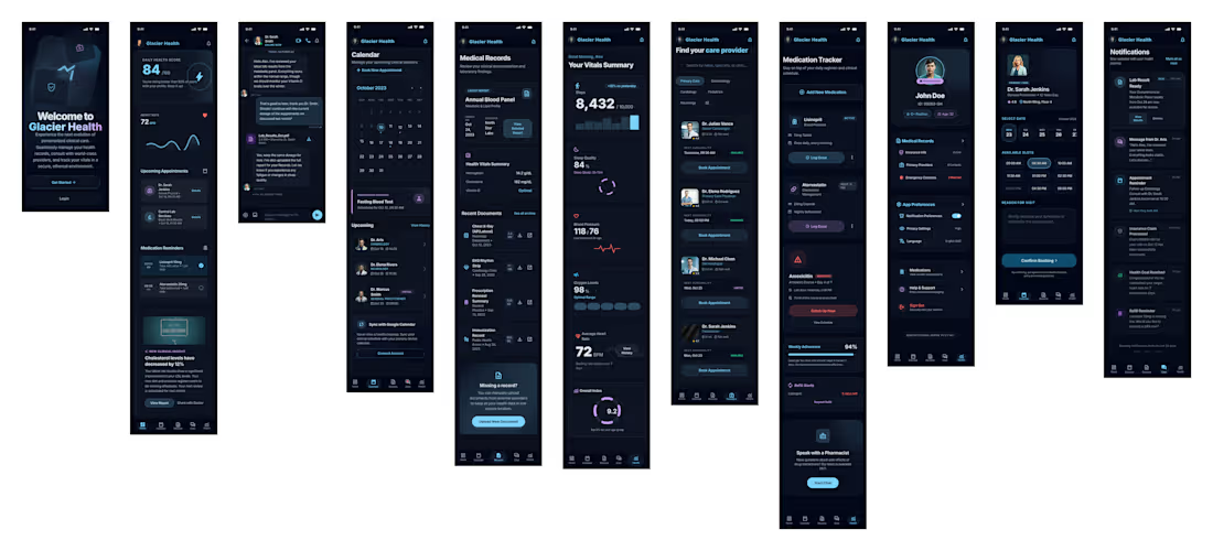
Glacier Health is a conceptual mobile healthcare application designed to put patients in complete control of their medical journey. The goal of this project is to bridge the gap between complex medical data and user-friendly digital experiences, wrapping essential healthcare features in a sleek, modern dark-mode interface that feels both secure and accessible.
The Challenge
Healthcare apps often suffer from clinical, uninspired interfaces that overwhelm users with information. The challenge was to design a comprehensive patient portal that handles dense data—like lab results, vital tracking, and appointment scheduling—without causing cognitive overload, all while maintaining strict visual consistency.
Key Features Designed (Phase 1 Preview)
While the full application is still in development, this initial 11-screen flow establishes the core user experience:
Unified Dashboard: A central hub giving users an immediate overview of their current vitals, upcoming appointments, and daily health scores.
Telehealth Integration: A built-in chat interface allowing patients to securely message their healthcare providers directly.
Vitals & Medication Tracking: Detailed, easy-to-read charts for monitoring heart rate, sleep, and steps, alongside a dedicated medication adherence tracker.
Provider Discovery & Scheduling: A streamlined directory to find specialists, view ratings, and book appointments via an integrated calendar system.
Medical Records Management: A secure vault for users to access their annual blood panels, health summaries, and recent medical documents.
Design Highlights
Dark Mode Aesthetic: Utilized a deep, moody color palette with neon teal accents to reduce eye strain and modernize the traditional "sterile" healthcare app look.
Data Visualization: Focused on clean, readable graphs and progress rings to make interpreting personal health metrics intuitive at a glance.
(Note: This is a preview of an ongoing project. Full prototype and additional flows coming soon!)
1
30
Project Title: Moore Fits: Streetwear E-Commerce App UI/UX
Role: Product Designer / UI/UX Designer
Project Type: Concept Design / Mobile App Design
Tools: Figma
Overview
Moore Fits is a conceptual mobile e-commerce platform designed for streetwear enthusiasts. The goal of this project was to design an end-to-end mobile shopping experience that allows users to discover bold styles, manage their cart, and checkout seamlessly.
The Challenge
In the crowded space of fashion e-commerce, the user journey needs to be as clean and frictionless as possible. The challenge was to architect a complete user flow from initial onboarding and authentication to product discovery, cart management, and secure checkout, all while maintaining a modern, edgy aesthetic fitting for a streetwear brand.
The Solution
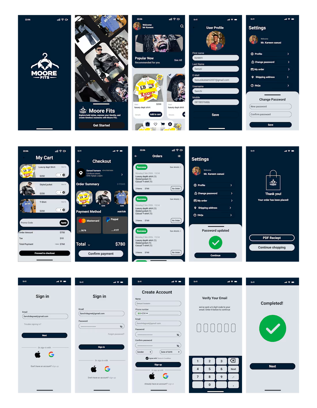
I designed a comprehensive 15-screen user flow that prioritizes navigation and ease of use. Key features of the design include:
Seamless Onboarding & Auth: A structured authentication flow (Sign Up, Sign In, OTP Email Verification) to ensure secure account creation.
Intuitive Product Discovery: A dynamic home screen featuring "Popular Now" and stylized product cards for quick browsing and adding to cart.
Frictionless Checkout: A clear, step-by-step cart and checkout process. Users can easily review their order summary, select payment methods (Card or PayPal), and confirm their purchase with distinct visual feedback.
User Management: Dedicated profile and settings screens for users to track orders, update shipping addresses, and manage account security.
Design Highlights
Visual Hierarchy: Focused on clear typography and distinct call-to-action (CTA) buttons to guide the user through the purchasing funnel.
Comprehensive State Design: Designed not just the primary screens, but also success states (e.g., "Order Placed Successfully", "Password Updated") to ensure a complete user experience.
1
32