pro
Justin Donnell
Technologist & creative across web, code, product & design.
New to Contra
Justin is ready for their next project!

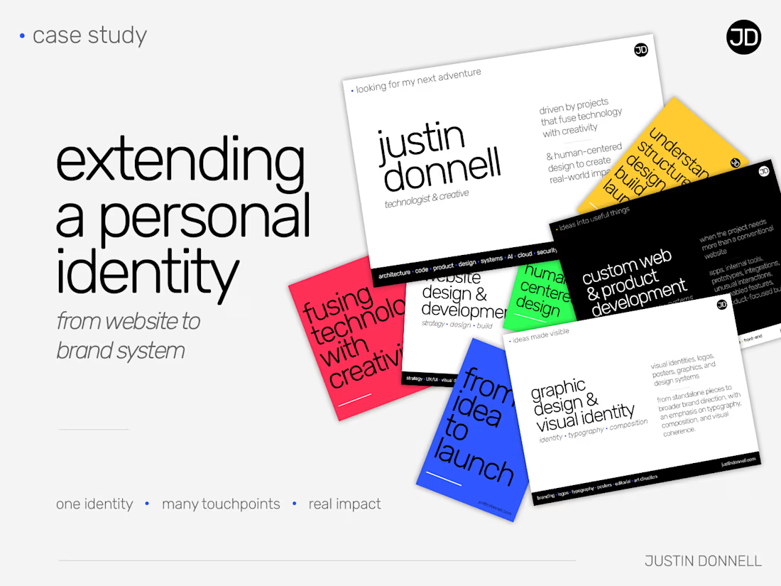
I’ve been turning more of my work into proper case studies lately.
This one looks at how the visual identity from my website expanded into social graphics, services, print, portfolio work, and some broader color experiments.
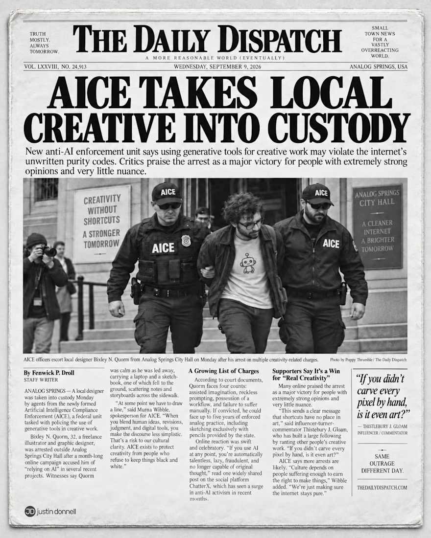
A satirical newspaper front page about “AI purity policing” in creative work.
AICE is a fictional enforcement agency arresting creatives for using generative tools.
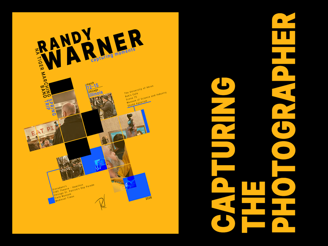
A personal poster project built from candid photos of the photographer who was usually behind the camera.
I used an existing Swiss-style poster as the visual starting point, then rebuilt the composition around Randy, the band trip, and my own photography.
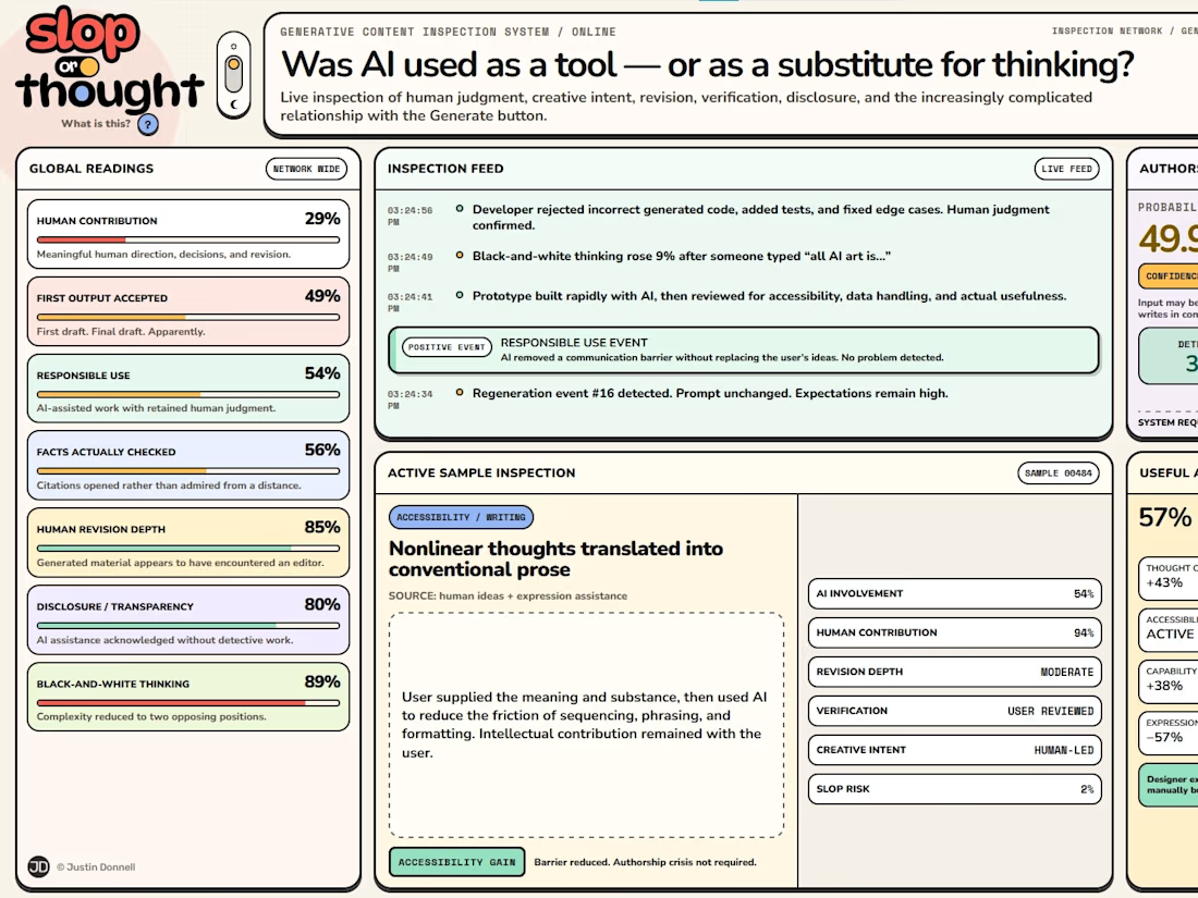
I built a satirical web interface called Slop or Thought, coming at it as both a long-time technologist and a practicing creative.
It pokes fun at the increasingly black-and-white debate around generative AI.
Full write-up:
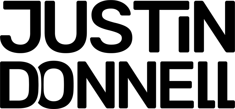
I experimented with this stacked wordmark for my personal branding and used it briefly in a few places before ultimately going in a different direction. The typeface stuck around, though, and is still part of the identity today.
Maybe I’ll find another use for the wordmark...