Joy Wandia
Graphic Designer
New to Contra
Joy is ready for their next project!



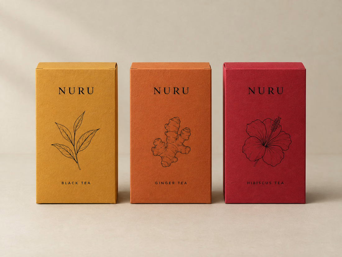
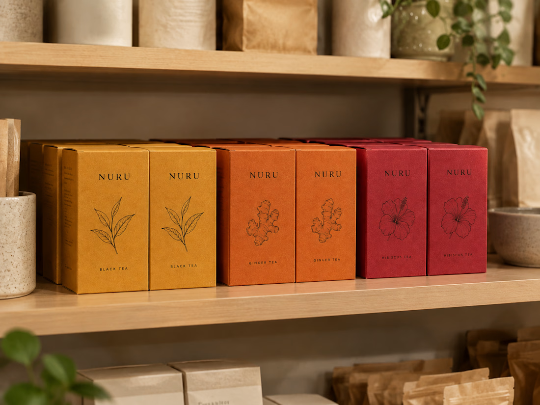
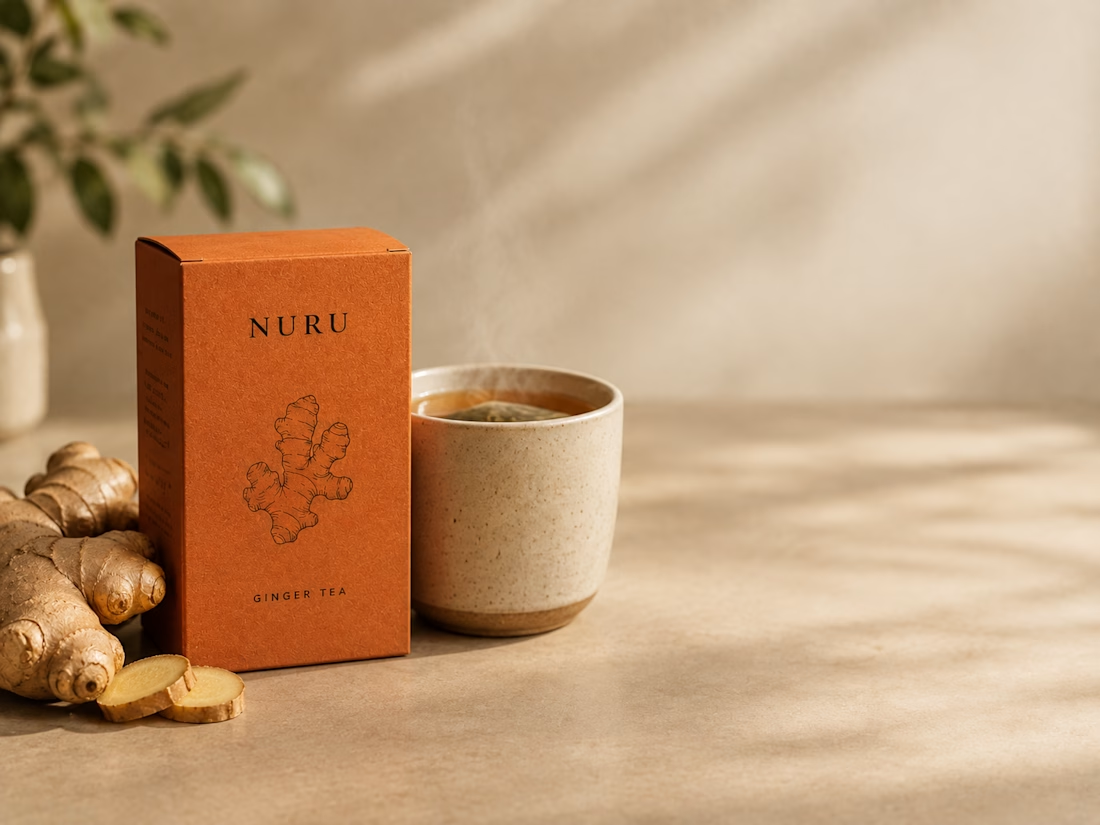
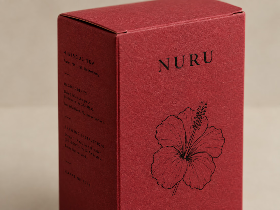
NURU TEA — One System, Three Intensities .A packaging system for a three-variant tea brand where structure and typography stay identical and only color and a single botanical mark differentiate each SKU.

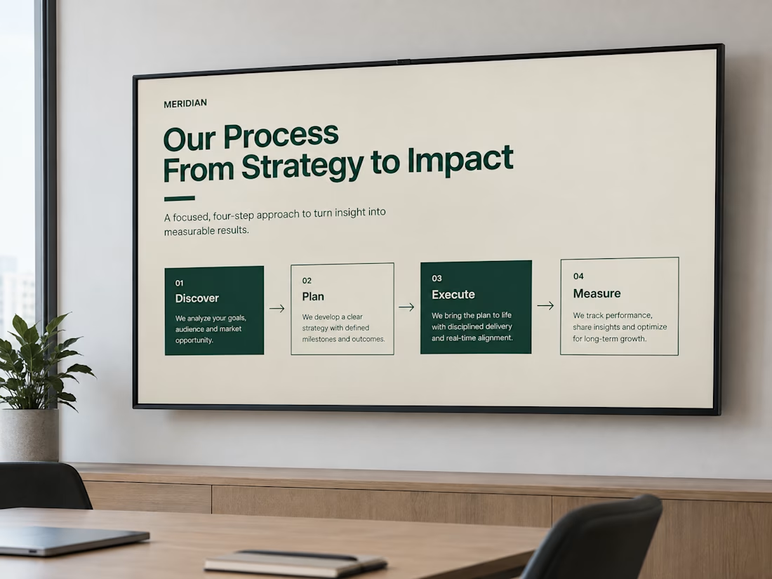
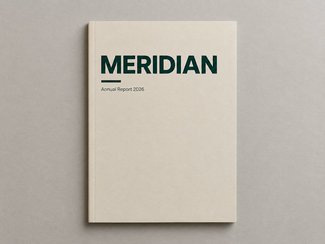
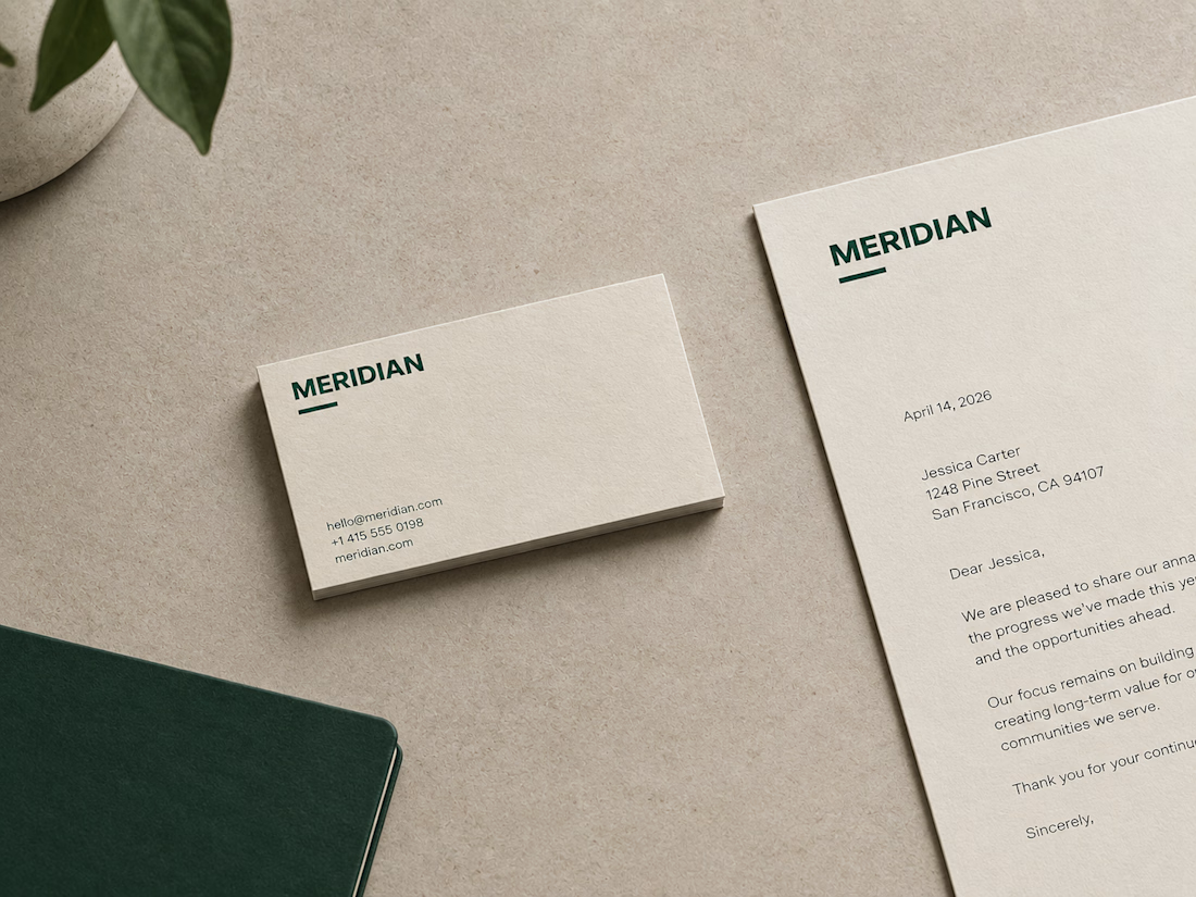
Meridian — Making Complexity Legible . A corporate identity and communication system built for a consultancy whose actual product is clarity — so the design had to demonstrate it.


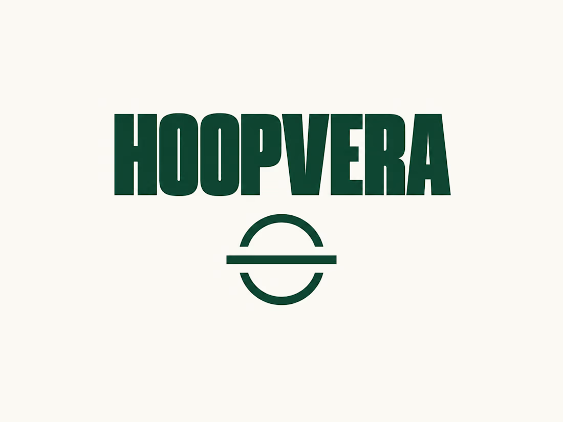
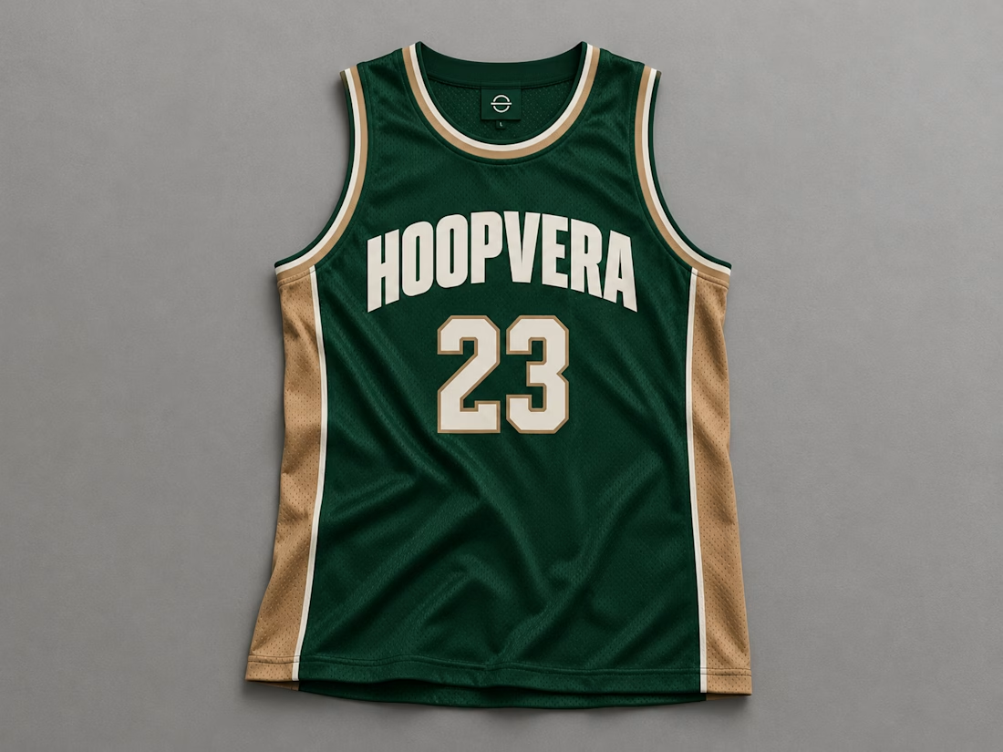
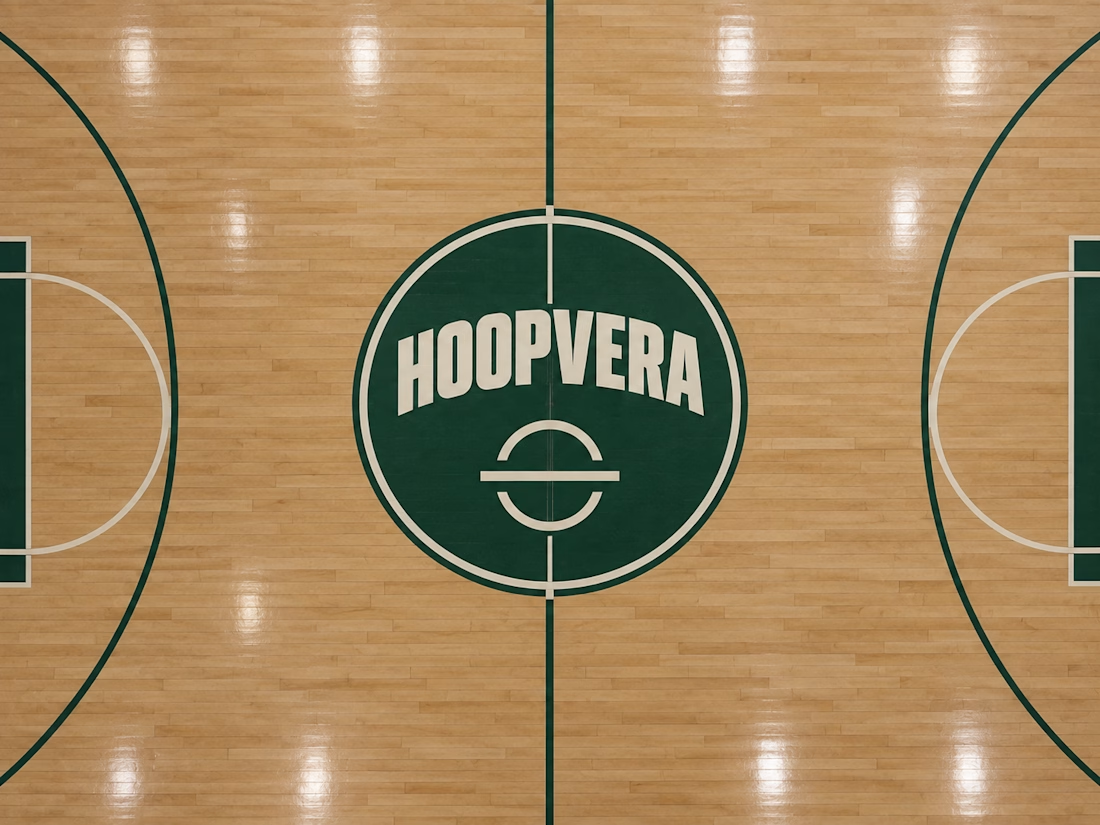
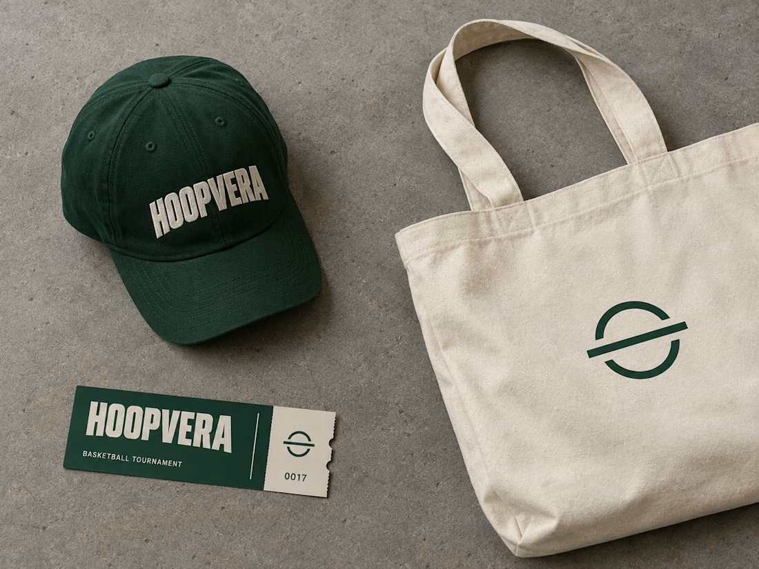
HOOPVERA — A Basketball Identity Built From the Court Itself . A typography-led sports identity system that draws its entire graphic language from real basketball court geometry instead of an invented mascot.

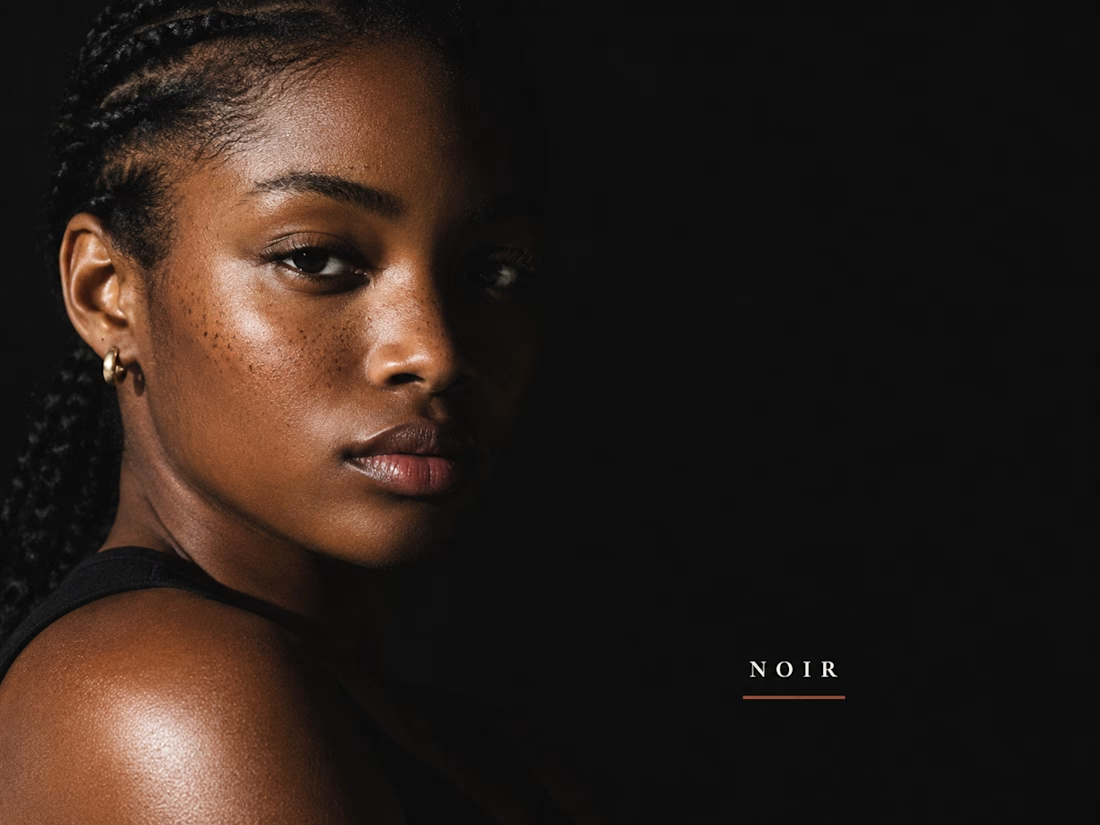
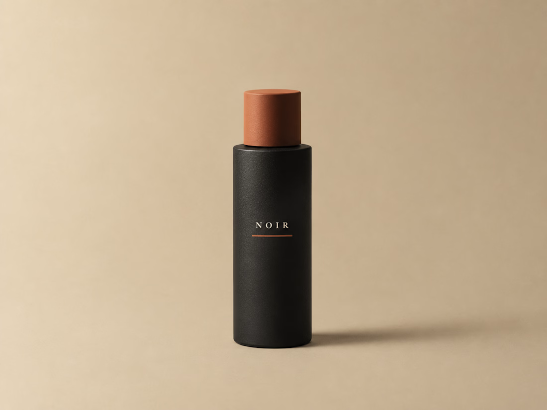
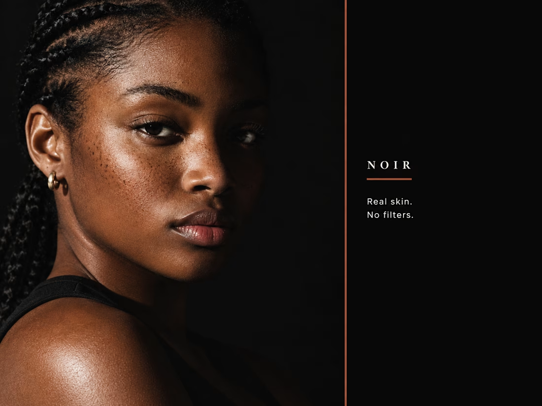
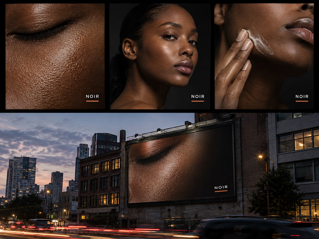
NOIR — Selling Skin, Not Coverage.🚀 A minimalist campaign system for a fictional skin-tint brand built around real, unretouched skin texture.