
MyWorldCup App⚽🌍
Ever since the World Cup began, I found myself doing the same thing, jumping between score apps for updates, switching to X for fan debates and banter, checking blogs for news, and moving across different platforms just to follow one tournament.
It felt exciting, but also fragmented. I wanted a simpler way for fans to experience everything in one place.
That idea became MyWorldCup; a fan-first, Mobile-first World Cup companion designed to bring every part of the tournament experience together.
Football fans can follow fixtures, standings, predictions, discussions, and tournament progress through a simple, intuitive experience with dedicated tabs for group tables, fixtures, match predictions, tournament brackets, country fan communities, live match discussions, and World Cup history.
Built using Figma Make, this project explores how AI-assisted design and rapid prototyping can turn an idea into an engaging digital experience faster.
The attached walkthrough shows the design process, key features, and how I used Figma Make to bring MyWorldCup from concept to interactive product.
Figma Make Preview:
https://www.figma.com/make/D0jcSSibf3m6rqOxo0eOtA/MyWorldCup-App-Design?t=eBxJ2o6WBxYlCs3q-1
X Link:
https://x.com/i/status/2067835678906323179
Figma Community:
https://www.figma.com/community/file/1649664233009803364/myworldcup-app
#ConfigMakeathon @figma
2
2
105
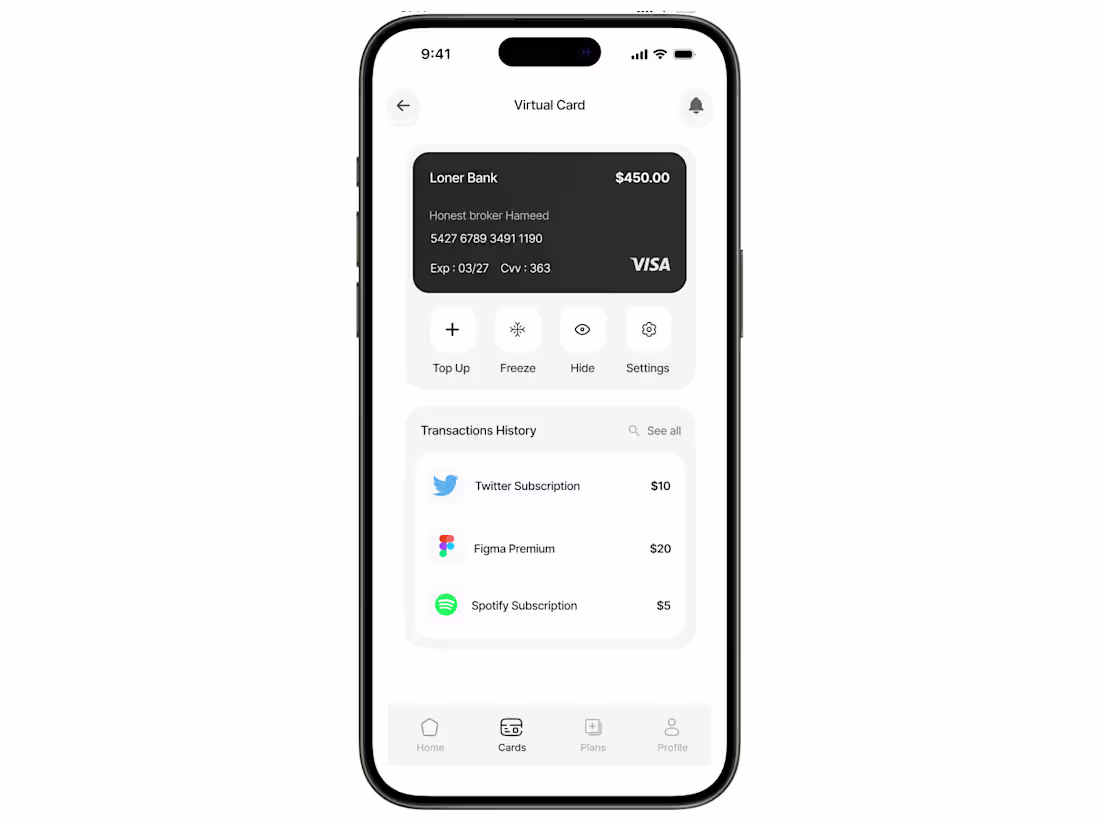
I designed this virtual card screen to make managing online subscriptions and digital payments feel completely effortless. Instead of cluttering the interface with heavy financial data, I used a super clean, minimal layout that puts the core actions like freezing the card, topping up, or viewing your details, just one quick tap away. The typography is soft and gentle, paired with a quiet, spacious design that reduces cognitive load, making transaction tracking feel smooth and intuitive.
0
30
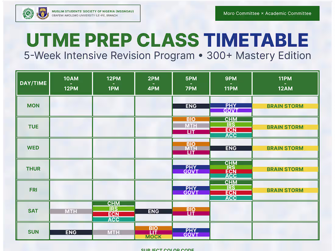
I designed this timetable to make a packed, 5-week exam prep schedule actually easy for students to read. Instead of a messy, confusing grid, I kept the layout super clean with bold headers so you can find the day and time instantly. I also color-coded each subject and added a quick key at the bottom so students can map out their weekly classes and brainstorming sessions at a single glance without getting overwhelmed.
0
38
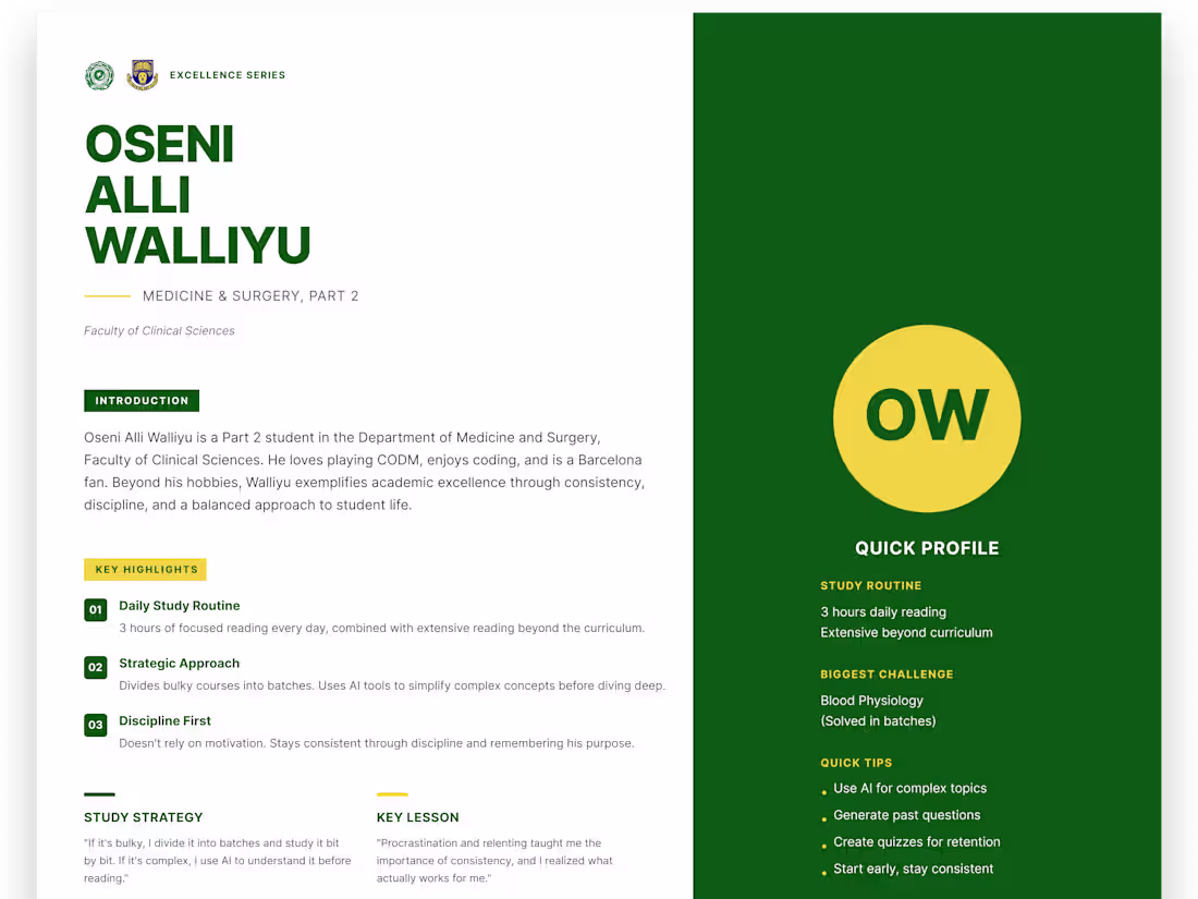
I designed this magazine-style graphic to turn a basic student interview into a really clean, sharp spotlight. Instead of dumping a massive wall of text on the page, I went with a split-screen look. The left side handles the main story with nice, bold text, while the green sidebar on the right lets you grab the quick facts at a glance. It just makes the whole thing feel way more premium and easy to read.
0
38
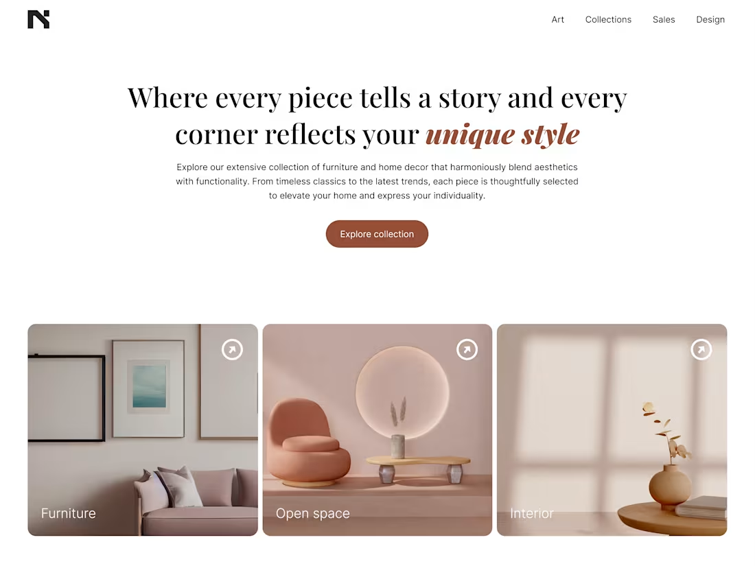
I designed this clean, high-end landing page to reframe how people interact with luxury furniture and home decor online. The goal was to move away from cluttered, chaotic e-commerce grids and instead create a serene, gallery-like digital experience that feels as intentional as a beautifully curated home.
0
42
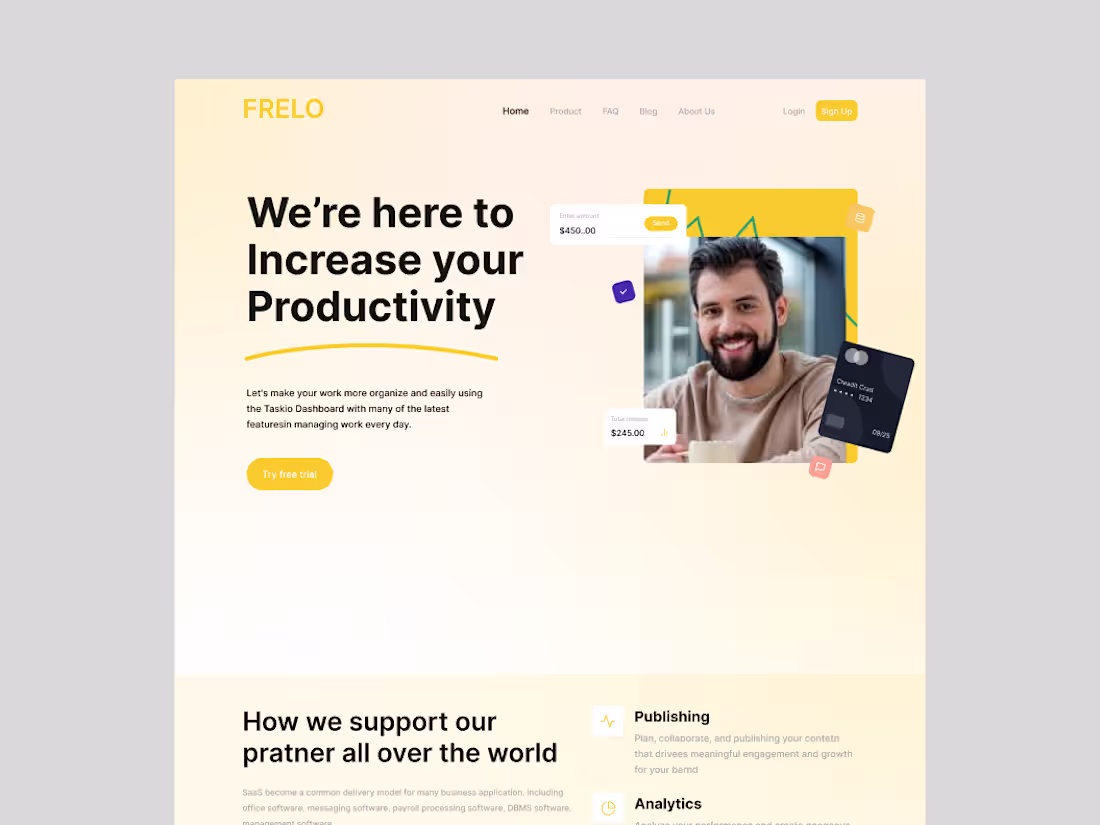
I designed this modern SaaS landing page for FRELO with a clean, productivity-focused interface that highlights simplicity, collaboration, and workflow efficiency. The layout combines soft neutral tones with bold typography and vibrant accents to create a balance between professionalism and approachability, while the structured sections guide users seamlessly through the product’s value, features, and engagement points.
0
44
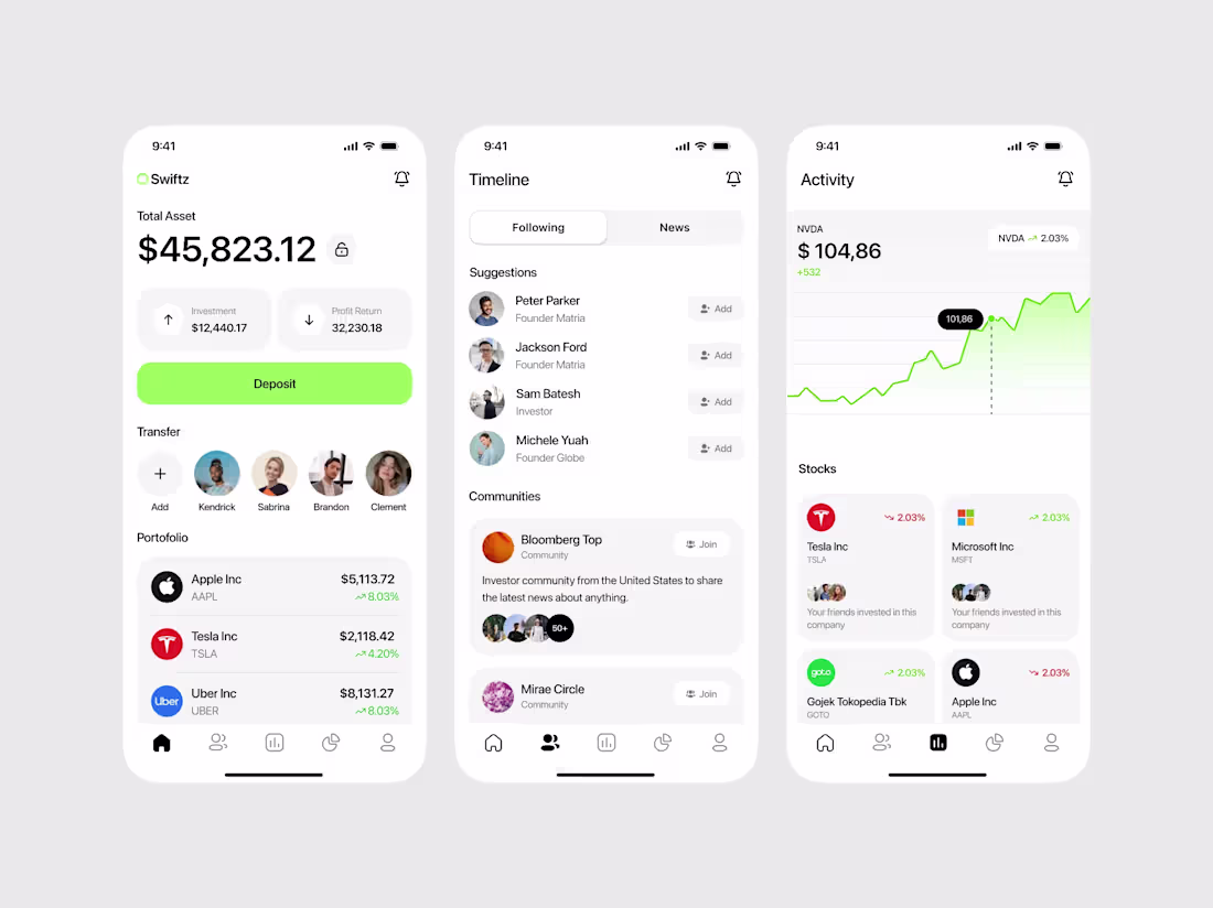
Design and implementation of a Banking app
0
52
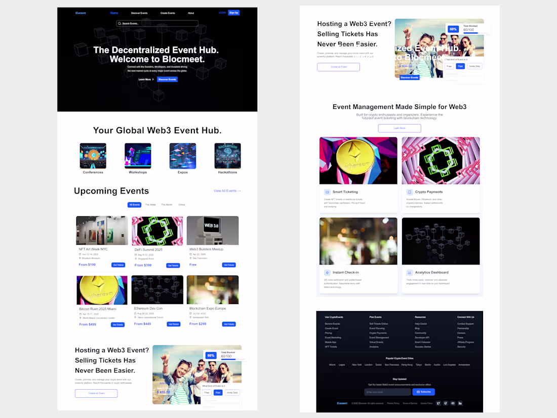
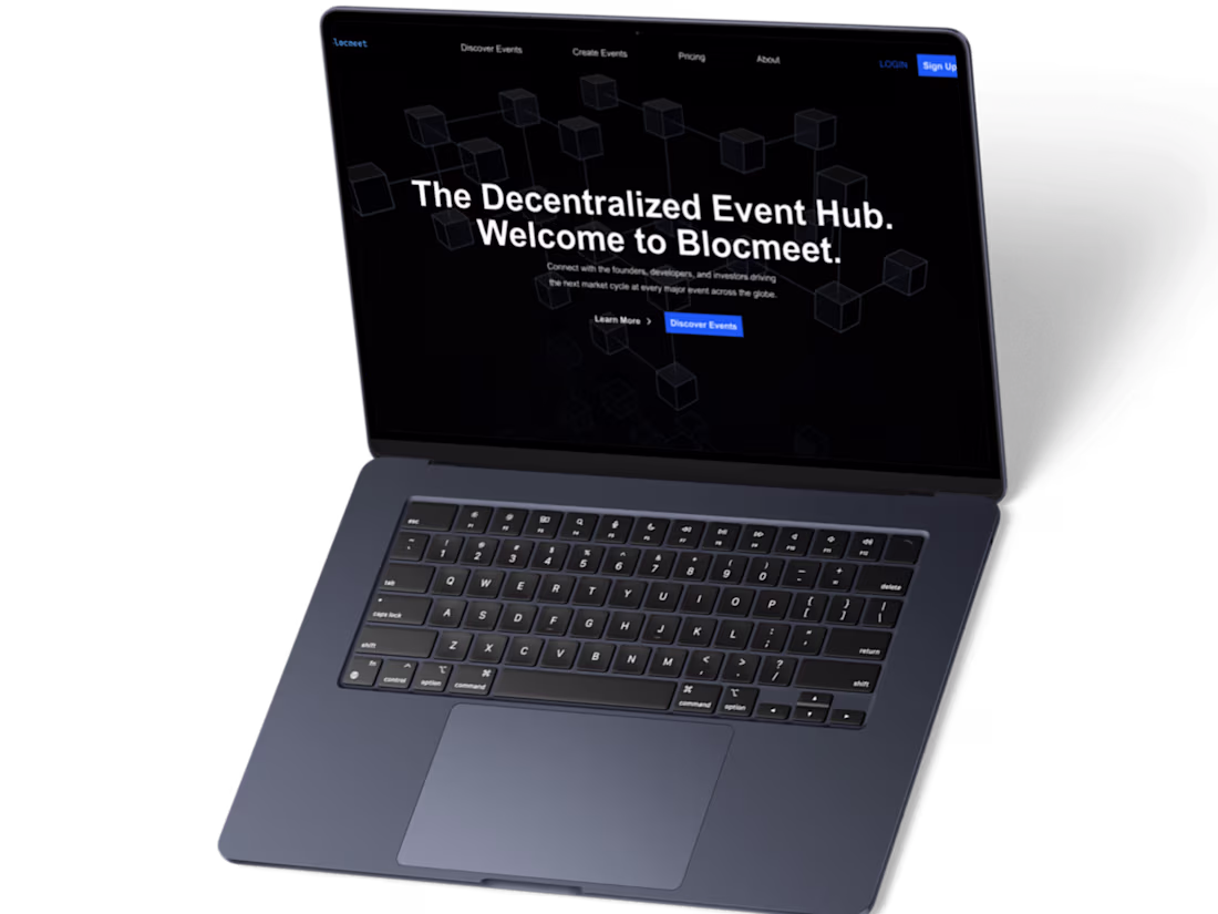
UI/UX Design for BlocMeet Web3 Event Hub
1
18
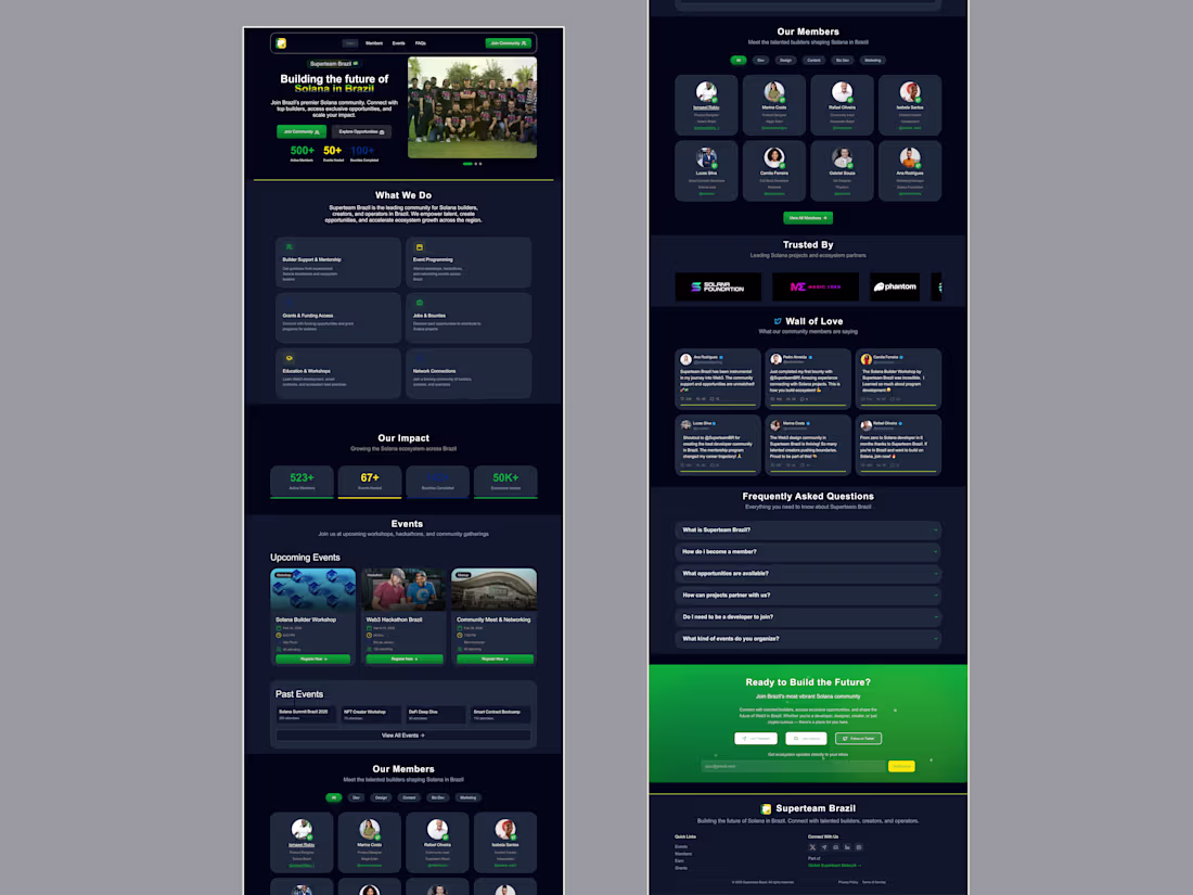
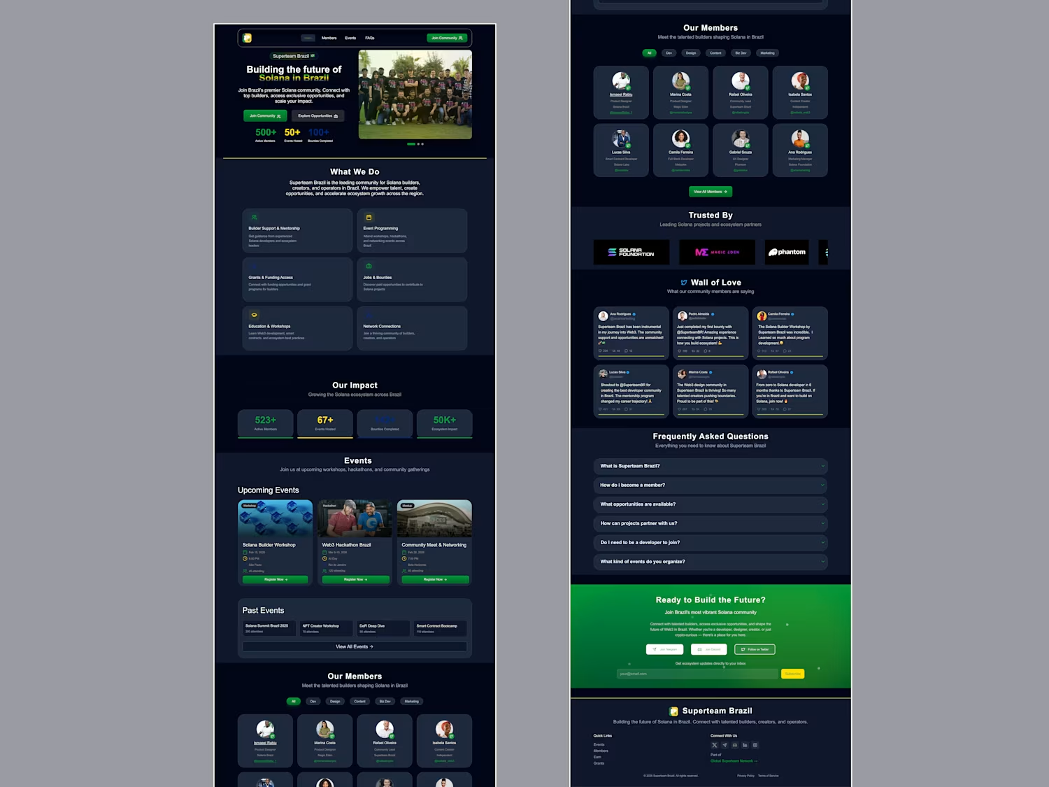
Superteam Brazil Community Landing Page Design
0
16
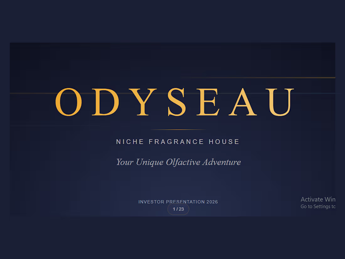
Odyseau Niche Fragrance House Pitch Deck
1
31
1
2
24
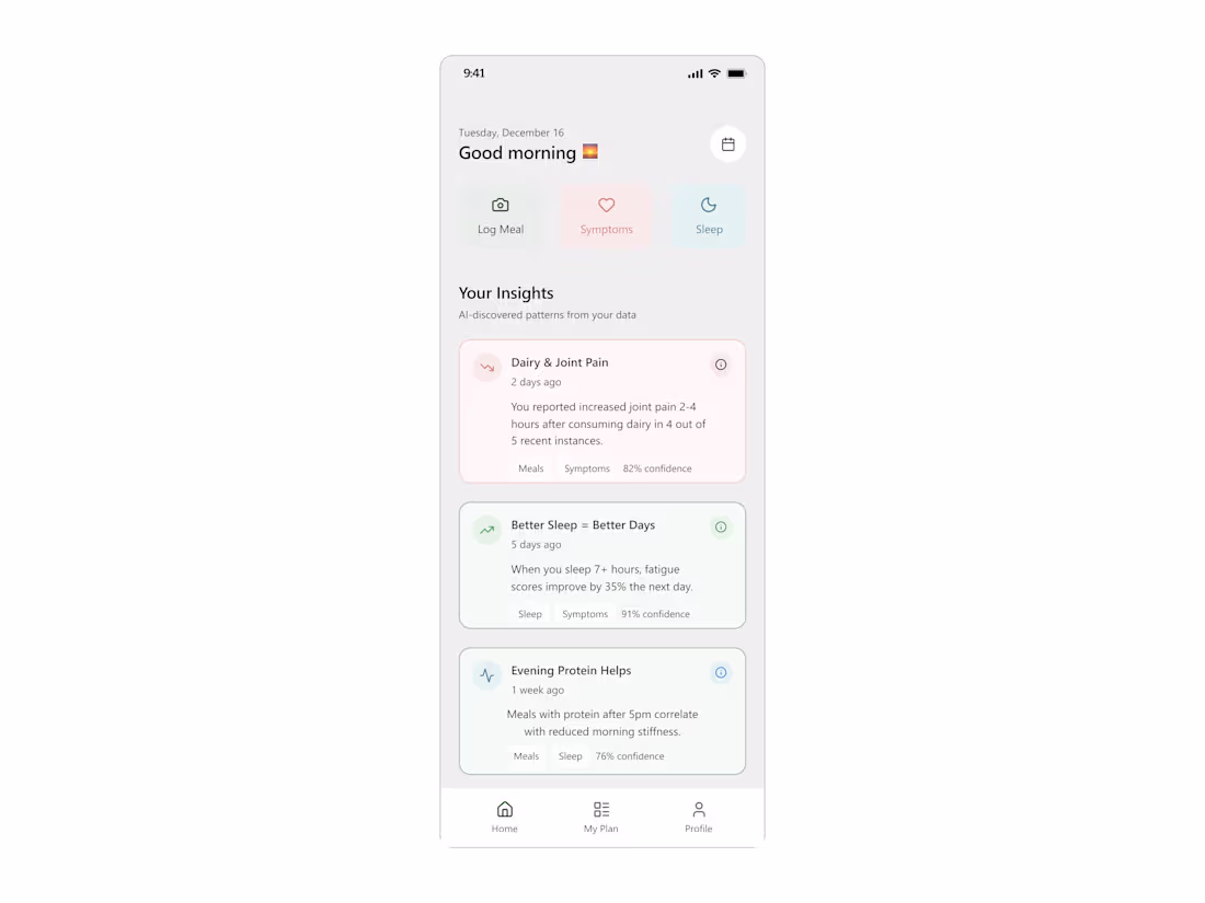
Design of Hi Honey - A Health App for Sjögren's Syndrome
2
6
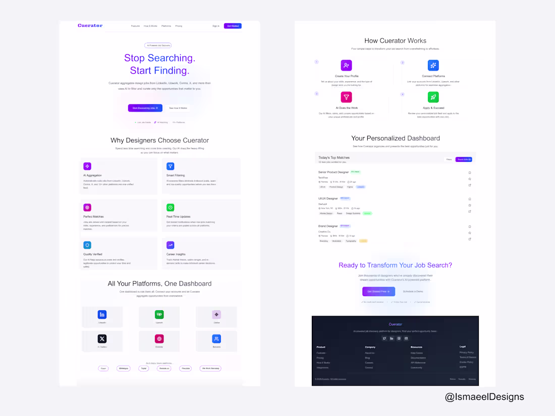
Landing Page Design for Cuerator
2
14
Clean Hero section I designed for a Crypto Web3 Platform. how's this guys😎
2
4
242
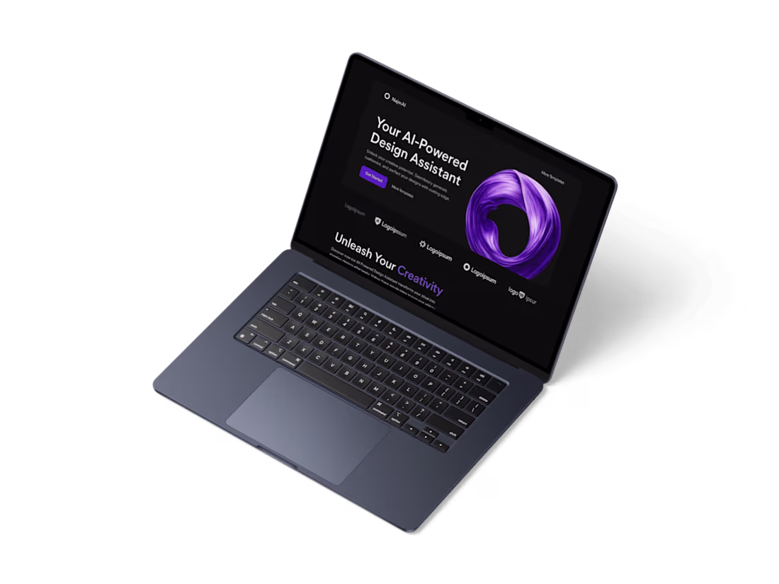
NajmAi Landing Page
I designed a clean, minimal landing page for NajmAi, an AI design assistant for designers. I handled everything from research to final UI. The main challenge was simplifying dense content, which I solved by improving structure and spacing. The final design was easy to navigate, and users interacted with it smoothly.
2
2
223
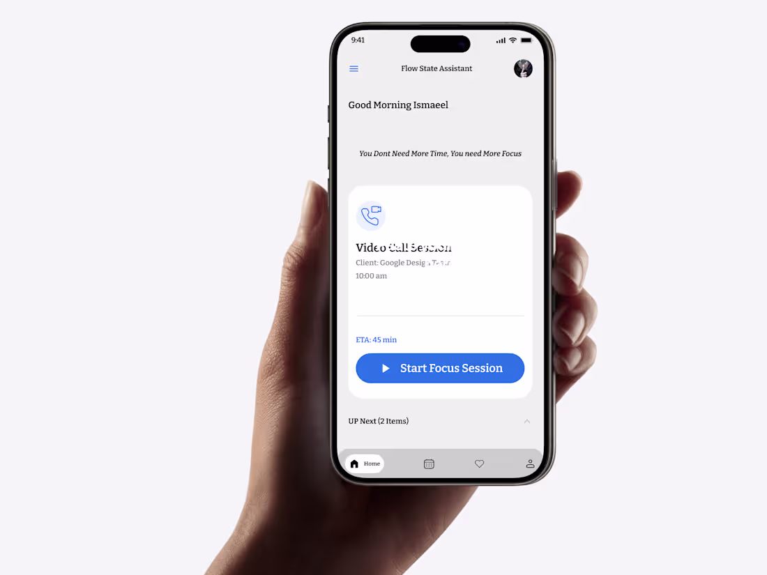
Flow State Assistant: A Mobile Productivity Tool
1
6
Working on a crypto trading/exchange platform 😎.
If you want intricate and precise user interfaces/ experiences, reach out now and let's bring your project to life
1
1
237
I'm currently working for a client who wanted to have designs in Figma to show direction and framer to being it to live. Reach out to me to create stunning and visually clean websites. 😎
2
209
Do you want clean work like this? Hit me, let's collaborate and bring your ideas to life.
1
3
197
Product Management App (Mobile UI Design)
1
6
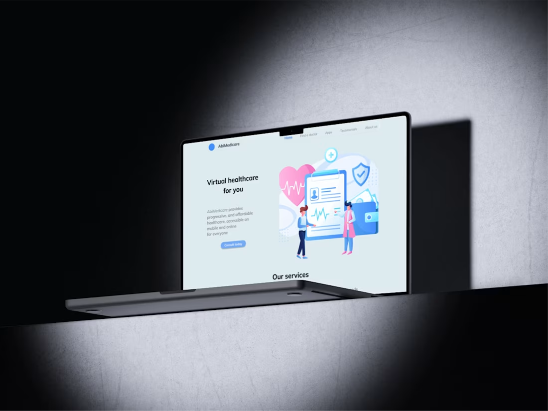
Health & Wellness Website: From Figma Concept to Framer Reality
1
8
Look what I'm working on😎.... a website for a health and wellness platform where users can fund a doctor, book consultations with verified experts, get Emergency care and lots more. I'm really excited to complete this project for $1,500. My client has liked and approved the design direction already and we're really progressing nicely. Afterwards, I'll develop it in #Framer so the website can come to live.here is a link to the figma file: https://www.figma.com/design/B5QjeWTRhxDExuRo2Vx1Yj/practice-n-Fun?node-id=1989-2784&t=2SYtl0ASRDLXkIkH-1
You should hire me for your next UI/UX Design/ Framer development jobs so you can enjoy timely and beautiful designs.
#thenewcontra #Workinprogress
4
29
312
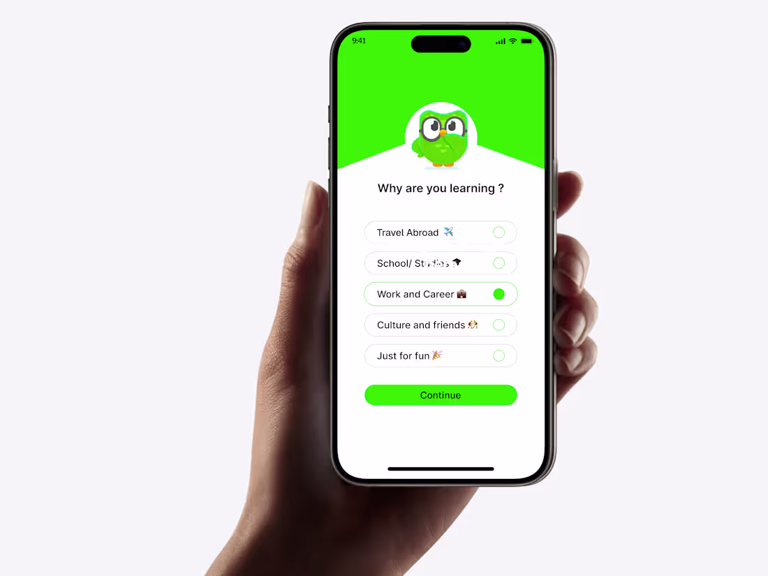
Language app redesign
1
6
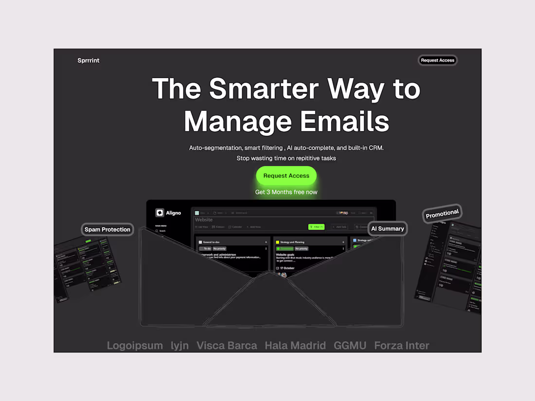
Smart Email Management Dashboard
1
4
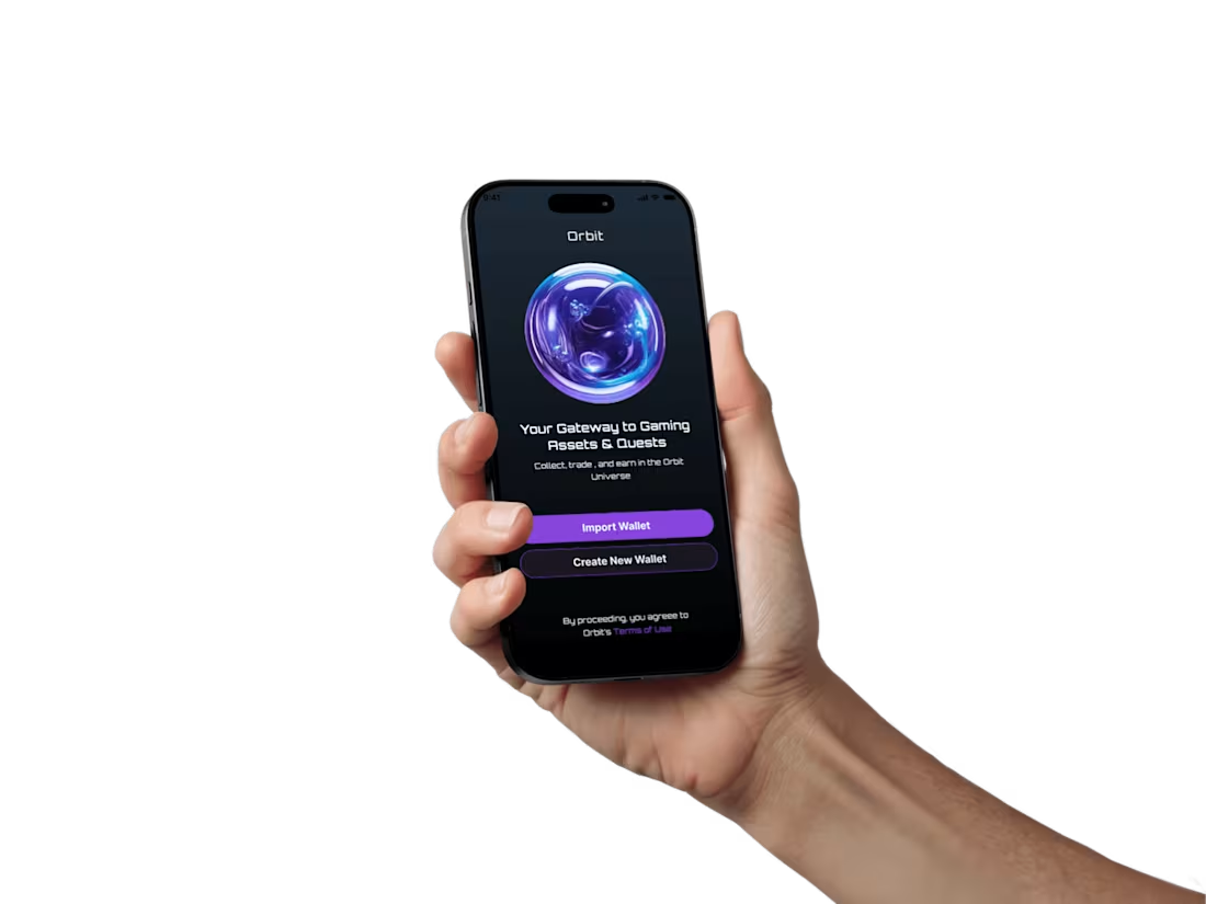
A Crypto Web3 Wallet Splash Screen
1
4
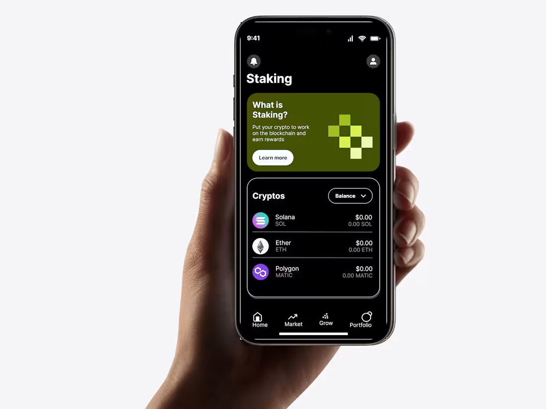
Homepage of a crypto trading app
1
8
A carpentry ecommerce store
1
6
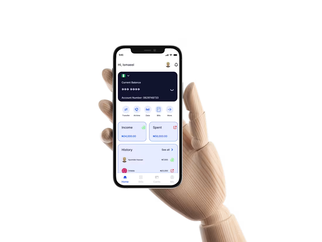
A Banking/ Fintech App Design
1
3
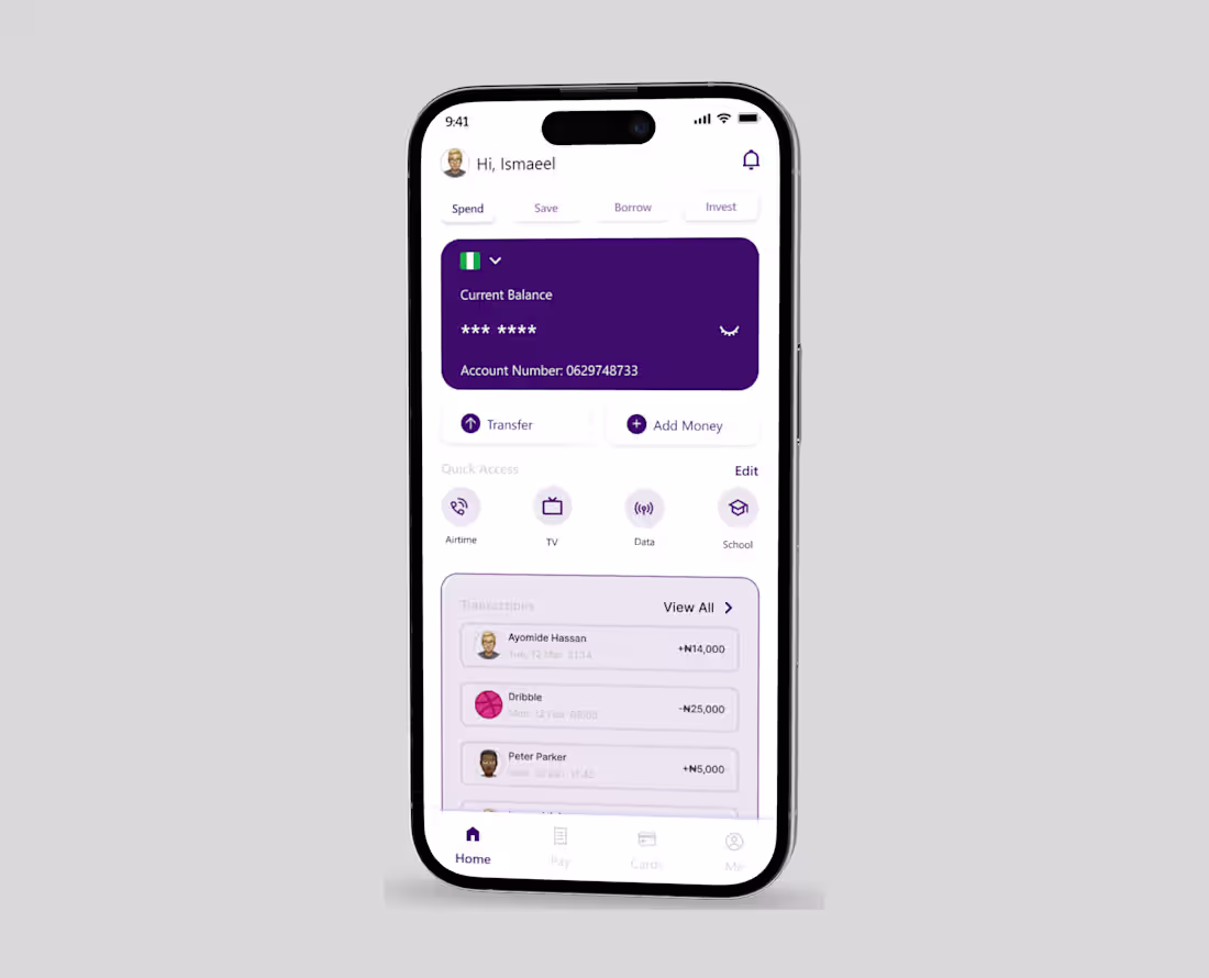
A Bank App Redesign
2
8
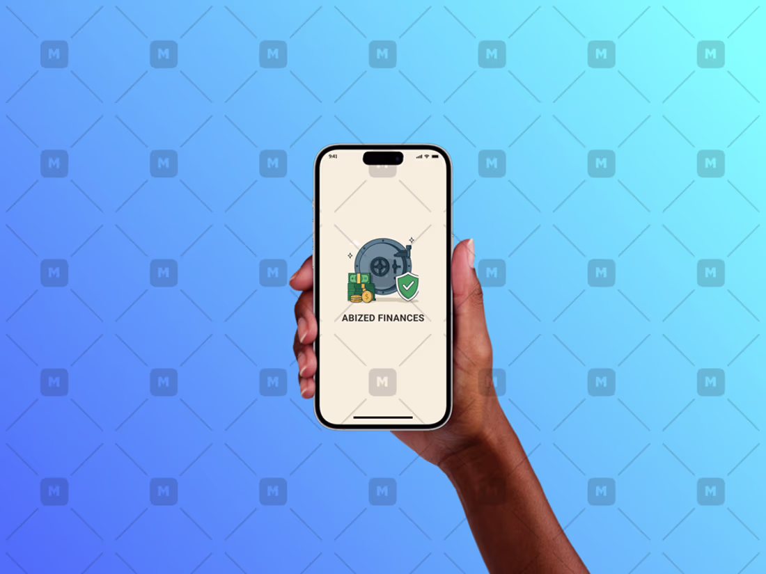
A finance app design
1
5
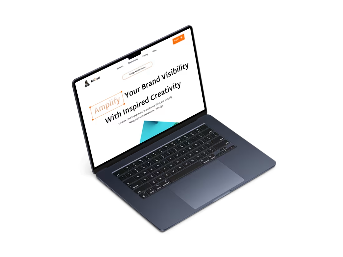
Simple landing page for a website
1
4
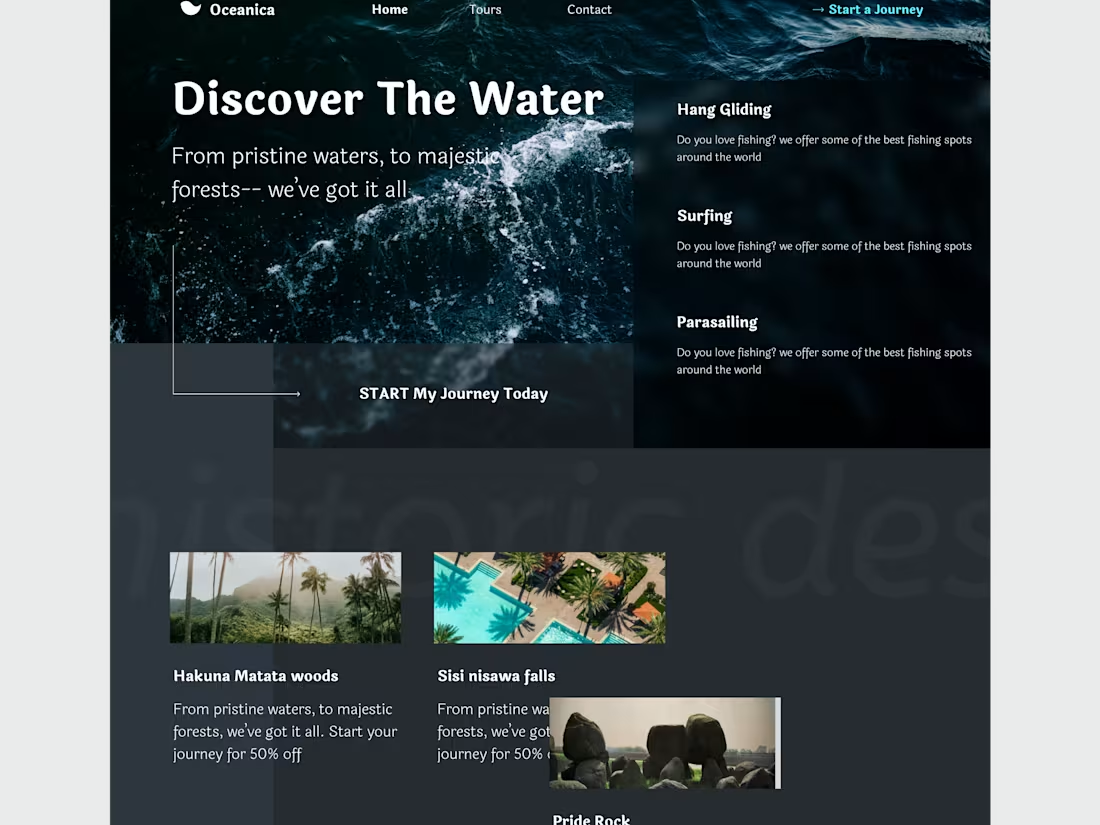
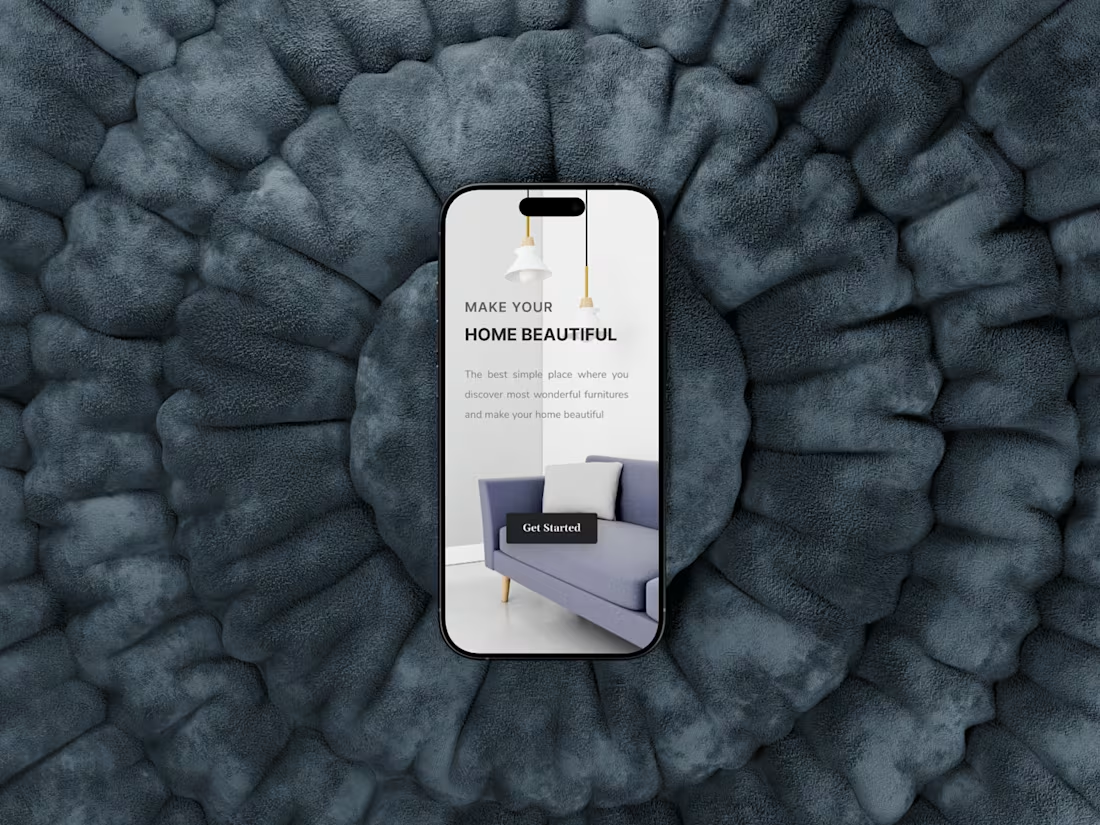
A landing page for a vacation based website
1
5