The network for creativity
Join 1.25M professional creatives like you
Connect with clients, get discovered, and run your business 100% commission-free
Creatives on Contra have earned over $150M and we are just getting started
Back to feedPost

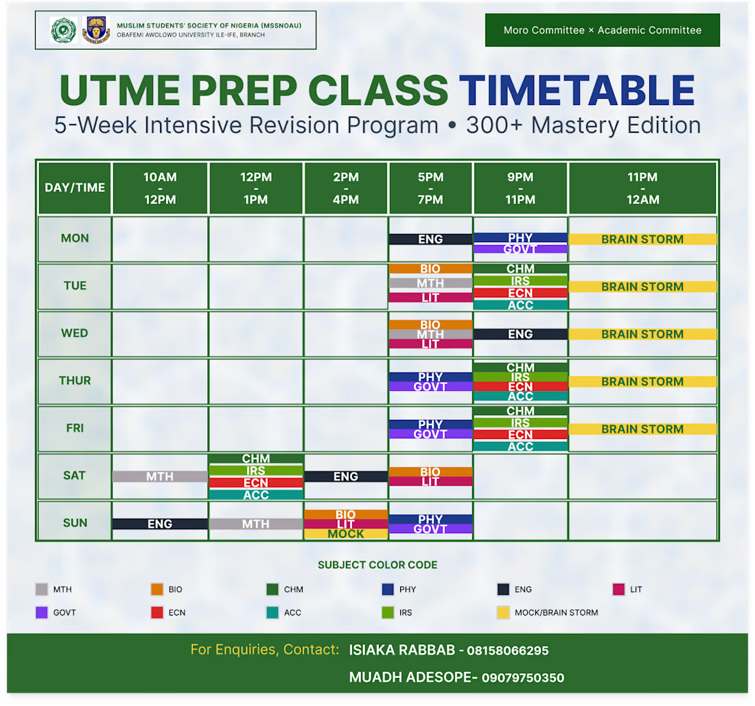
I designed this timetable to make a packed, 5-week exam prep schedule actually easy for students to read. Instead of a messy, confusing grid, I kept the layout super clean with bold headers so you can find the day and time instantly. I also color-coded each subject and added a quick key at the bottom so students can map out their weekly classes and brainstorming sessions at a single glance without getting overwhelmed.


The network for creativity
Join 1.25M professional creatives like you
Connect with clients, get discovered, and run your business 100% commission-free
Creatives on Contra have earned over $150M and we are just getting started








Related posts

Interactive AI Analytics Dashboard | SaaS Product Design
A modern, animated AI-powered eCommerce analytics dashboard designed to help businesses track sales performance, monitor revenue, understand customer behavior, and make data-driven decisions.
The design combines a clean SaaS interface, intuitive data visualization, interactive dashboard elements, and smooth animations to create a more engaging user experience. Every section is designed to make complex analytics easier to understand while maintaining a professional, scalable, and user-friendly layout.


Super clean work!


Clean layout pure focus


A little behind the scenes of a site launch video I'm working on 👀
