Ismaeel Rabiu
Top 1% Mobile Apps and Web Designer
- 5.0
- Rating
- 43
- Followers




MyWorldCup App⚽🌍
Ever since the World Cup began, I found myself doing the same thing, jumping between score apps for updates, switching to X for fan debates and banter, checking blogs for news, and moving across different platforms just to follow one tournament.
It felt exciting,...

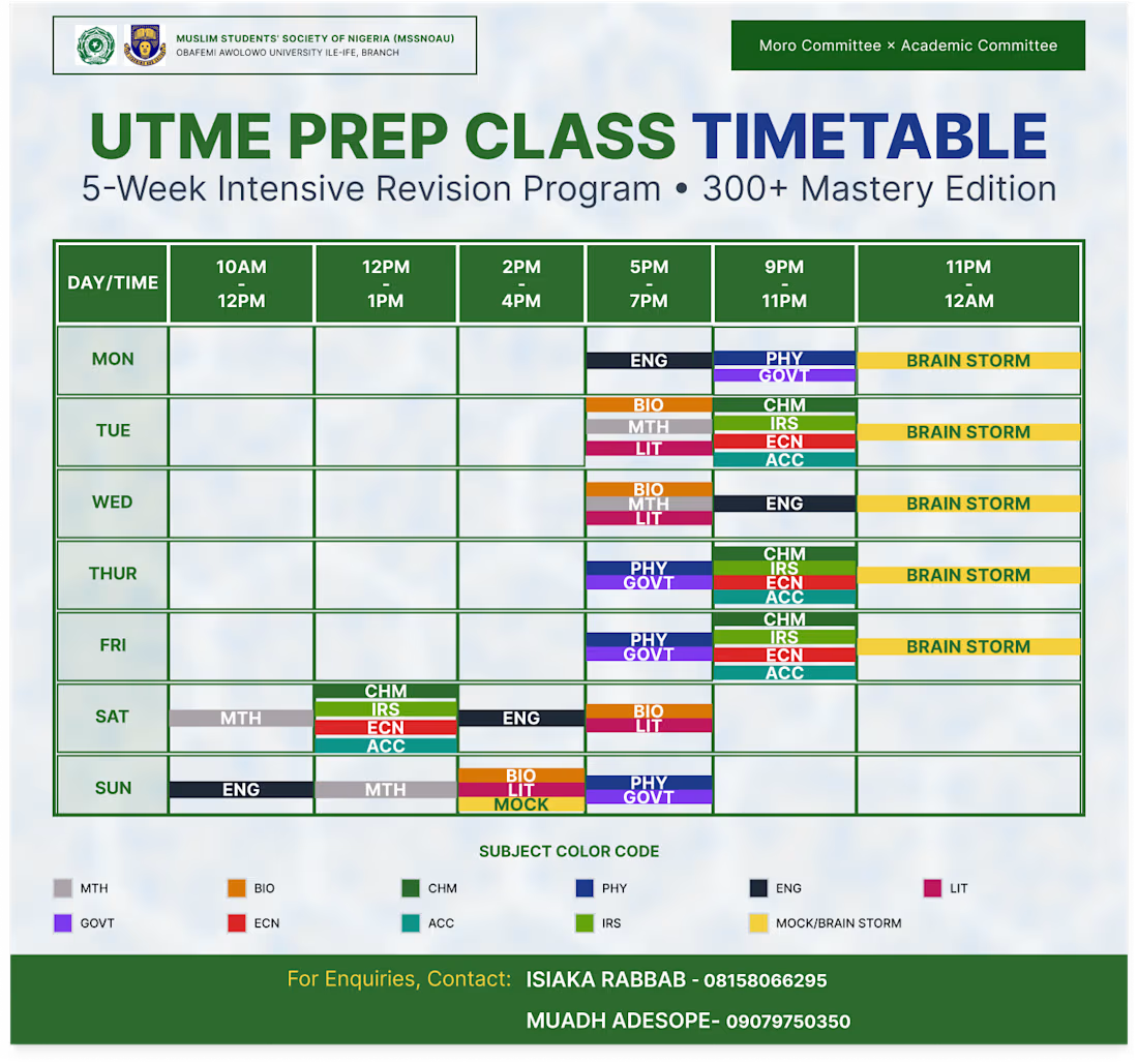
I designed this timetable to make a packed, 5-week exam prep schedule actually easy for students to read. Instead of a messy, confusing grid, I kept the layout super clean with bold headers so you can find the day and time instantly. I also color-coded each subject and added a...
I designed this clean, high-end landing page to reframe how people interact with luxury furniture and home decor online. The goal was to move away from cluttered, chaotic e-commerce grids and instead create a serene, gallery-like digital experience that feels as intentional as a beautifully curated home.

I designed this modern SaaS landing page for FRELO with a clean, productivity-focused interface that highlights simplicity, collaboration, and workflow efficiency. The layout combines soft neutral tones with bold typography and vibrant accents to create a balance between...