
pro
Ihar Yanouski
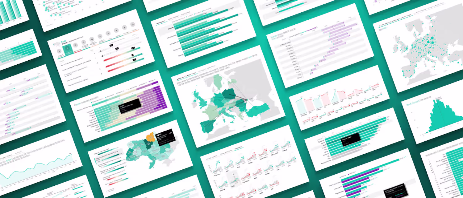
Data Visualization Expert | Design & Development | D3/Svelte
- $10k+
- Earned
- 6
- Followers
Well, it's really smooth invoicing and payment process with Contra. So pumped to see where this journey takes me!
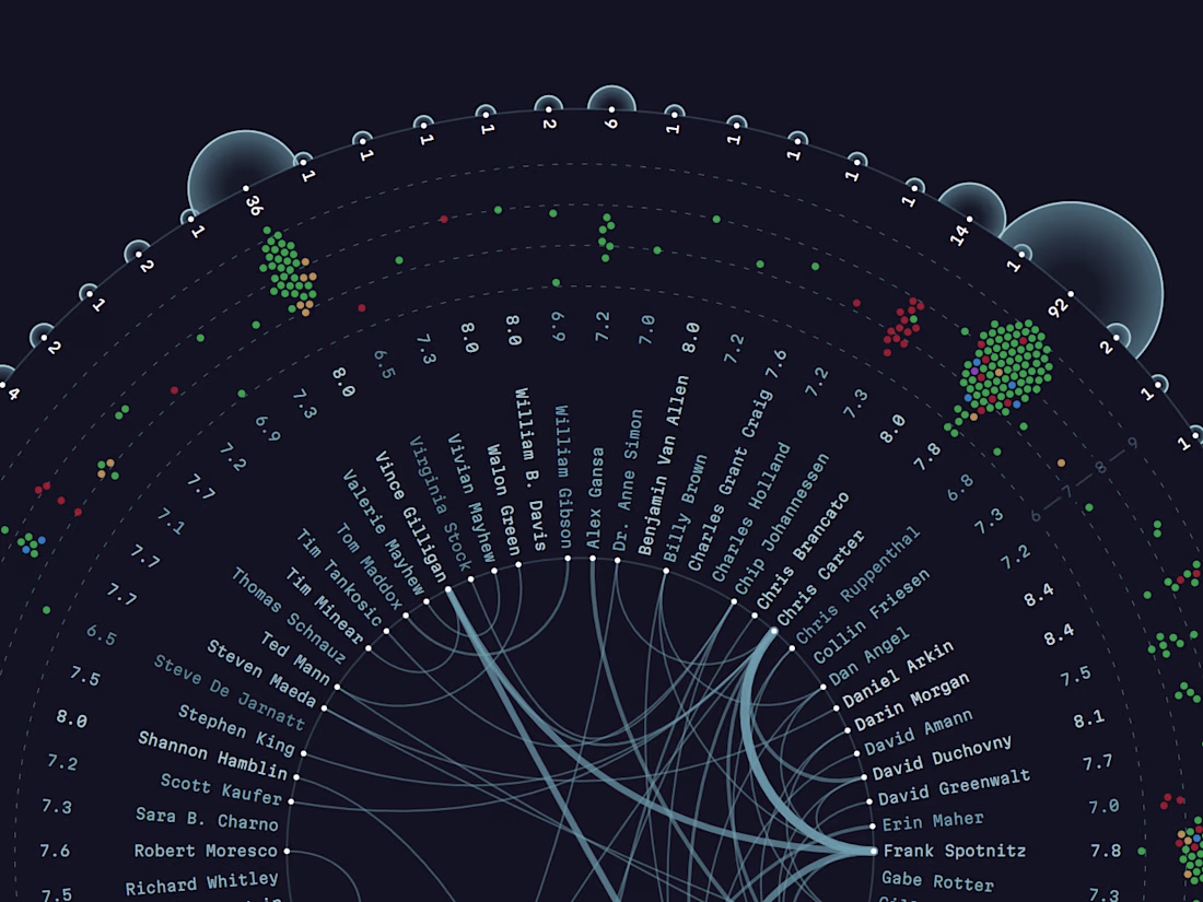
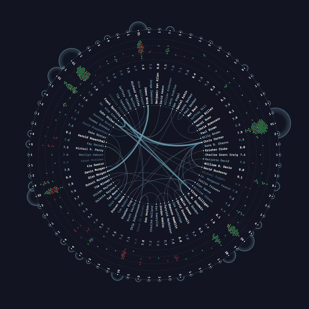
The truth is out there—and data visualization is the lens that helps us find it. 🕵️♂️📈👽
Great data design doesn’t just look beautiful. It acts as a powerful tool to uncover hidden connections, investigate complex cases, and reveal stories that would otherwise stay buried in...


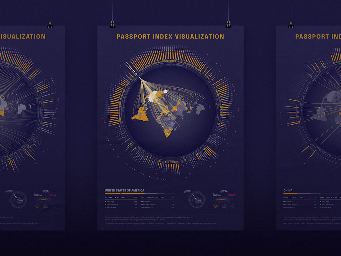
I love diving into messy datasets and turning hundreds of spreadsheet rows into clean, meaningful visuals. Here is my take on the Global Passport Index. The image below shows the static poster version, but you can also explore the full interactive visualization.
Maped all settlements in Belarus mentioned in Wikipedia (Official Standard edition — be.wikipedia). Those that have an info about the date of foundation or first mention (only 6.5% in total, somewhat 1.5k out of 23k) also plotted on the timeline below.
Interestingly, the relative...
