Honey Nandal
Creative Designer | Web & Brand Design Specialist
- $10k+
- Earned
- 7x
- Hired
- 5.00
- Rating
- 108
- Followers
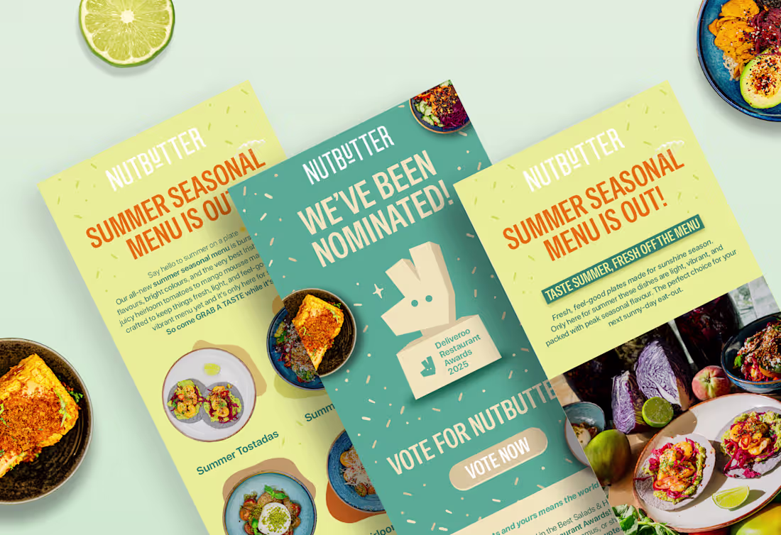
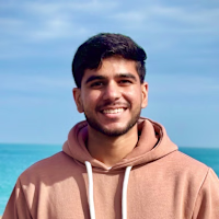
Email Marketing - Nutbutter | Klaviyo Email Design & Development
2
33
Designed and developed this email campaign for Nutbutter using Klaviyo, celebrating their Deliveroo Restaurant Awards nomination.
The goal was to get their audience excited and drive votes through a clean, engaging design that stands out in crowded inboxes.
🎨 What I Did:
→ Full email design and development in Klaviyo
→ Created both static and animated versions for impact
→ Maintained brand consistency with playful, food-forward visuals
→ Strategic layout to drive clicks to the voting page
📊 The Results:
→ 37.2% open rate (well above industry average)
→ Sent to 1,489+ engaged subscribers
→ Clean, conversion-focused design that delivered
Sometimes the best designs are the ones that don't just look good, they perform. And this one did both 💪
4
289
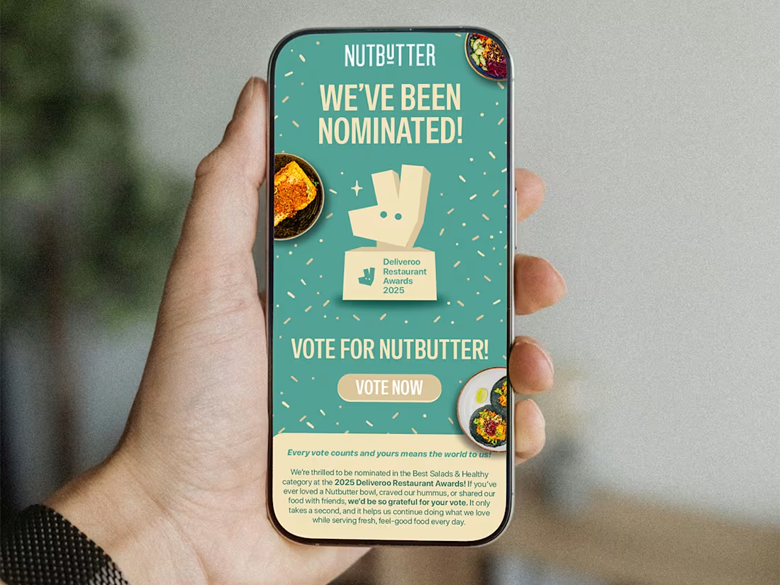
Autumn menu launch emailer design for Nutbutter.ie (https://Nutbutter.ie) 🍁
Which one would you choose?
- Variation 1
- Variation 2
4
290
Social Media Talks - A visual identity crafted for a modern marketing podcast. Built to capture attention, guide conversations, and thrive across digital platforms.
From podcast thumbnails to branded social reels. Bold type, vibrant layouts, and a system designed to grow with the content.
7
239
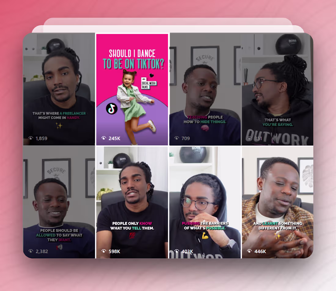
Here's what happens when you nail both the visual identity and the content execution. 🔥
I designed the brand and edited long-form & short-form content for a podcast launch, and the results speak for themselves:
📈 The Numbers:
→ 598K views on a single reel
(https://www.instagram.com/reel/Ceypvn0ghNr/)→ Multiple reels (https://www.instagram.com/socialmediatalks.ie/reels/) hitting 400K+ views
→ Massive engagement boost across the board
This wasn't luck, it was strategic branding paired with polished, scroll-stopping content that actually resonates with people.
The lesson I learned is that a strong brand identity is only half the equation. How you show up consistently in content is what turns visibility into real engagement.
Proud of these results and excited to see what's next 💪✨
4
180
Social Media Talks | Podcast Brand Identity Design
2
71
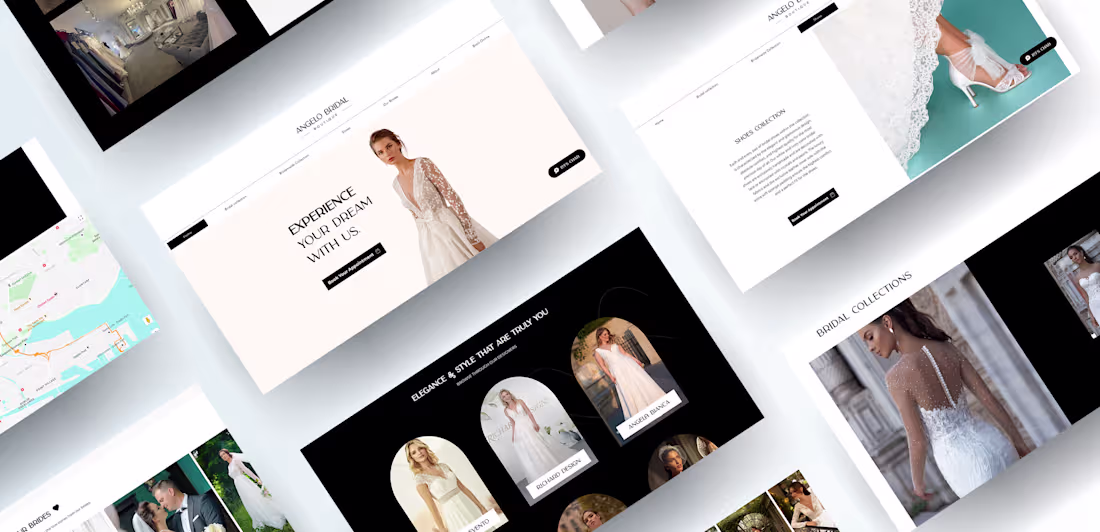
Re-designed the web experience for Angelo Bridal. 🪄
Clean layouts, spacious breathing room, and a color palette that whispers luxury. Every page was designed to feel calm, elegant, and easy to explore.
3
6
173
Some short-form content that I had edited for Angelo Bridal to spread the word about their beautiful boutique on social media.
After the whole re-branding, I had a much better understanding of the client's vision with their brand's language and tone. I worked on editing a lot of Instagram reels/content to promote their bridal collections, and a virtual boutique tour.
What do you think?
3
27
238
Angelo Bridal | Luxury Rebranding & Website Design
2
83
Aer Lingus College Football Classic App - UI/UX Design & Dev
4
15
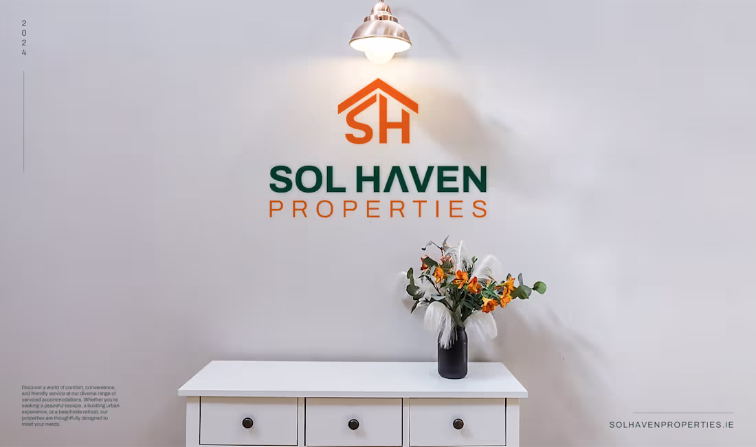
Sol Haven Properties | Brand Identity Design
3
16
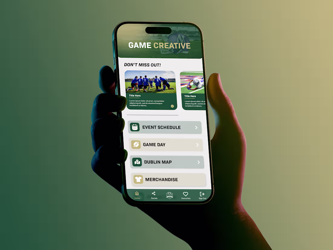
A project I'm incredibly proud of... 💖
The official mobile app for the Aer Lingus College Football Classic 🇮🇪🏈
It was a real world project serving over 1,000 American football fans flying to Dublin. Having Aer Lingus's name on something I designed, developed, and launched still feels surreal.
🛠 What I Did:
→ Full UI/UX design from client wireframes
→ Kept branding consistent throughout, following proper brand guidelines
→ High-fidelity prototyping & App Store visuals
→ Handled testing & publishing on both stores.
I single-handedly managed this project from proposal email to launch, maintaining constant communication between both teams.
📈 Results:
→ 1,200+ downloads in 2 weeks
→ Live during a high-traffic international event
→ Delivered under tight deadlines for one of Ireland's biggest events
Case study coming soon.
36
94
1K
💪 Sarah Murphy Fitness Website Design & Development
Designed and built a clean, high-impact website for Sarah Murphy, a personal trainer and nutrition coach in Ireland.
The goal was to create a digital presence that feels energetic yet refined, blending bold typography, empowering visuals, and an intuitive user experience.
A modern, conversion-focused website that mirrors her brand values: confidence, balance, and transformation.
5
95
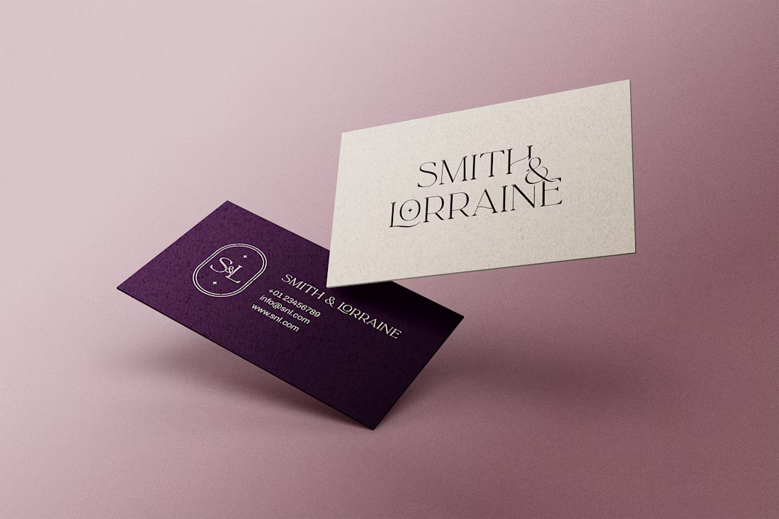
✨ Smith & Lorraine - a brand born inside a castle.
This project was for two business partners who recently bought Killoskehane Castle in Ireland and wanted to create a timeless personal brand around it.
I crafted their full visual identity, from logo concepts to business cards, social media banners, and merchandise.
The goal was clear: build a brand that feels luxurious, elegant, and quietly powerful... just like the castle itself.
Deep plum tones, graceful typography, and subtle metallic accents came together to form the final look.
2
5
122
REIL - From brand identity to the Ideal Home Show stand design 🇮🇪
This one’s close to my heart. After completing REIL’s full rebrand, I designed their exhibition booth for the Ideal Home Show in Dublin, crafting something that not only stood out but reflected who they’d become: a premium, trustworthy brand leading Ireland’s retrofit energy space.
From concept sketches to 3D mockups, endless iterations, and even the infomercial that played live at the booth, I handled it all.
Flying to Dublin and seeing everything... the stand, flyers, brochures, tote bags, merchandise, all designed by me, displayed under one roof… surreal.
A proud moment seeing months of design come alive in the real world. 💚
4
97
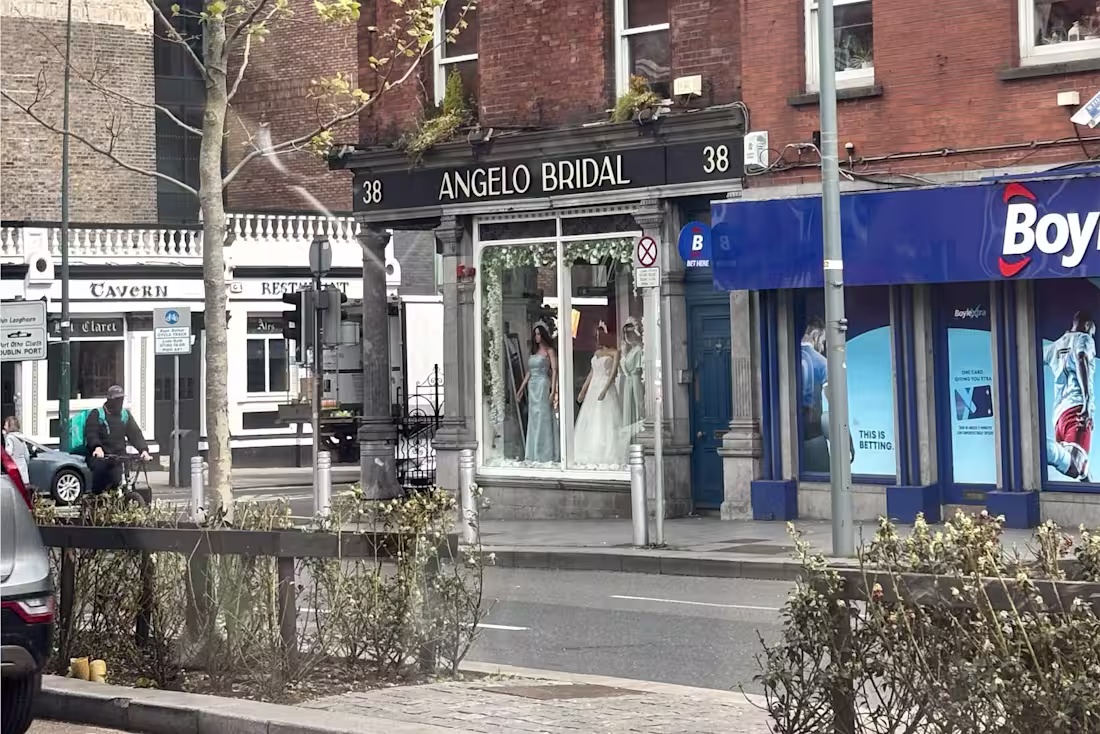
Angelo Bridal - A Luxury Rebrand close to my heart ✨ 🥹
Earlier this year, I visited this boutique in Dublin 🇮🇪 the same one I had rebranded from scratch a while back.
Seeing my work in person, from the signage to the business cards displayed inside was surreal.
This project was about more than design. It was about redefining elegance and building a brand that felt timeless, luxurious, and true to their brides. 💍
Scope:
→ Full Brand Identity
→ Website Design
→ Print & Business Collateral
(will be sharing more about the project in upcoming posts. 👀)
For now, here’s a glimpse into the new identity that became the foundation for everything else.
9
10
175
Building a brand from the ground up 💪✨
Union Strength, a local Irish gym that needed more than just a logo. They needed a complete brand presence, online and offline.
🎨 What I Created:
→ Bold, modern brand identity and logo design
→ Social media templates & merchandise designs
→ Comprehensive brand guide & presentation
→ Fully custom website that embodies their strength
The challenge?
Taking a local gym and giving them a brand that feels powerful, impactful, and unmistakably them.
The black, neon yellow, and geometric patterns became the visual language that now defines Union Strength. Every detail was designed to embody strength and community.
I believe, this is a great example of what happens when branding and web design work together seamlessly. 🔥
2
6
131
Bunq Website Redesign Concept | Fintech UI Design
1
21
Vibrant Life Chiropractic - bringing wellness to life through design.
Created a calming yet confident brand identity for a chiropractic and wellness clinic that wanted to move away from the typical “clinical” look and feel.
Soft, modern tones and clean typography were used to communicate trust, care, and holistic healing, all while keeping the visuals fresh and approachable.
A brand that feels as rejuvenating as the service it represents. 🌿
2
6
108
NEJ | Concept Brand Identity for Activewear Brand
1
50
Among the 'Top 1% of Creatives' on Contra ✨
Even the screenshot got the motion treatment, just couldn't help myself.
Proud of this one!
Here's to the next chapter! 💪
6
7
181