


Letting a headline breathe
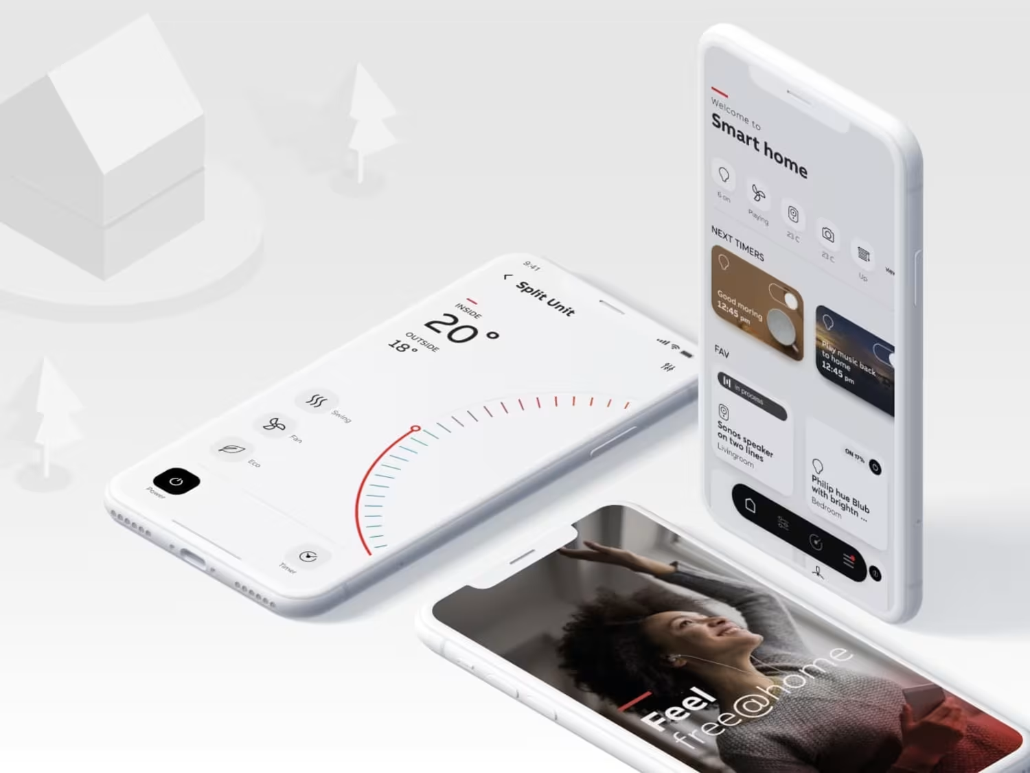
On the Moksha site, a breathing-device product page, the hero headline doesn't appear all at once. Each letter slides in and fades up, one after another, so the line settles slowly instead of snapping into place.
I wanted the first few seconds to feel...

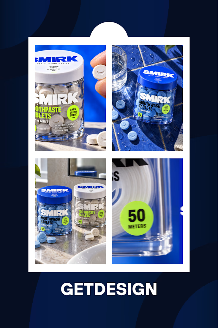
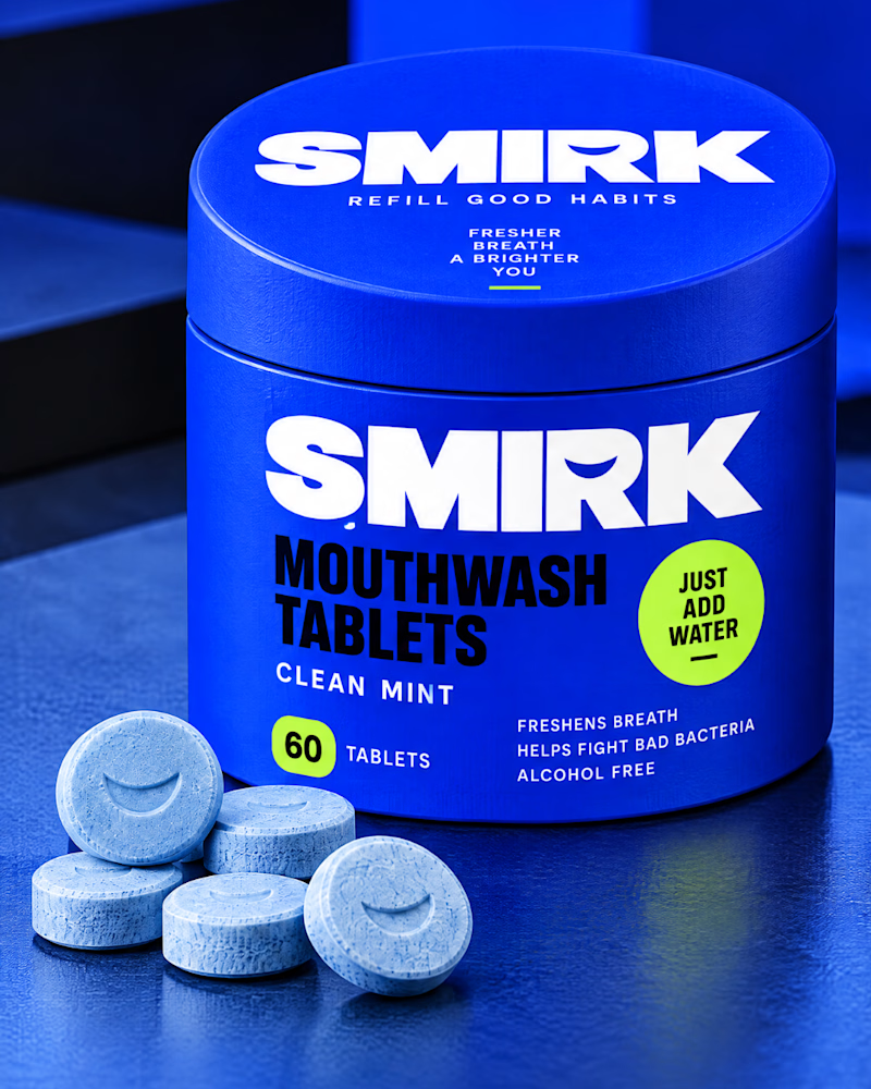
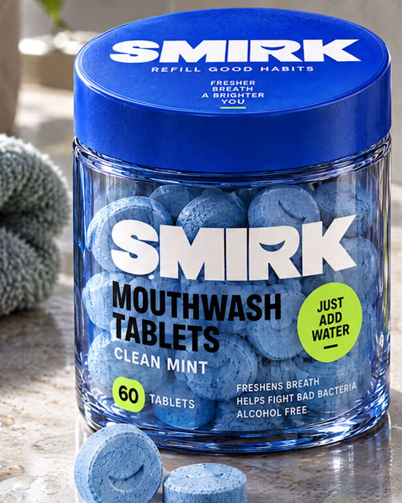
A visual transformation that turns everyday dental care into a fresh, modern brand experience. From the initial concept to the refined final look, every detail reflects simplicity, clarity, and confidence.
5 votes
Ends in 1d
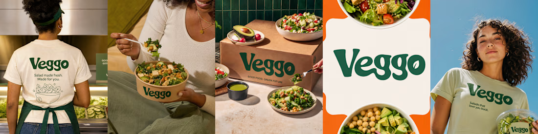
For Veggo, I explored a fresh visual direction built around vibrant colours, balanced typography, and carefully considered design details. The goal was to create a cohesive look that communicates the restaurant's personality across different touchpoints.
I explored Solea through a curated collage of visual elements, focusing on composition, colour harmony, and overall aesthetic. The result is a cohesive visual direction with a distinctive character.
#Contra #GraphicDesign #VisualIdentity #CreativeDirection #DesignPortfolio

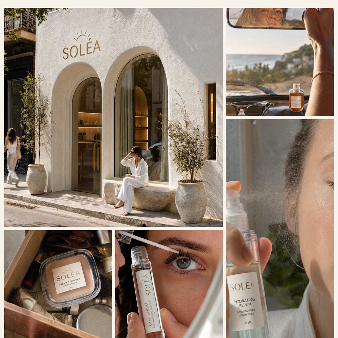
I approached this project through a collage-led design direction, experimenting with image placement, visual rhythm, and product-focused storytelling to build a cohesive composition.