Mati Design's Work | ContraWork by Mati DesignMati Design
Creating functional and beautiful designs đź’ˇ
Elevating Veggo's Visual Identity & Social Presence
Project Overview
Veggo is a contemporary plant-based restaurant looking to stand out in a crowded market. As the lead content & brand designer, I was tasked with shaping their ongoing digital presence—curating high-impact visual assets, streamlining post architecture, and building a cohesive brand voice that resonates with conscious food lovers.
Design Strategy & Execution
Brand Consistency: Developed an accessible visual framework featuring rich, warm color palettes and bold typography to step away from predictable eco-friendly visual tropes.
Content Hierarchy: Designed structured, digestible social templates to highlight seasonal menu items, making key information easy to scan and engage with.
Visual Storytelling: Transformed standard product updates into polished design assets tailored to drive higher user engagement and brand recognition.
Deliverables
End-to-End Social Media Visual System
Content Layout & Graphic Templates
Brand Style & Layout Guidelines
I would love to get your feedback on this presentation—does the focus on visual strategy and content architecture represent the design process well, or should I tweak the structure? Crafting the Visual Identity for Elichi Coffee | Case Study
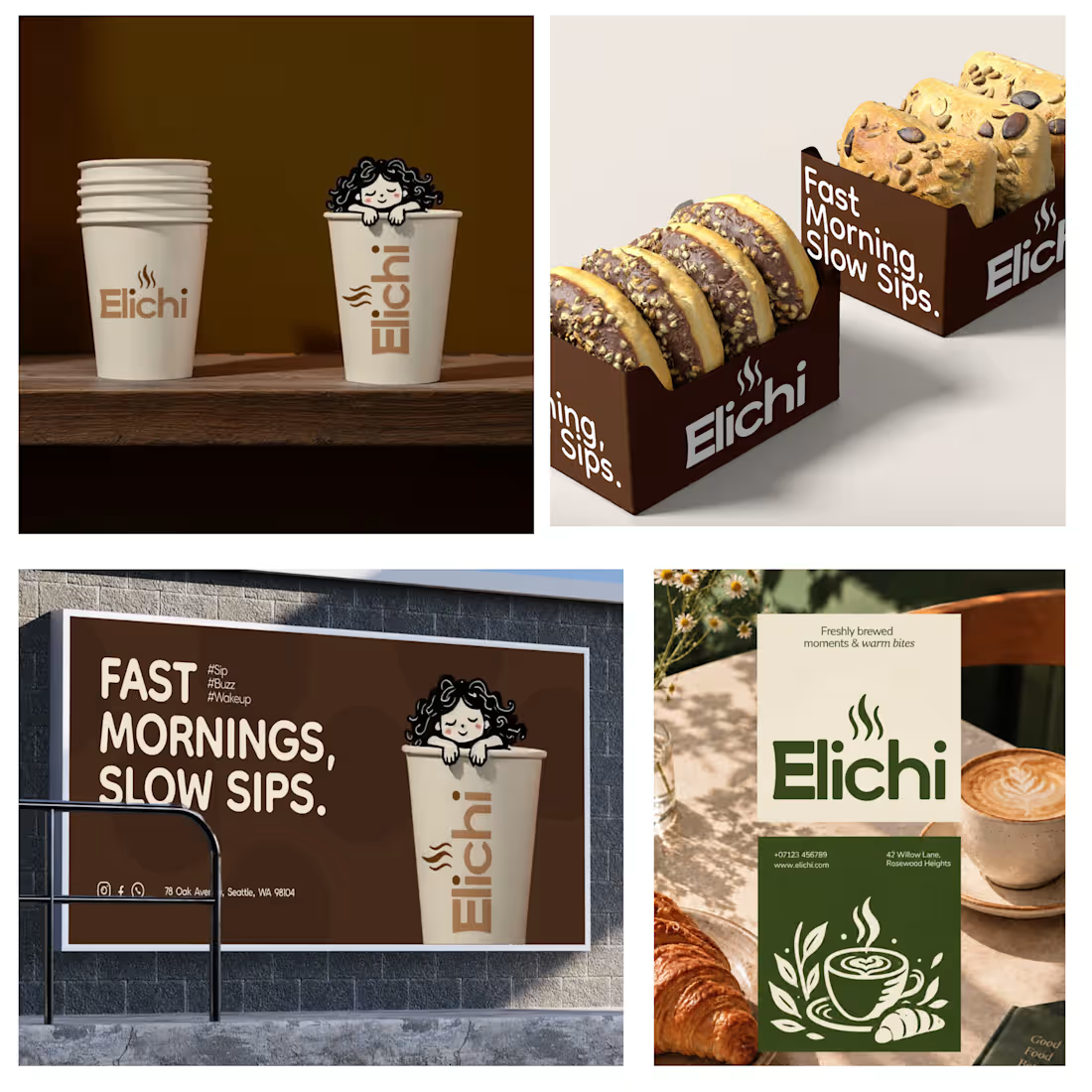
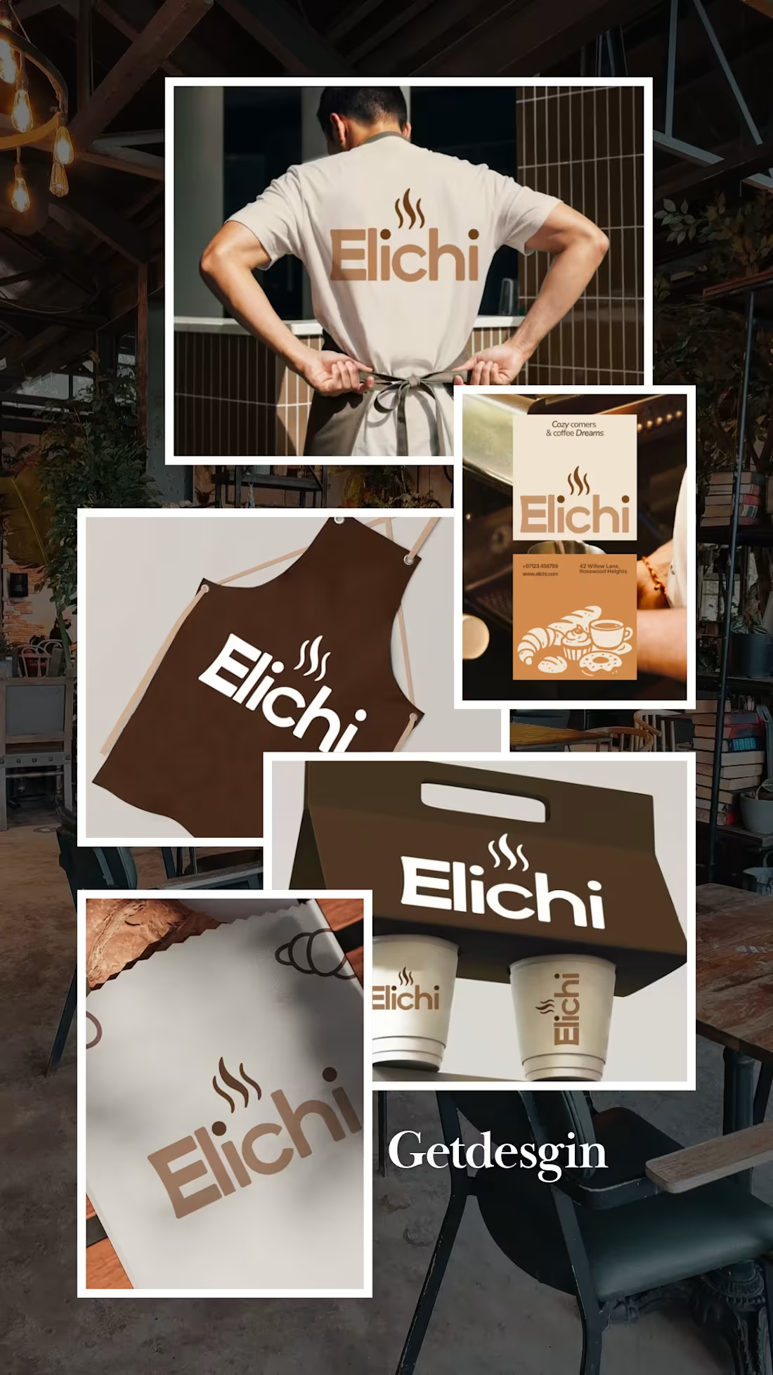
For Elichi, the goal was to build a brand identity that captures the ritual of craft coffee. The visual direction balances modern simplicity with a warm, sensory feel—creating a clean yet inviting identity across every touchpoint.
Design Highlights:
Custom Typography: Paired clean, modern letterforms with subtle editorial accents to establish an elevated, boutique feel.
Packaging & Collateral: Used generous white space and structured layout grids so the physical packaging feels premium in hand.
Palette & Materials: Blended deep, roasted tones with soft, muted neutrals to reflect the warmth of the space and the richness of the brew.
I’d love to get your feedback on this direction:
How does the balance between modern typography and warm tones feel to you?
Does the packaging strike the right balance between minimal and welcoming? Project Showcase: Brand Identity Design for Burger Lover 🍔🎨
As a designer working with small businesses, I recently led the visual identity design for Burger Lover, a fast-casual restaurant looking to establish a distinct, memorable presence in a competitive market.
My focus was on translating the brand’s core personality into a clean, cohesive visual system that bridges the gap between digital marketing and physical packaging.
Key Design Deliverables
Logo & Visual Identity: Crafted a modern, scale able mark built for high legibility on everything from app icons to storefront signage.
Packaging & Touch points: Designed branded takeout boxes, custom burger wraps, and sticker seals engineered to create an elevated unboxing experience.
Color Palette & Typography: Paired appetite-stimulating primary tones with strong display typography to establish instant visual recognition.
Social & Marketing Assets: Developed structured templates to ensure consistent visual hierarchy across digital channels.
I’d love to get feedback from fellow designers! How do you feel about the packaging layout and visual balance? Any insights on the typographic hierarchy would be greatly appreciated.