
Georgia Mashford
Brand Designer and Strategist 🪄
- $10k+
- Earned
- 13x
- Hired
- 4.97
- Rating
- 368
- Followers
The best kind of portfolio update is seeing the work keep working!!
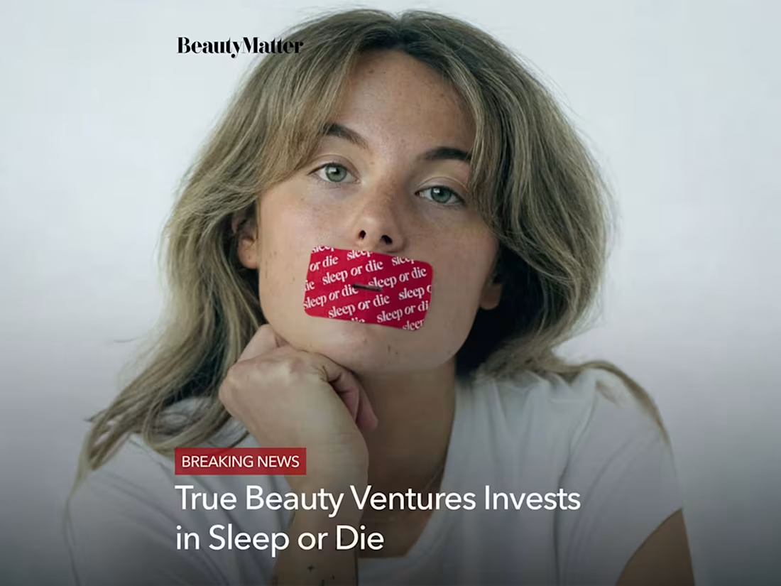
Last year, I helped build the foundation for Sleep or Die (https://contra.com/p/mWXgcXE7-sleep-or-dietm-or-brand-strategy-and-development-web-design?referralExperimentNid=DEFAULT_REFERRAL_PROGRAM&referrerUsername=georgiamashfordcreative), from brand strategy and identity to creative direction and photography.
🤯 Just this week the brand has gone on to receive $1M in funding, and I’ve been seeing accounts with 75K–100K+ followers sharing the brand and some of the photography I created in those early stages.
While the brand has evolved since my initial work with them, it’s a nice reminder that the early stuff matters. The strategy, the visuals, the tone, the way a brand shows up before most people know who they are; it all becomes part of the foundation.
Very grateful to have played a role in getting this one off the ground!!
8
32
1.5K
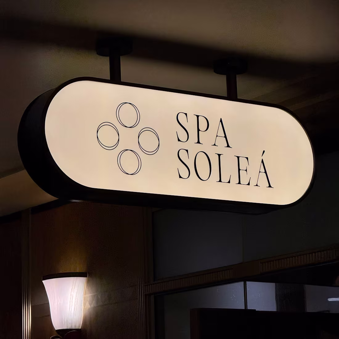
Spa Soleá | Brand Design & Web Design
2
23
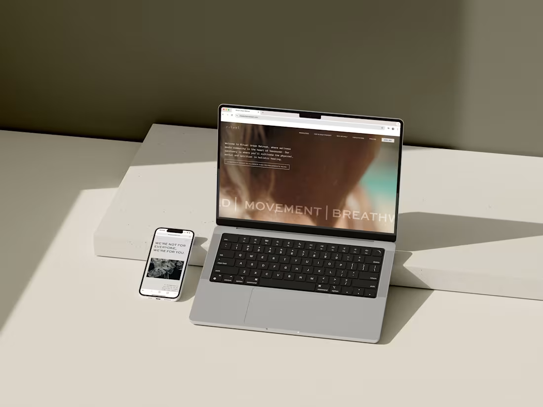
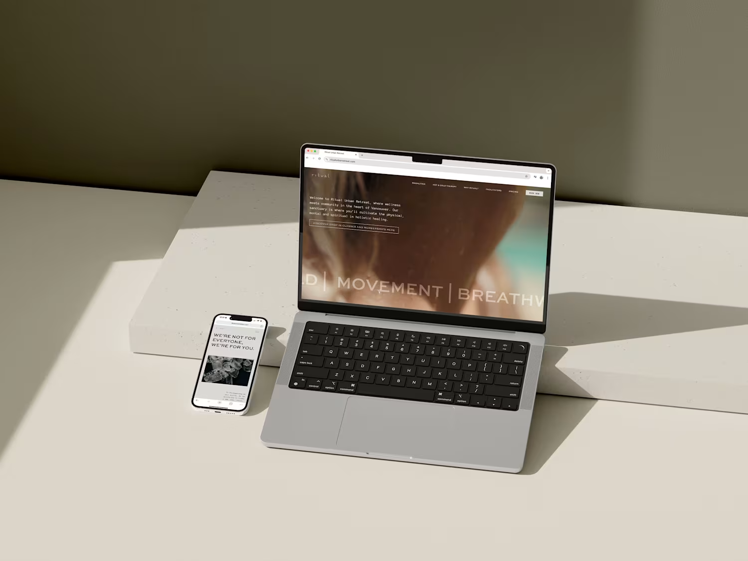
Ritual Urban Retreat | Brand Application & Strategy
10
100
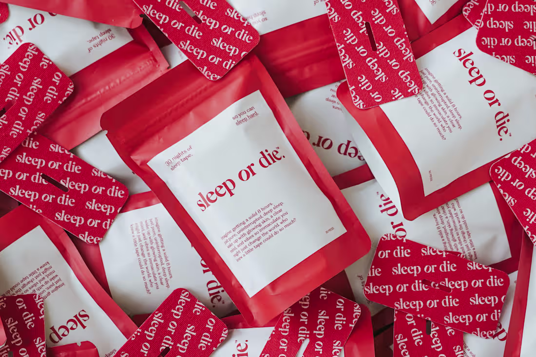
Sleep or Die™ | Brand Strategy & Development, Web Design
17
172
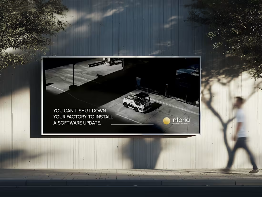
Intoria | Rebrand & Web Design
4
35
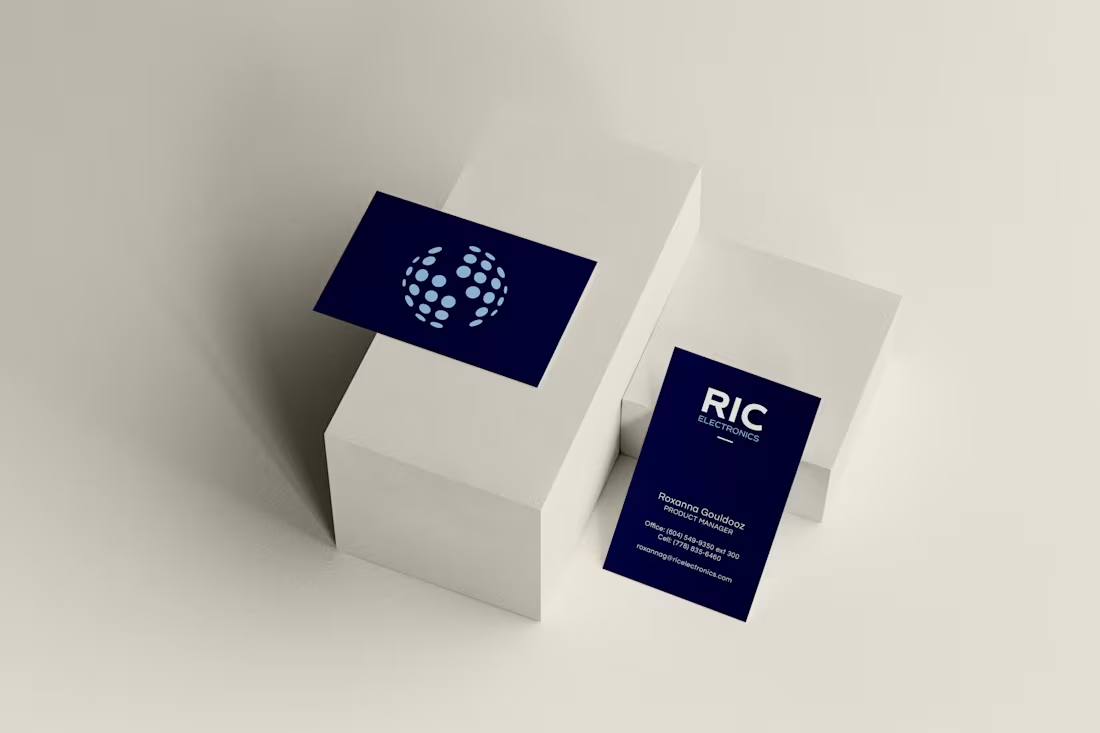
I led a brand refresh for RIC Electronics, a Canadian manufacturer specializing in power and energy solutions.
This wasn’t a total rebrand, it was a refinement. The original logo felt outdated and disconnected from the team, so the goal was to create something that still honoured their roots but reflected who they are now: sharper, stronger, and more aligned.
The result: a cleaner form, refined typography, and a mark with meaning that's built for the people who use it every day!!
26
60
1.7K
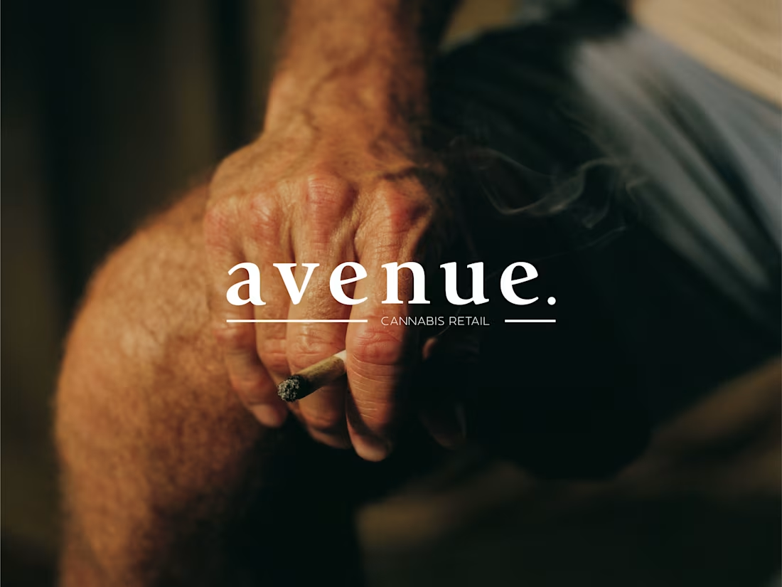
Avenue Cannabis | Brand Design
15
99
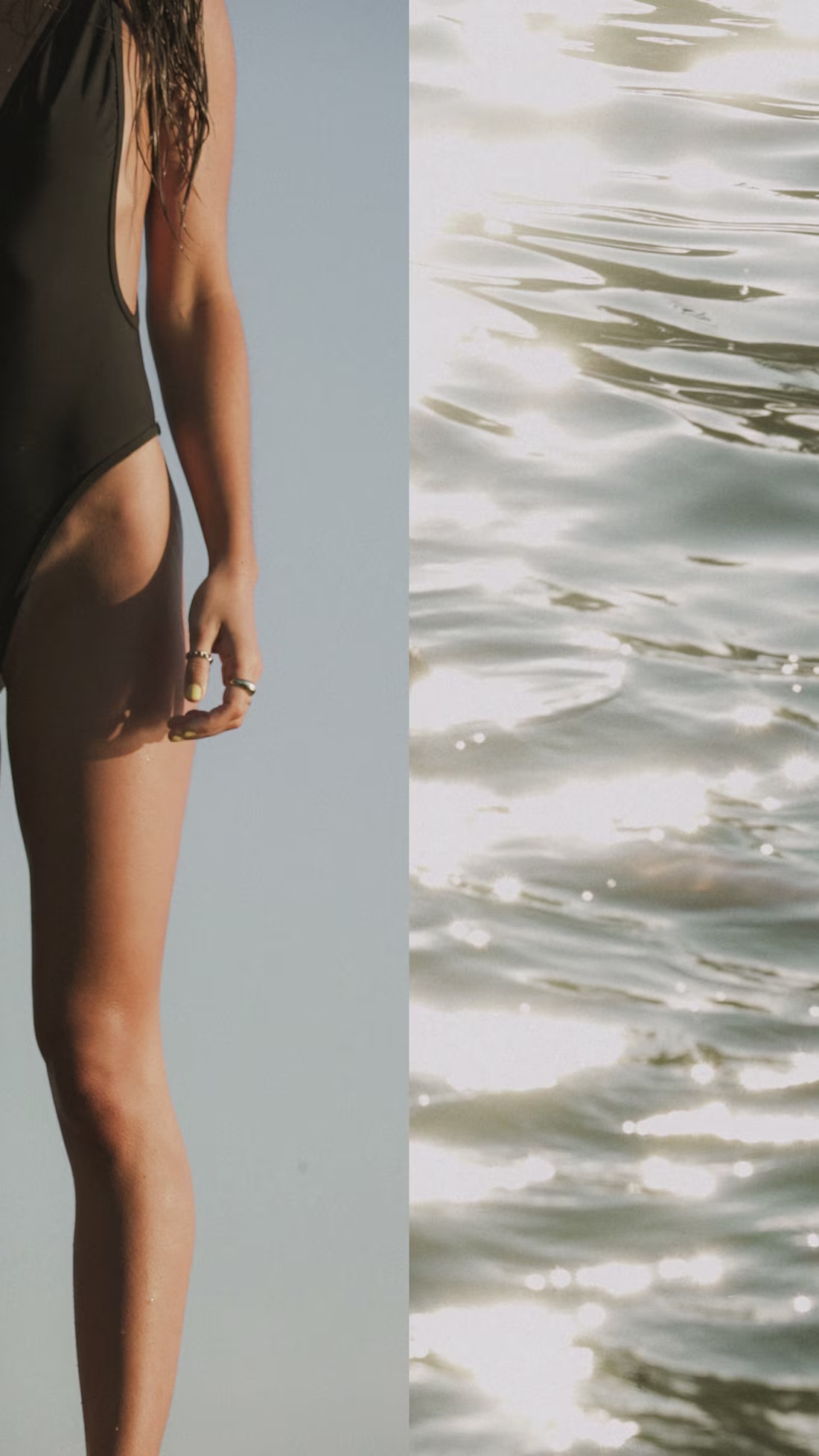
A part of my creative world I haven’t shared here yet: photography.
Alongside brand design, I spend a decent amount of time behind the camera.
For me, photography is another way of telling a brand’s story; through mood, detail, and energy.
While I love shooting for brands, I also love getting to be creative in an unrestricted way and having the freedom in personal creative shoots like this one i’m sharing with you today.
Excited to start sharing more of this side of my work with you 🤗
5
37
1.3K
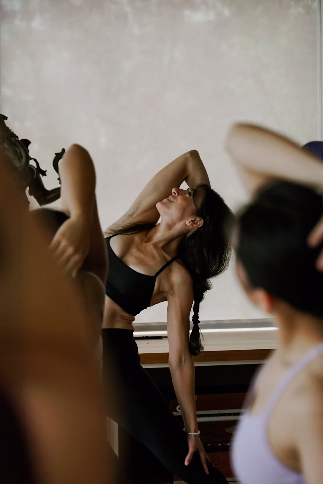
Alo Yoga | Photography
9
142
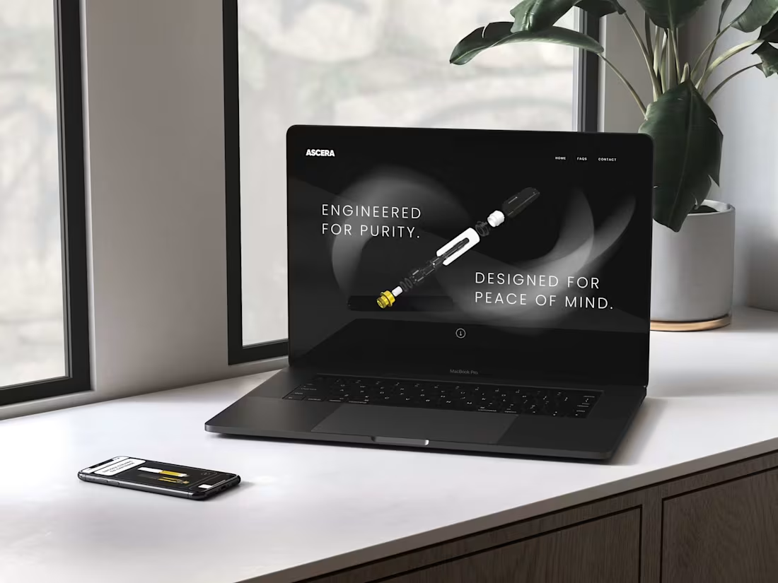
ASCERA | Website Redesign
5
44
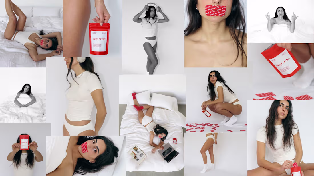
As the creative on this project, I got to build this brand from the ground up; brand strategy, positioning, identity, packaging, website, AND the brand photography. The whole damn thing!
A brutally honest, anti-traditional, brand that is here to shout from the rooftops how important sleep is, but in a *cool* way. Every detail was designed to feel real, raw, and self-aware.
The brand has now been featured in numerous press and articles talking about the approach, and how they've stood out in the sleep and wellness space.
Sleep or Die™ (https://sleep-or-die.com/) is one of those projects that reminded me why I love what I do. Still one of my favourite projects to date.
6
41
1K
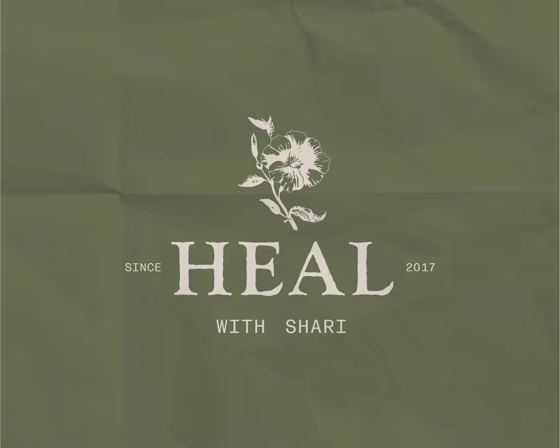
Heal with Shari | Branding & Packaging
4
50
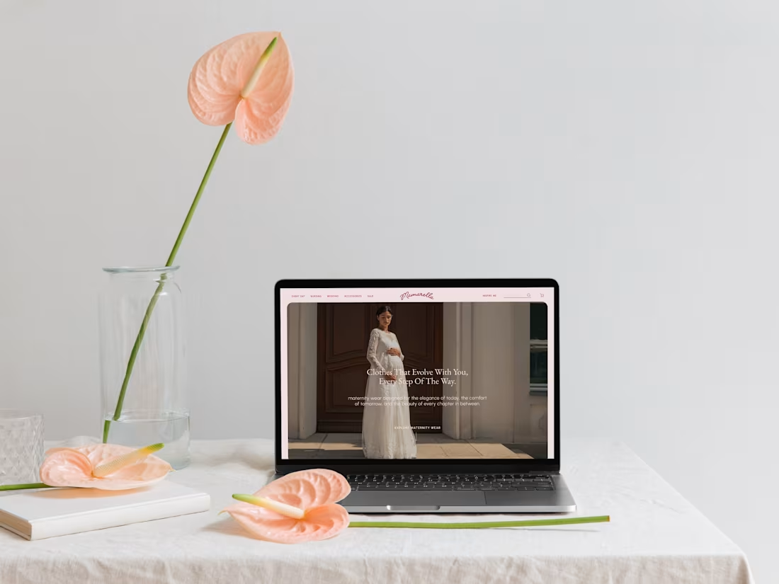
Joining this challenge with a mini campaign created for Mamarella, a European maternity brand. I reimagined their visual direction for this campaign (as the request), with new language created by moi, and using existing imagery 👀
I always use Figma to design my client's websites!
Swipe through to see how it came together ↓
25
44
1.2K

Rock Busters | Brand Design & Packaging
3
22
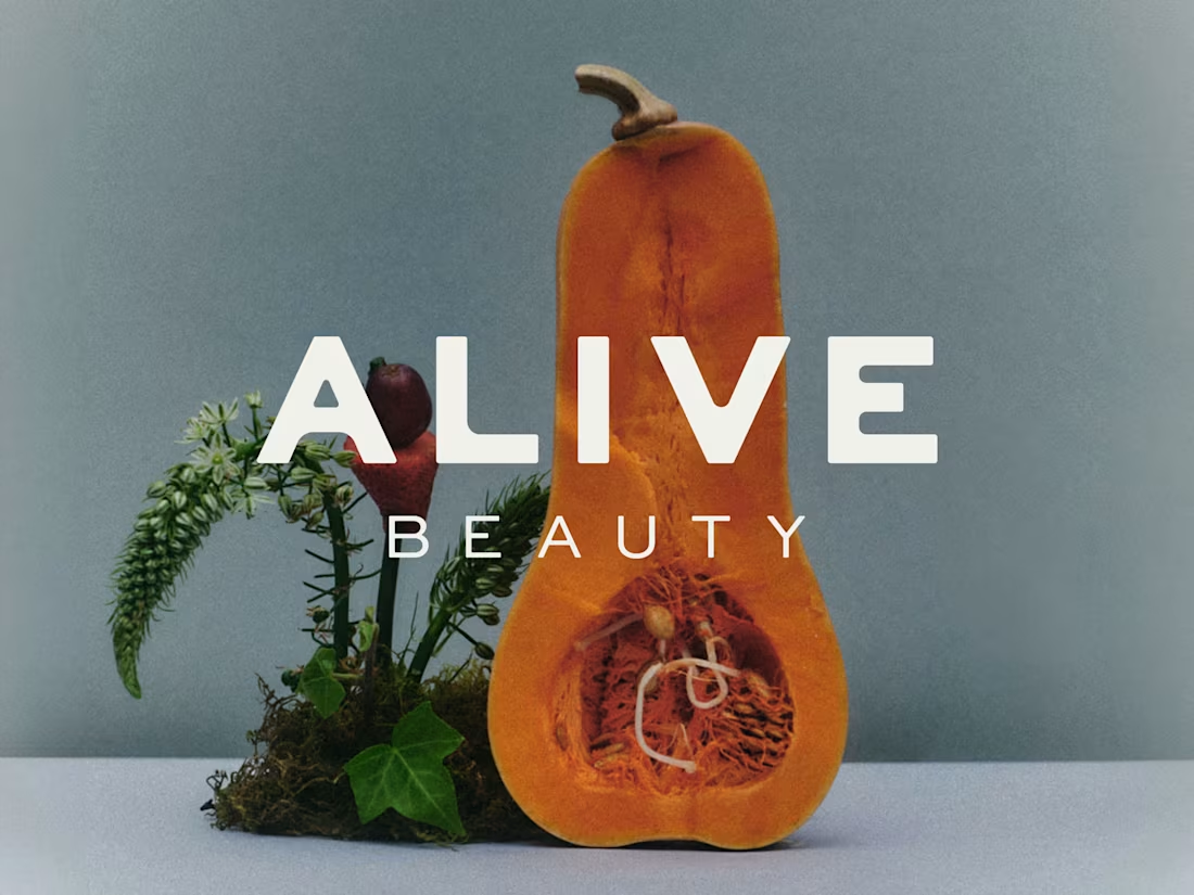
Alive Beauty | Brand Design & Application
5
55
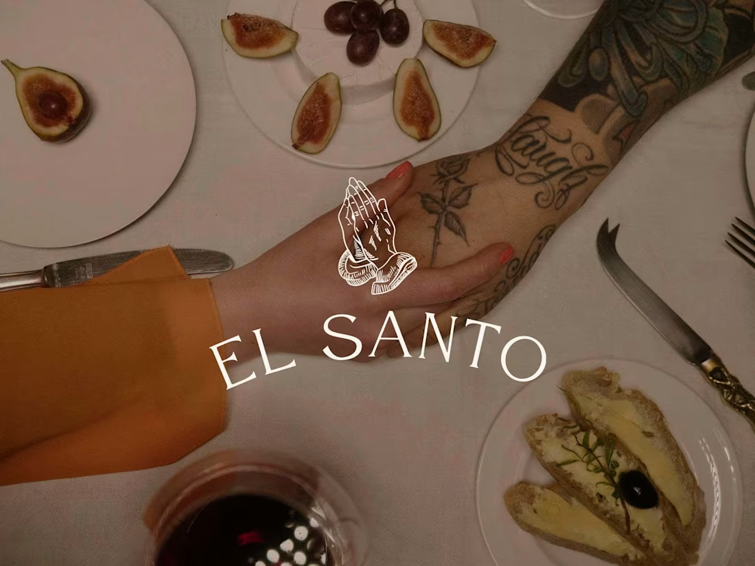
El Santo | Brand Design & Photography
23
191
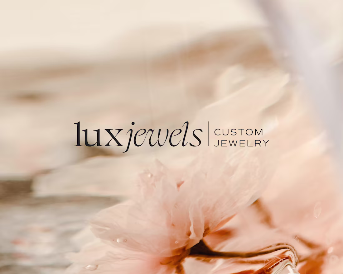
Lux Jewels | Brand & Website Design
3
41
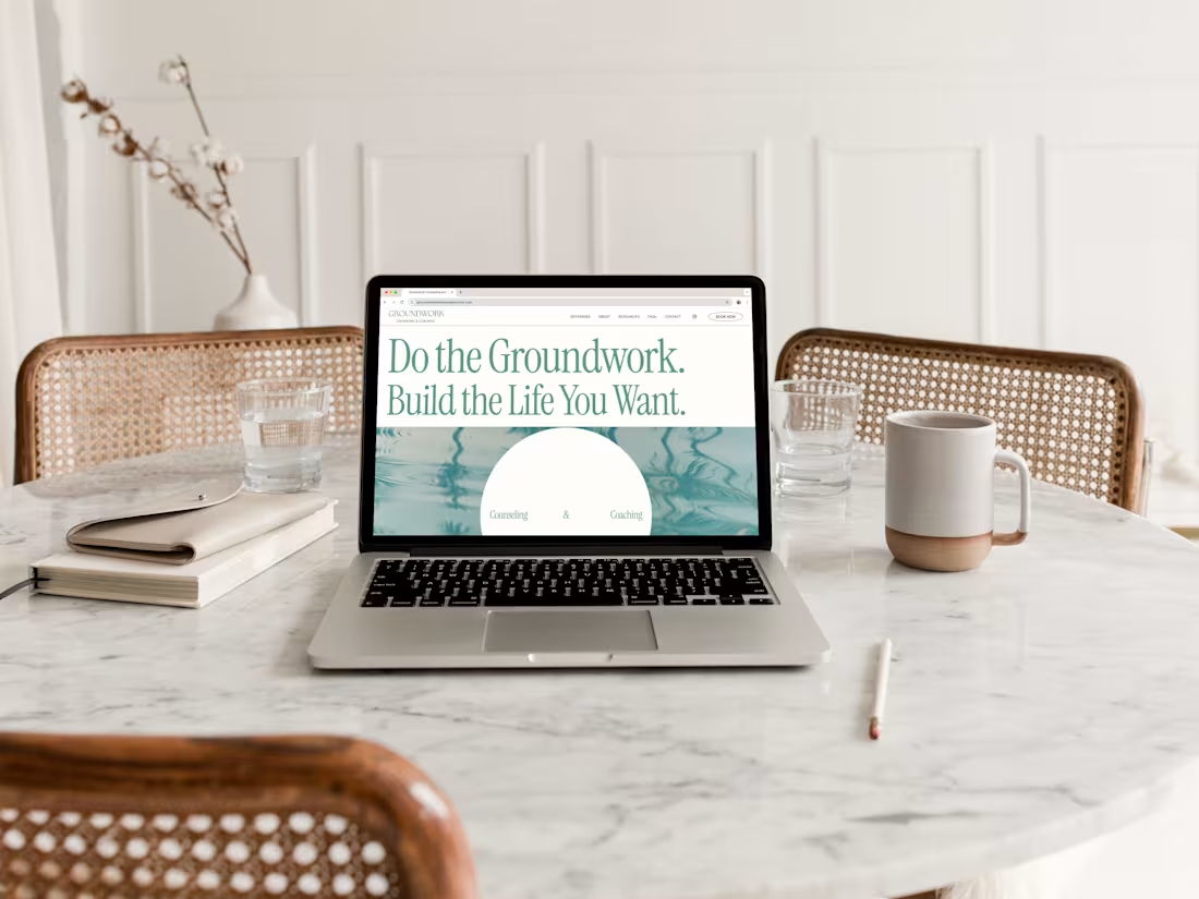
Groundwork Counseling & Coaching | SquareSpace Website
12
117