pro
Edward Jaiyeola
Framer Designer & Revenue-Focused Sites | Ecom Partner | AI
- $1k+
- Earned
- 5.0
- Rating
- 56
- Followers


I sketched a website before I "designed" it.
Old NOVO Studios site vs. my sketch of what I wanted: minimal, whitespace, a little luxury.
Turned the sketch into a prompt, let AI generate the first pass. It wasn't finished:
Hero image was missing, sourced and fit one myself
Removed a...

A or B? 🎨
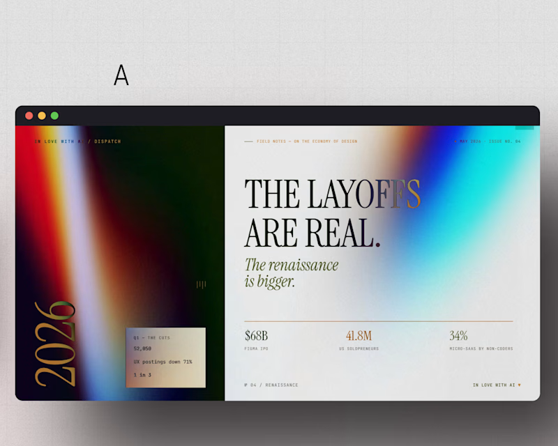
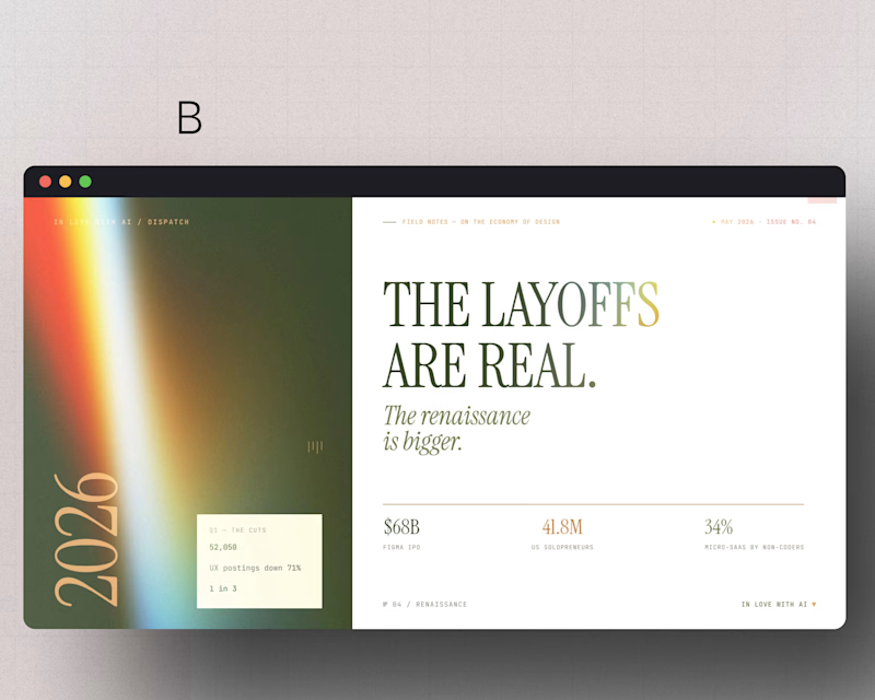
Same layout. Same headline. Two completely different moods, just from color.
A brings the cool, high-contrast energy. B goes warm and editorial.
Which one makes "the layoffs are real" hit harder for you?
Drop your pick below. A or B?
#WebDesign #Framer #EditorialDesign
3 voted
50%
3 voted
50%
6 votes
Closed
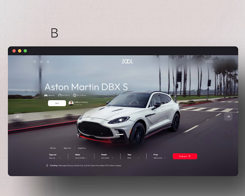
A or B? 👀
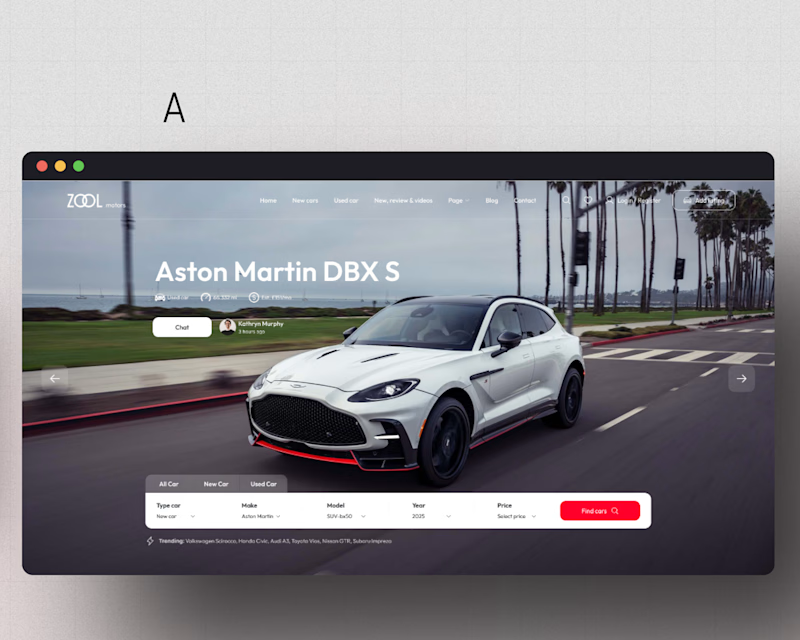
Same car. Same page. Only difference is how the hero section is built.
One small layout decision here can be the difference between someone scrolling past or actually clicking "Find cars."
Drop your pick in the comments. A or B?
3 voted
60%
2 voted
40%
5 votes
Closed
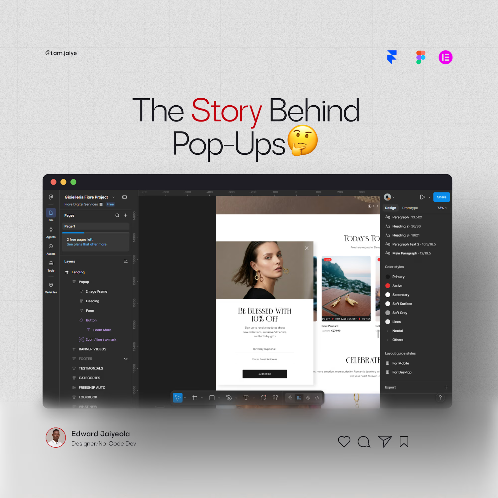
Pop-ups weren't planned. They were a fix.
1997, Tripod.com. A car company didn't want their ad next to content they weren't comfortable with. A small team wrote code to open ads in a separate window instead.
That quick fix became the pop-up. For years, it was one of the most hated...