The network for creativity
Join 1.25M professional creatives like you
Connect with clients, get discovered, and run your business 100% commission-free
Creatives on Contra have earned over $150M and we are just getting started
Back to feedPost
Taste Test


A or B? 👀
Same car. Same page. Only difference is how the hero section is built.
One small layout decision here can be the difference between someone scrolling past or actually clicking "Find cars."
Drop your pick in the comments. A or B?

3 voted
60%
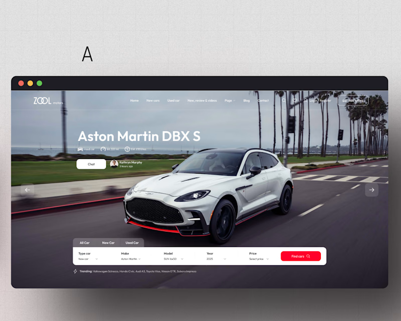
2 voted
40%
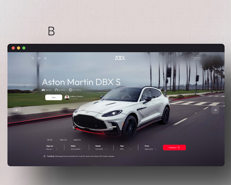
5 votes
Closed
By the way I am open to any criticism 🌚...let's have it

B but i think you need to work more on the UI, like make the bg blur and black to read text easily, but not add above the car to focus on the car to get eye guest
Yeah I was thinking of that as well.. Thanks

A would have been better if you added the nav link to it
Yeah I wanted a neat look for concept B

Great layouts. I lean toward the right option because the solid search bar makes it much easier to scan the page. Though, in the right option too, the top nav text struggles a bit with readability against the background.

The network for creativity
Join 1.25M professional creatives like you
Connect with clients, get discovered, and run your business 100% commission-free
Creatives on Contra have earned over $150M and we are just getting started







Related posts


Every element feels perfectly placed! 👏

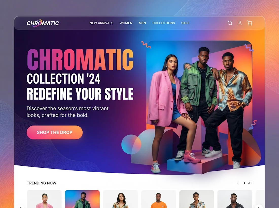
Modern Slick hero page design figma+Tailwind+Gemini ;)




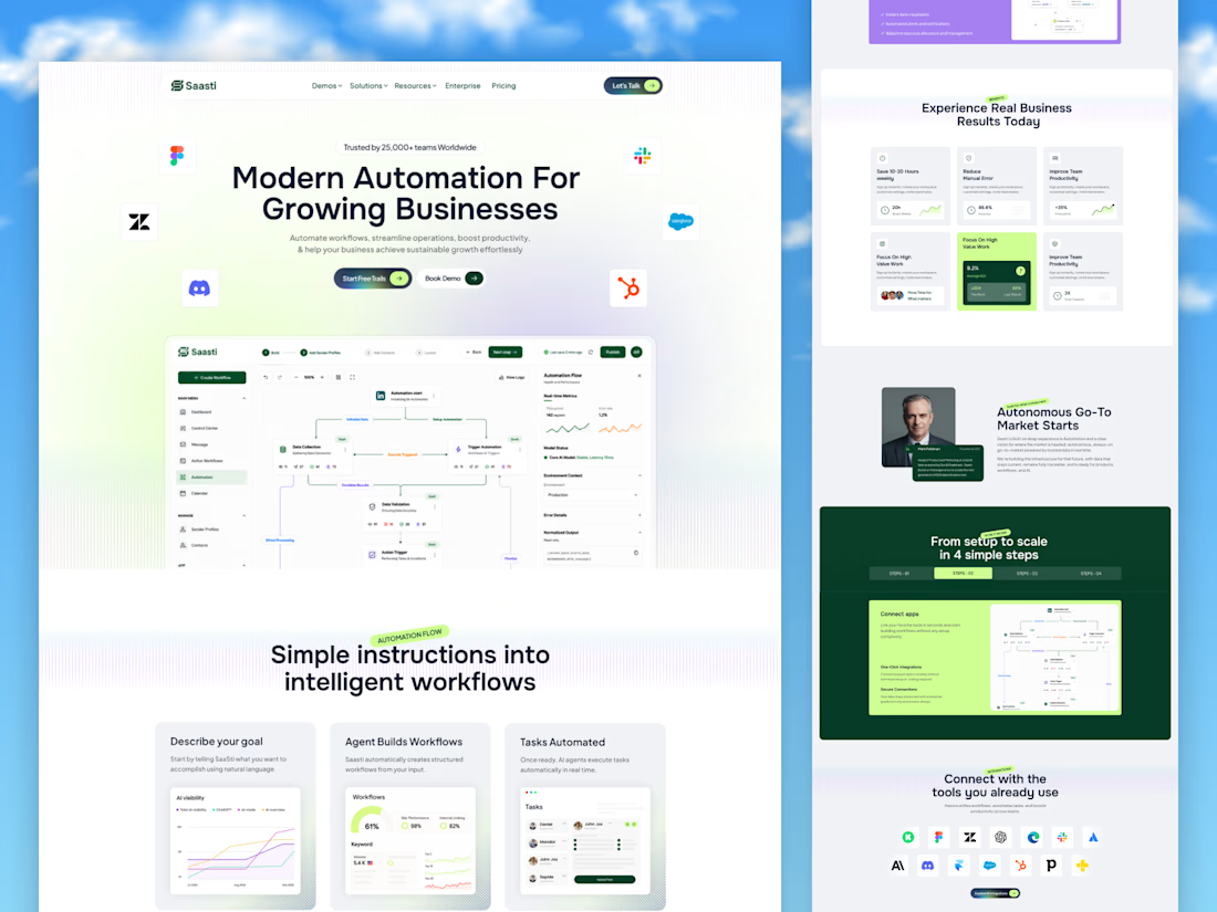
🚀 Saasti — Smart Automation for Growing Businesses
A modern SaaS website concept designed to turn complex automation into a simple, intuitive experience. With clean layouts, interactive workflow dashboards, vibrant accents, and clear messaging, every section highlights the power of smarter business operations.
✨ Modern SaaS UI/UX Design
⚡ AI-Powered Automation Experience
📊 Intuitive Workflow Dashboards
🎨 Clean, Conversion-Focused Layout
Designed by OrdainIT to bring innovation and usability together.
#SaaSDesign #UIDesign #UXDesign #AI #WebDesign #DashboardDesign #OrdainIT



Brilliant execution!