The network for creativity
Join 1.25M professional creatives like you
Connect with clients, get discovered, and run your business 100% commission-free
Creatives on Contra have earned over $150M and we are just getting started
Back to feedPost
Taste Test
A or B? 🎨
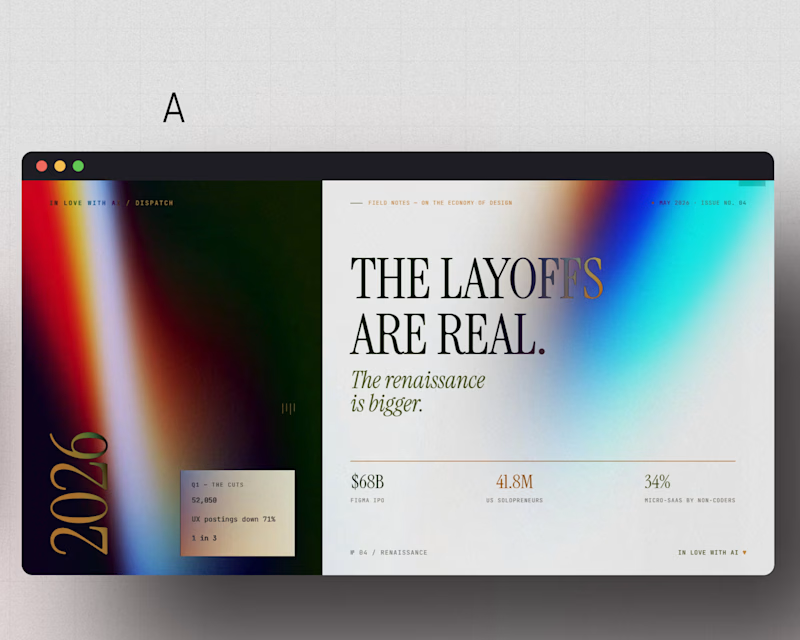
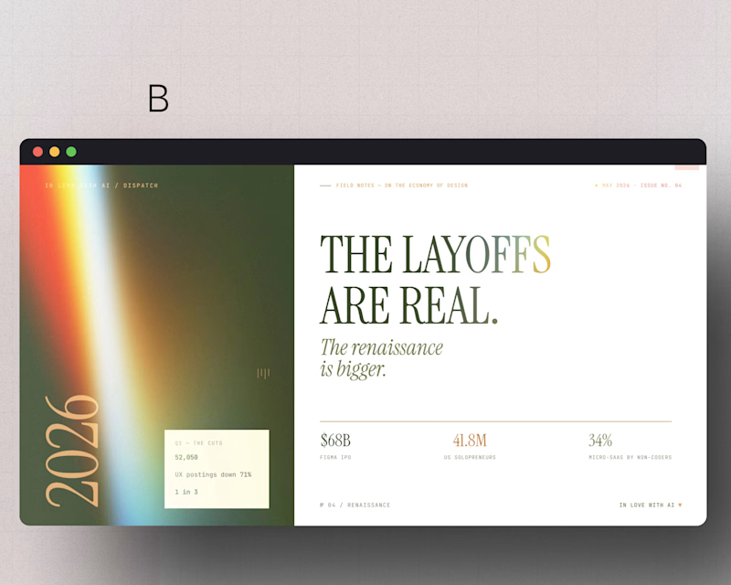
Same layout. Same headline. Two completely different moods, just from color.
A brings the cool, high-contrast energy. B goes warm and editorial.
Which one makes "the layoffs are real" hit harder for you?
Drop your pick below. A or B?
#WebDesign #Framer #EditorialDesign

3 voted
50%
3 voted
50%
6 votes
Closed


I think I like the concept A better 🤔
But what's your say, though?
The network for creativity
Join 1.25M professional creatives like you
Connect with clients, get discovered, and run your business 100% commission-free
Creatives on Contra have earned over $150M and we are just getting started



Related posts


Some concept work from the agency. Planning to share more of what we create, from clean interfaces to the little motion details that bring them to life.
Check out the website: https://urest.agency/


I created 2 concepts for the same tagline "Shaping Skylines", for a vertical construction company. Both of these are scroll triggered, which one you prefer? I'm biased towards the skewed option.
I'm giving a free component copy for both of them:
Zoom in: https://framer.link/CQNgUkU
Skewed: https://framer.link/XTmQcBK
Check them out and if you'd like, use them in your upcoming project!
29 voted
64%
16 voted
36%
45 votes
Closed

Flawless

Same projects. Different perspectives.
With INKY, switching between grid and list views changes more than the layout.
The grid gives projects a visual presence. The list offers a more direct way to browse and compare.
Neither is necessarily better.
They're simply two ways of experiencing the same work.
One portfolio. Two perspectives.

Cool 3D assets